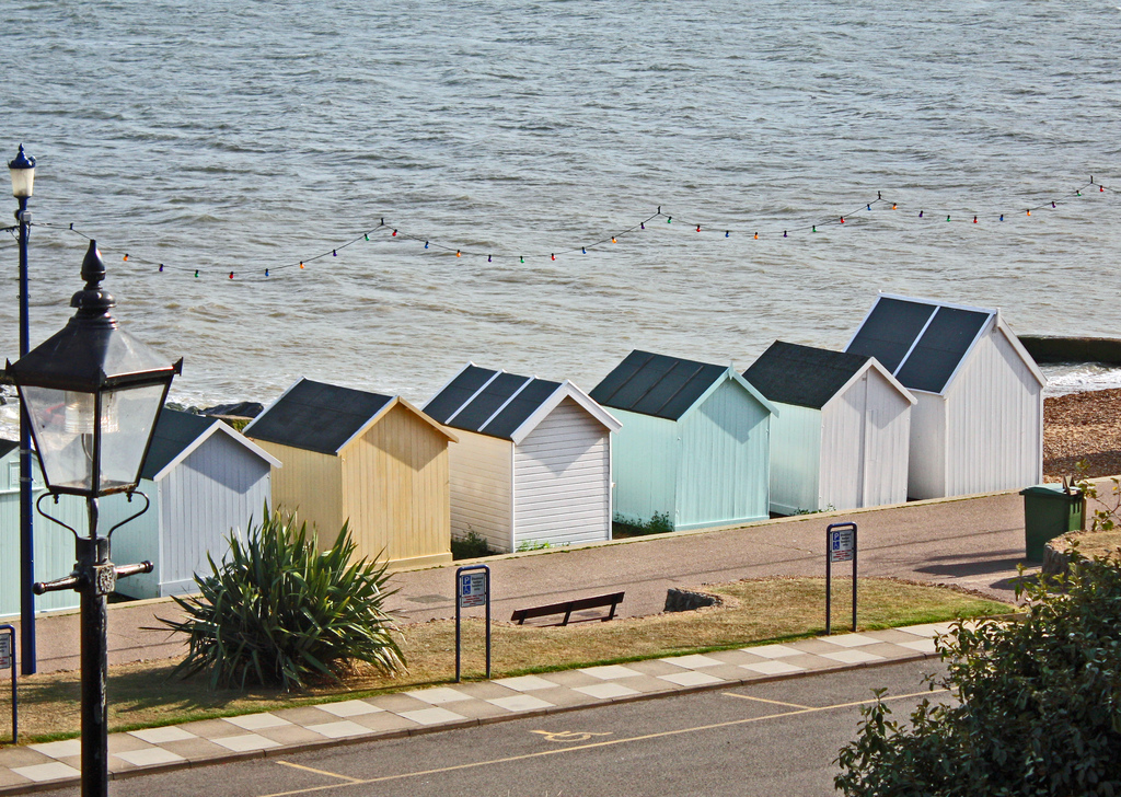
Inside, Outside, In Between.
Possible starting points, Easter holidays.
|
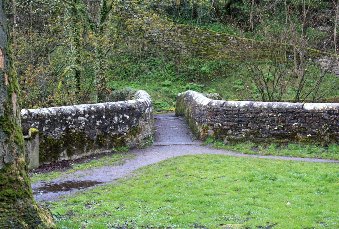
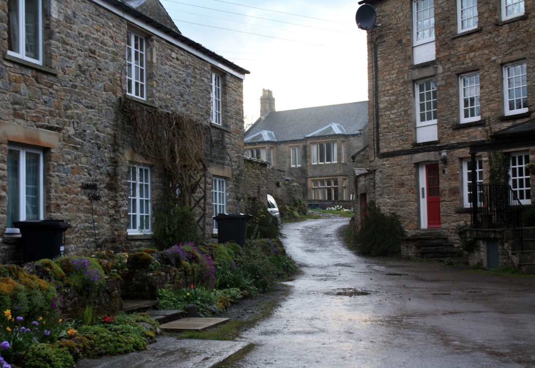
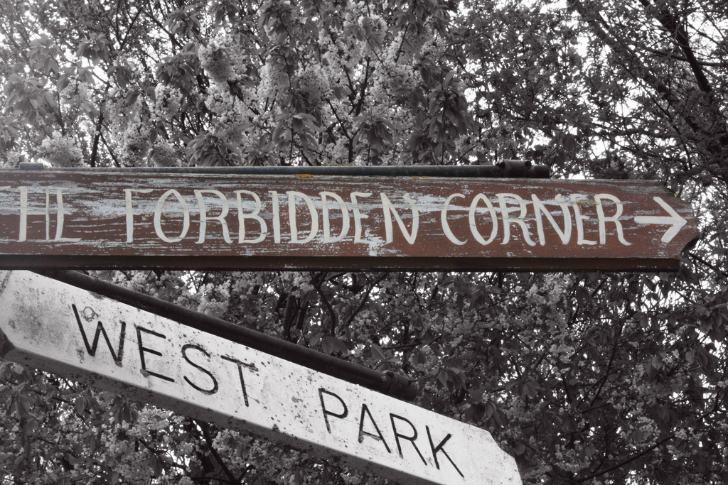
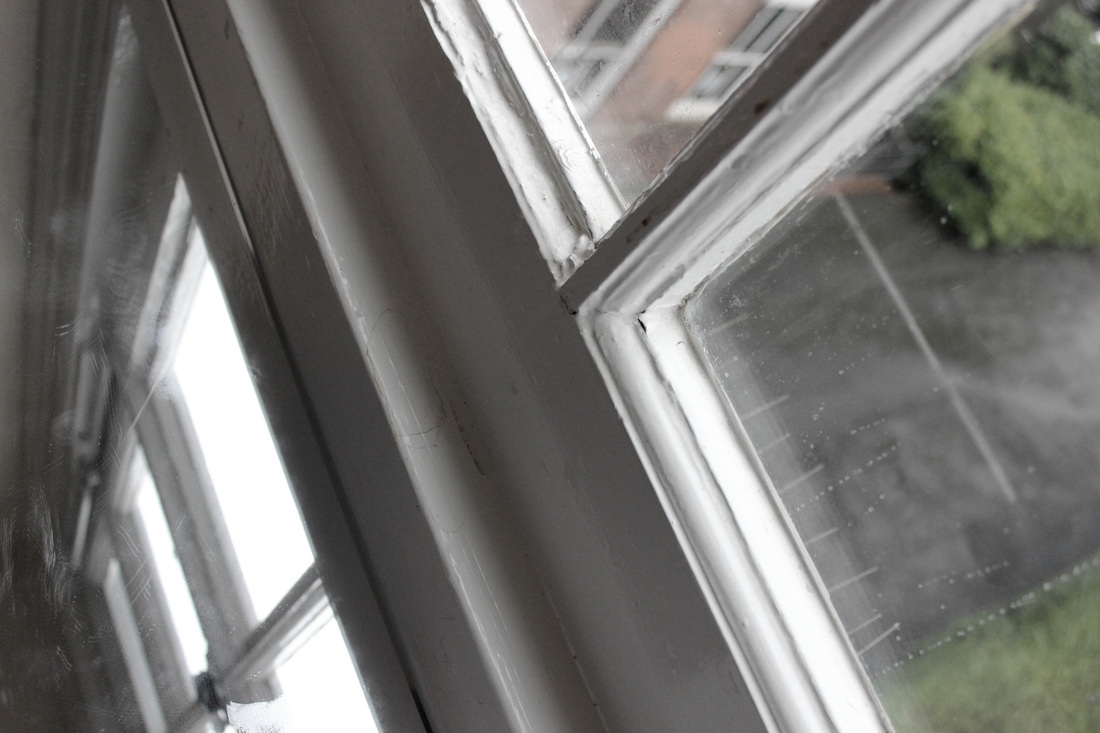
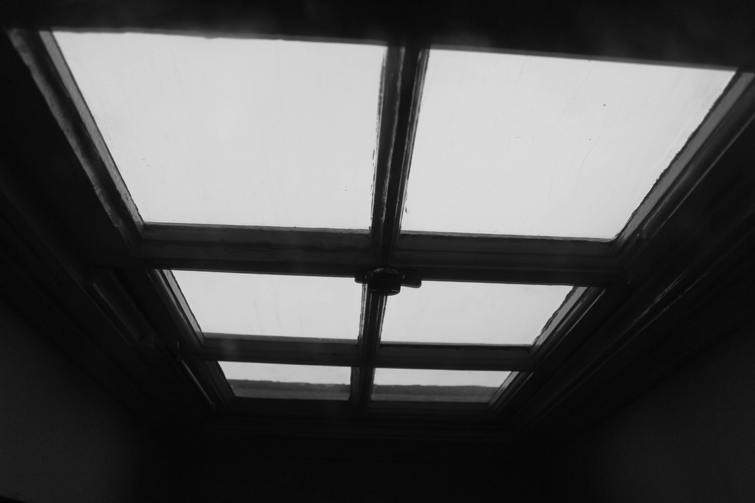
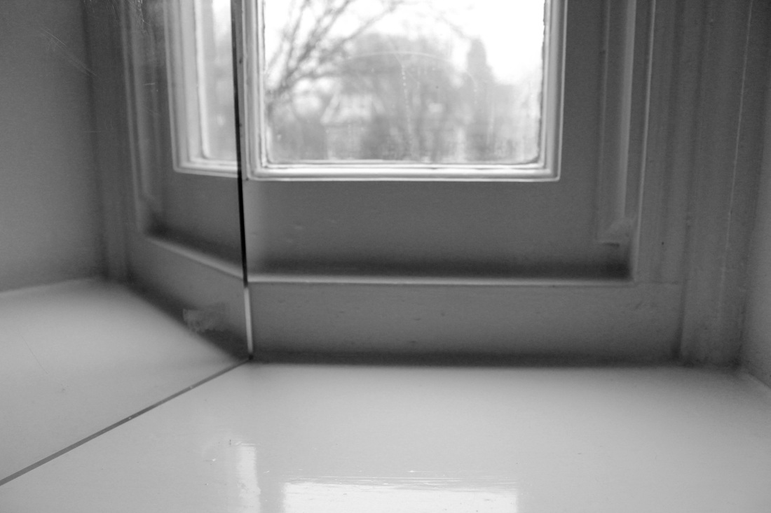
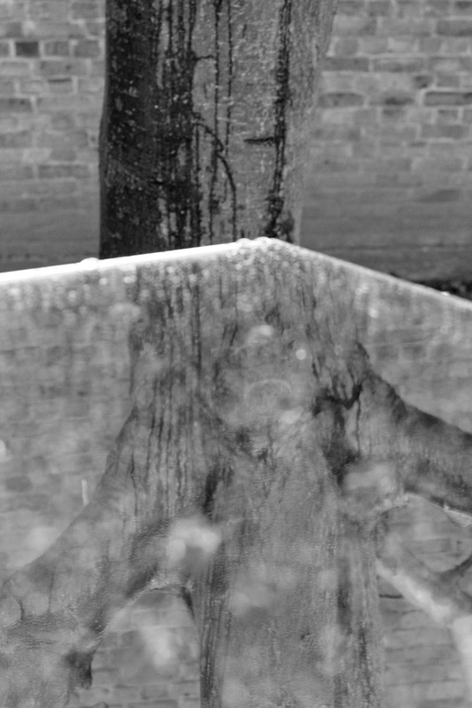
Paths and Passageways.
Geometric shapes. |
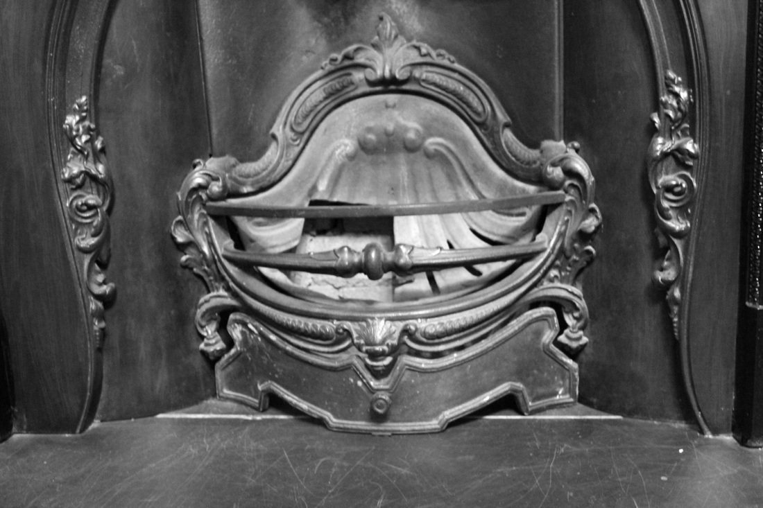
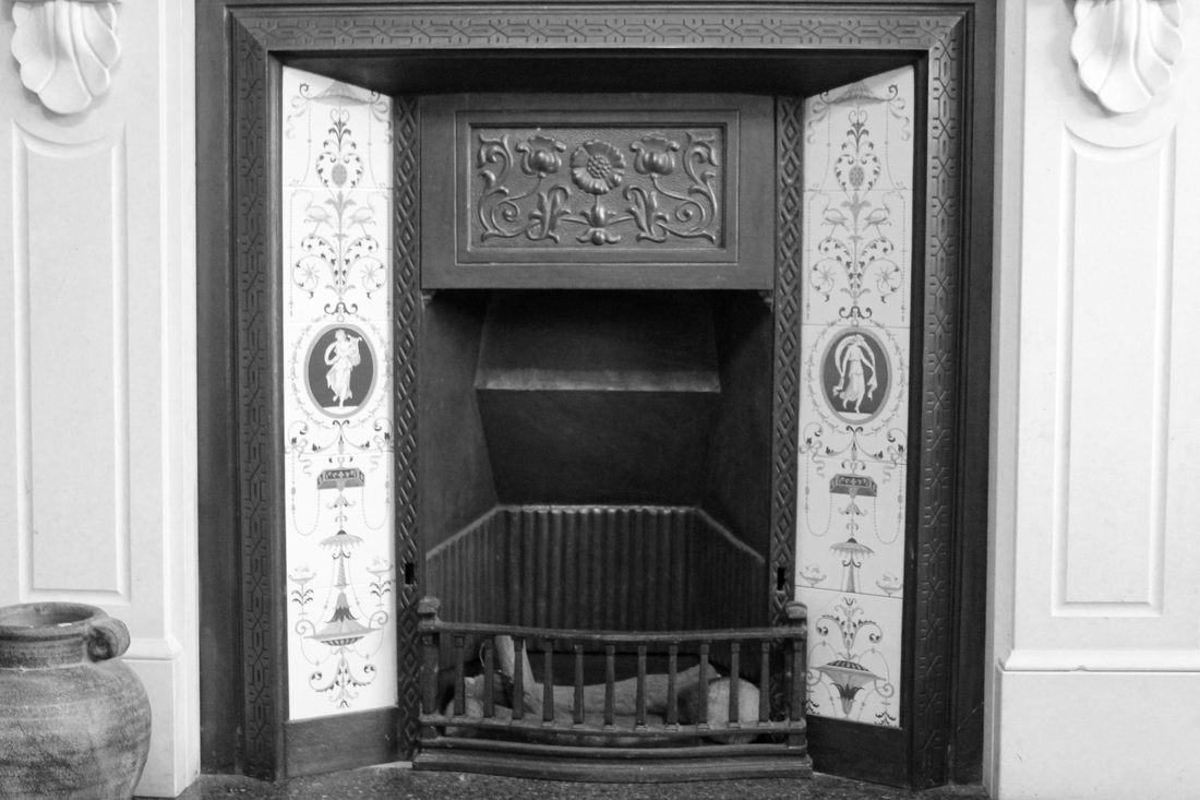
Signs.Fireplaces. |
|
|
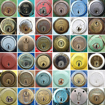
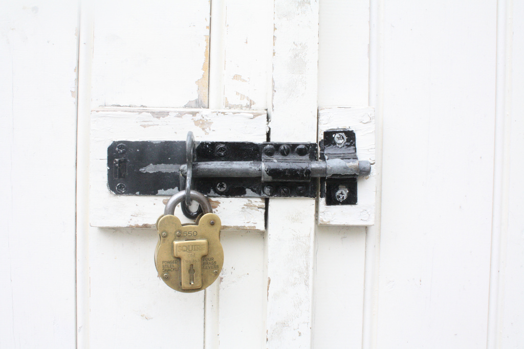
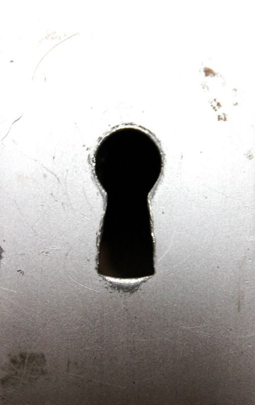
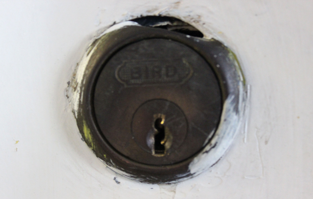
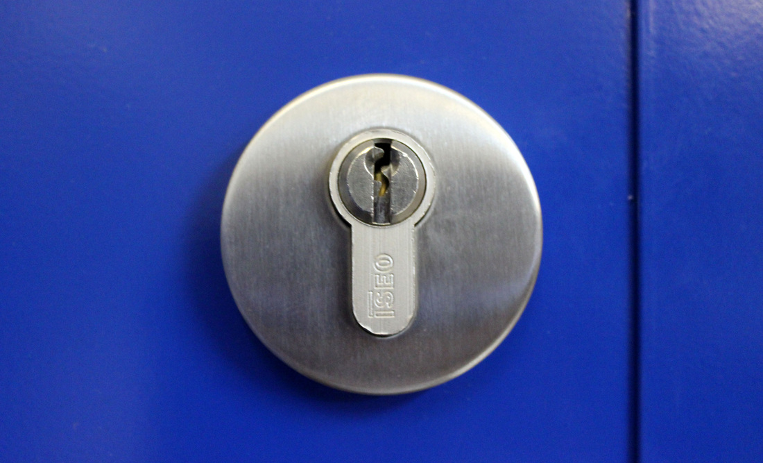
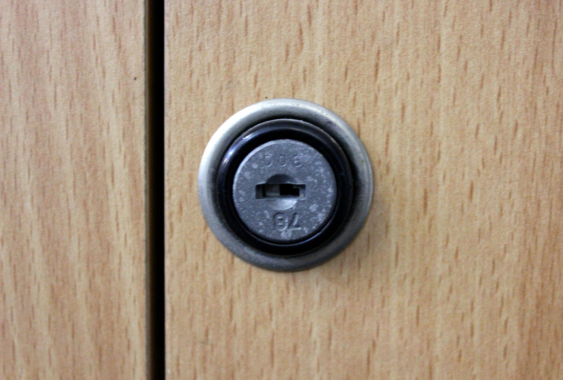
Locks. |
|
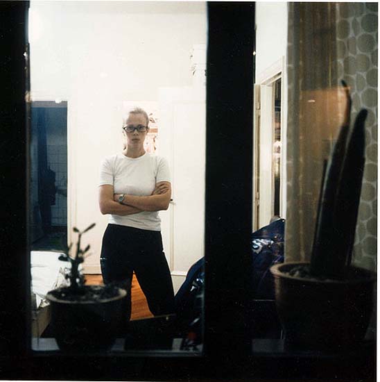
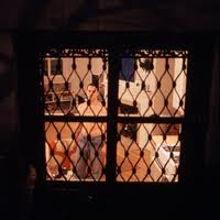
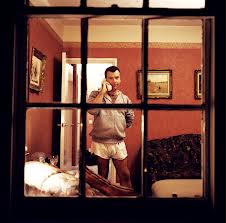
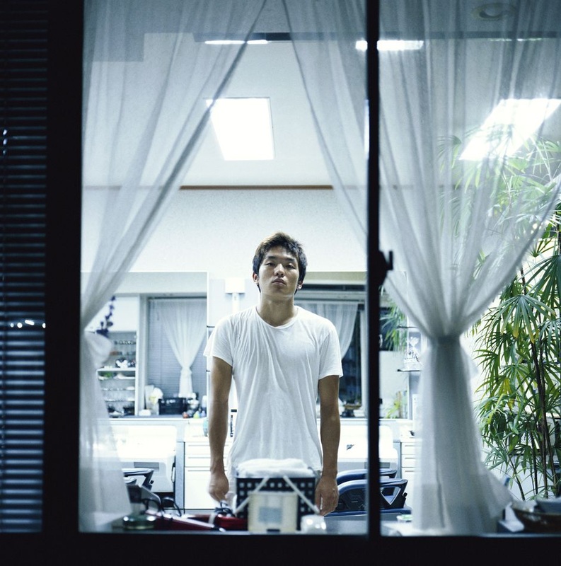
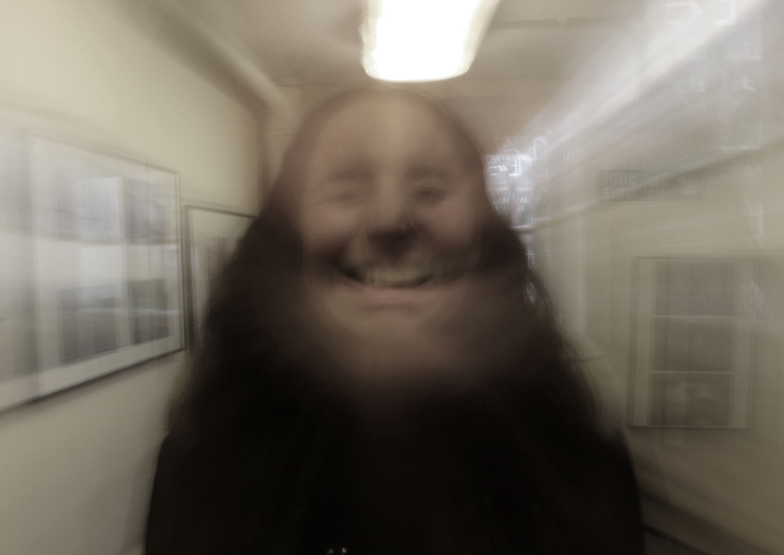
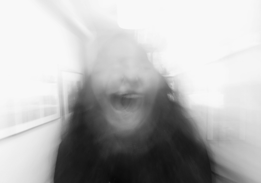
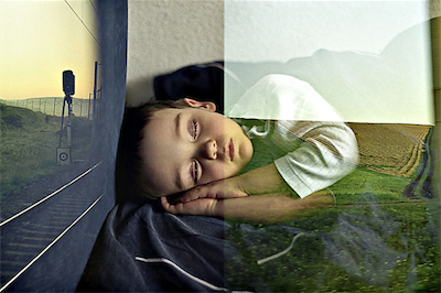
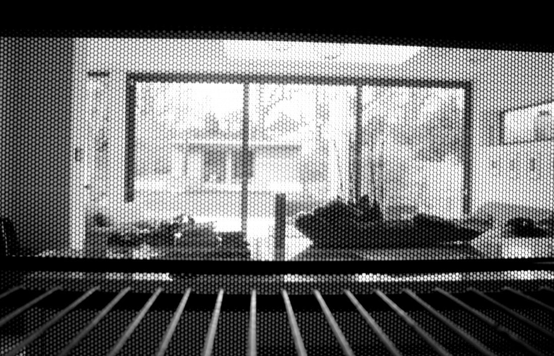
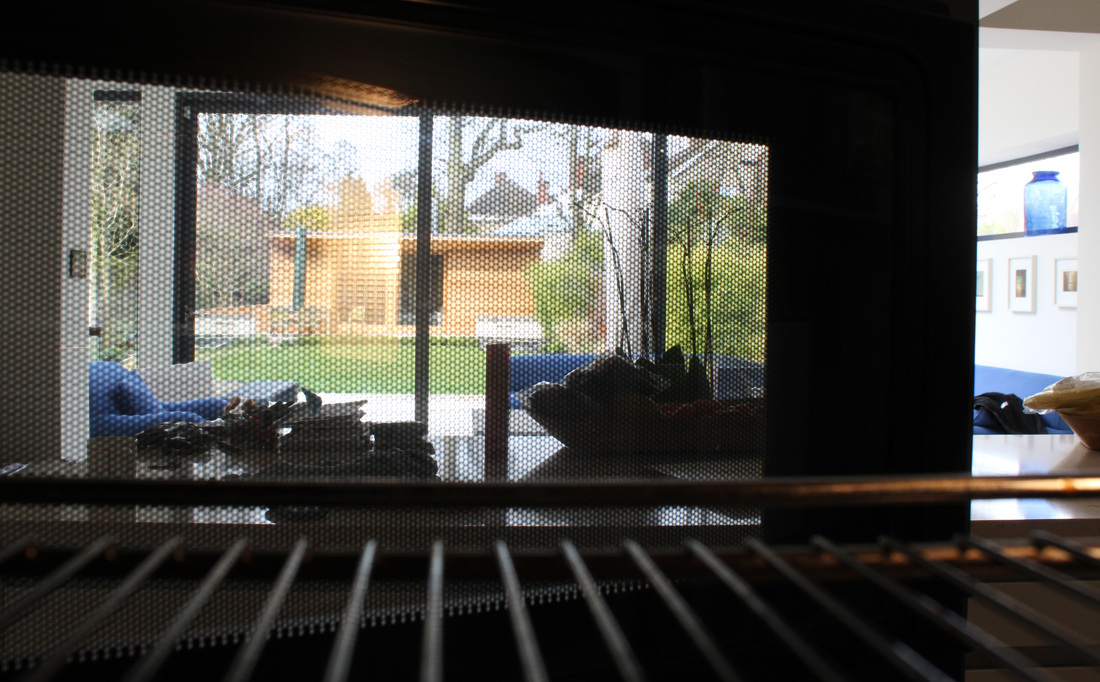
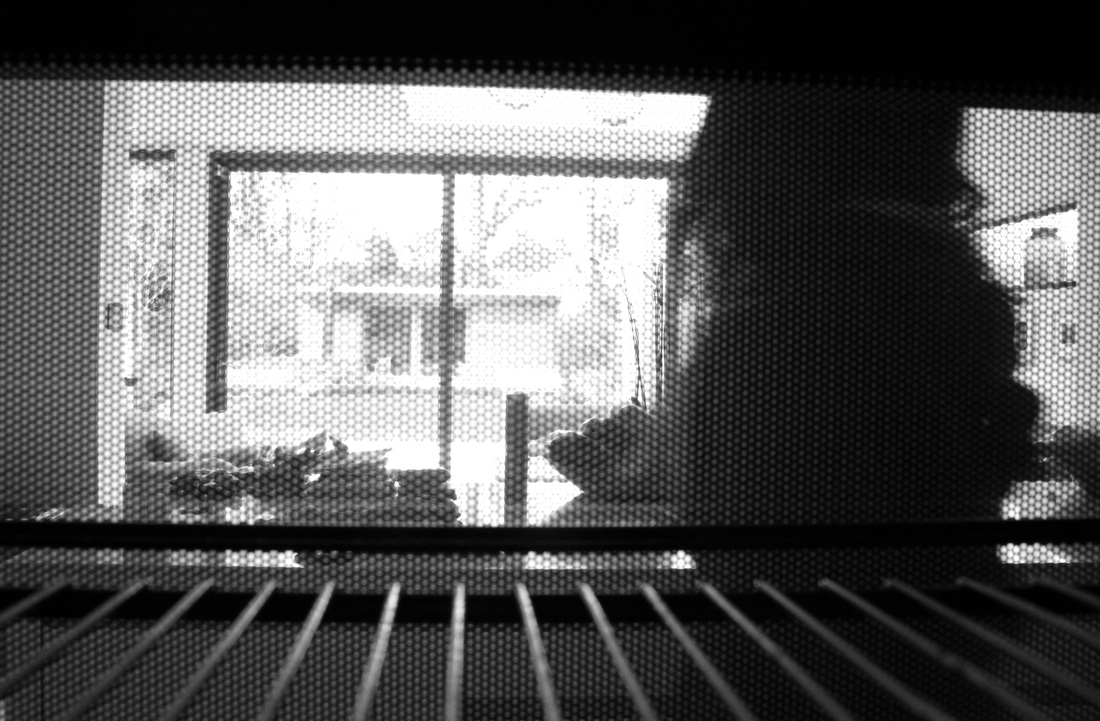
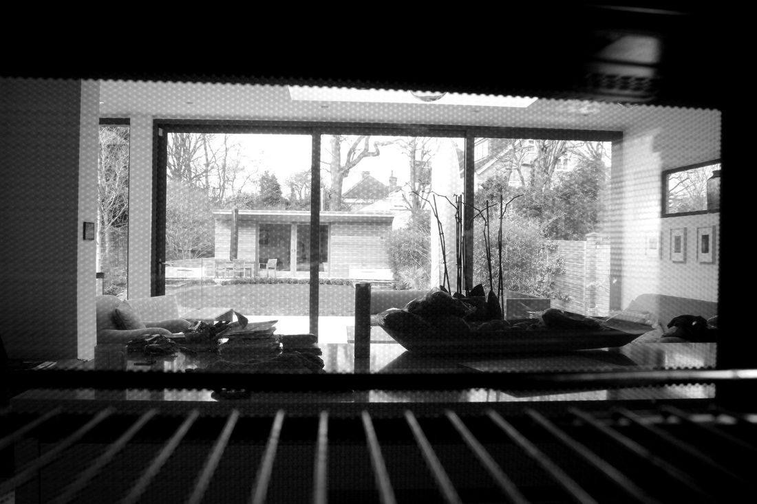
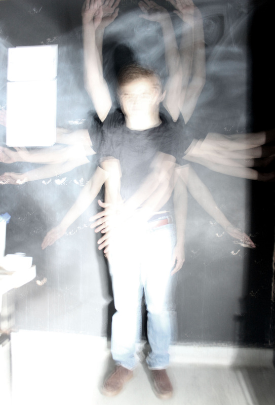
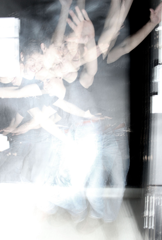
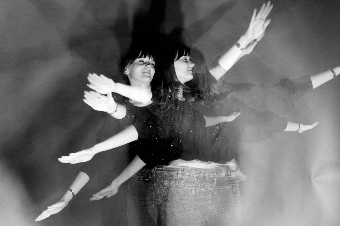
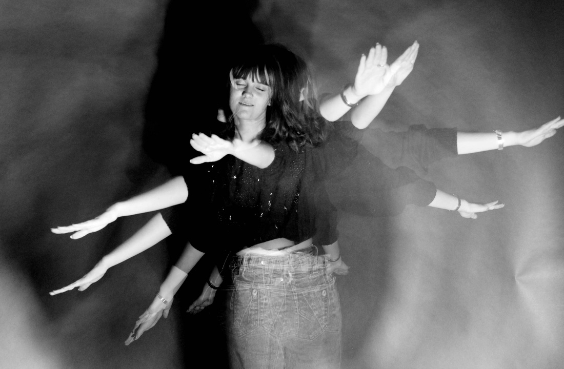
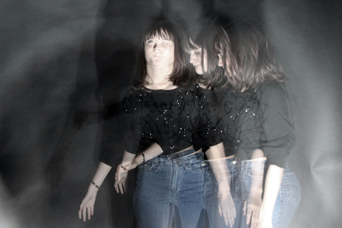
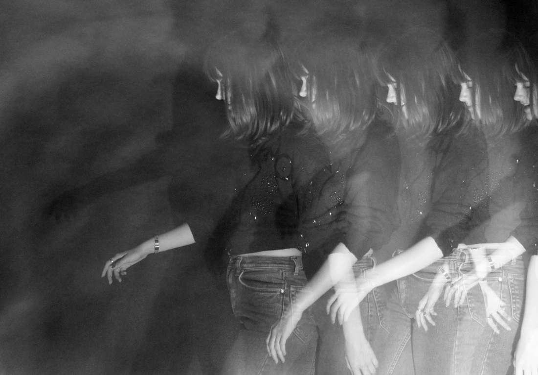
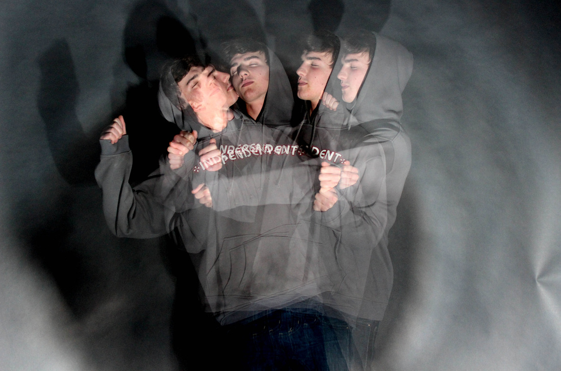
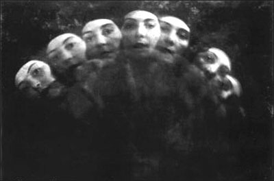
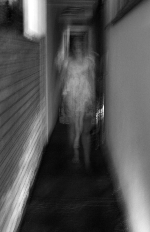
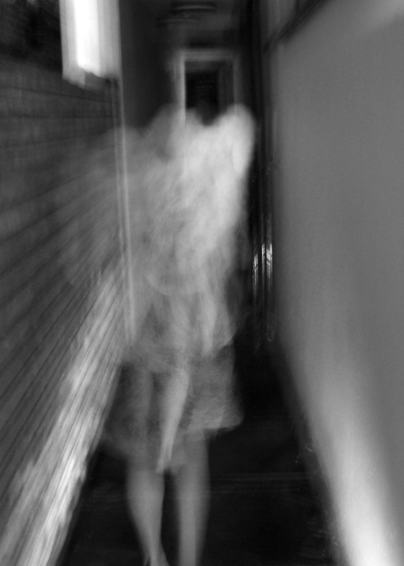
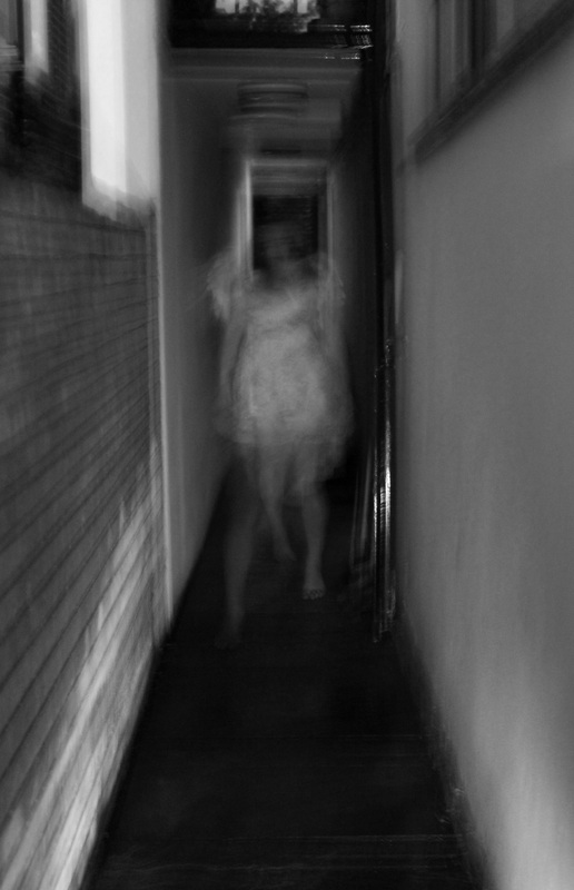
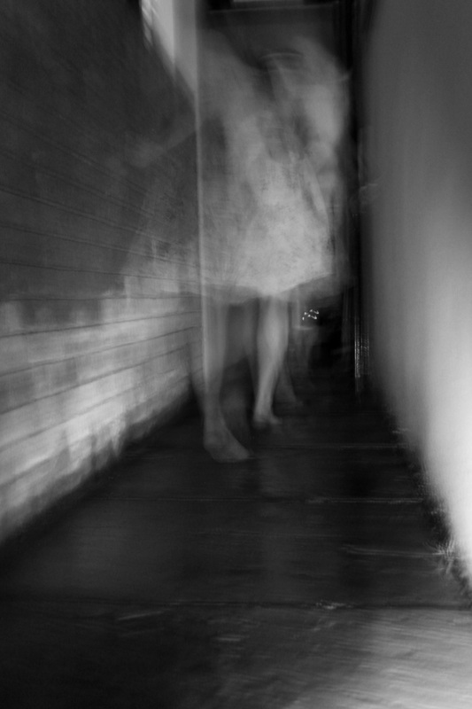
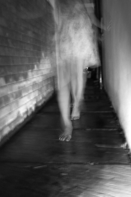
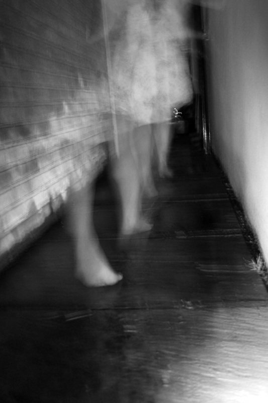
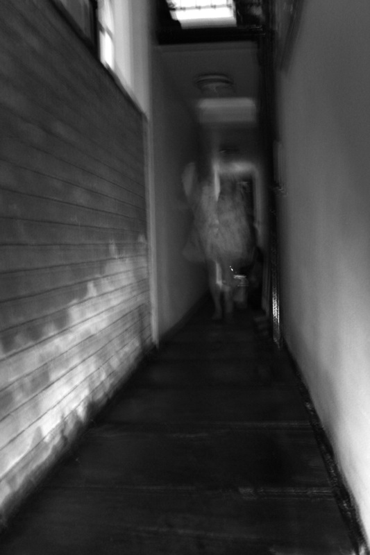
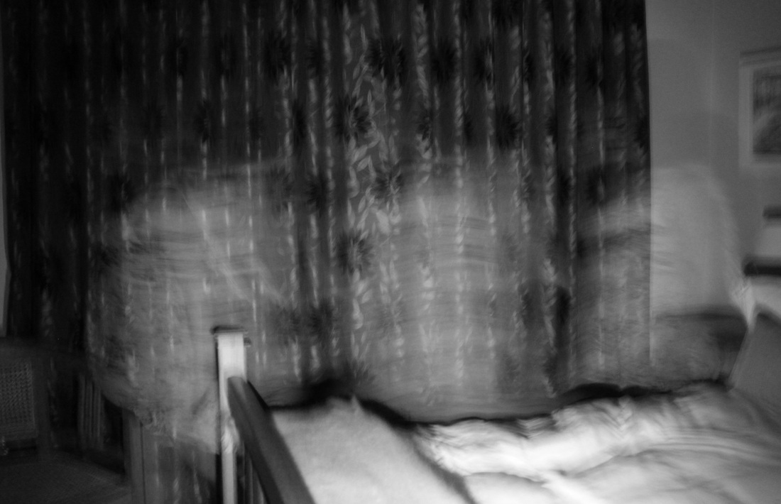
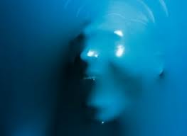
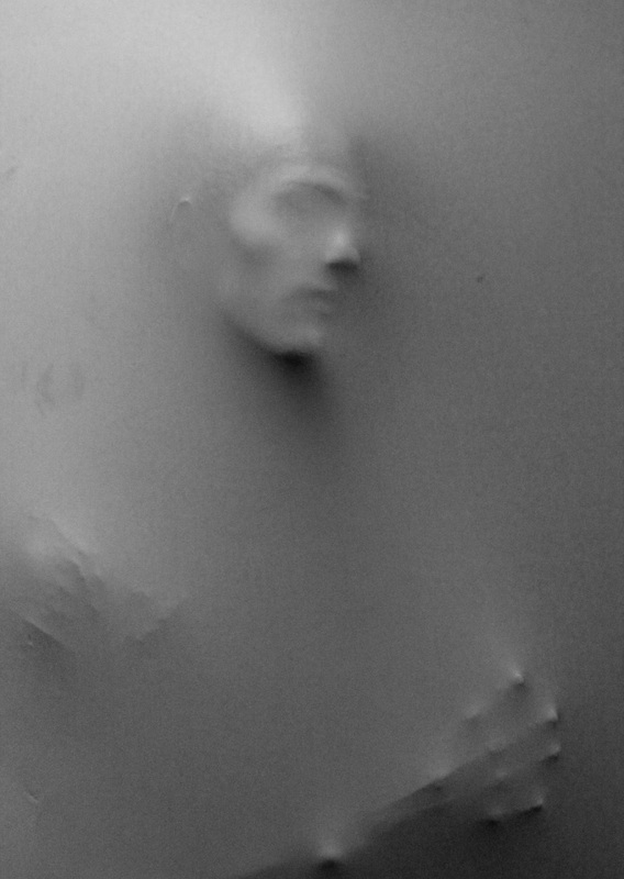
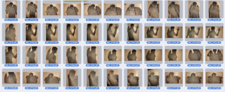
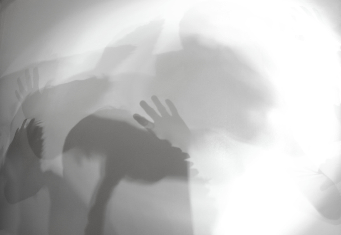
Artist research. Shizuka Yokomizo. Shizuka Yokomizo is a Japanese photographer who uses both still image and film to create a relationship between the person viewing the photo and the subject within the picture. Yokomizo explores what is unseen through the photographing of private and public lives. Yokomizo's work fits within the brief due to the way she explores the boundaries between the two. Her photographs are so effective in creating several moods at one, while leaving a large about free for the individual's inturpretation. The mood in each of the four images to the right is quite vacant and shallow. Due to the lighting, they were taken at night time, almost creating a type of mystery to each one. This concept combined with the natural pose and props of the subject in the picture, creates a sense that we are intruding on their environment and personal space. This almost makes us question our own purpose, being in someone else's territory. The clothing of the man in the bottom left image heightens the sense of intimacy present, as well as him being on the phone. Personally, Yokomizo's work pushes the idea of society being so caught up in our own lives, that we don't stop to recognise other people within theirs. Her images convert my mood to a much more calm one, as there are so many levels within each photograph, my though process completely slows down. |
|
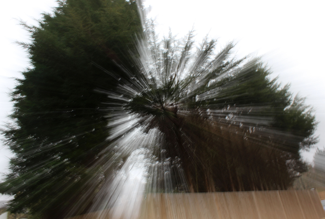
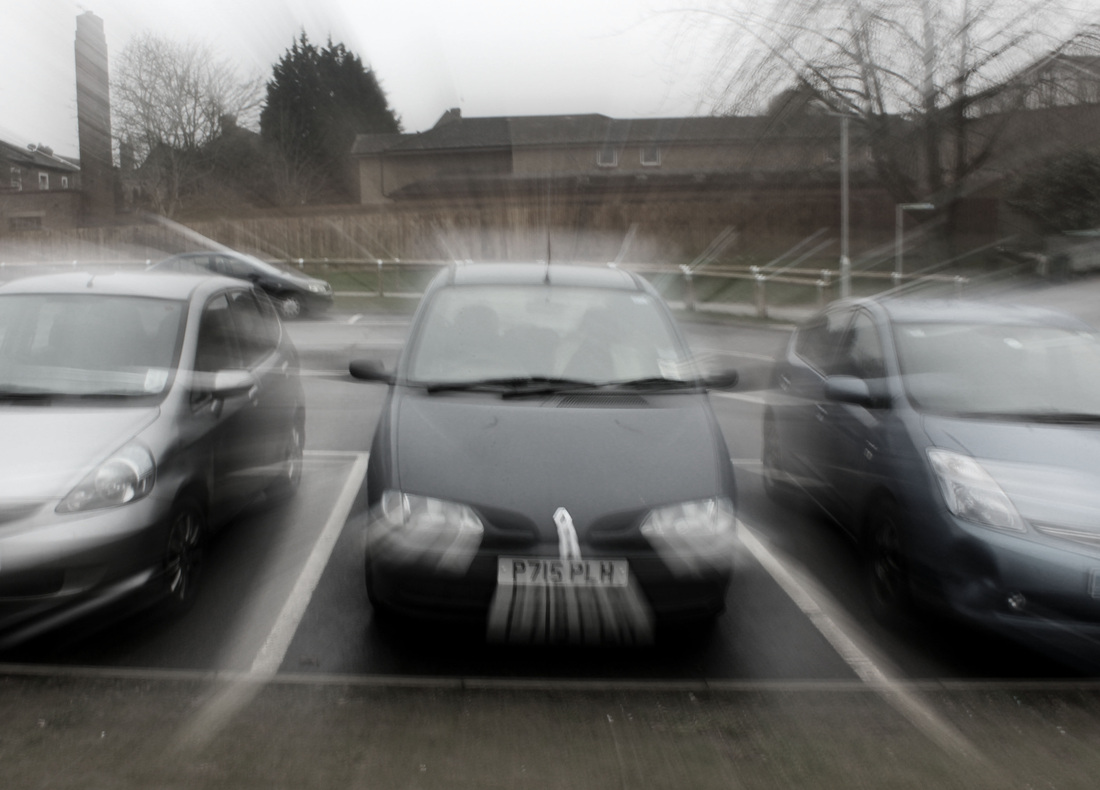
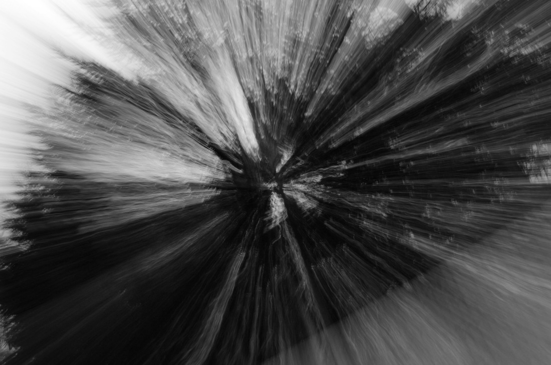
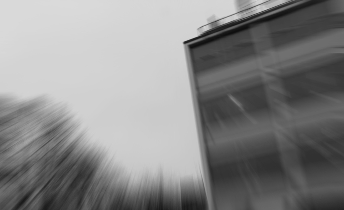
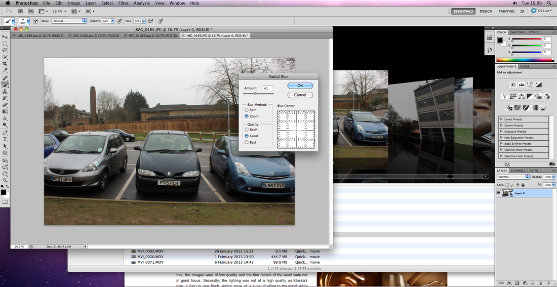
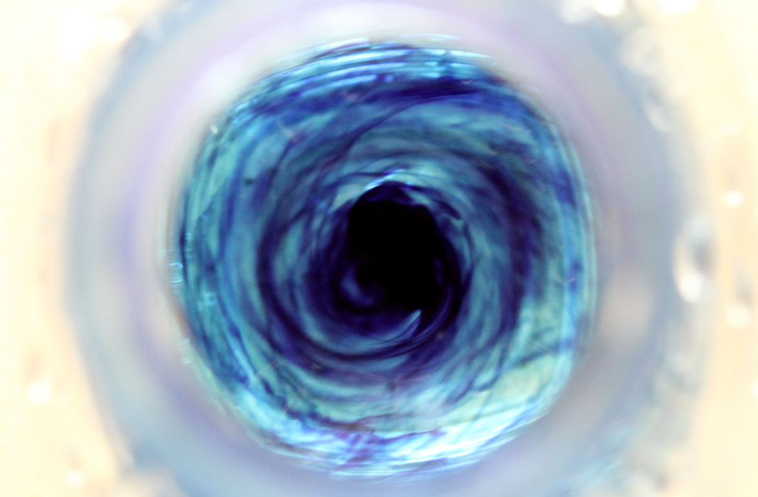
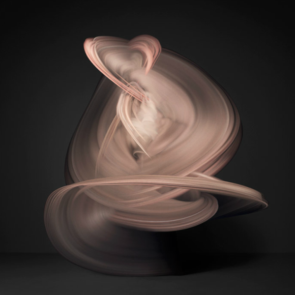
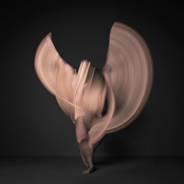
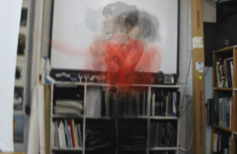
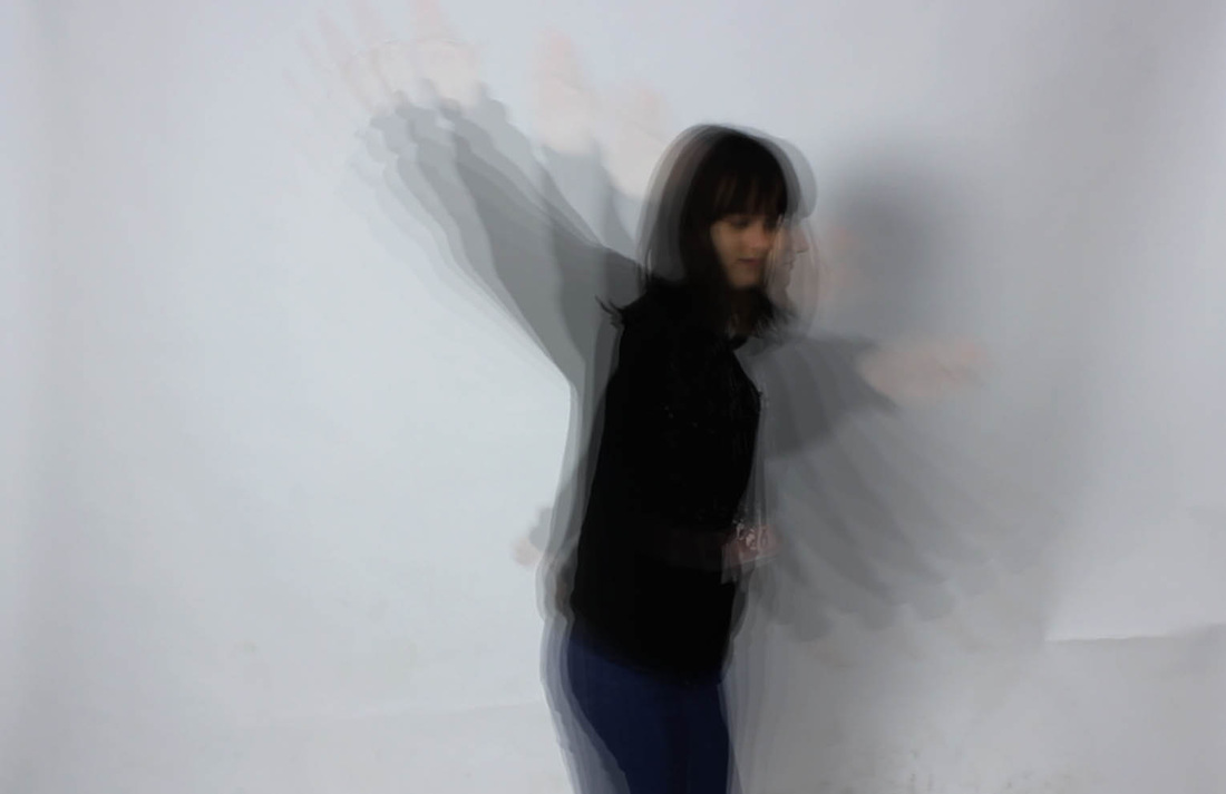
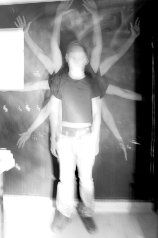
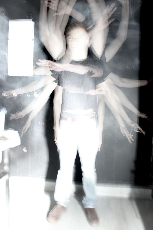
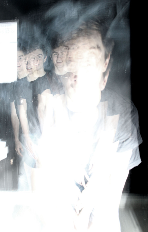
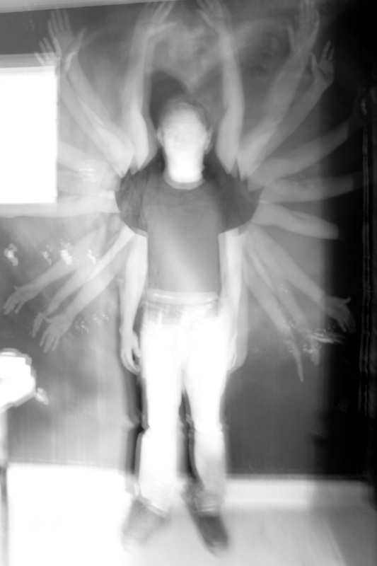
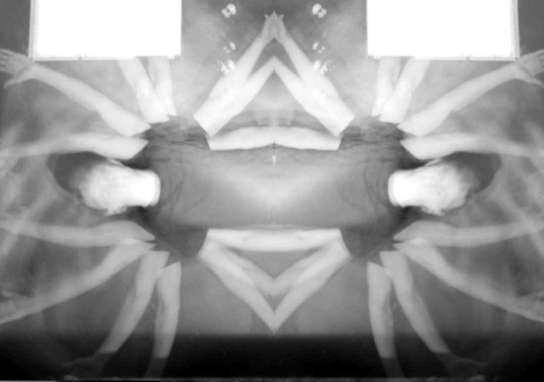
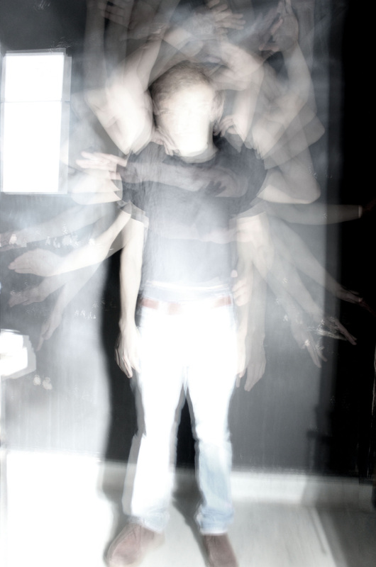
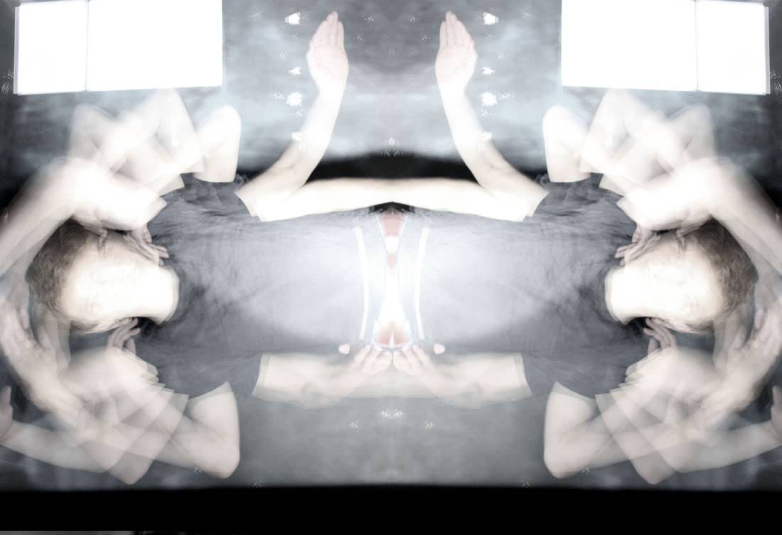
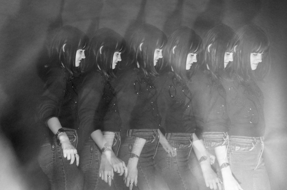
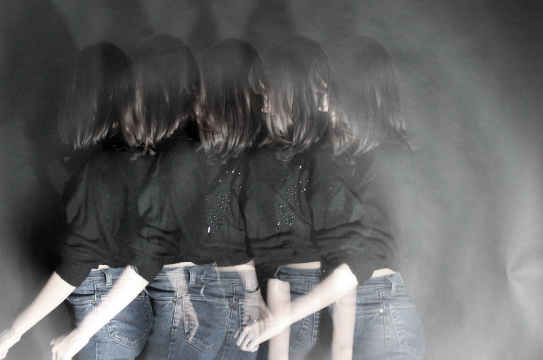
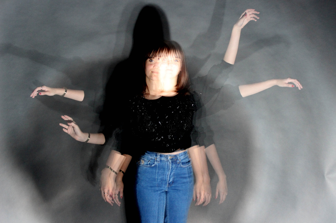
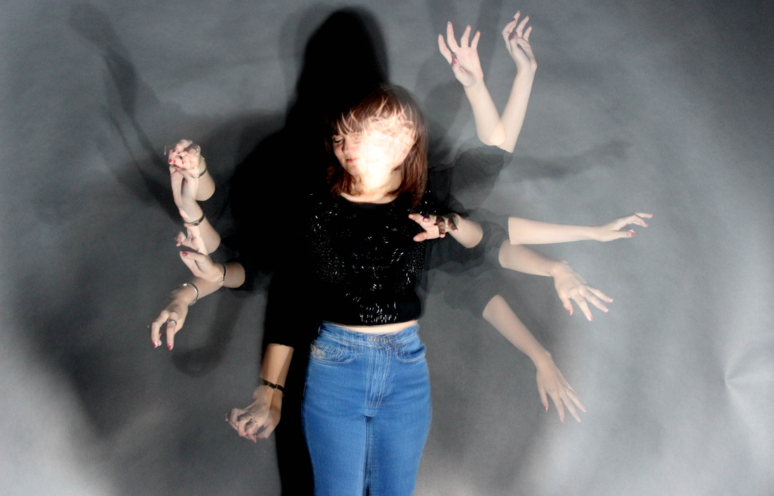
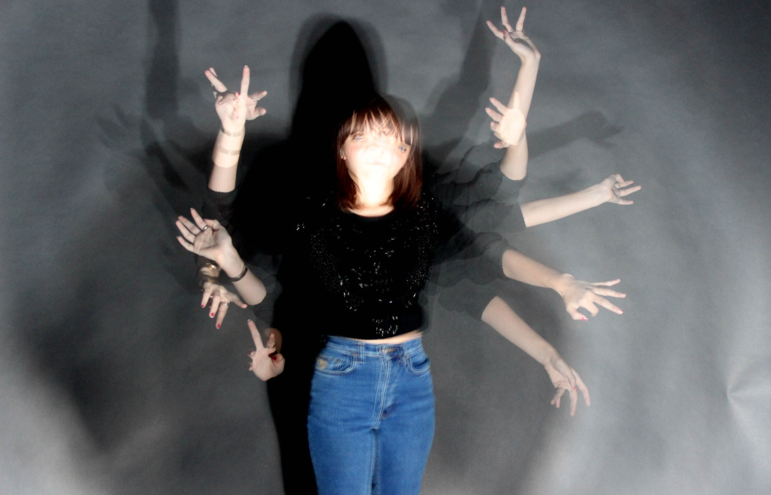
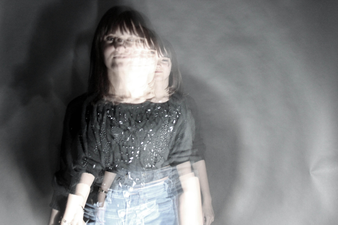
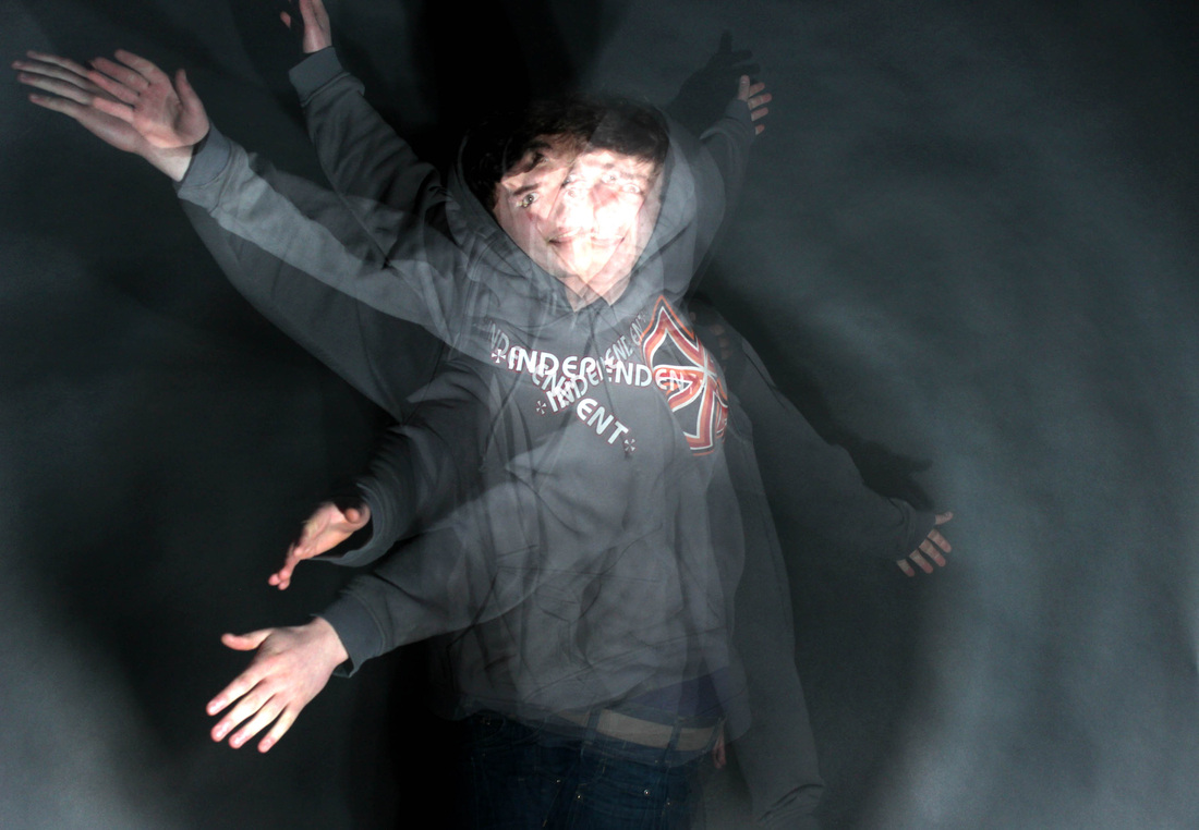
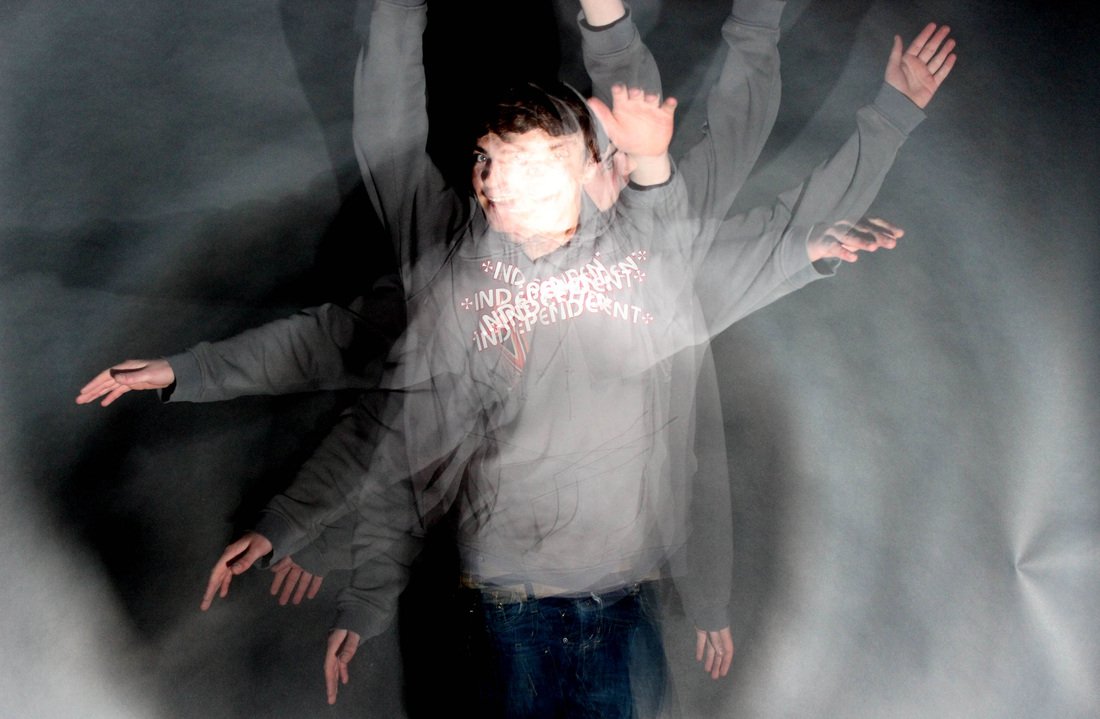
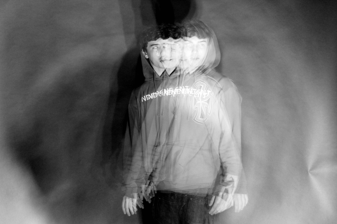
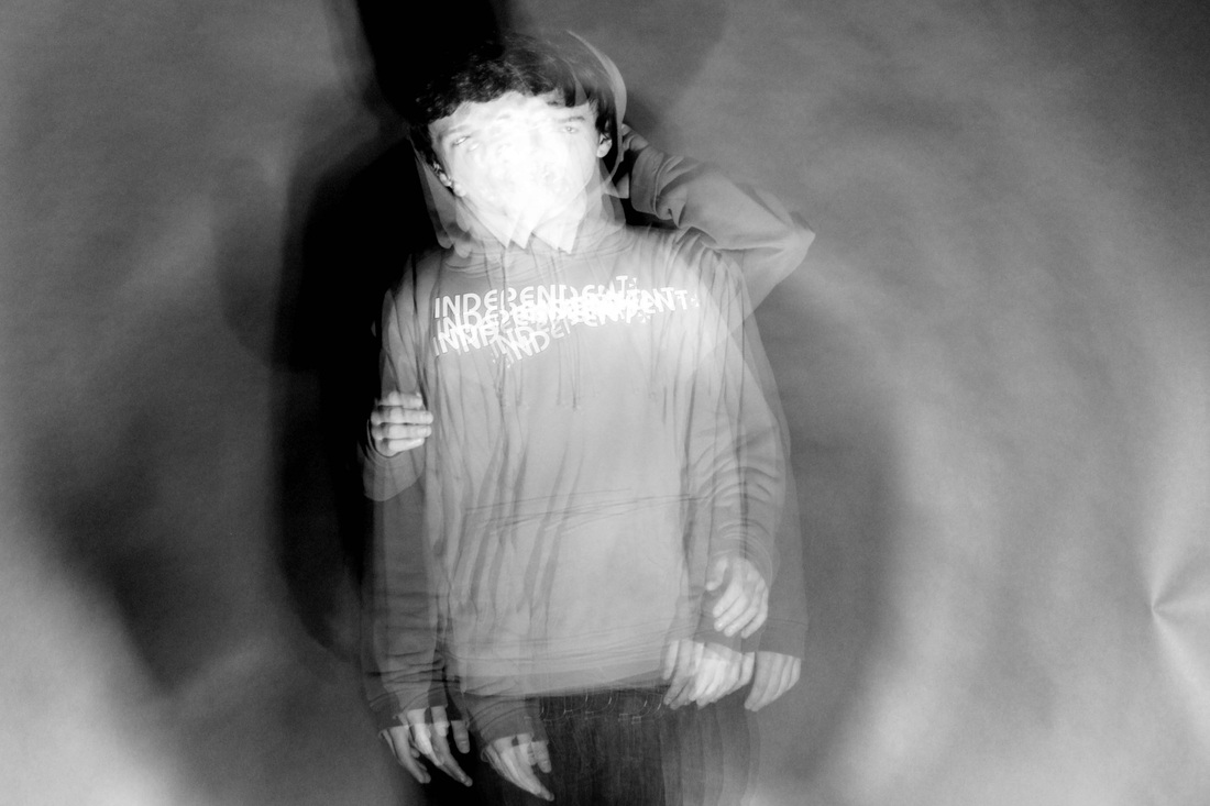
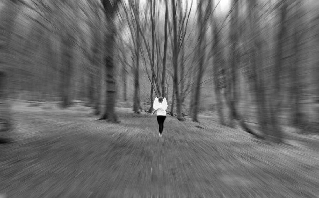
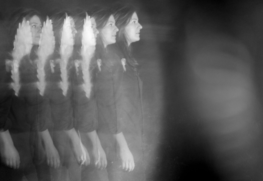
Zoom Blurr.
Dominic Harris.
Dominic Harris.
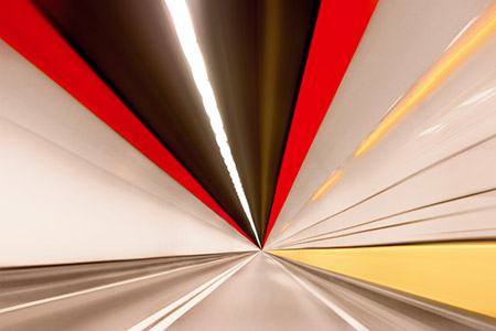
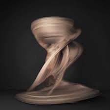
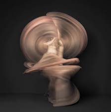
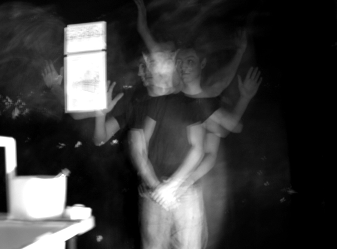
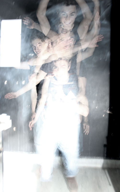
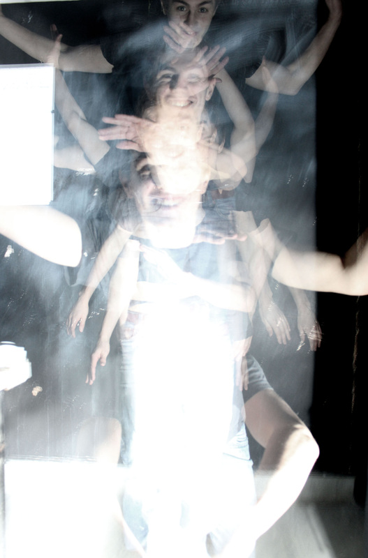
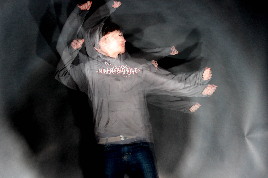
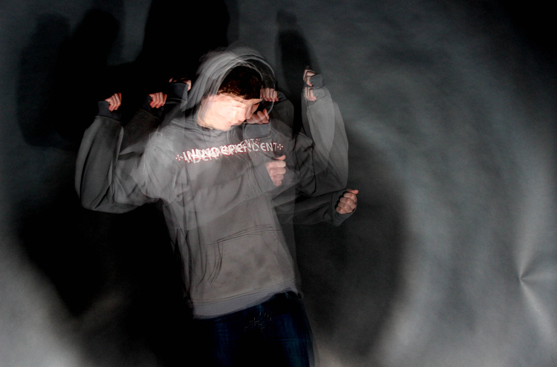
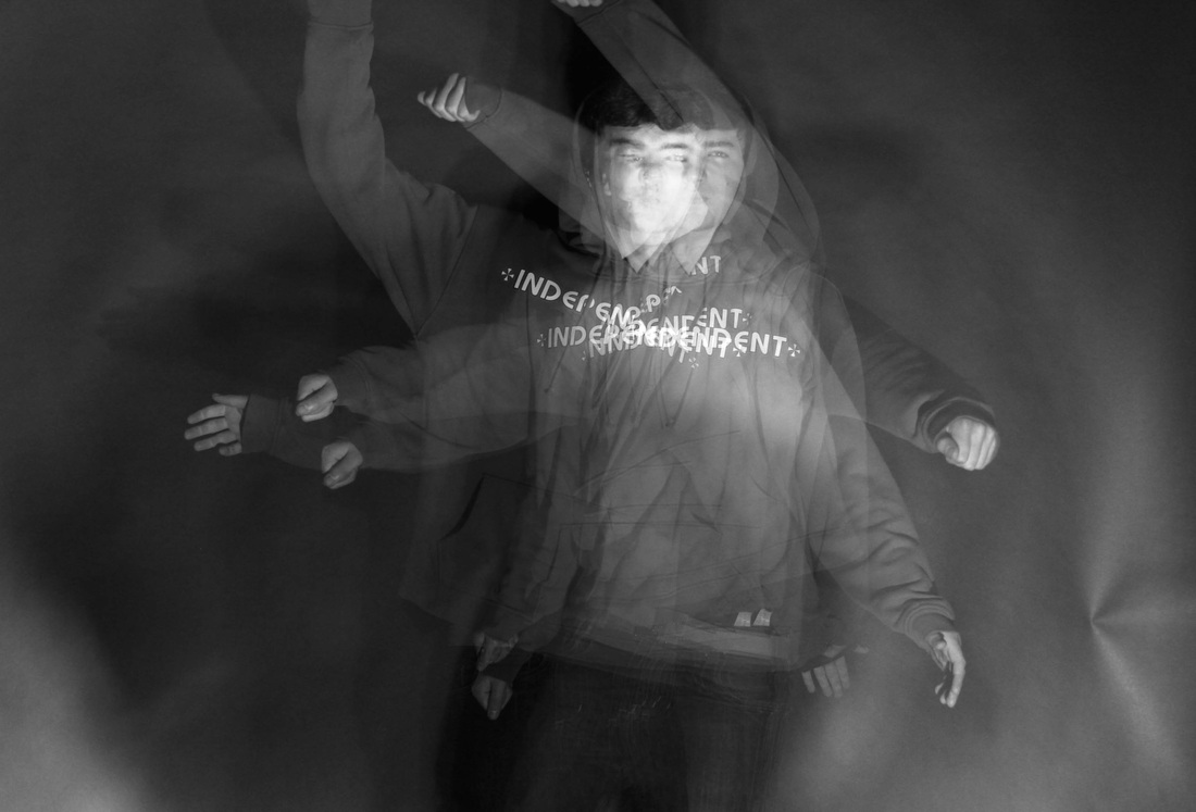
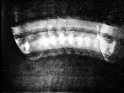
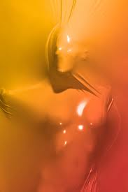
Dominic Harris describes himself as an "Interactive artist", who puts large focus on lighting and electronics. His work appeals to me due to its almost abstract tendency. Harris fits into the brief due to the journey to and from different destinations, and what is in between. Harris's images use a technique called "Zoom blur", and gives off the impression that an object/ subject is moving away/ towards the camera at a significant speed. This is highly effective in his work as the a popular subject Harris photographs is transport, mostly trains. Some of Harris's images are so effective in creating this high speed vision, that the object he his trying to capture is out of sight to us and replaced with a number straight lines. This really highlights the photographer's intentions of the fast moving pace the transport is moving at, and perhaps reflects the fat pace of our society.
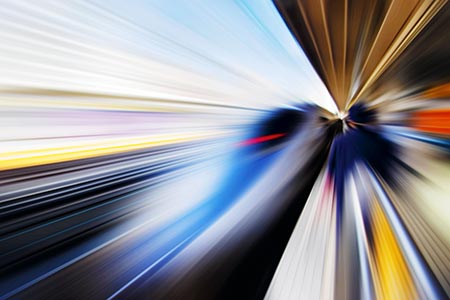
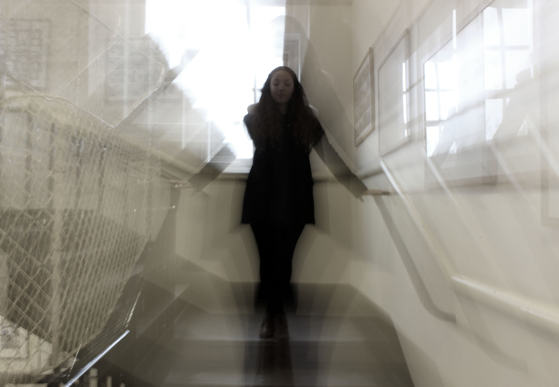
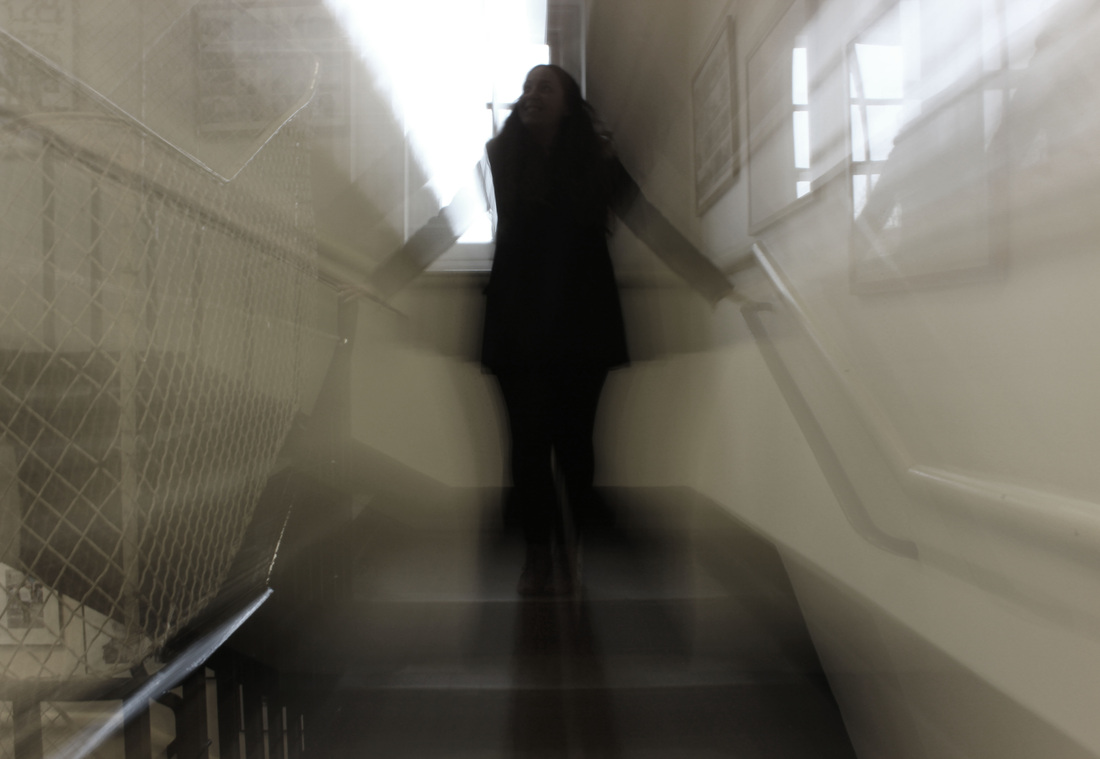
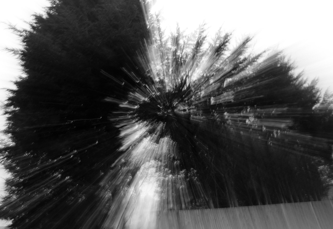
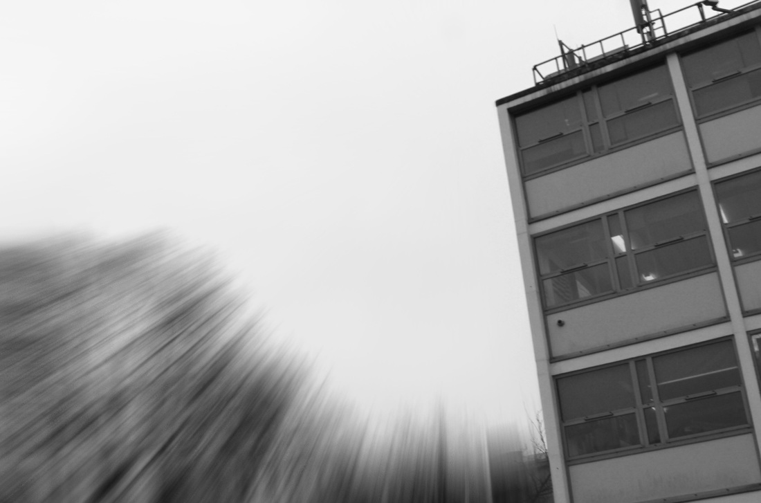
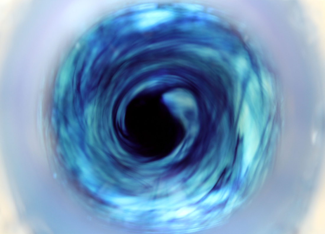
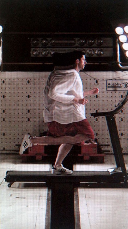
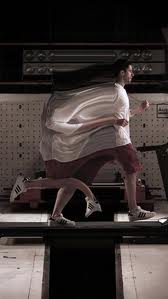
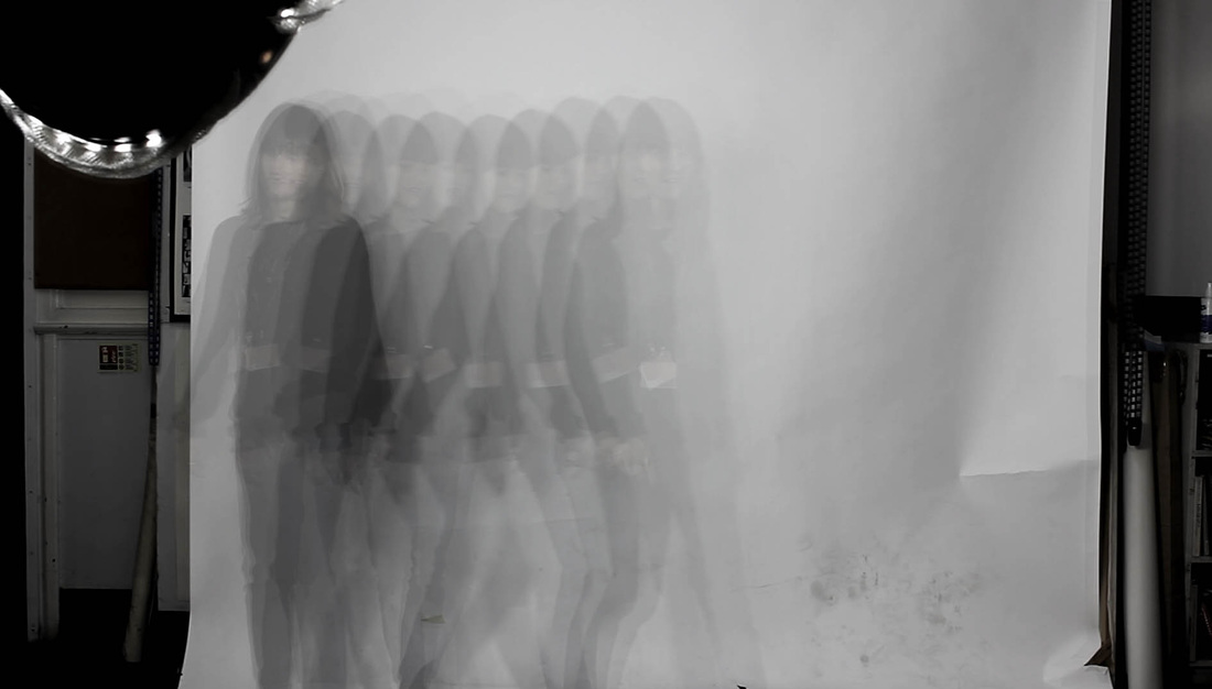
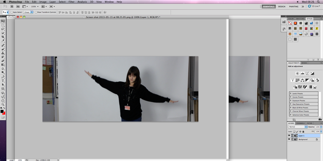
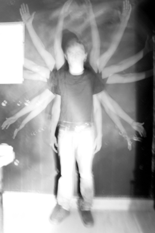
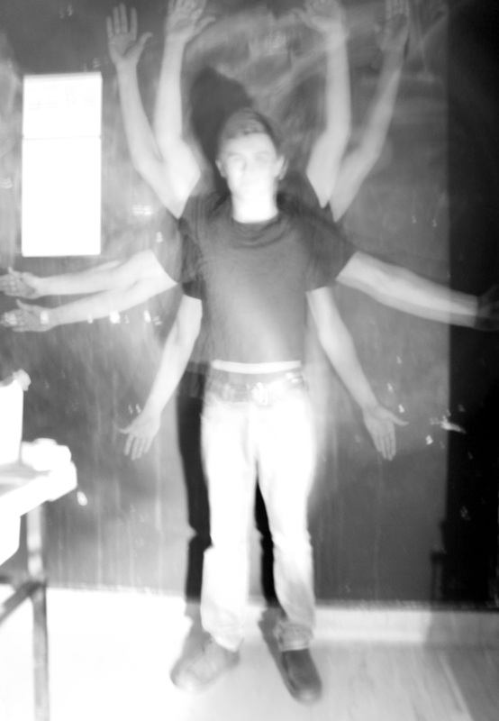
I attempted to recreate the concept Dominic Harris uses in his images through specific techniques on my camera, and later on Photoshop. My personal expectations of the technique were low due to the fact that I had never experiments with the zoom blur before, yet after a few attempts, the images I had taken looked successful. While my subject stood still, I set my camera to f/22 to allow a slow shutter speed that would give me enough time to twist my lens to zoom in and out. The ISO was at around 200. The technique was successful when capturing people, as a almost "out of body" effect is given off, and the image looks almost mysterious and harrowing. On the other hand the effect was also successful when photographing still cars, as it made the object look as if it was moving. If I was going to refine my set, I would use somewhat more interesting backdrops and subjects, paying special attention to the lighting, as in my last set I feel that I didn't really achieve this to the best of my ability.
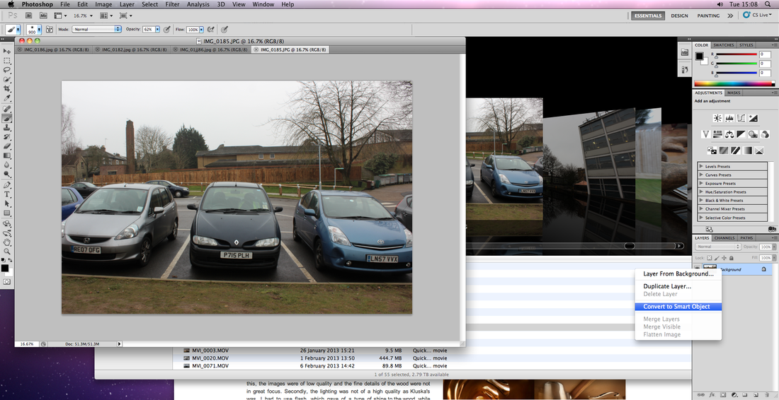
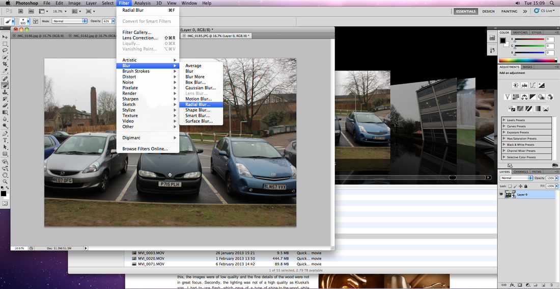
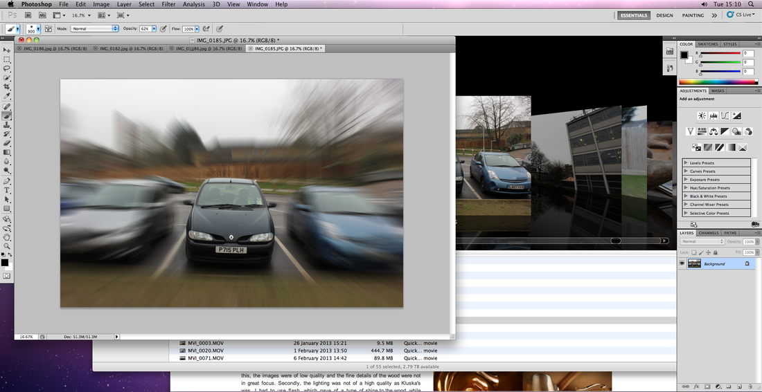
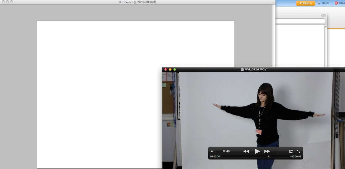
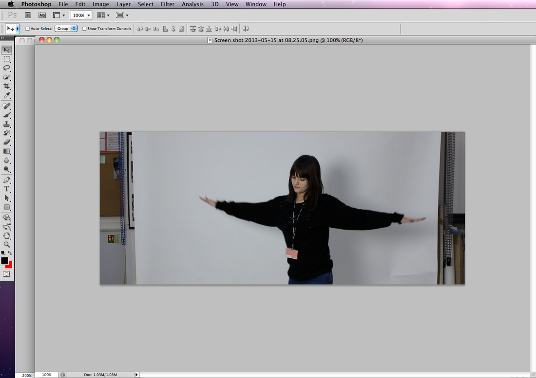
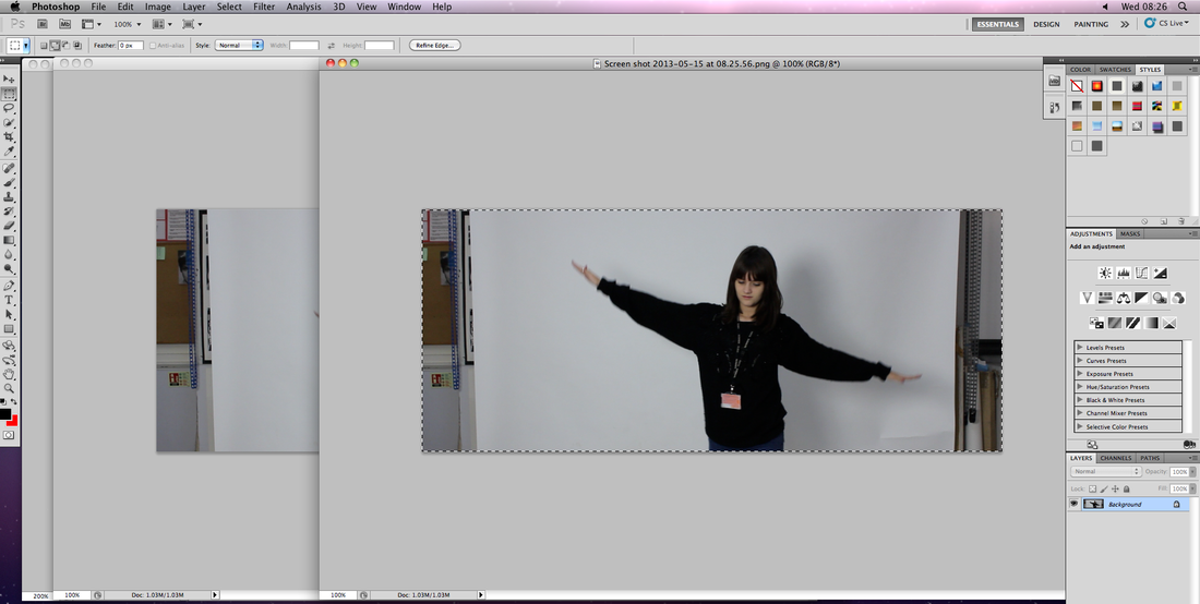
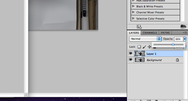
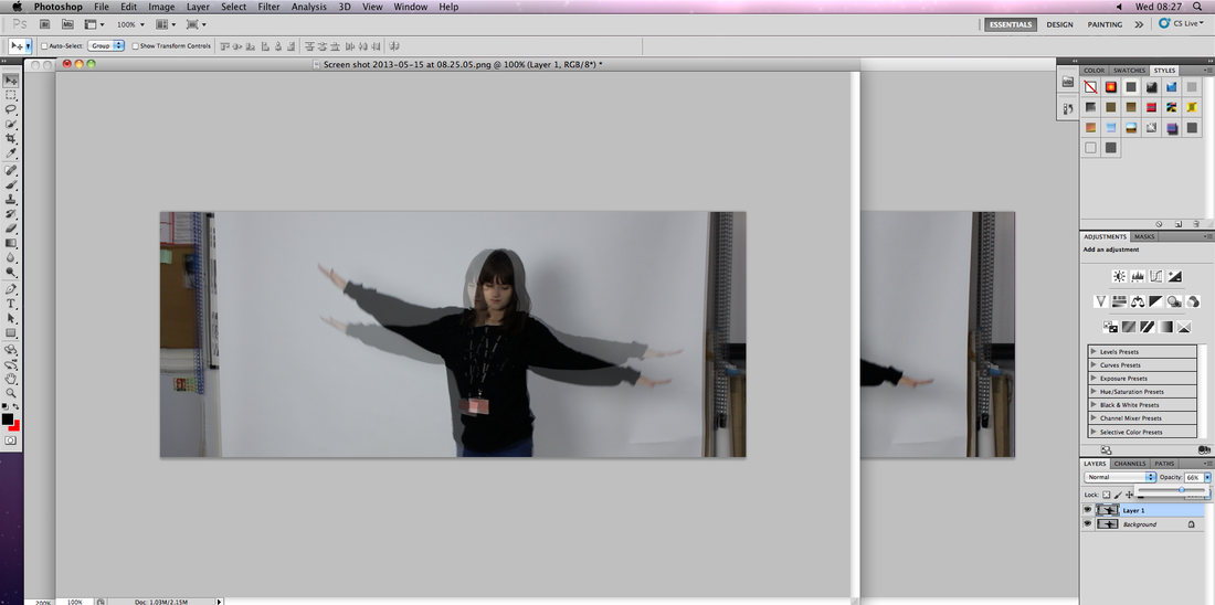
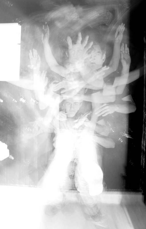
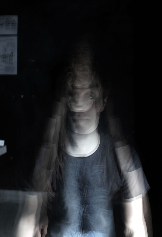
Another way the zoom blur can be achieved is through Photoshop. The image I started with had to be compleatly still, with no previous manual zoom blur on the photo. I then had to open a new layer on top of the back ground image and convert it to a smart object, then on this layer I could select the radical blur effect from the image filters, then from there select the "zoom option". Once the ideal level of blur was achieved and in the right place, I could now put my main subject back into focus, for example the car. To do this I simply painted the car using the paint tool, making sure I was still on the smart object layer. Unlike the manual method of creating a zoom blur, using Photoshop allows me to be in control of just what is kept in focus, how much zoom blur there actually is, as well as where the blur begins, (e.g where the center point is located on the photo).
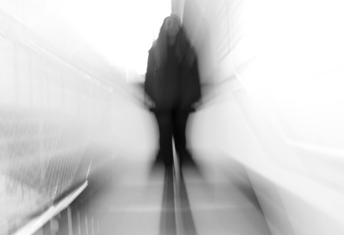
I attempted to recreate the concept Dominic Harris uses in his images through specific techniques on my camera, and later on Photoshop. My personal expectations of the technique were low due to the fact that I had never experiments with the zoom blur before, yet after a few attempts, the images I had taken looked successful. While my subject stood still, I set my camera to f/22 to allow a slow shutter speed that would give me enough time to twist my lens to zoom in and out. The ISO was at around 200. The technique was successful when capturing people, as a almost "out of body" effect is given off, and the image looks almost mysterious and harrowing. On the other hand the effect was also successful when photographing still cars, as it made the object look as if it was moving. If I was going to refine my set, I would use somewhat more interesting backdrops and subjects, paying special attention to the lighting, as in my last set I feel that I didn't really achieve this to the best of my ability.
Another way the zoom blur can be achieved is through Photoshop. The image I started with had to be compleatly still, with no previous manual zoom blur on the photo. I then had to open a new layer on top of the back ground image and convert it to a smart object, then on this layer I could select the radical blur effect from the image filters, then from there select the "zoom option". Once the ideal level of blur was achieved and in the right place, I could now put my main subject back into focus, for example the car. To do this I simply painted the car using the paint tool, making sure I was still on the smart object layer. Unlike the manual method of creating a zoom blur, using Photoshop allows me to be in control of just what is kept in focus, how much zoom blur there actually is, as well as where the blur begins, (e.g where the center point is located on the photo).
|
Unedited selection.
|
Zoom blur experiments.
Edited selection |
Zoom blur in photoshop.
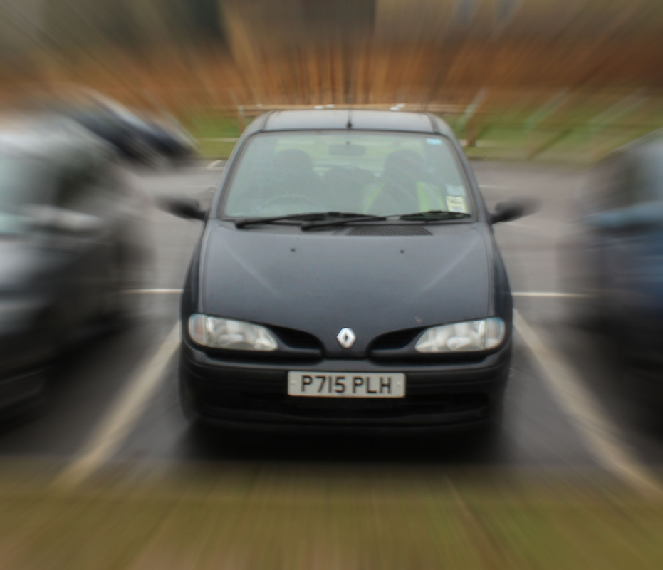
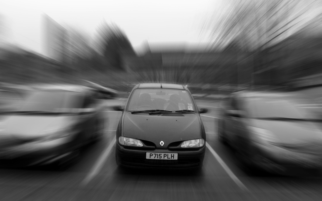
Step by step process.


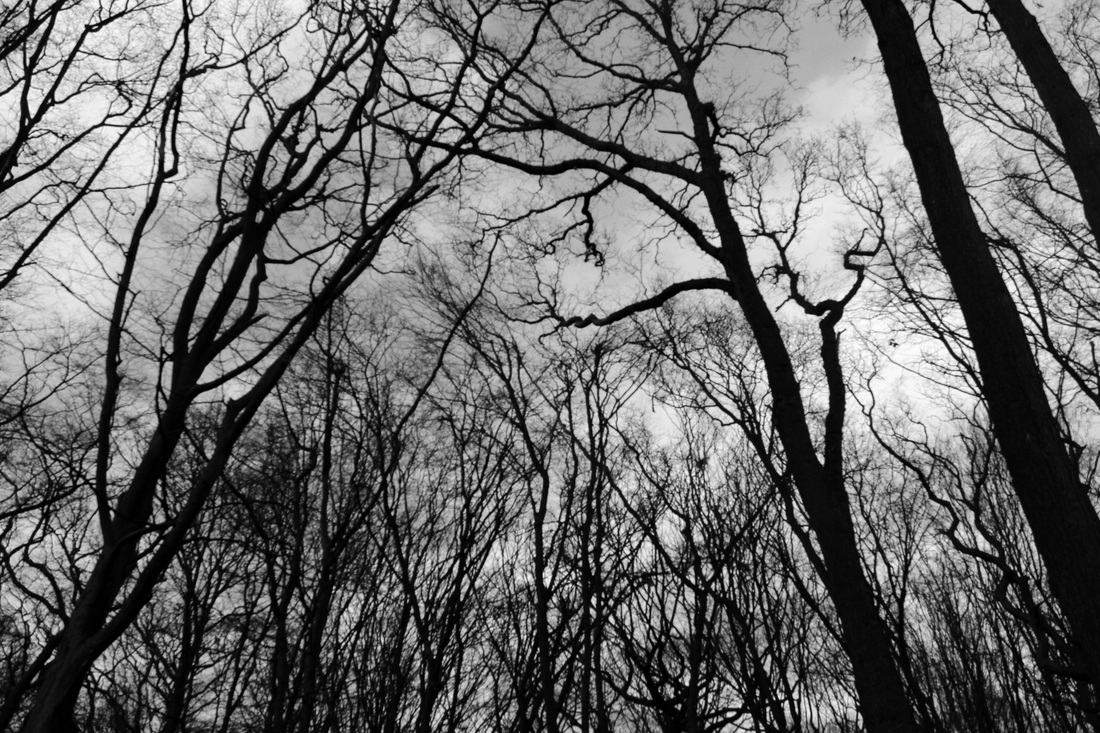
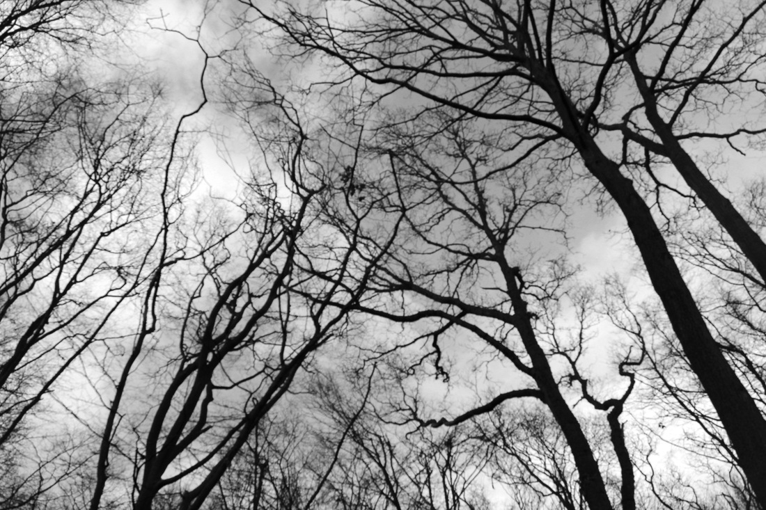
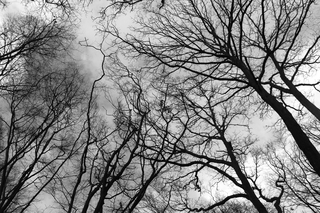
Altering the relationship with our environment.
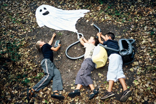
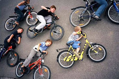
Jan von Holleben.
Jan von Holleben.
|
Response.
Unedited selection. 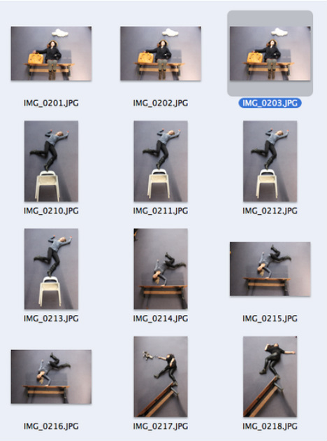
|
Edited selection.
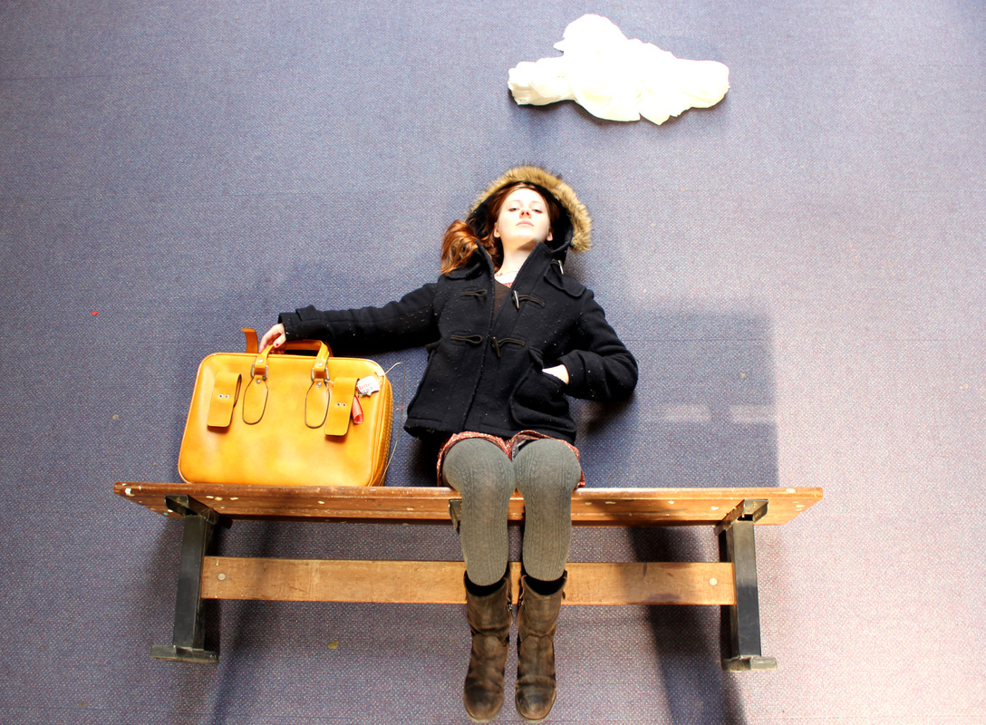
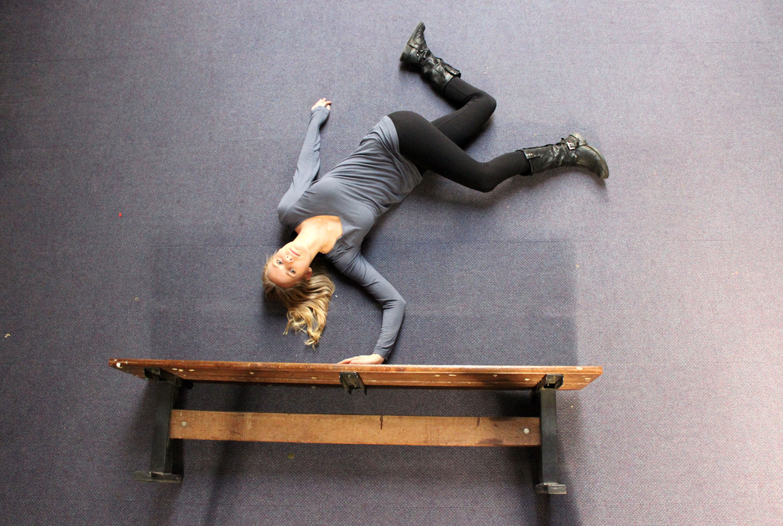
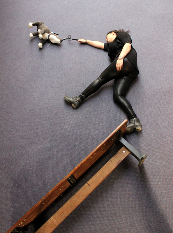
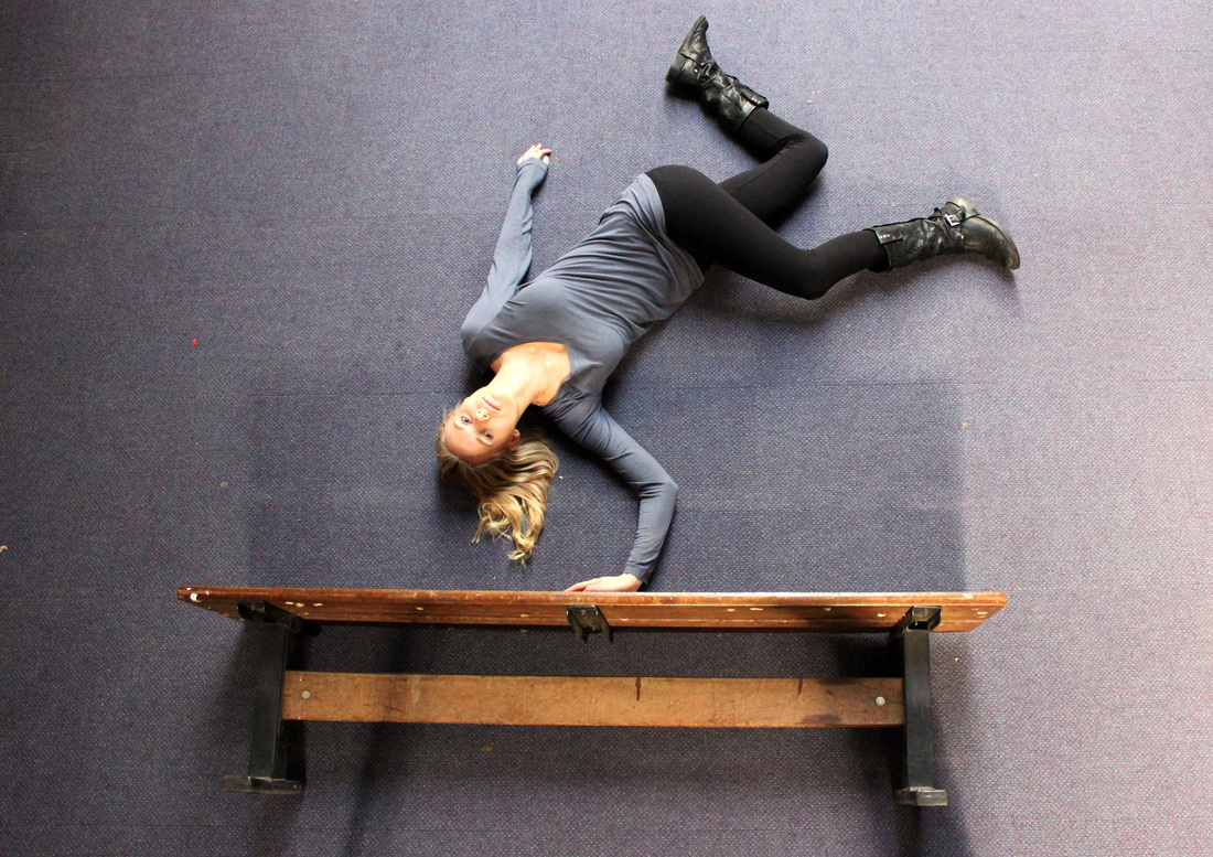
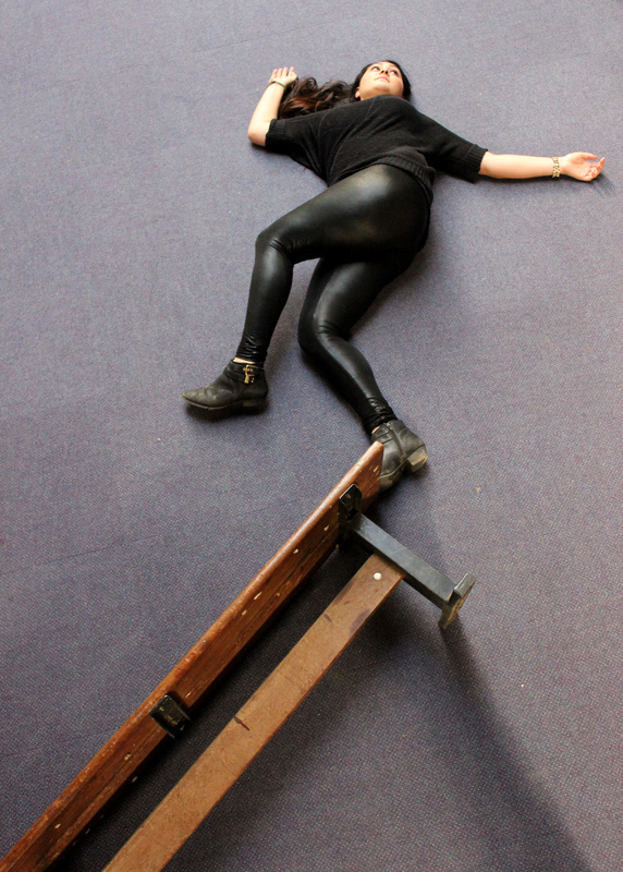
Photographer Jan Von Holleben's work is based on the concept of playing with prospective and altering the relationship we have with the our environment. His work is successful due to the use of situations that in everyday life appear impossible, such as the broomstick riding, yet as his work is laid out on the ground, it becomes possible, therefore makes us question our own thinking. What makes Von Holleben's images so effective is the exact angle in which he takes the photo from, gives the effect that we are looking straight at the subject in front of us. His use of props is also very effective as it puts the positions and poses into a greater context. I responded to Von Holleben's work by shooting my subject from a higher angle by using a ladder. Whilst initially the idea was appealing, I feel my images are not a great representation of what could be achieved if a large amount of time and effort was put into the concept and the props as well as the lighting, which I didn't largely focus on. However, I feel the most successful images were the ones that experimented with positions that are difficult to maintain in a normal straight on photograph, such as the one handed hand stand on the bench, or balancing on the edge of it. I'm not overly disappointed with the outcome, as I do feel there is only so far there images can be taken to that hasn't already been achieved by other photographers, however the workshop was a great way to experiment with different possible techniques I wouldn't have automatically thought of trying out when given the brief.
|
Photographing a journey.
|
|
|
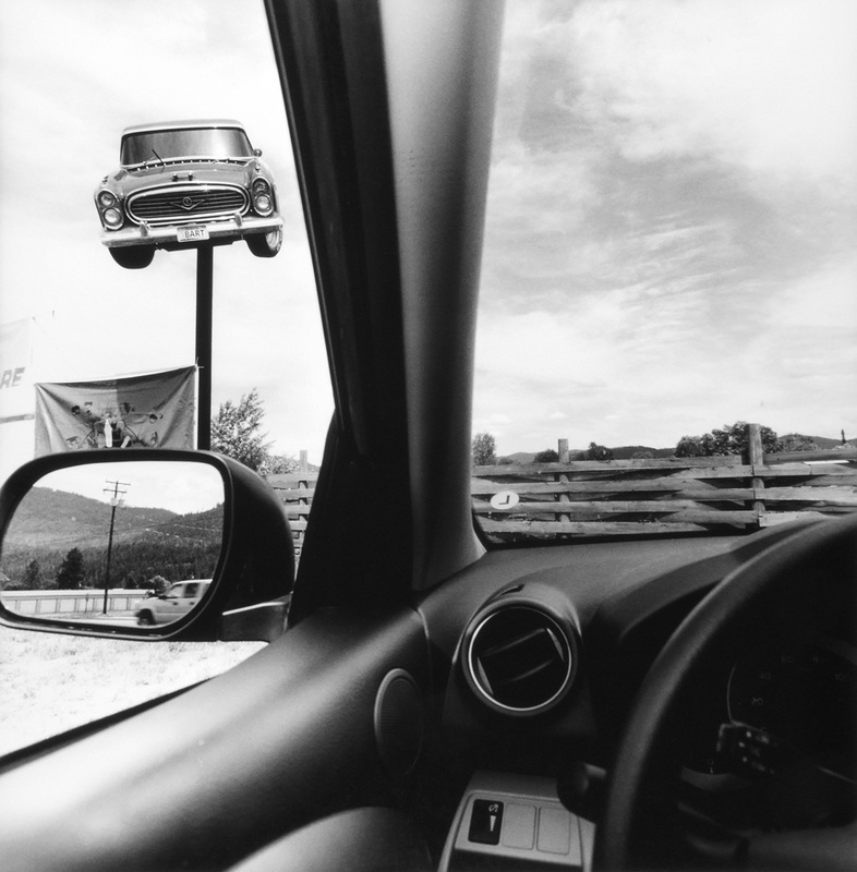
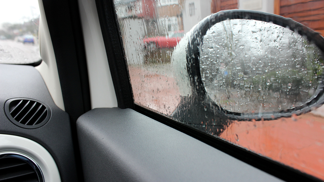
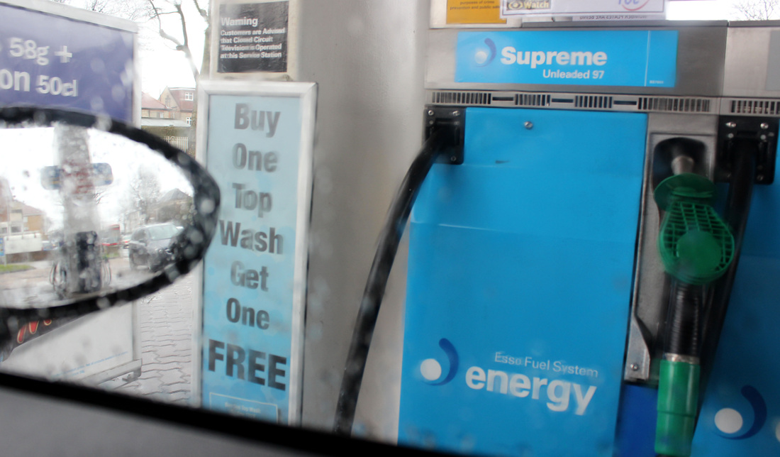
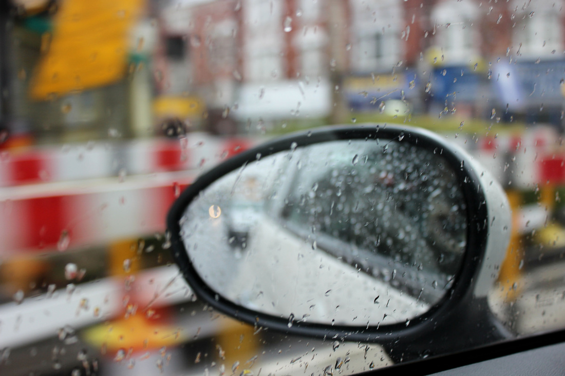
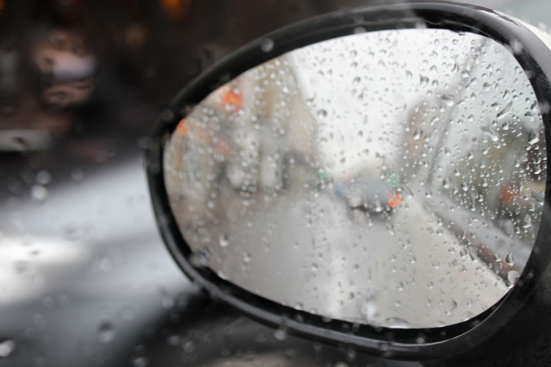
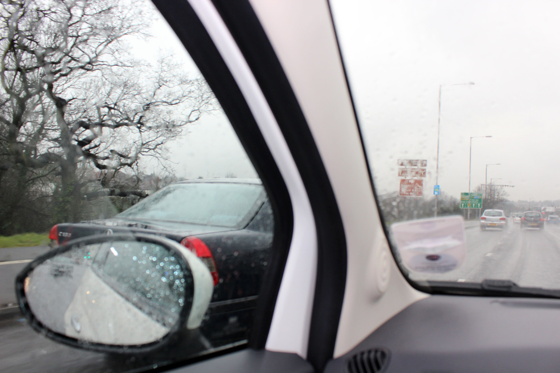
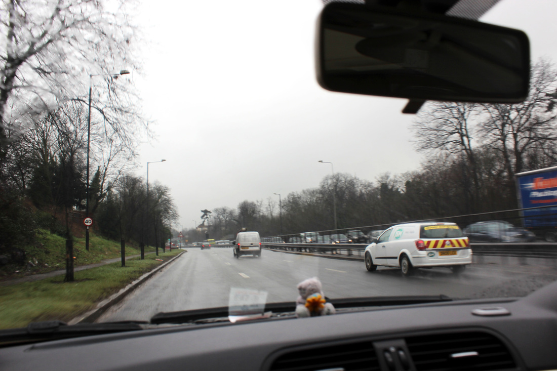
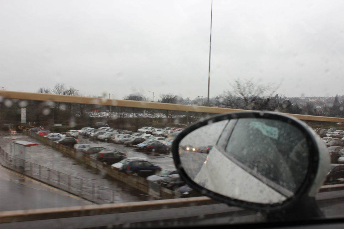
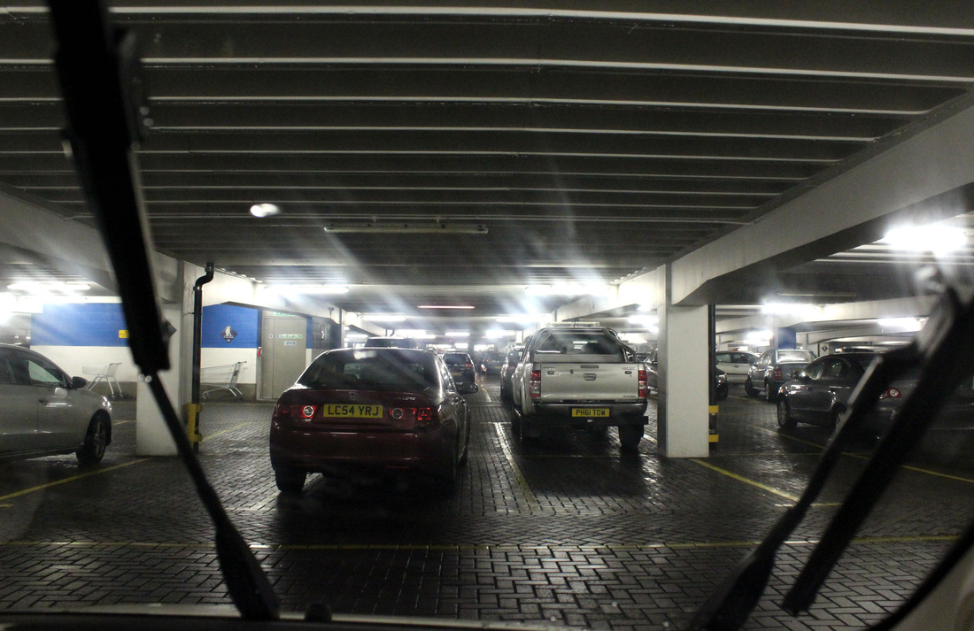
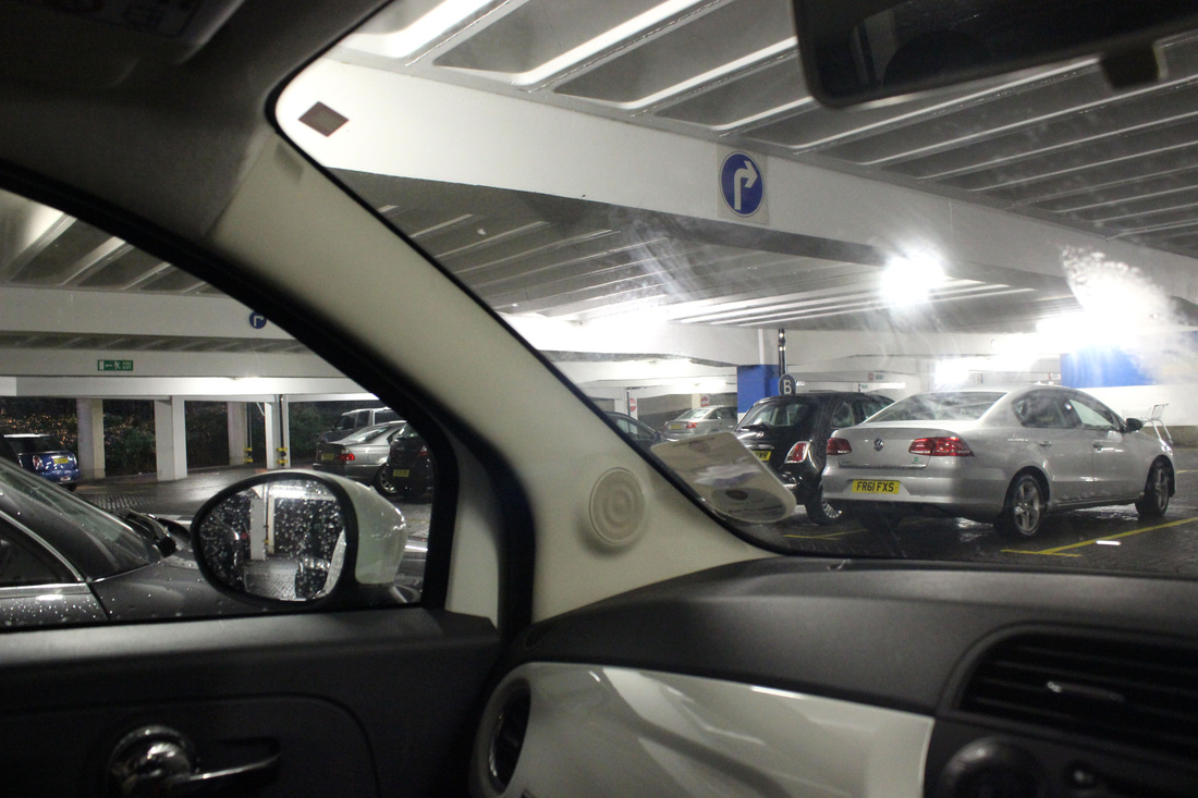
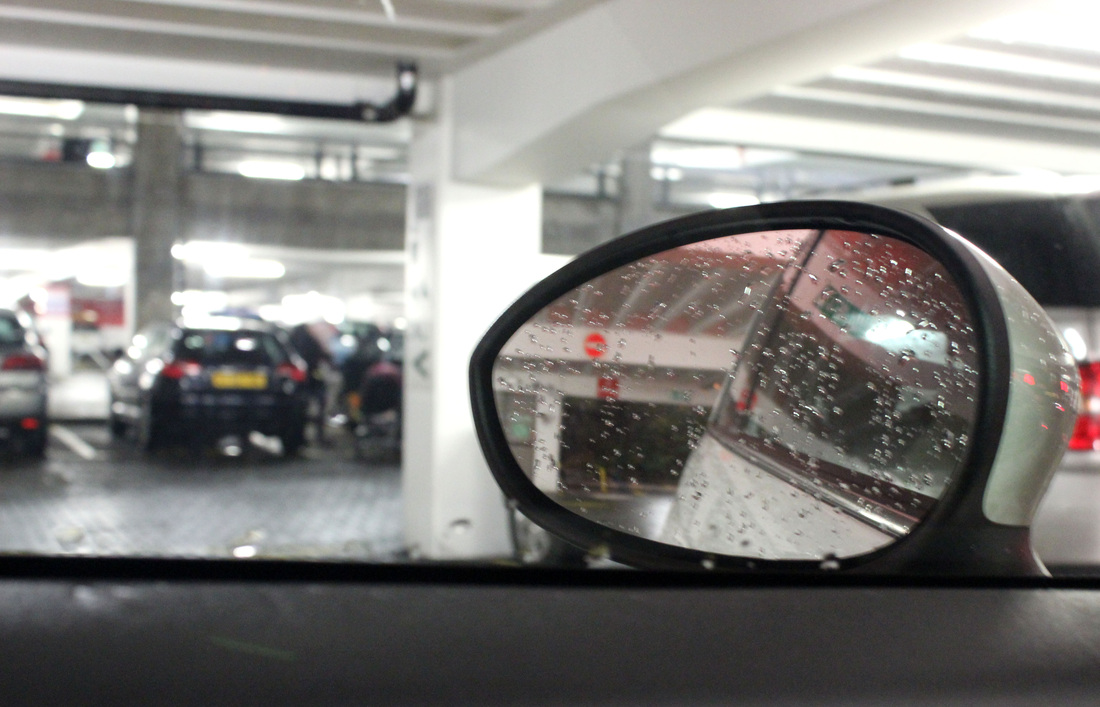
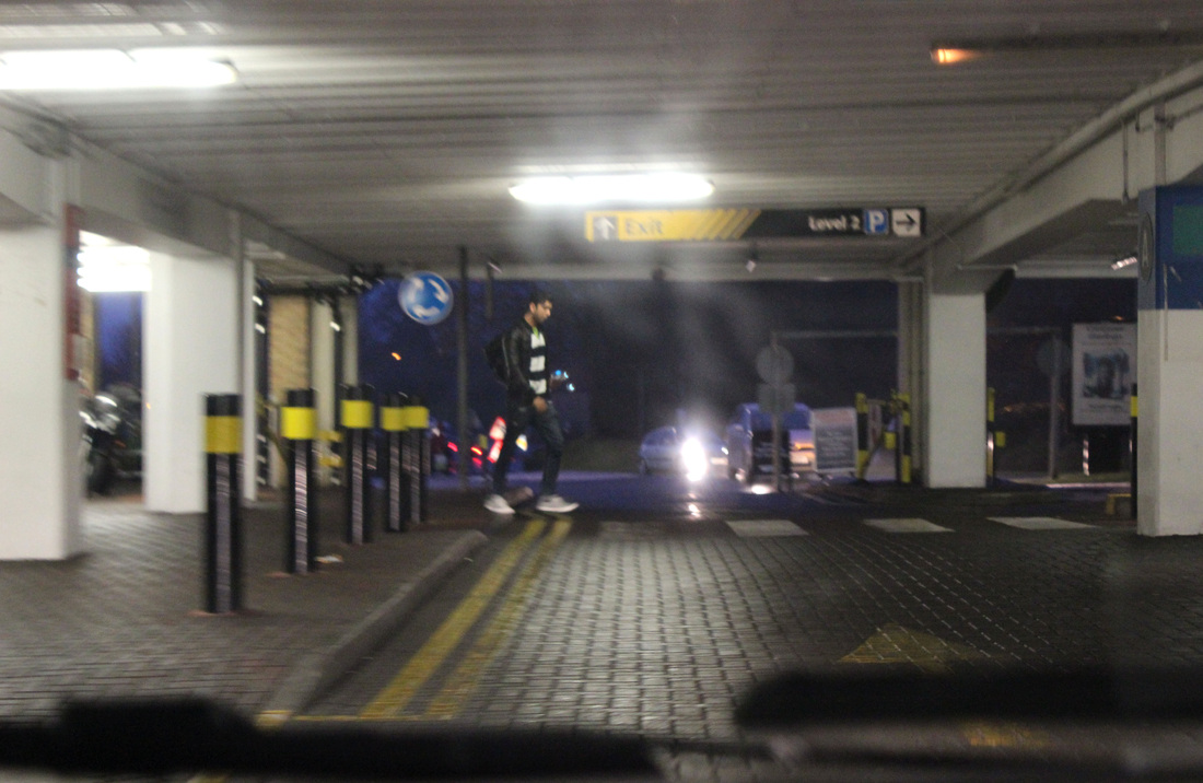
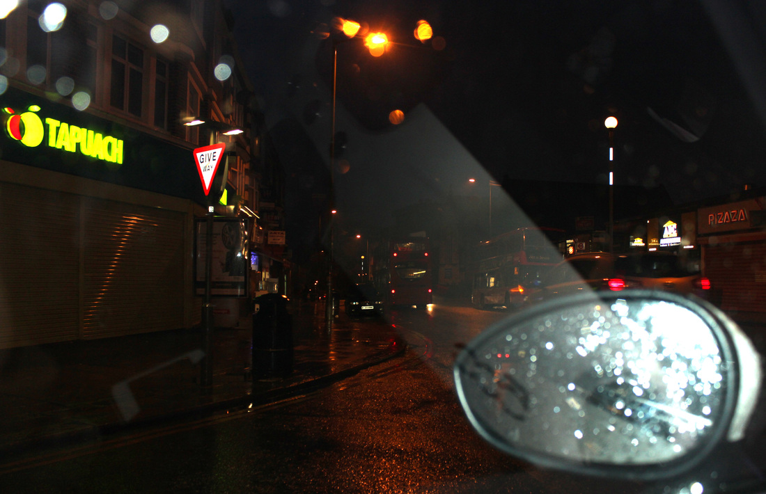
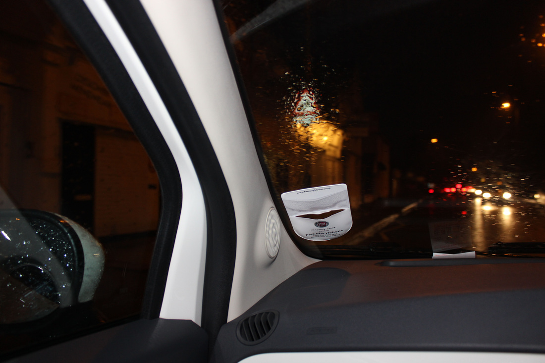
Another concept that fits in with the brief of "Inside, Outside, In Between", is the idea of capturing a journey, as the transition between each destination is being recorded. I chose to take my images from inside a car, as this was another way which effectively addressed the brief, through images of the outside being taken from the inside, thus combining all three aspects of the brief. I am overall very pleased with how my images turned out. The weather, lighting, time of day, colours and location were all effective and consistent through out. Firstly, as it way raining the day I took my images, the barrier between the inside and outside became more apprent through the rain interrupting the transparent glass. The lighting transition from day to night was also highly effective, enhancing the idea of time and length of the journey and allows variation. The fact that there is a instant contrast from where its light to where the images are at night questions the viewer as to what took place in between the two images. The colours highlight the vibrancy of the city, while also contributing to a lively, busy feel. The most effective example of this is the image featuring the bus. The fact the bus is also out out focus also contributes to the sense of the busy city feel, while also looking somewhat illustrated. Colour is also used effectively from the headlights of cars in front in comparison to the dark night. The fact the wing mirror is in the majority of the images, of at least inside features of the car, create an element of consistency which enforces the journey aspect of the images, turning them into more of a series than a set of images. If I was going to further improve these images, I would photograph a different form of transport, such as looking out of a bus window or a train, however still keeping one aspect of the image consistent such as the window. Alternatively, I could photograph a walk, keeping feet in the image throughout, adding a level of consistency, yet changing the texture of the floor throughout the journey, such as grass, pavement, stones, carpet etc. These are all possible ways in which this idea could be further developed into a different type of journey.
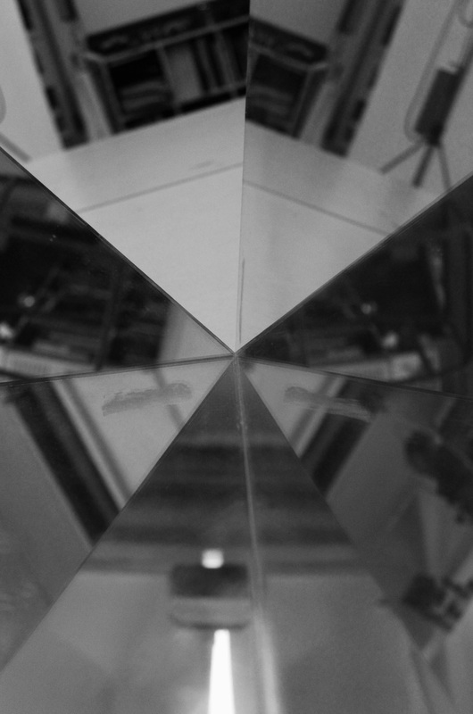
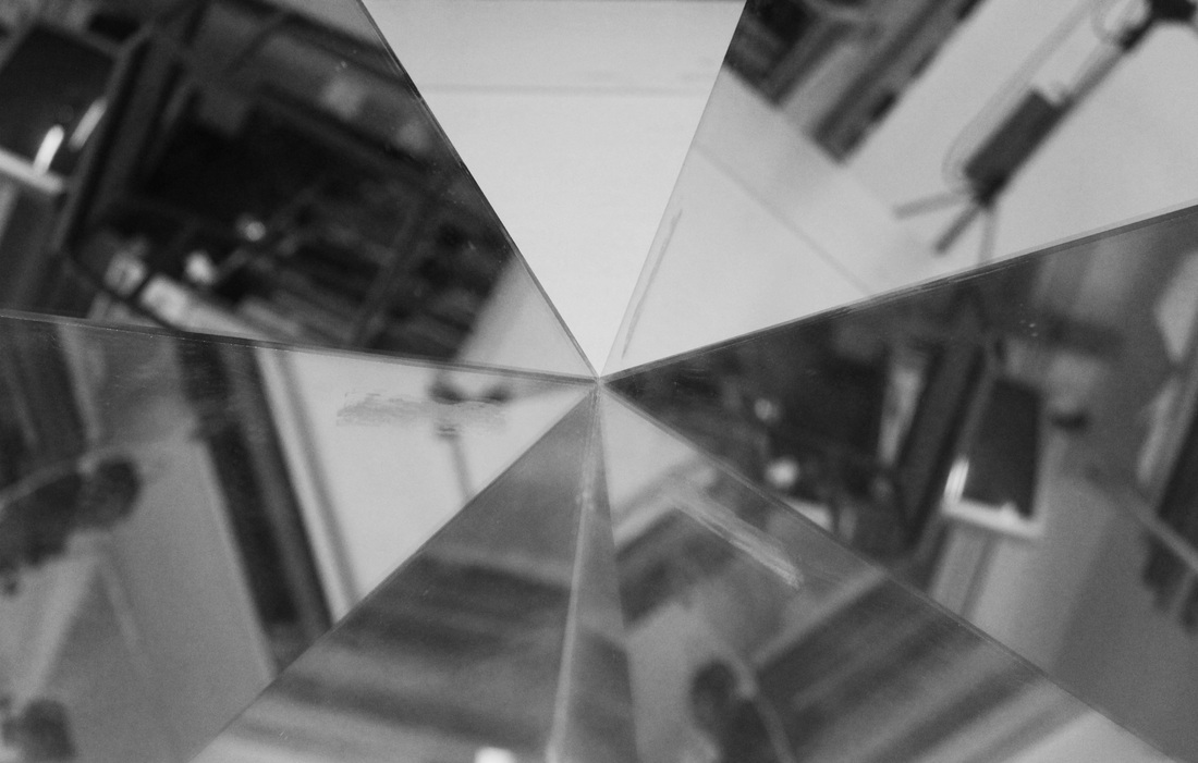
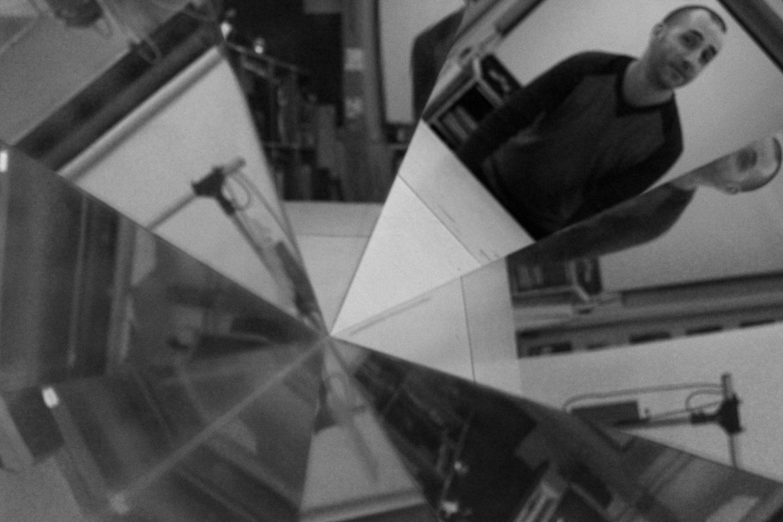
Reflections.
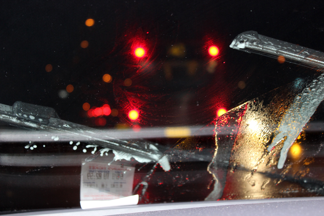
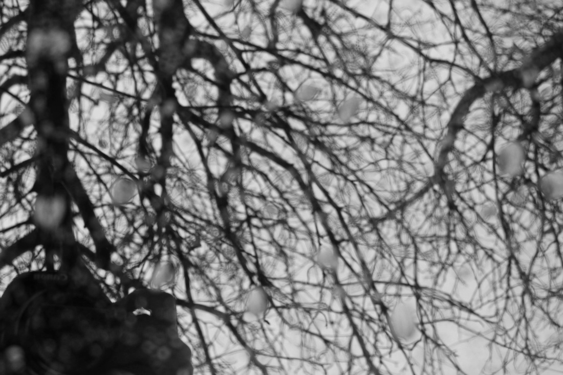
As another possible starting point, I experimented with the idea of reflecting. By taking the photo at a certain angle, I could keep the camera out of shot while still capturing the reflection of whatever was around the mirror at that moment, this proved successful. My favorite images of the set are the ones that feature rain drops of the mirror, as this enhanced the presence of the mirror itself while adds texture to the image. My first few images were taken inside by placing to mirror in a V shape, and tolding my camera between them. This created an effective kaleidoscope effect of whatever was in shot at that moment.
|
|
|
Strand One, Inside.
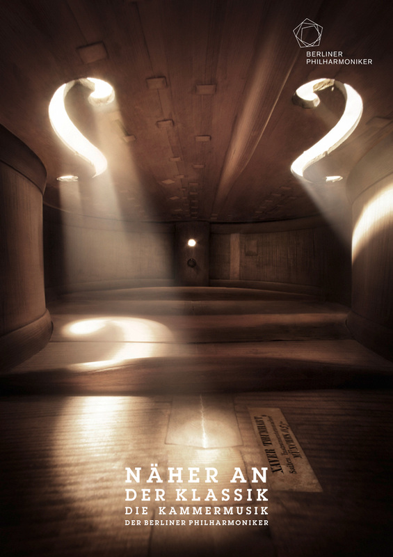
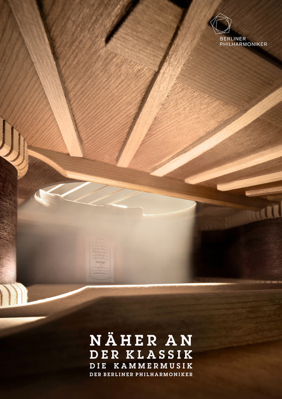
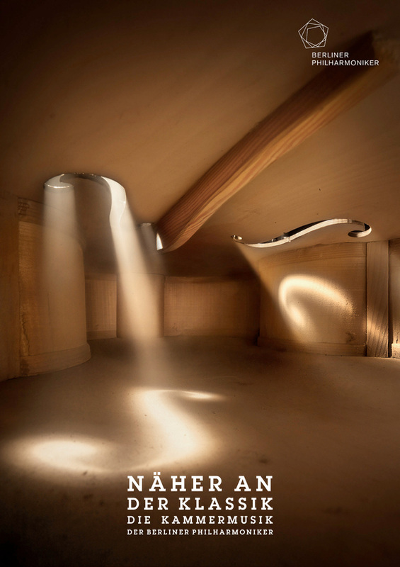
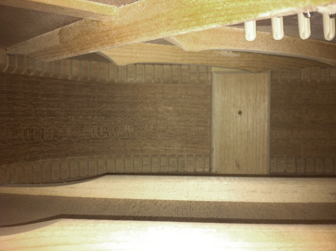
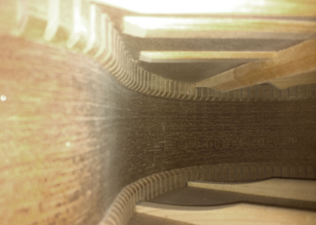
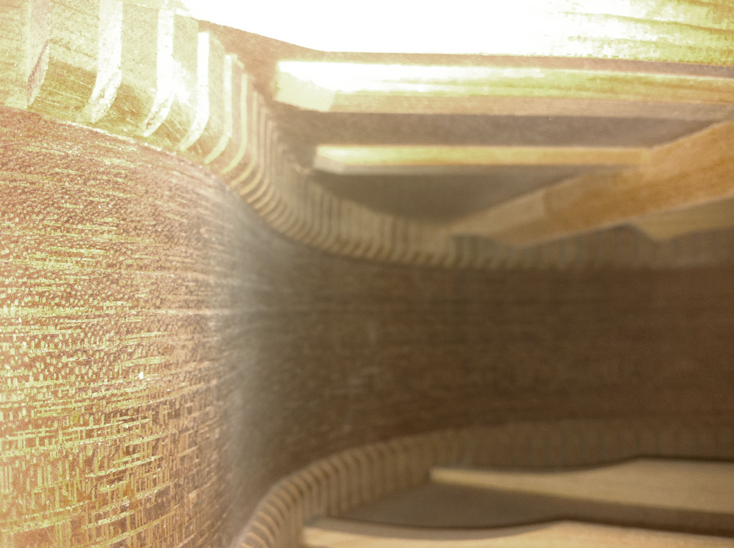
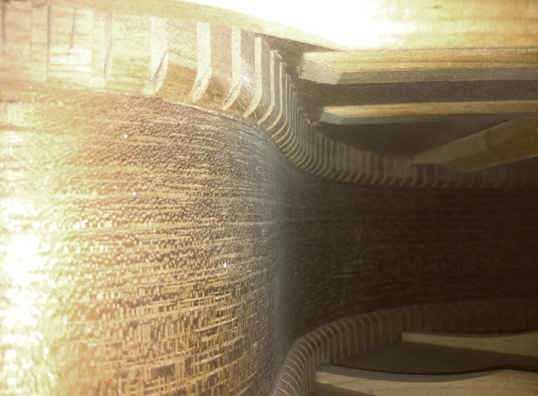
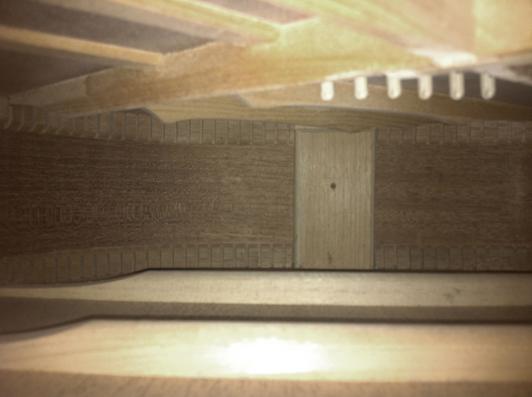
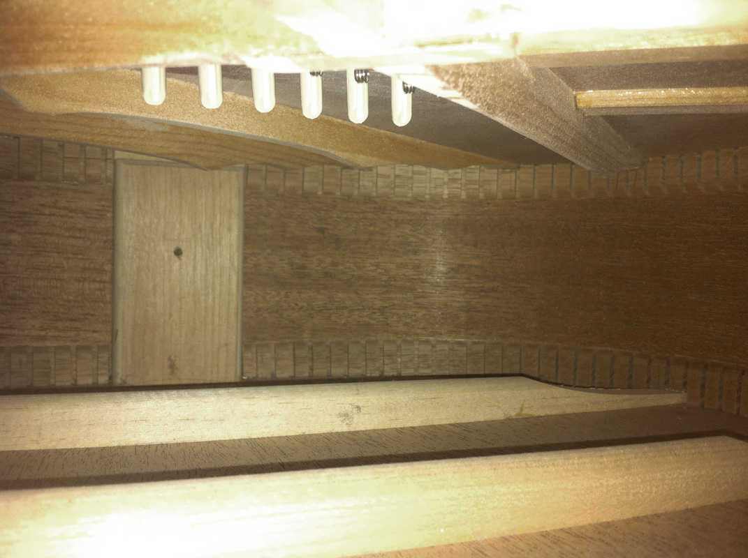
Mierswa Kluska. I found Mierswa Kluska's work to fit in perfectly to the brief of "Inside, outside and In between". His shots of the insides of musical instruments are so mesmerising, that it takes the viewer a few minutes to realise that we are in fact, not in an all wooden room, but a small wooden instrument. The details of the wood and the individual parts of the instruments are what makes it look so big, as well as the lighting coming from above. This aspect really highlights the effect of us being in a room, as the way the light enters looks like windows. I attempted to recreate Kluska's images by photographing the inside of a guitar. While mine worked out better than I had imagined, they could still be drastically improved. Firstly, as my high quality camera would not fit into the guitar, I had to use the camera on my phone as it slipped in easily. Due to this, the images were of low quality and the fine details of the wood were not in great focus. Secondly, the lighting was not of a high quality as Kluska's was. I had to use flash, which gave of a type of shine to the wood, while hiding any fine details. To get the fully effect of instrument, I feel I wood have to cut into one, so I could place my larger camera in better, and so it would not be so dark that I have to use flash. Other instruments I could experiment with are, double bass, trumpet, clarinet, drums, flute, organ, violin, for example. Unedited selection.
|
|
Edited response.
|
Further response.
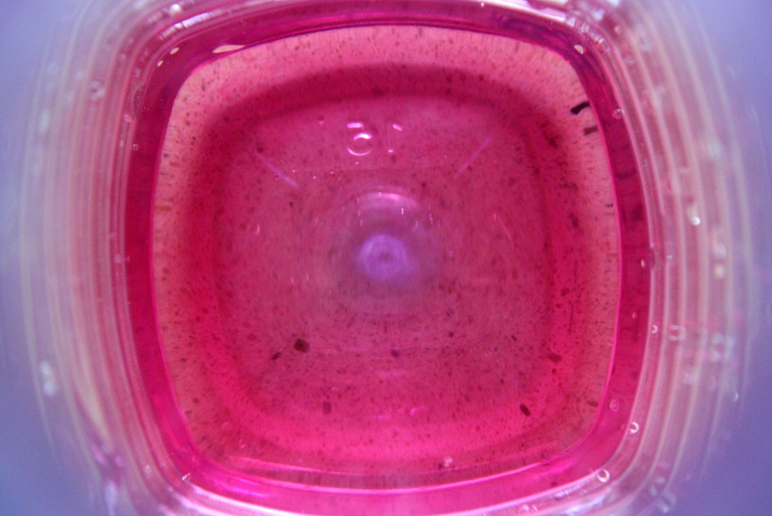
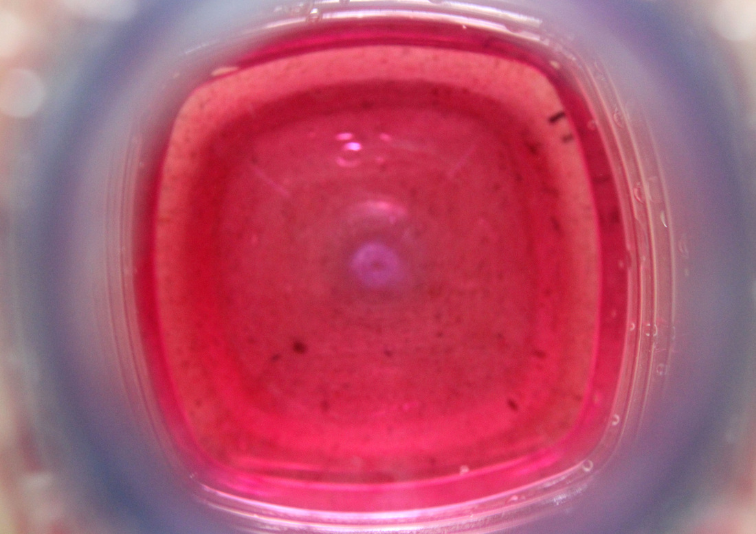
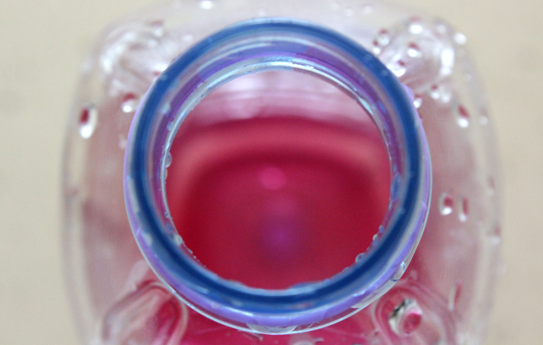
Inside a water bottle. To further respond to my inside of a guitar set, I decided to capture the inside of a water bottle. This worked well as we are so familiar with the outside of a bottle, that the inside is more unfamiliar, and therefore follows the same concept of the musical instrument series. I feel my experiment was successful due to the use of dept of field which placed the center of the bottom of the bottle in focus and the sides out of focus, creating a deep affect from the bottle. I thinks the colours were also very effective in this set, the blue against the white surface creates a nice contrast. Whilst the technique is simple, I feel the outcome looks highly effective and could work well as a set featuring different types and colours of drink bottles. As well as this, I could add different coloured liquid to the bottle, creating a new type of texture. Furthermore, I would also like to continue capturing the inside of objects that we are so used to only seeing the outside of, such as kitchen appliances for example.
|
Unedited selection.
|
Edited selection.
|
Further refinement.
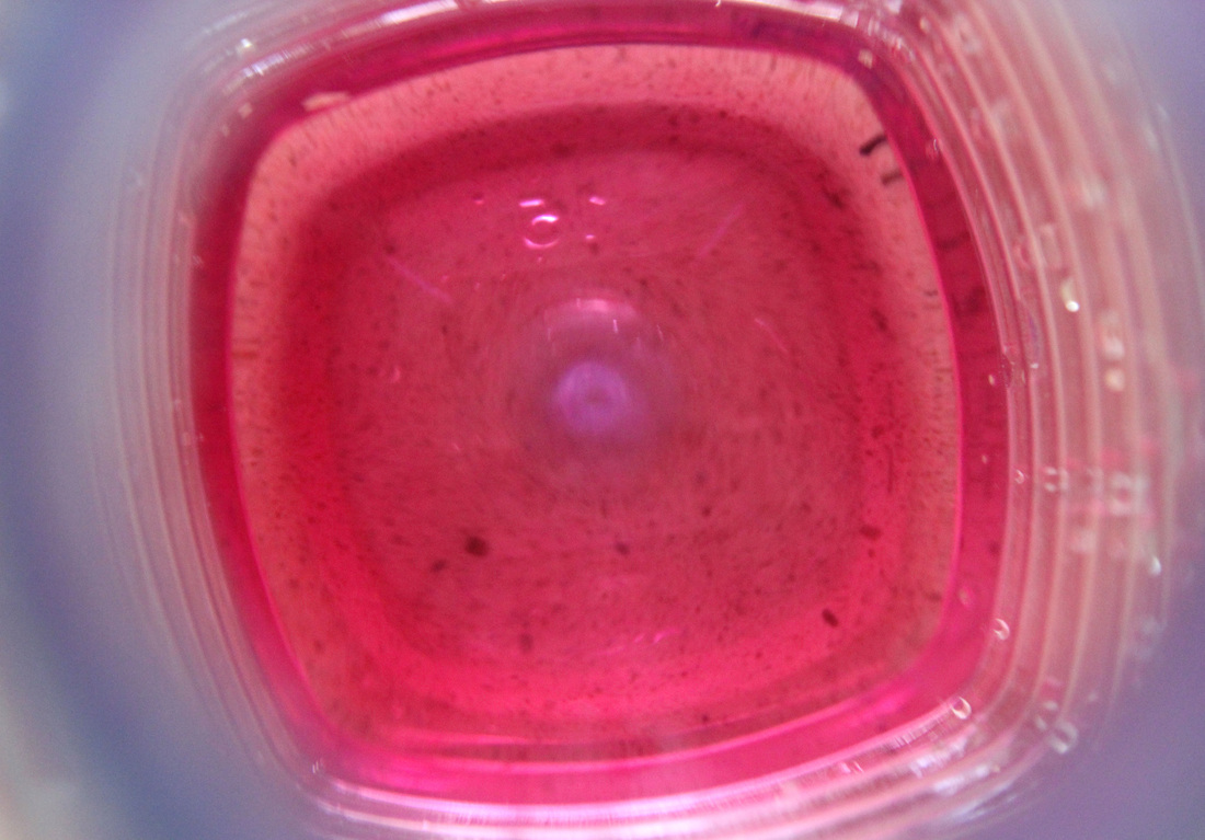
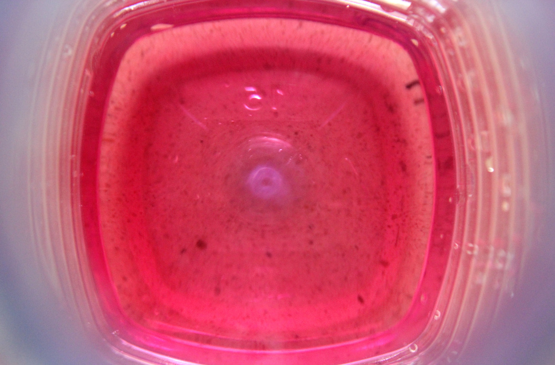
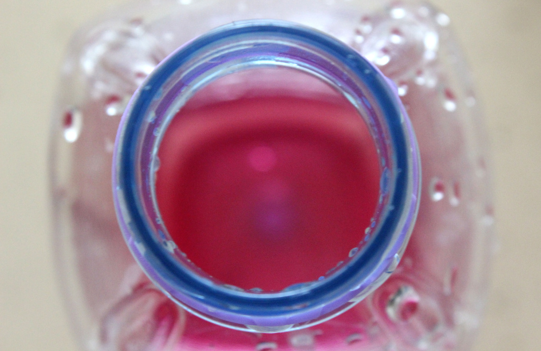
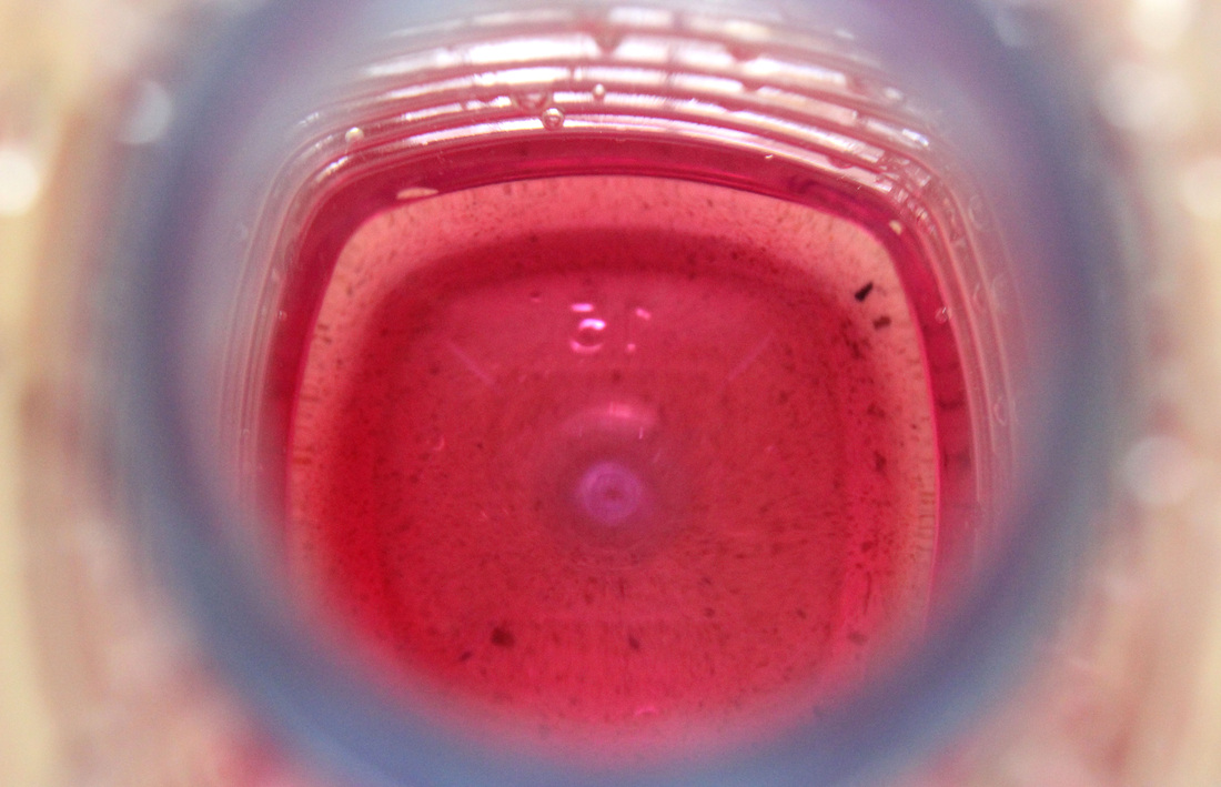
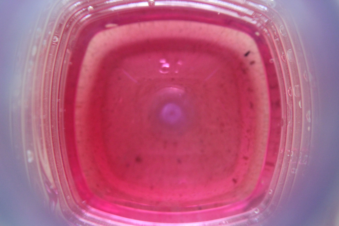
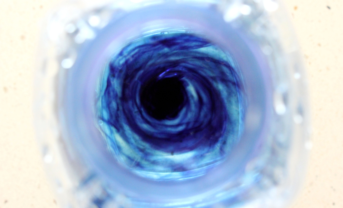
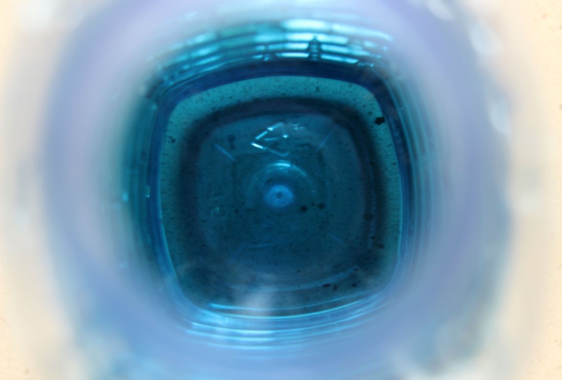
Continuing from my previous set of experiments with the water bottle, I decided to add water and colour to the images. By taking the image from the same angle as before, I created a level of consistency within each set. Again, I am happy with how these turned out. The use of liquid changes the detail of the water bottle slightly, while the use of colour creates a effective contrast in comparison to the white surface again. I particularly feel the use of blue food colouring mixing into the water is highly effective in comparison to the all one colour liquid. Here, a sense of movement is also created and adds dimension to the bottle as well as looking slightly mysterious and magical. The way the ring at the top is included in the majority of the images reveals more about what the object is.
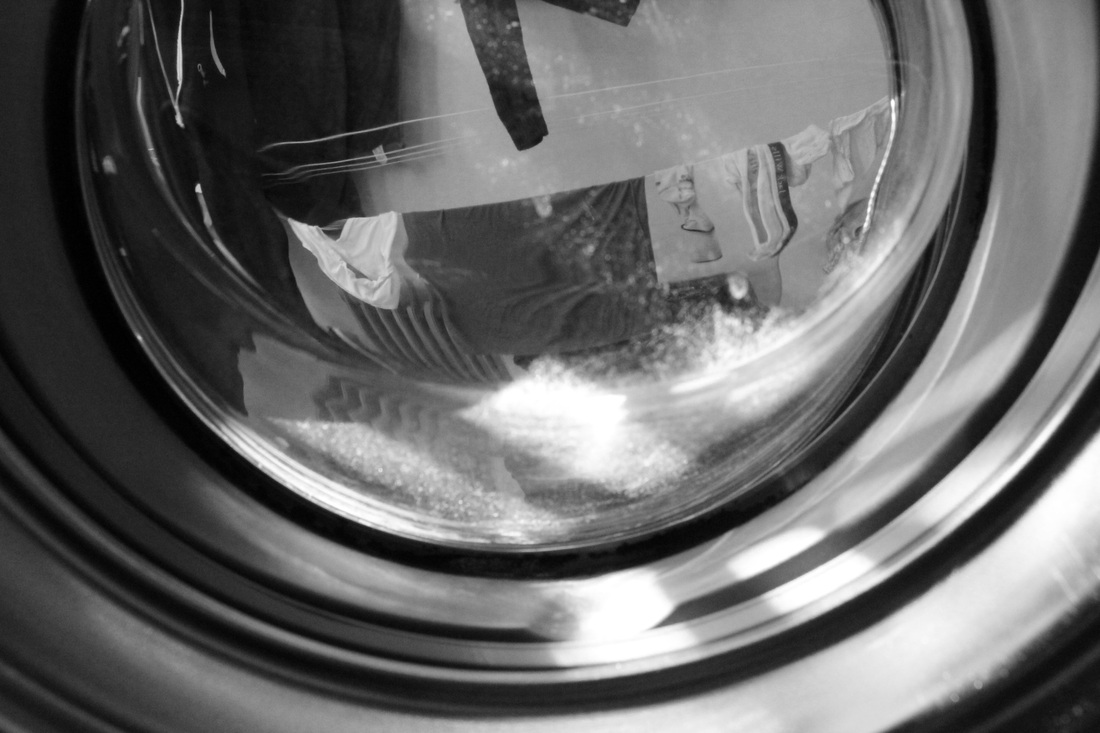
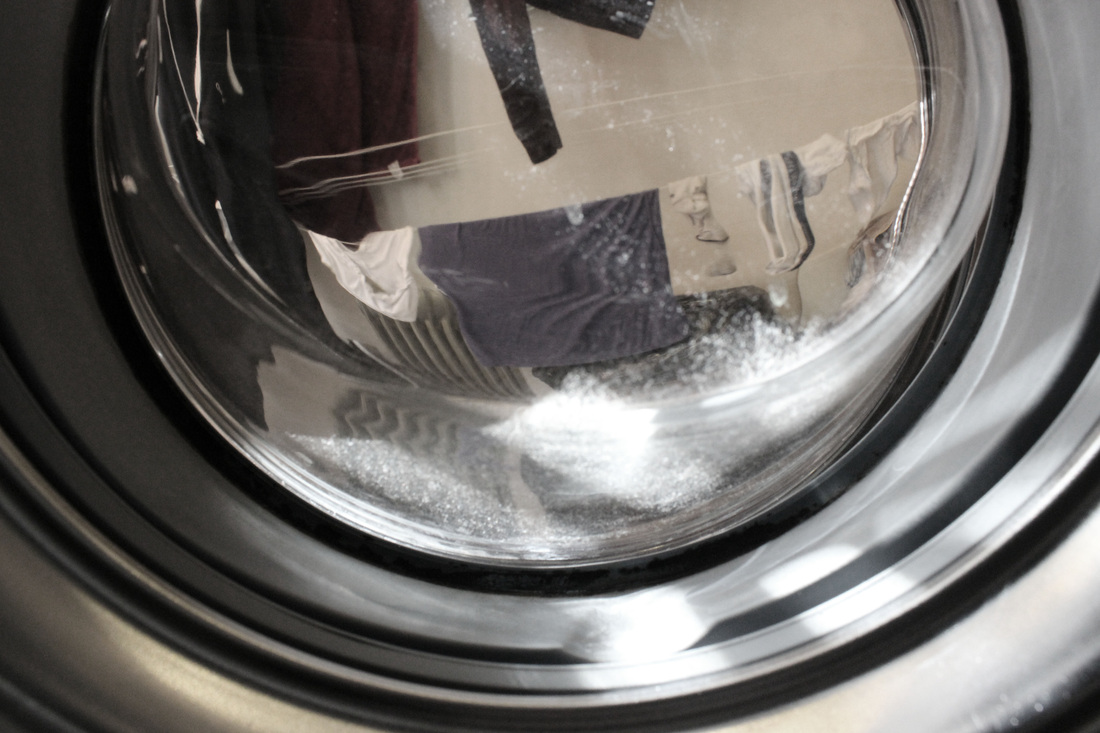
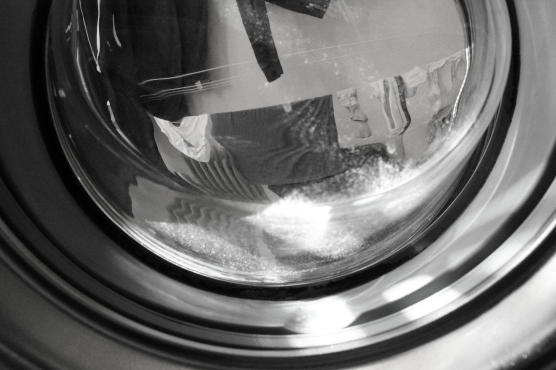
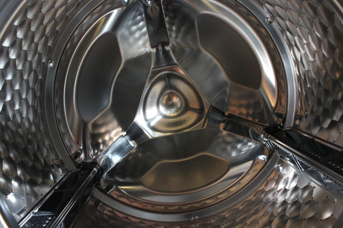
Inside Household Appliances.
|
|
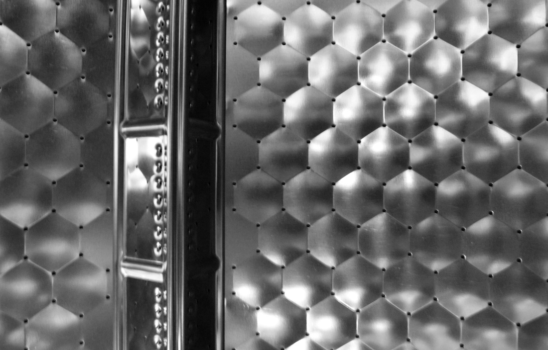
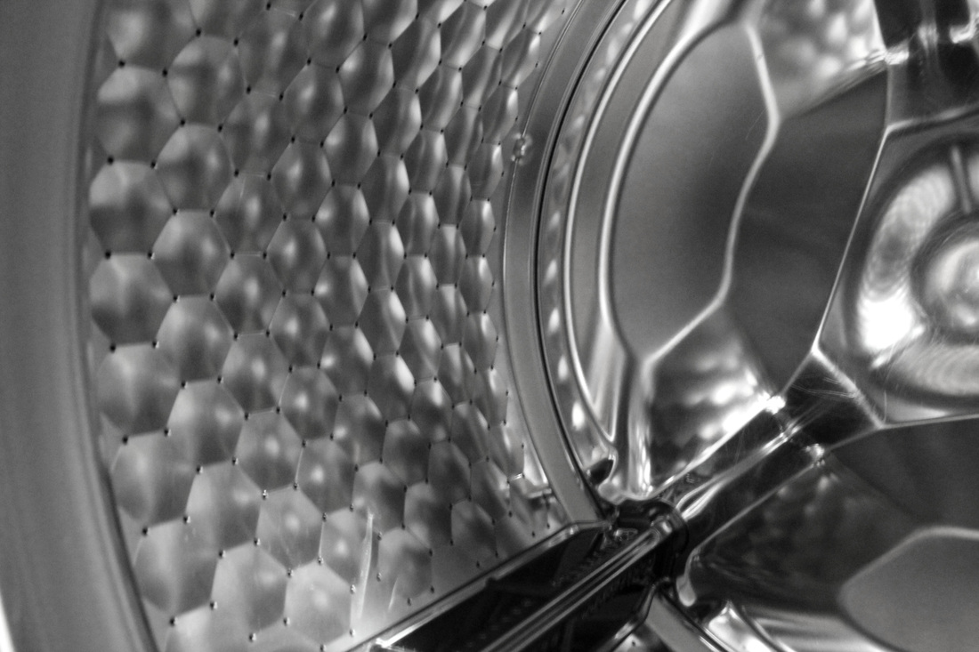
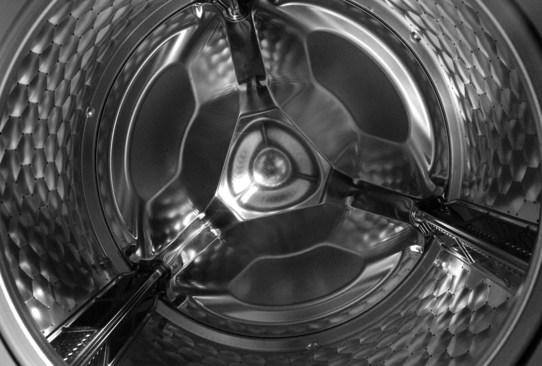
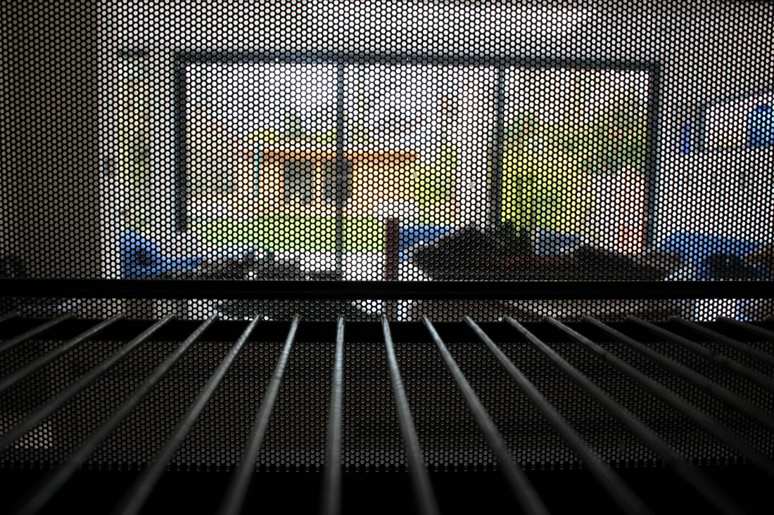
Following on from my images of inside objects, I decided to place my camera into kitchen appliances such as the washing machine and the microwave. I had to use self timer to insure I captured the inside of the appliance without also capturing myself. What I think is most effective about this set is the way that the image captures aspects of both the inside of the appliance and the outside at the same time, thus fitting in with the exam brief. In one of the images, I deliberately got into the shot, to emphases the stationary position on the appliances and enhance a feeling of scale in comparison to myself.
|
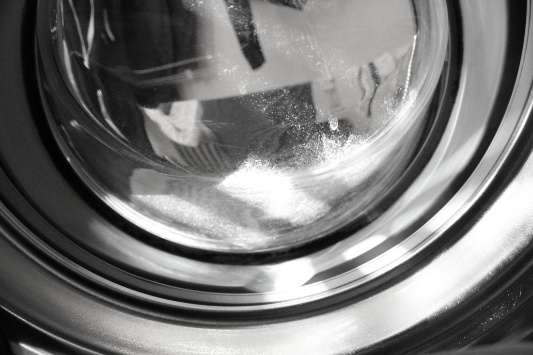
After fully evaluating this strand of "Inside", I've decided not to pursue it further. I feel that whilst the images I have taken are effective in reflecting a sense of scale and perception, there is only so far I could take the concept. In comparison to my other strands and other possible ideas, this theme leaves little to the imagination and is not as exciting or attention grabbing as other ideas I could explore. Whilst these images act as a nice starting point, I cannot see myself continuing to develop them out to there full due to the simple and slightly unexciting nature.
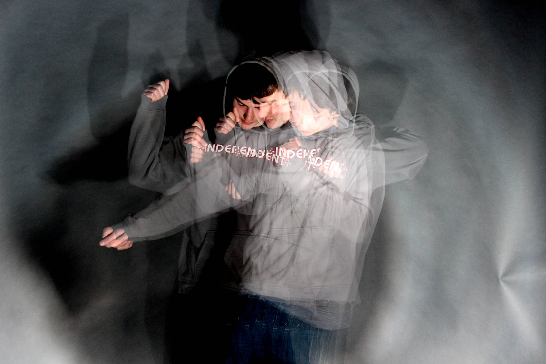
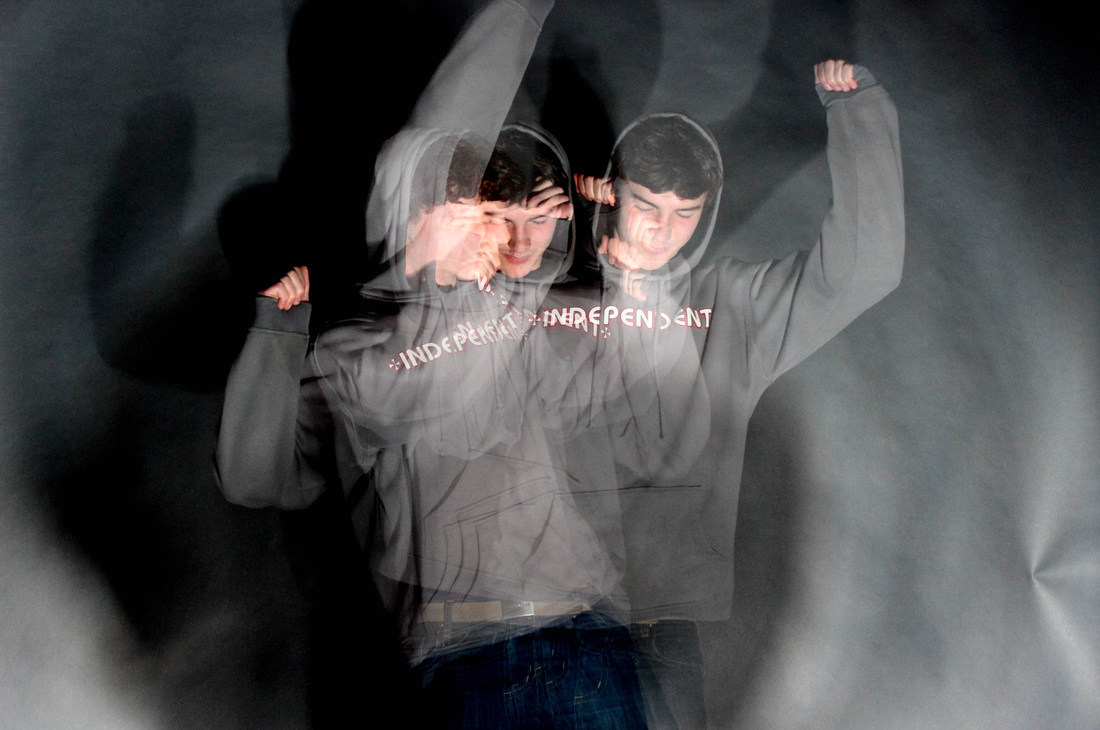
Strand Two: Movement.
Daniel Crooks.
Daniel Crooks.
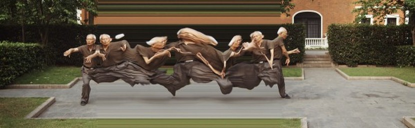
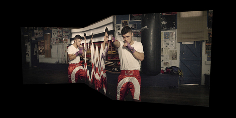
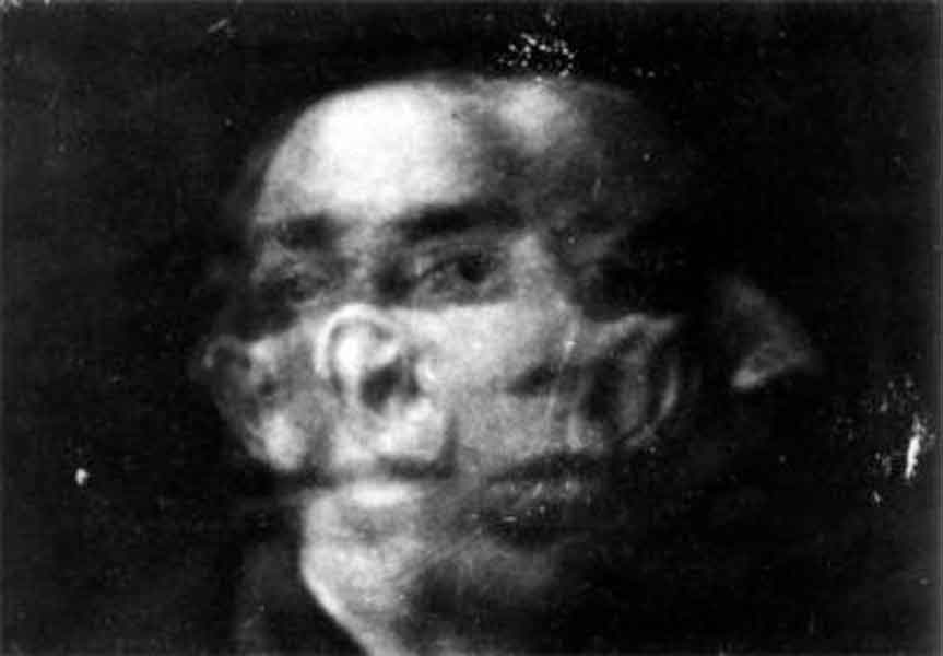
Daniel Crooks is a Australian artist who explores movement in his photography. His work fits within the "Inside, Outside, In between" brief due to the focus from one type of movement to another. His images look almost unnatural, in that someone has taken over the body of his subject and are manipulating it. While most would guess at a long exposure being used, Crooks films his subject doing the chosen movement, (for example, tai chi above, or boxing below) then plays it back slowly, capturing the individual movements. He shoots using a natural backdrop, which holds relevance to the movement. This is much more effective than if the image was shot against a plain studio background as it adds to the purpose and meaning. Personally, I feel Crook's work effectively highlights the fast moving pace of our society, and when slowed down so severely, we can really appreciate the human form and the transition from each shape.
|
Michael Langan & Terah Maher.
Shinichi Maruyama.
|
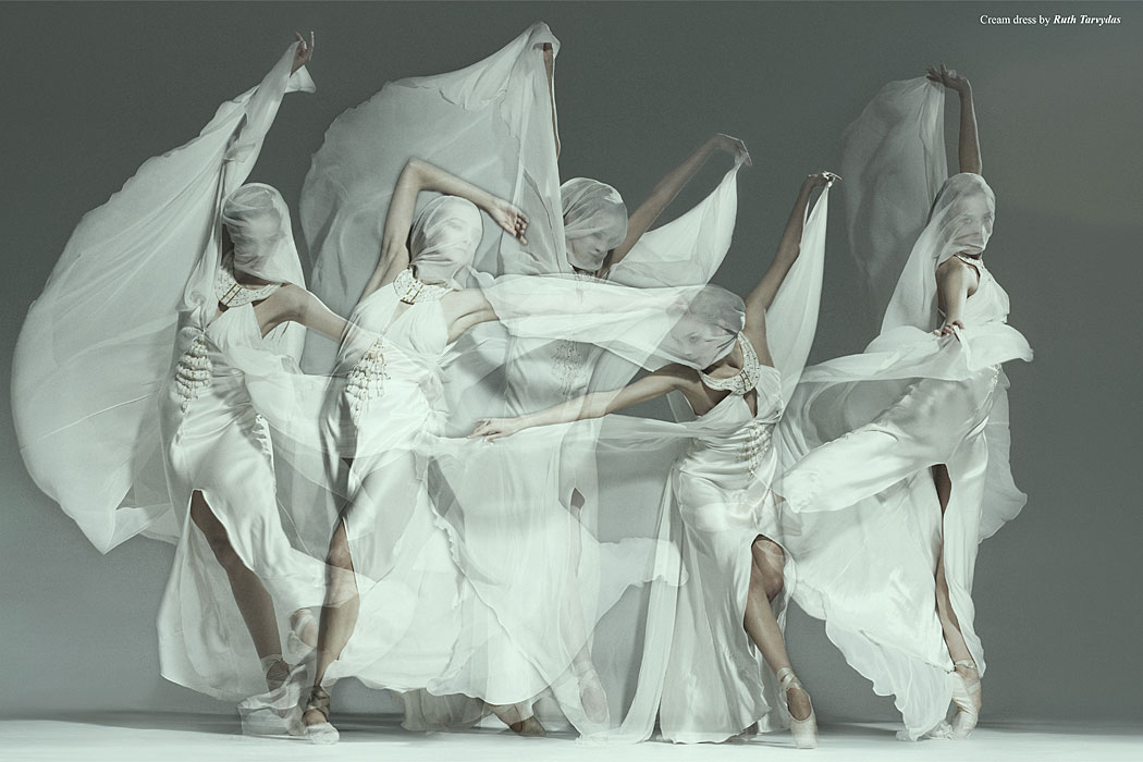
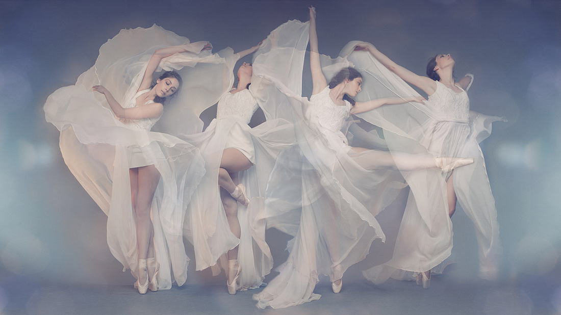
Michael Langan & Terah Maher and Shinichi Maruyama's work draws parallels with Daniel Crook's images as they all explore fluid movement, capturing each movement as if the photograph itself is moving image. Michael Langan & Terah Maher's use a long exposure and a strobe light to almost freeze every movement one after the other. The plain backdrop allows the attention to be on the subject and really highlights the shapes being made from the model. The transparency combined with the clothing in these images give off an almost ghostly effect that appears almost magical. I would like to attempt to recreate these images as the process is simple, yet the final look is affective. On the other hand, Shinichi Maruyama's images aren't made up of lots of individual movements, instead they appear as one long, fluid movement that is none stopping. Like Daniel Crook's, these look fast moving and busy. Instead of creating a ghostly effect like Langan and Maher's do, Maruyama's look as if the model has superpowers, add mystery is further added as we never see the model's face or body. I feel as if Maruyama's images were undoubtable manipulated in photoshop. The model's body almost looks like liquid moving, and therefore takes the person viewing the image a few moments to figure out what they are looking at, therefore adding an abstract feel to the images. |
Jan Masny
Movement.
My first response.
My first response.
|
|
|
|
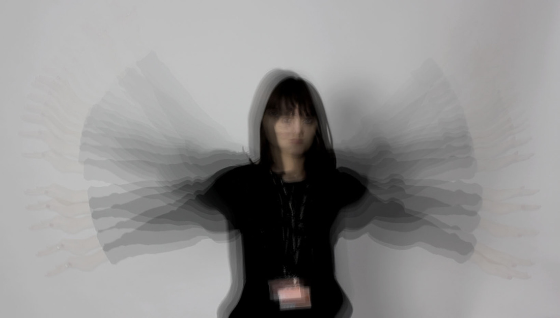
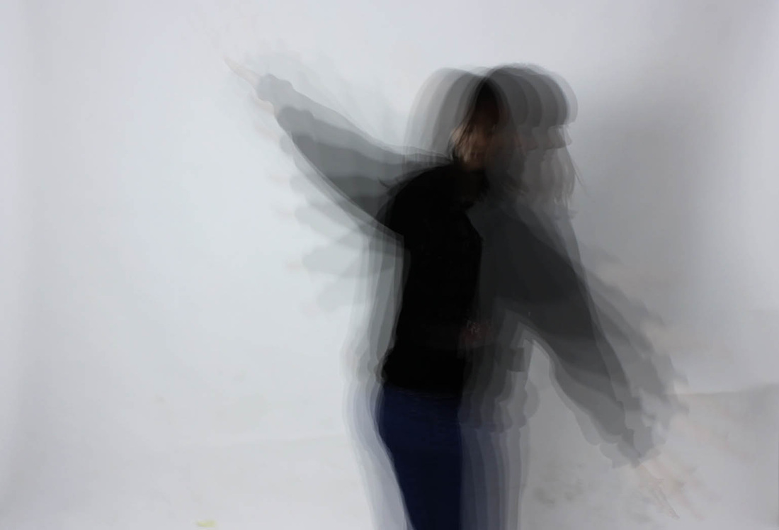
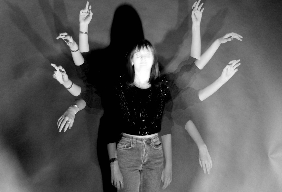
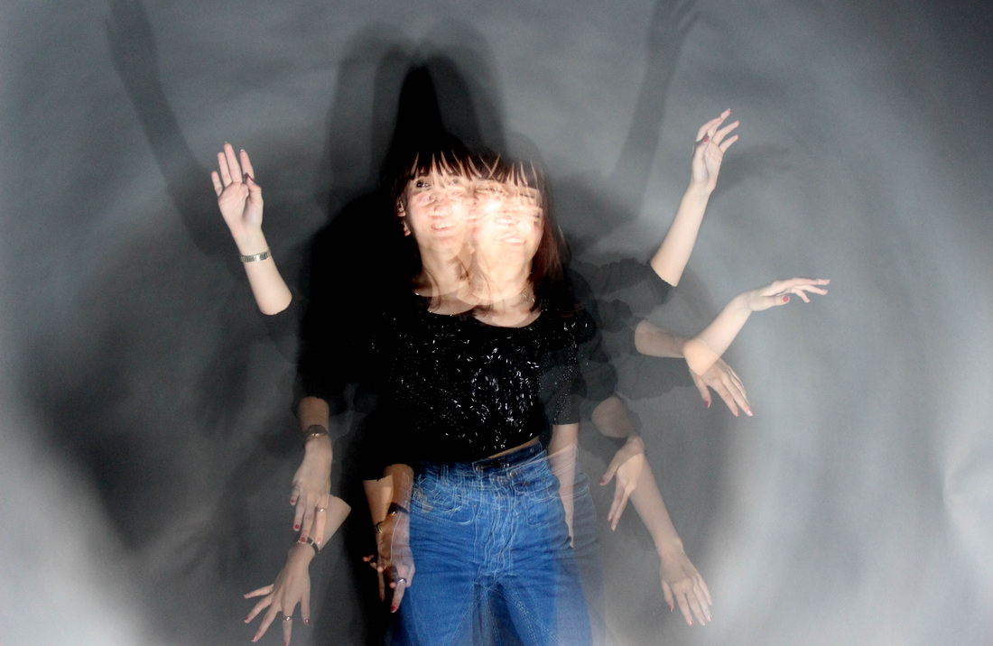
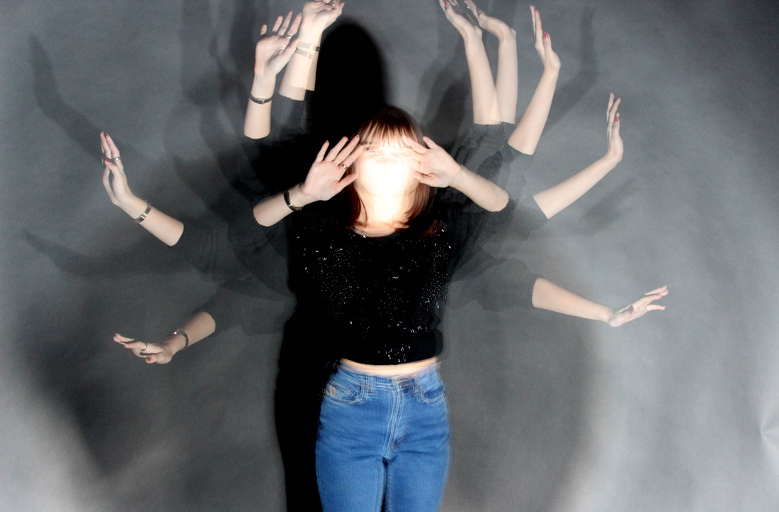
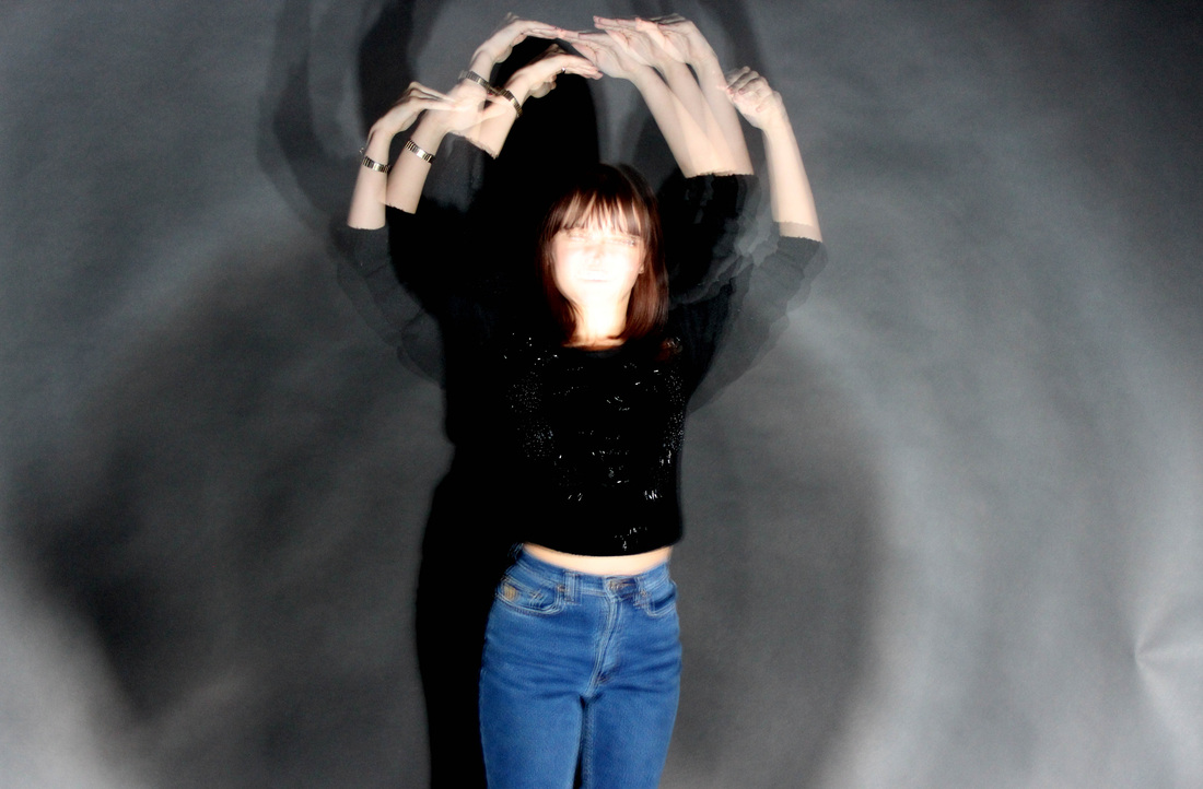
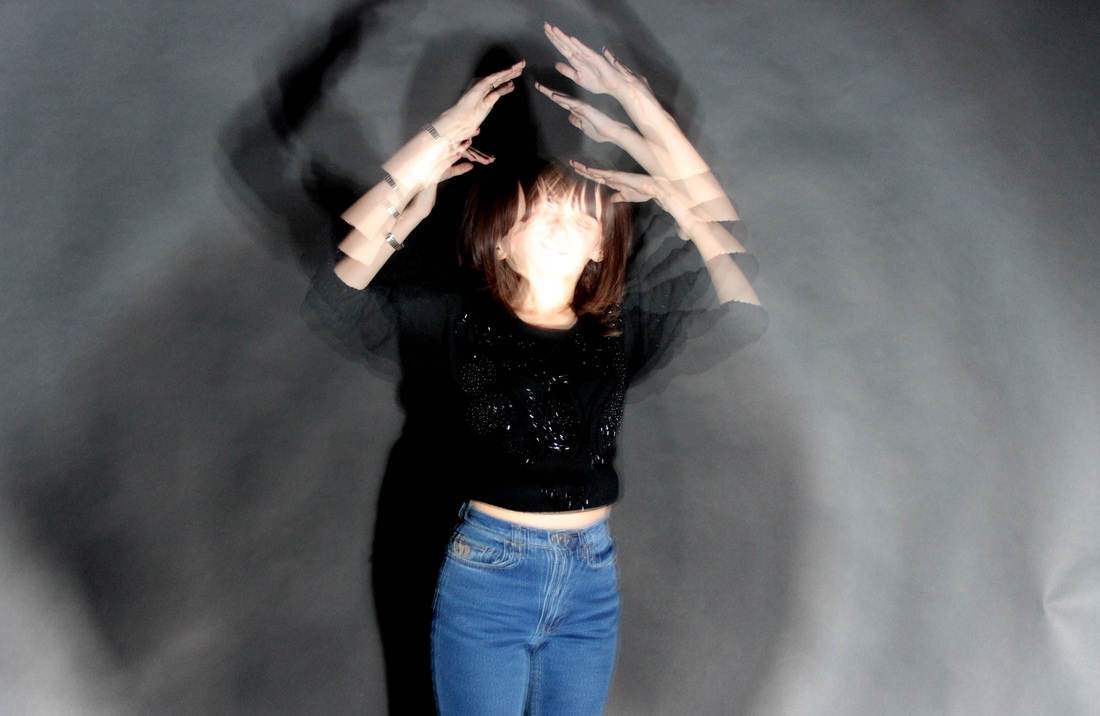
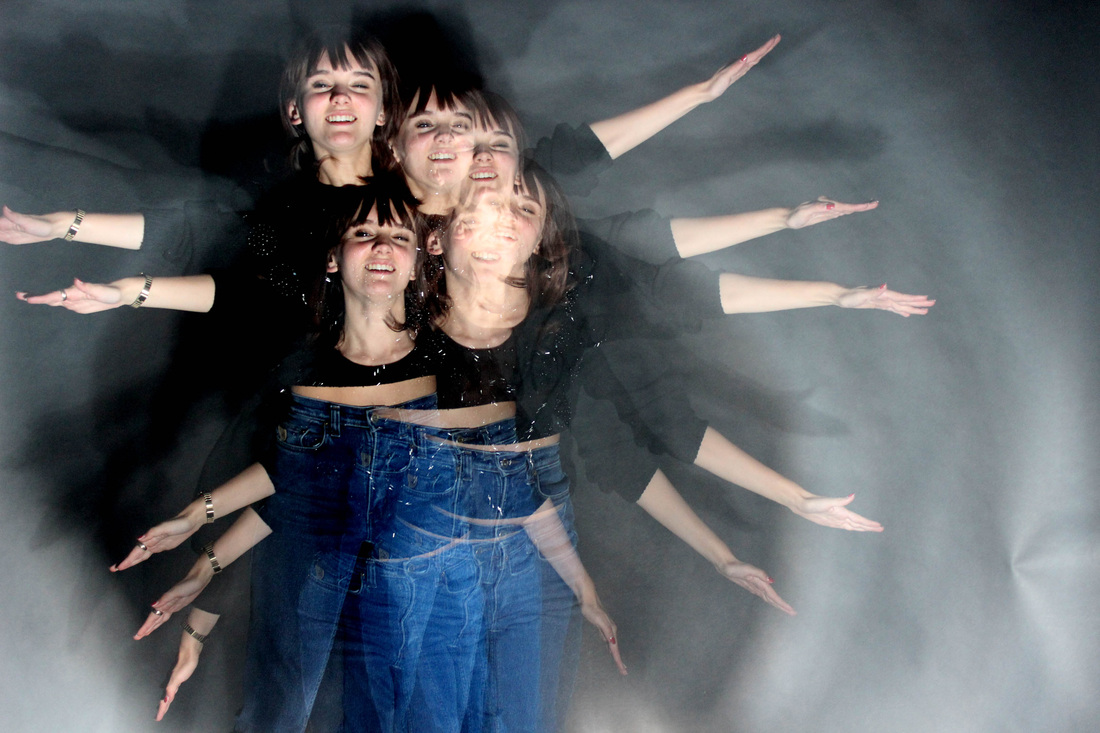
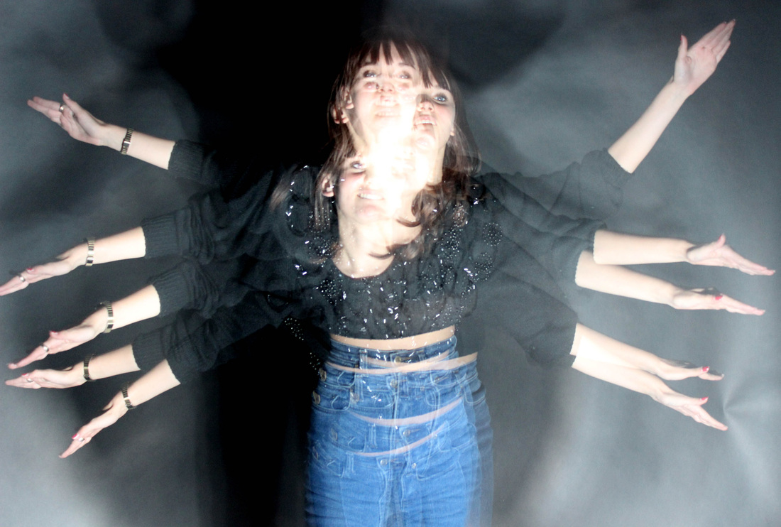
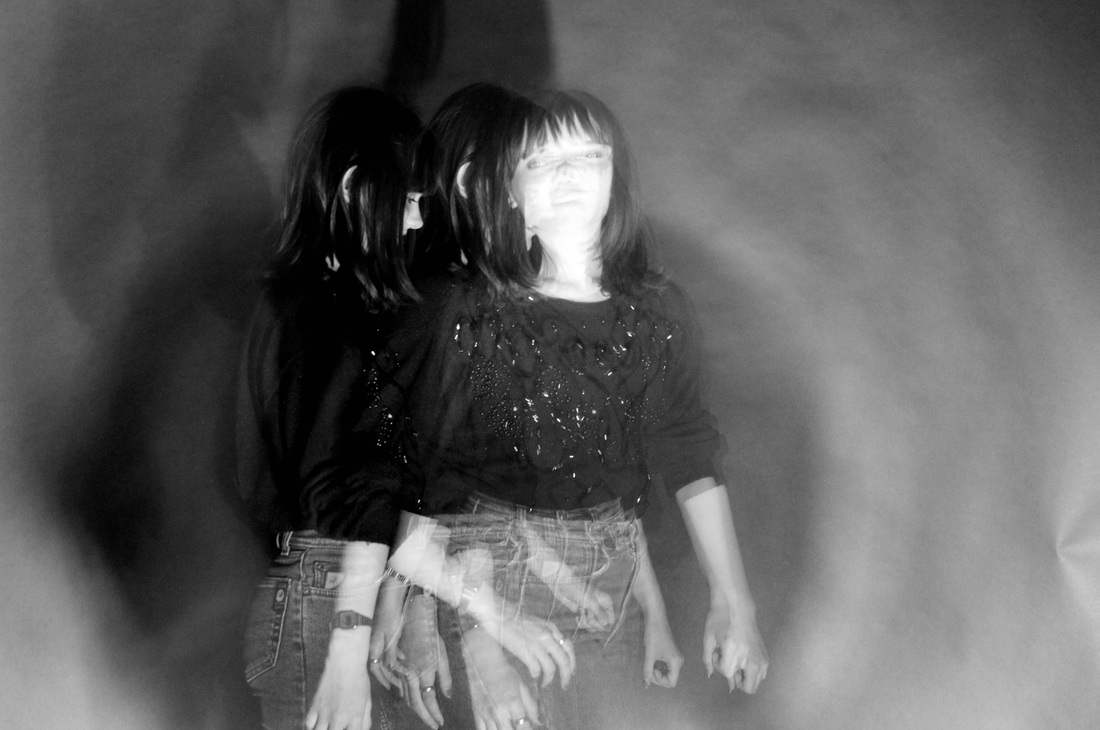
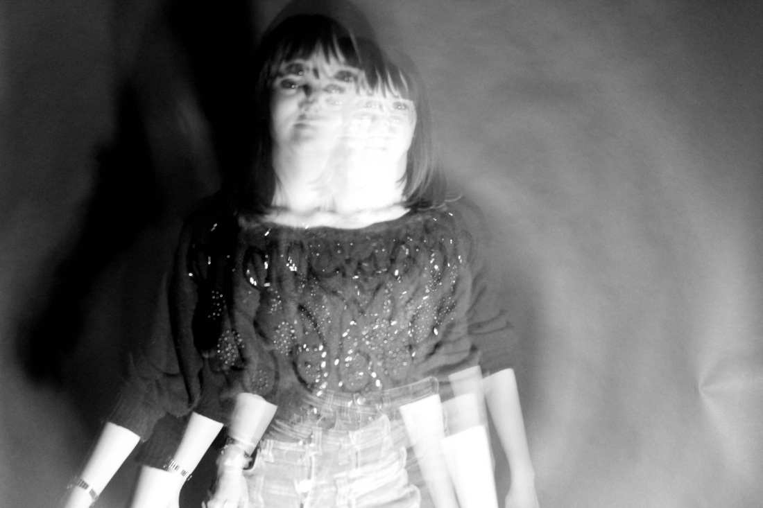
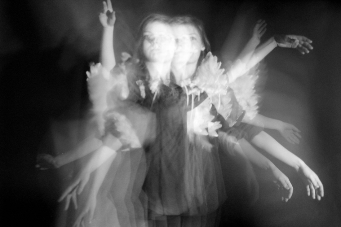
I responded to my artists researched using a studio location so it would be easier to photoshop as there were no background complications with blur. My subject looks as if she is moving at a very fast pace and I achieved this effect by filming my model moving, then combined several screen shots, layering each on top of one another and altering the opacity. These images relate to Michael Langan and Terah Maher due to each individual movement being captured. The images gives of the effect of a long exposure, however as the post production editing is so precise, I am able to control each movement compared to using a long exposure. I think my set were successful for a first attempt, especially the last two, as there was a large range of movements. Again these were successful as it appears that my subjects arms are moving very fast, almost like a fairy or a bird. These would look good in a natural environment. In this case, the first image would look better in front of a natural background as the movement is natural too. To improve my images at this point I would improve the lighting, as I feel they are badly lighten. I would also try to keep features such as the face in focus, as well as changing the environment and perhaps add the use of props. I would like to experiment with a long exposure and see how the two techniques compare.
|
Photoshop how to.
This technique of creating movement was created in photoshop. I firstly had to open up my short video clip in quicktime player and copy my chosen frame onto a blank document. I then chose another frame from the video in which the models pose was slightly different to the one previous. I then copied that one into photoshop and layered it over the first one. Now I could experiment with the opacity of the layer so the one behind it would show through. I repeated this process several times to create the effect of the model moving her arms. Once I was happy with the range of movement, I then flattered the layers onto one image and cropped the image. I could then go on to adjust the levels and effects on the image.
Movement.
Further response, long exposure.
Unedited.
Further response, long exposure.
Unedited.

Edited selection.
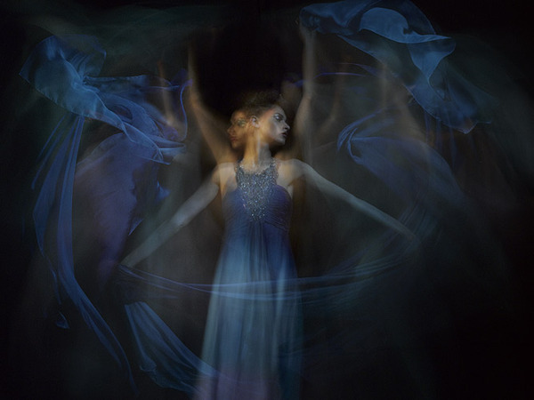
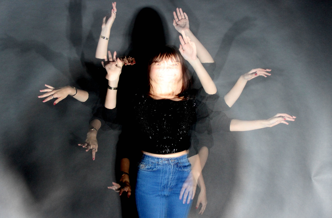
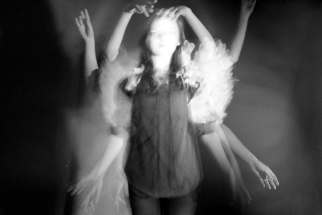
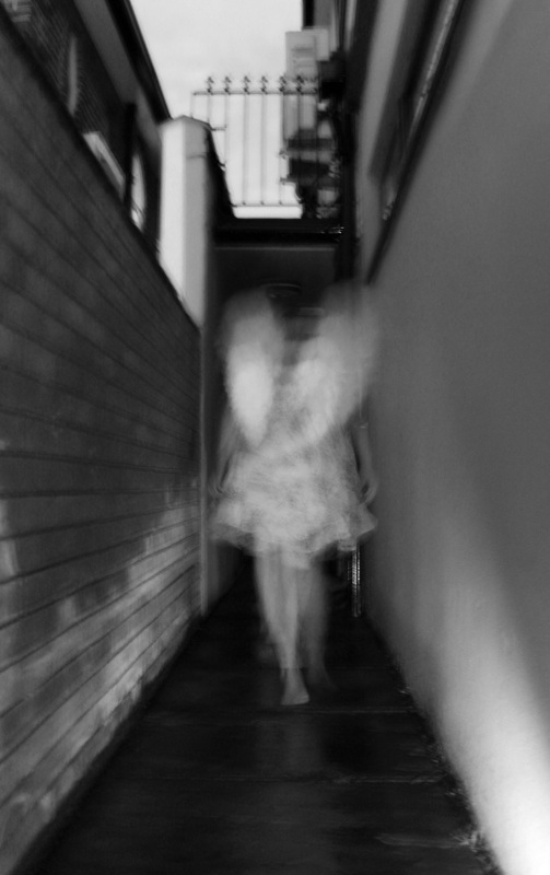
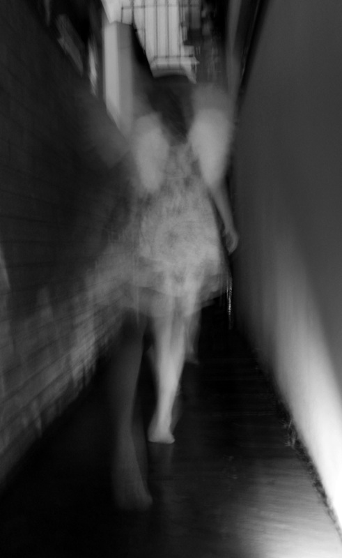
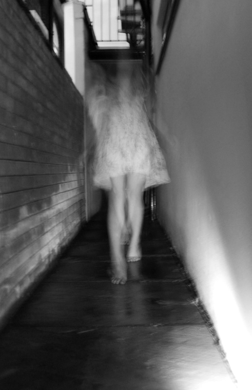
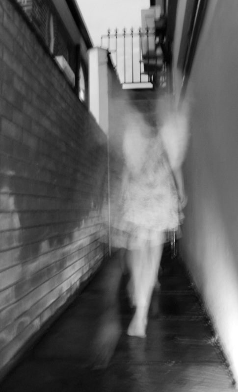
I combined two techniques to further extend my experiments into movement. The photos had to be taken in a room that was completely blacked out, therefore I used the dark room. There could be no light as I used a strobe light to capture each individual move my subject was doing. A long exposure was used so a range of movement could be captured. This set relates to Michael Langan & Terah Maher's work the most as every shape created through the subject moving is so clear, I suspect that they used the same techniques of the strobe/ flash light and a long exposure. The set of images were successful for a first attempt, especially as I hadn't experimented with the strobe and long exposure before. The most successful images were the ones where the subject has a large range of movements, for example when he moves towards the camera, the size of his face and body change. I also like how the movement creates a slightly translucent effect to the subject. This combined with the large range of movements gives of a ghostly/ spiritual effect which could possibly link to my next strand "Parallel world". To improve this set, I would take the images on a completely blank background as I feel the slight details on the backdrop distract from the subject. I would also photograph more exciting movements that take up a larger space, as these were the ones that worked the best previously. I'd love to be able to take this idea outside, perhaps at night, to get a much more exciting backdrop in shot. I could possibly use a empty alley way or dark woods to add to the mysterious feel that the ghostly effect already gives off very nicely.
|
Further response to movement, Long exposure.
Unedited selection. 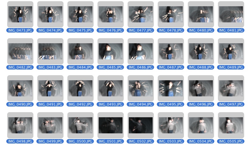
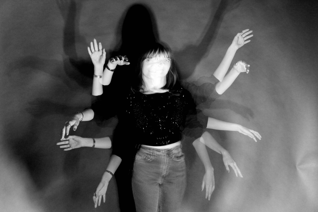
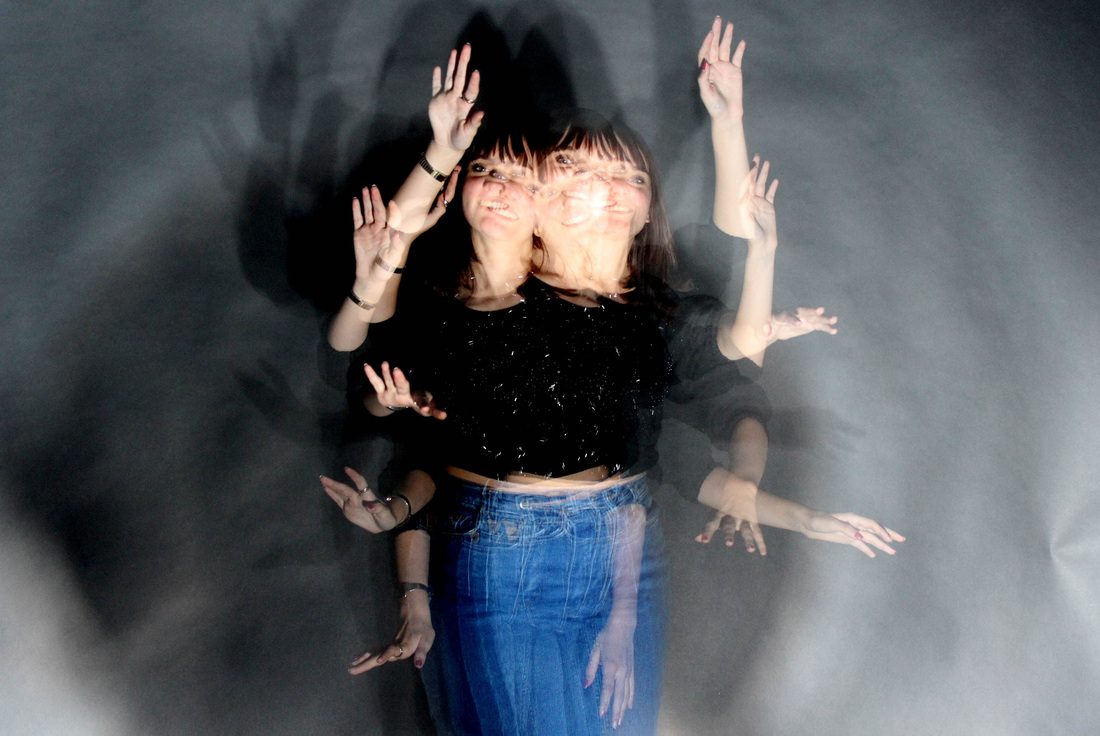
Once I had experimented with the strobe light and a long exposure, I wanted to further improve the look of the photos given that my first attempts were overexposed. This next set were much more successful due to the blank backdrop I used. As well as this I also paid more attention to the speed of the stope next to the shutter speed on my camera, which really made a difference. Whilst the ones where just one body part is moving (eg arms) were effective, ultimately the images that involved full movement from the whole body were the most successful. This way each individual movement is captured and really gives off the effect of movement within a photograph. The images look really good in colour, as there is a contrast between the background and the clothing, however the black and white ones look slightly more spooky/mysterious and could almost be combined with my third stand of Parallel world/ Mystery. To improve my set further, I would bring my subject closer to the camera and further from the back drop, as in this set, the light hits the backdrop creating a light space. The images would be more successful if the space around the model moving was completely black. I will go on to laying these images on top of each other to create an even larger range of movement. I would also like to go on to combine this strand with my third strand.
|
Edited selection.
|


Strand Three: Parallel World/ Mystery (Part 1).
Francesca Woodman.
Francesca Woodman.
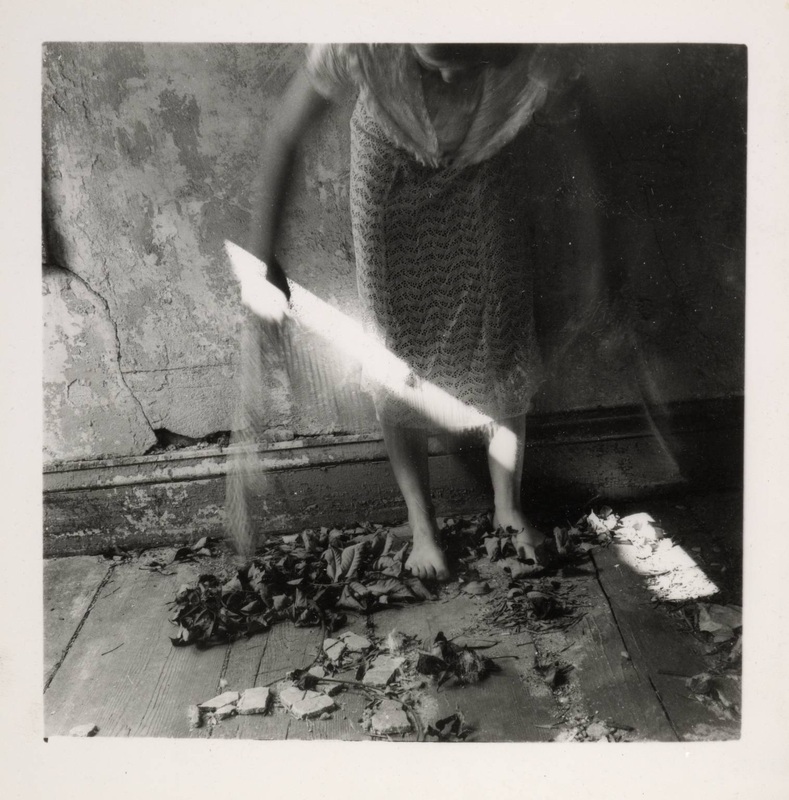
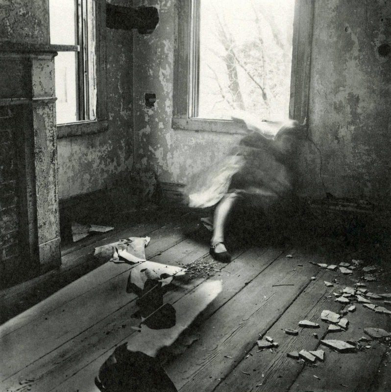
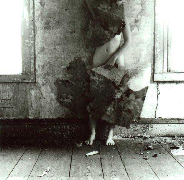
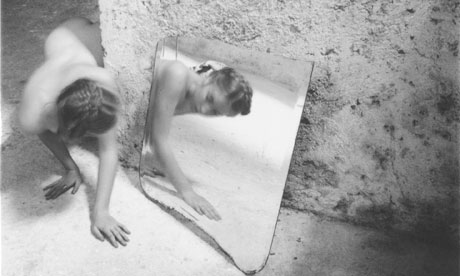
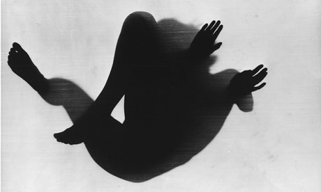
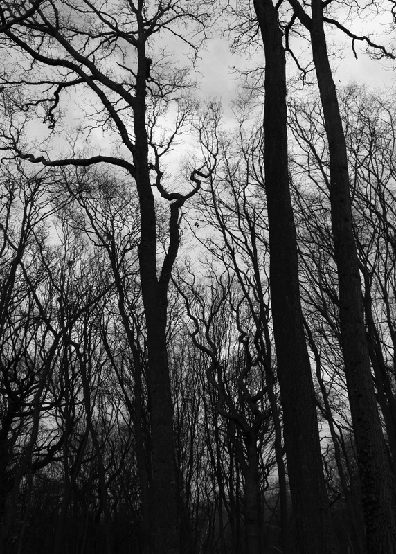
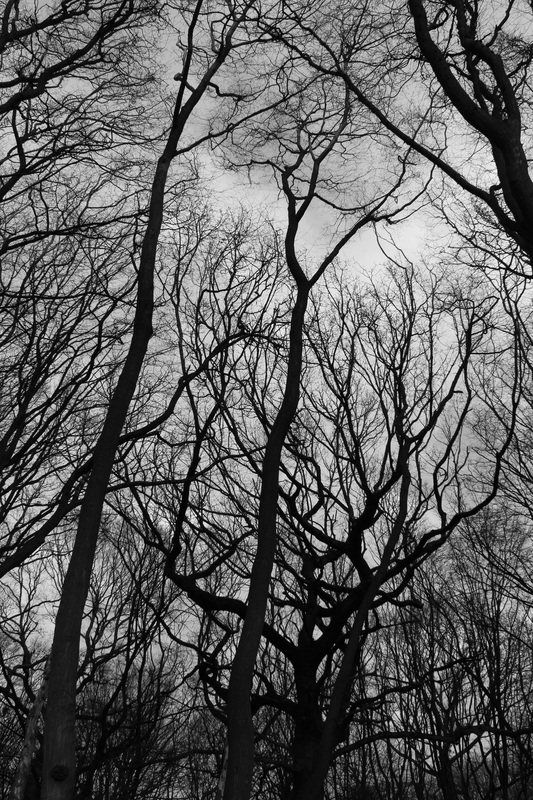
Francesca Woodman is an established photographer who explores the concept of the supernatural and mystery within her images. I was inspired by her work due to the way in which the techniques used trick the mind and make us question what we are seeing. In some ways, Woodman's work could also fit nicely into my "movement" strand, due to the long exposure techniques used and the ghostly feel that is created within this technique. I like the idea of the parallel world theme within this brief. To successfully achieve a quality of image similar to Woodman's, I would have to focus on the look at feel of the environment, as the backdrop plays a major role in creating and mysterious atmosphere. For example, I could take my images in dark alley ways, graveyards, forests or ruined, old houses like in Woodman's images. The colours used would have to be relatively dark and plain to heighten the dark and surreal feel portrayed from the subject. I like the way that Woodman's images have a ancient, gothic feel to them, heightened by the faded colour scheme. The look of the images also create a context for the ghostly figures present. The way the subject is captured also creates a sense that they are not supposed to be in the shot, as their surroundings are so deserted and empty, as if no one has set foot there for years.
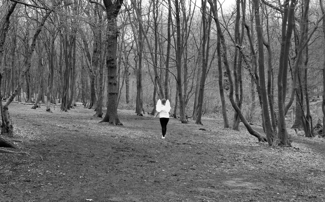
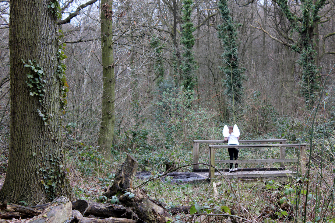
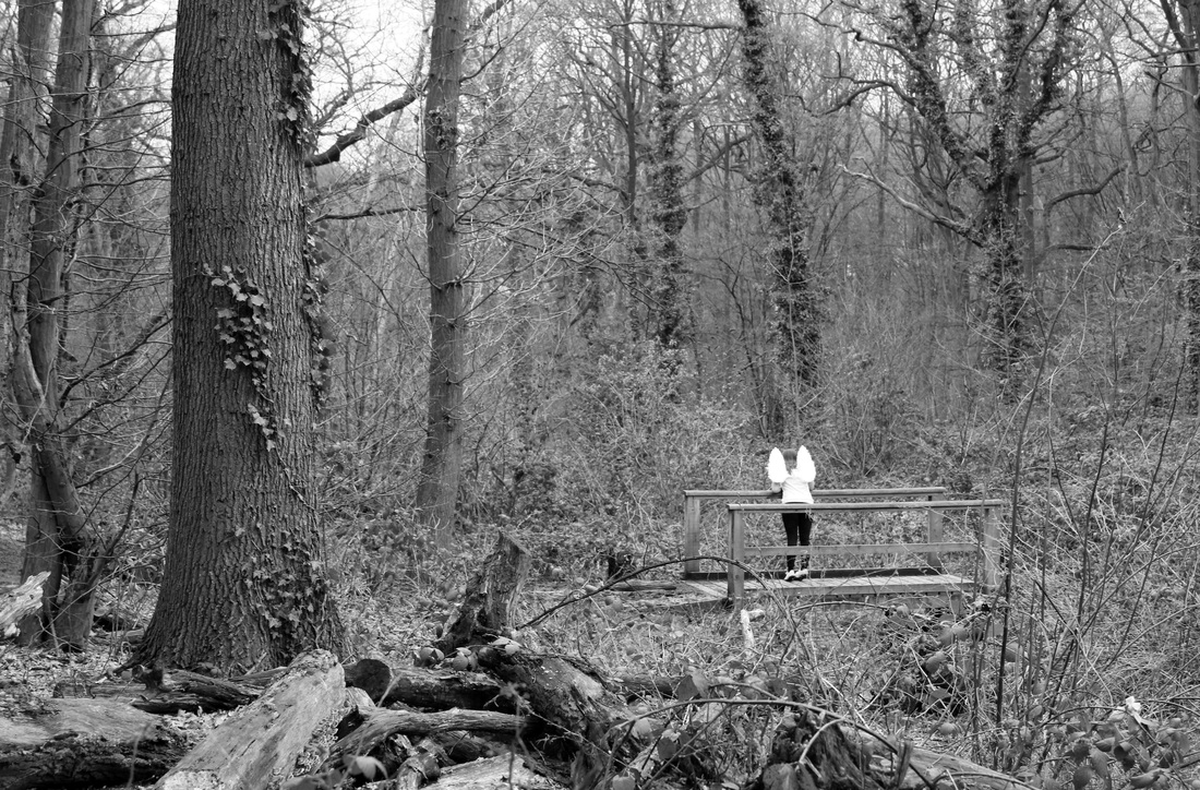
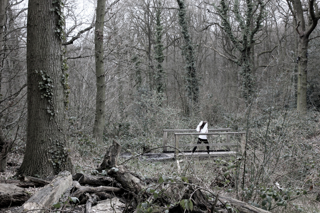
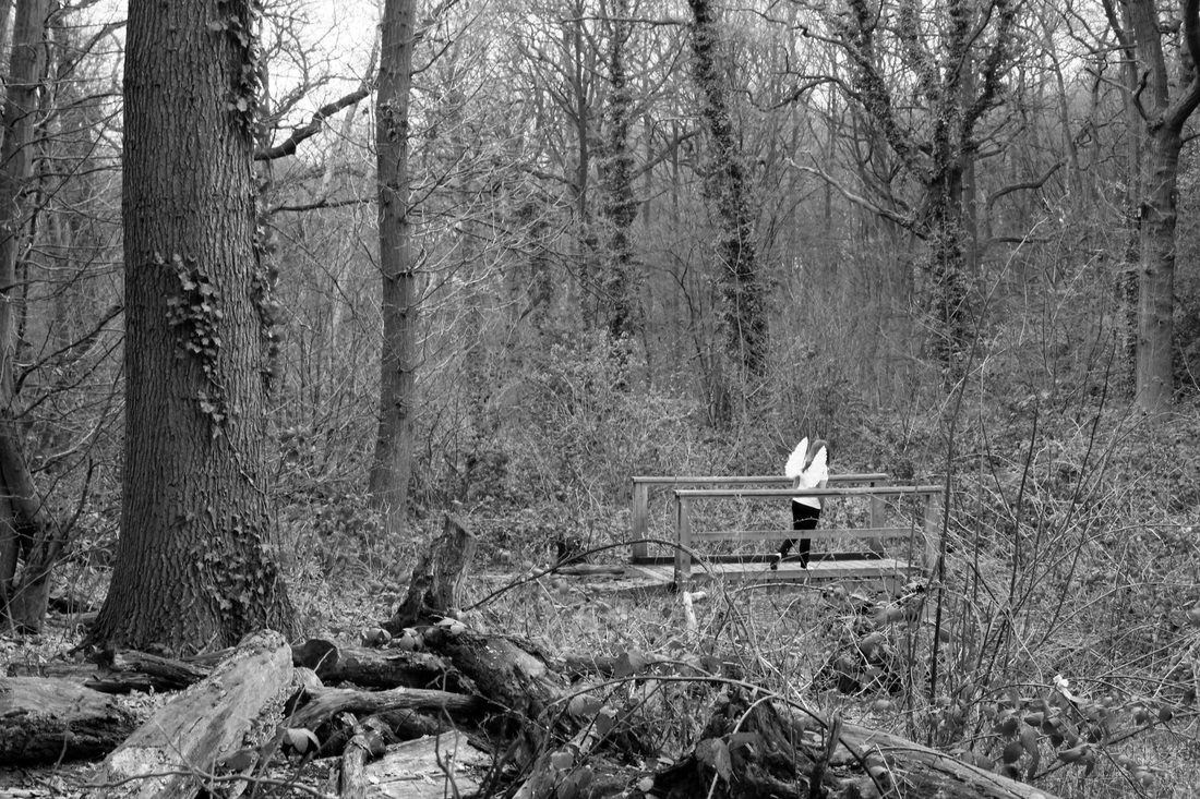
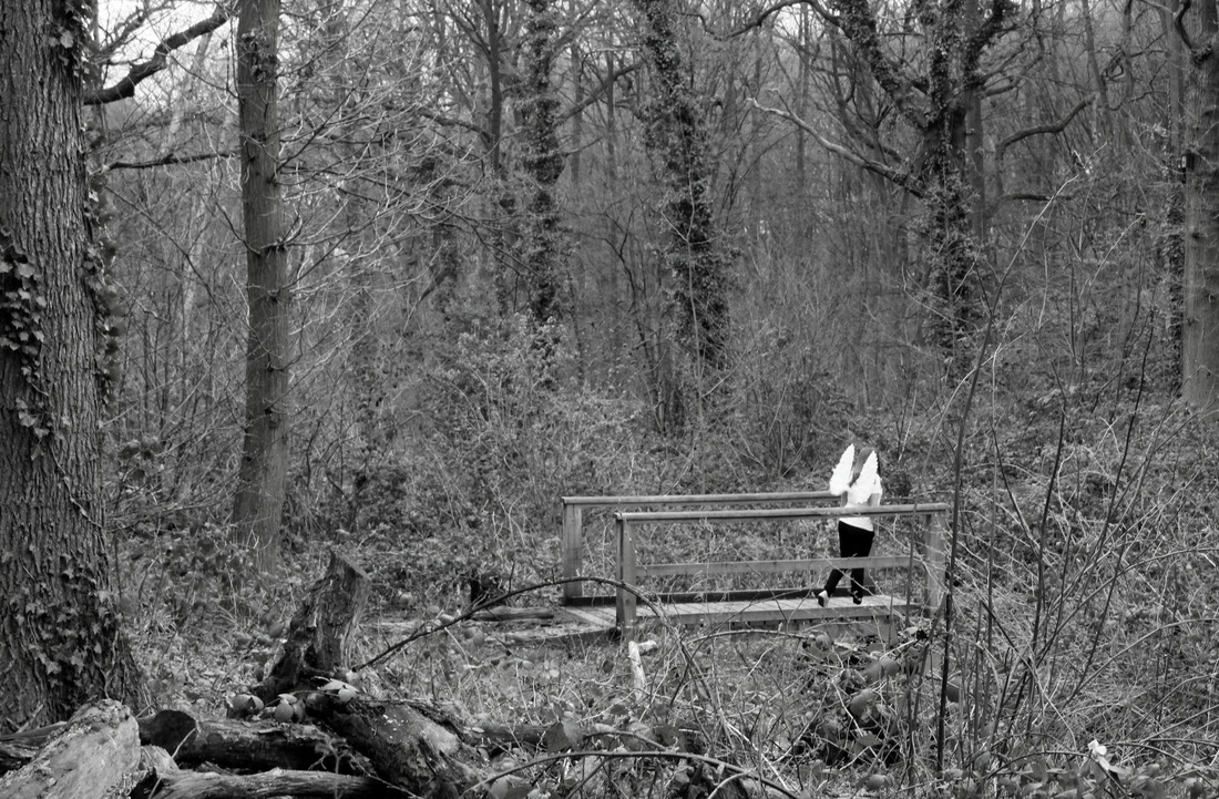
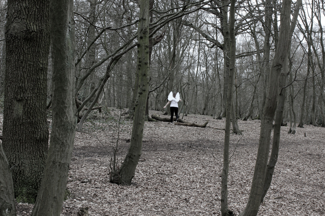
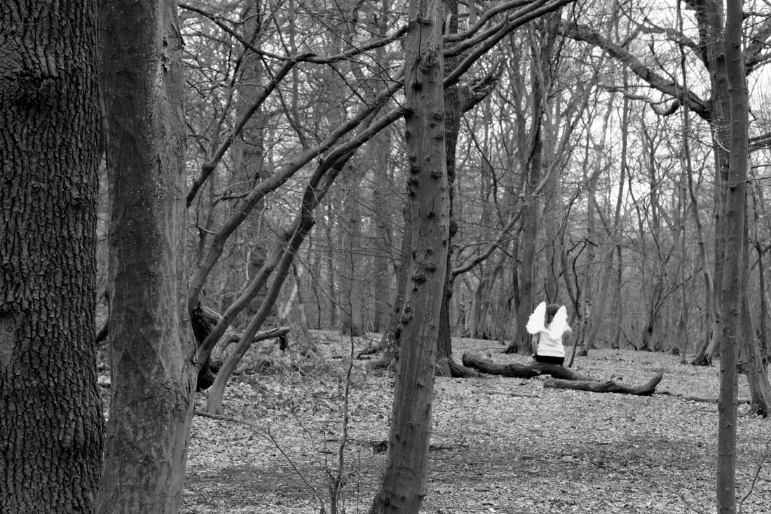
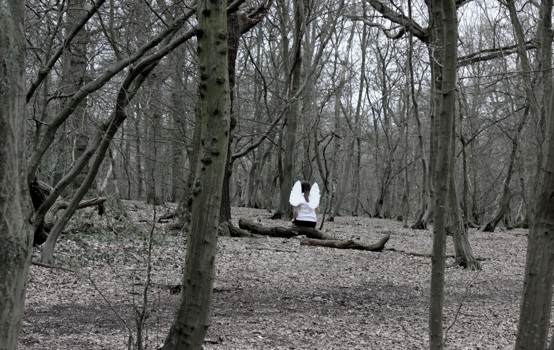
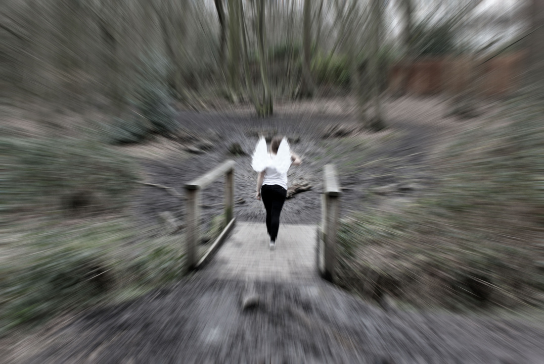
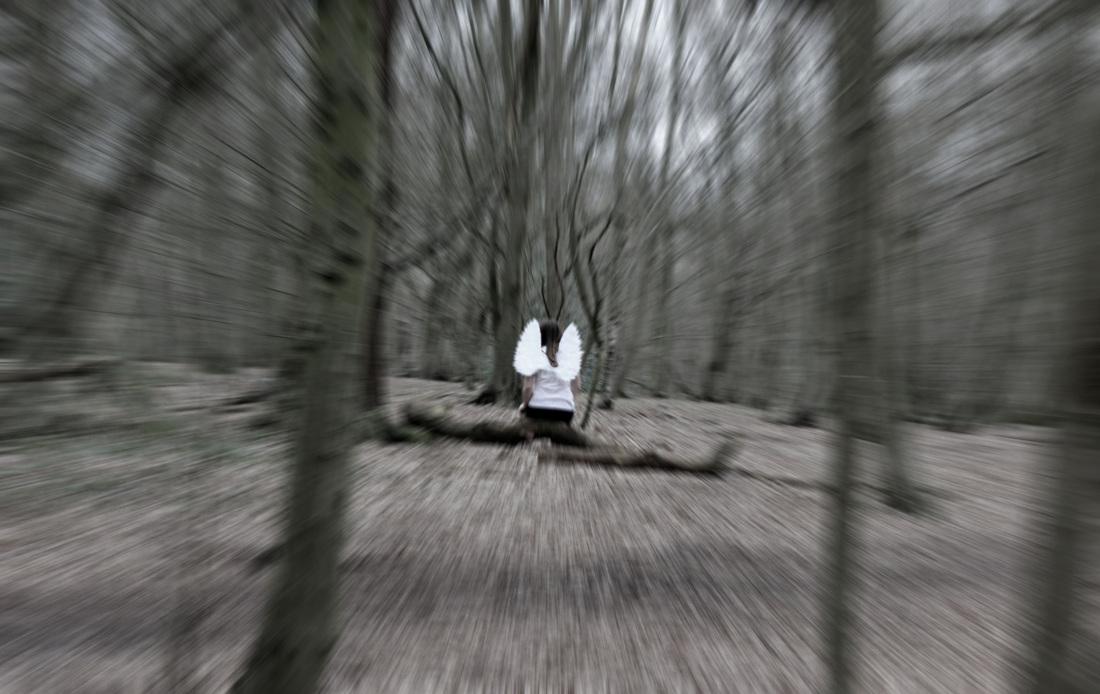
Ed Sheeran.
"Give me love" video.
"Give me love" video.
|
Unedited response.
|
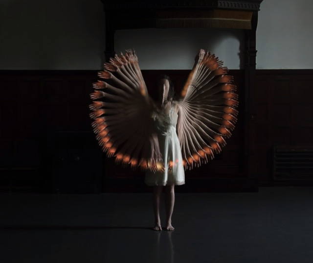
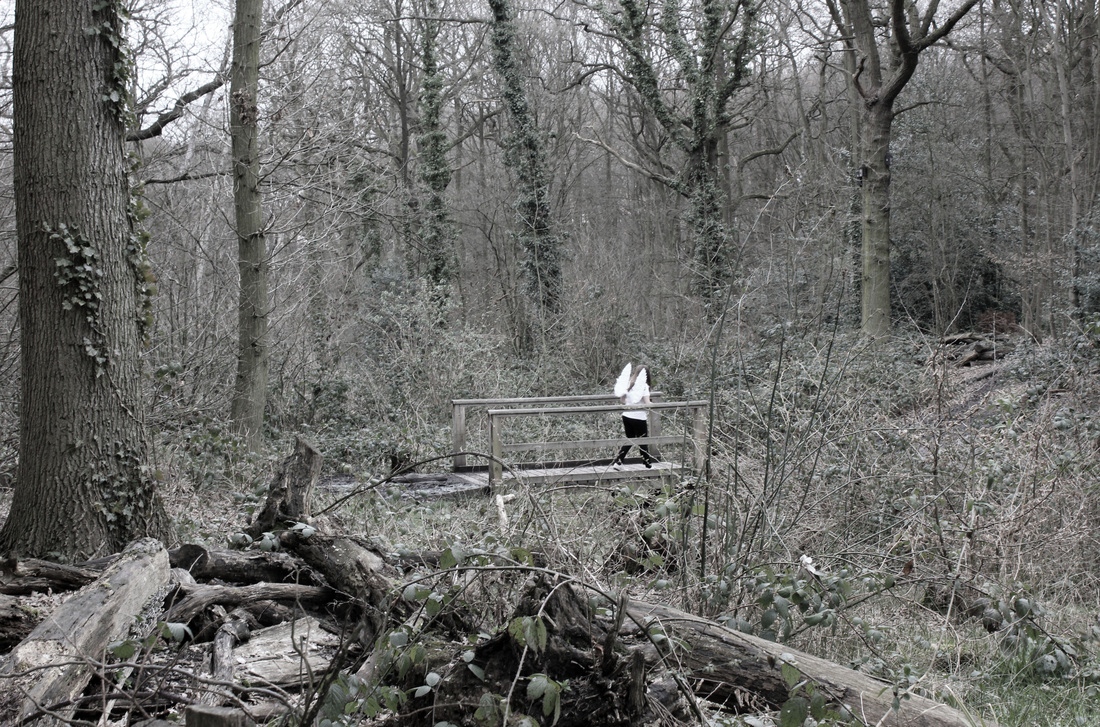
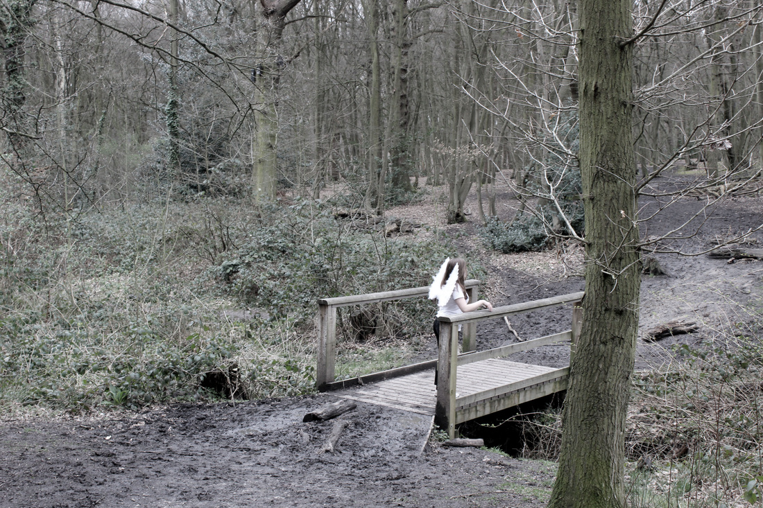
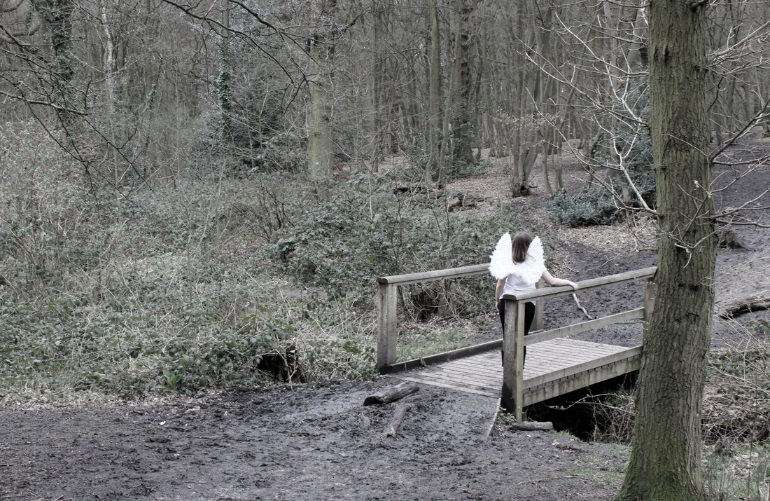
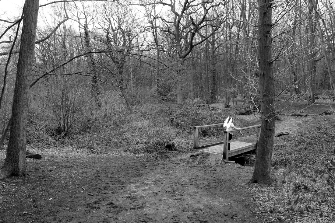
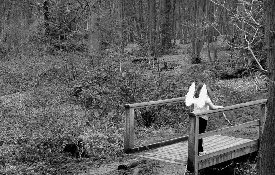
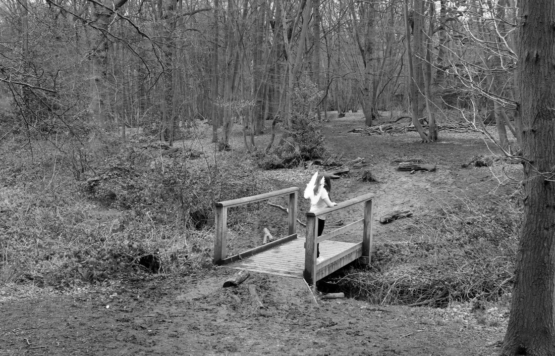
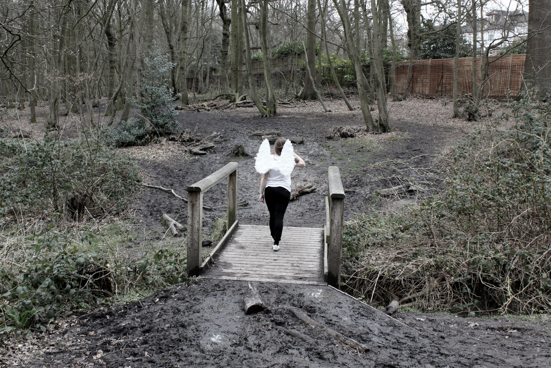
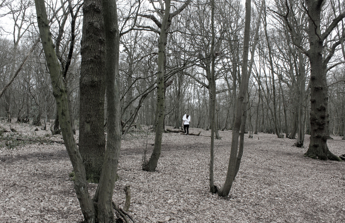
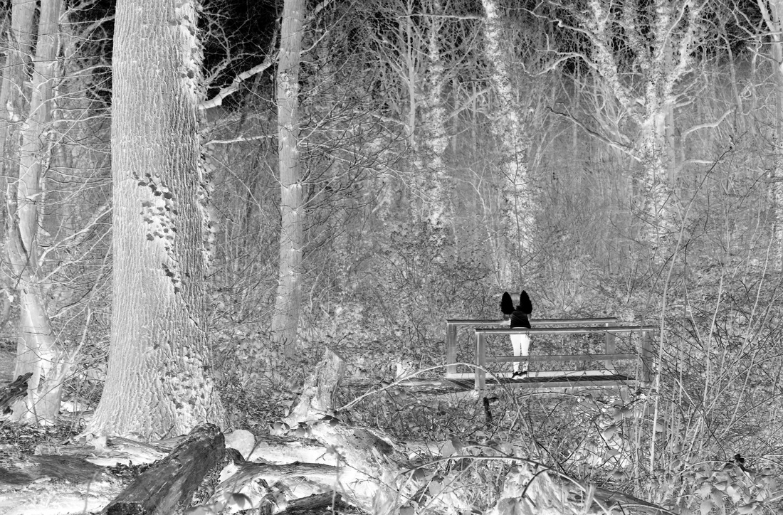
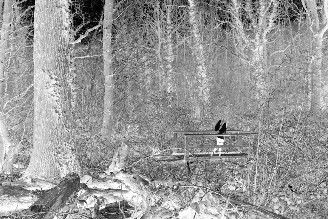
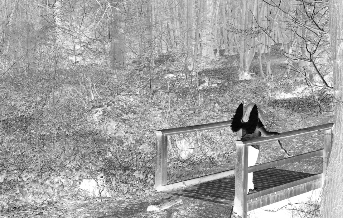
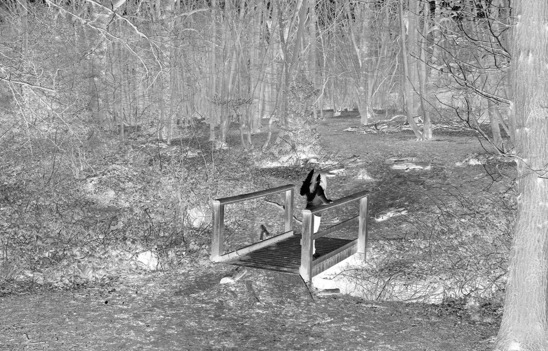
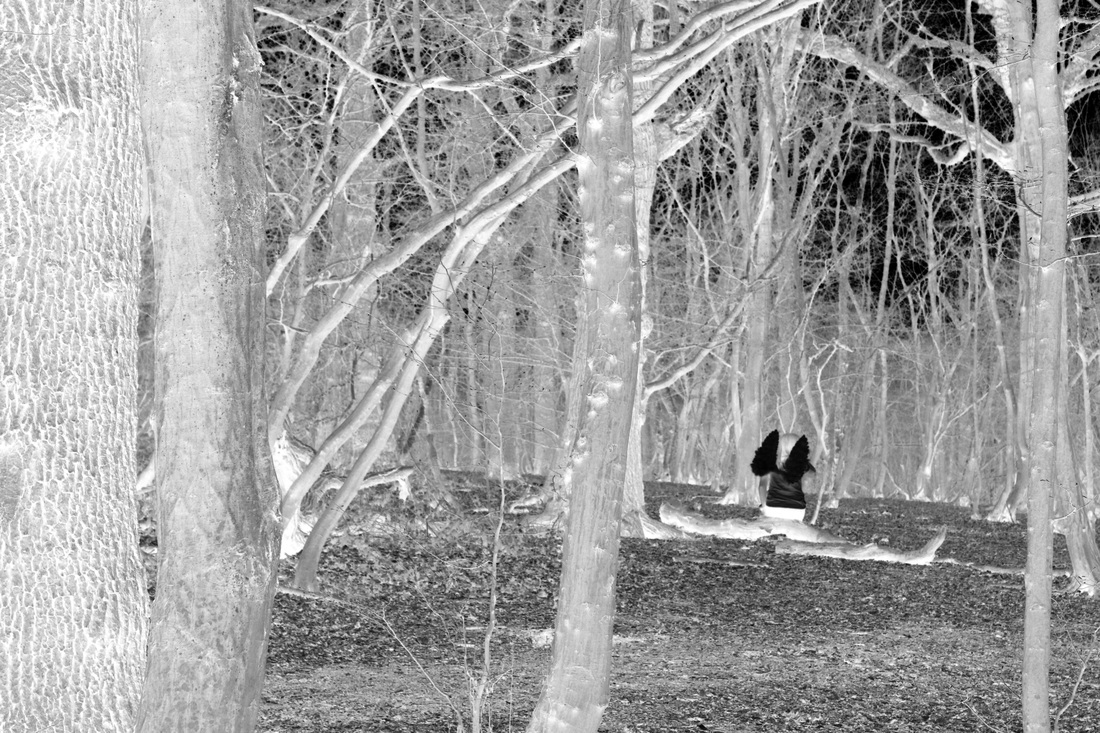
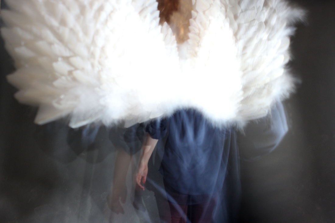
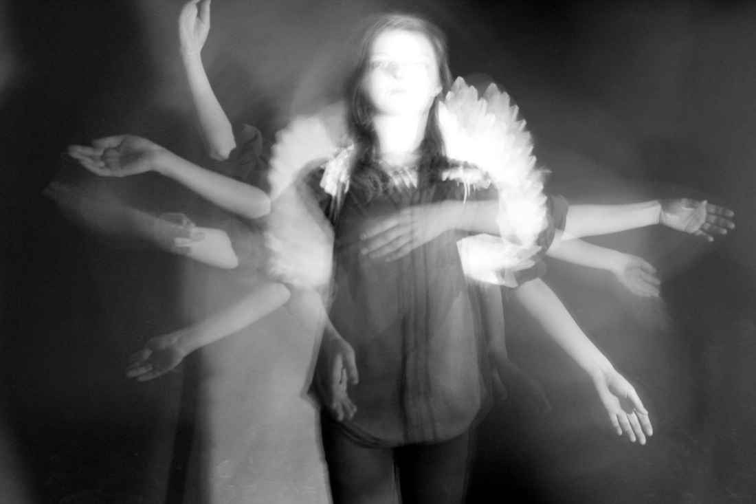
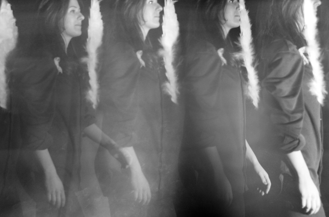
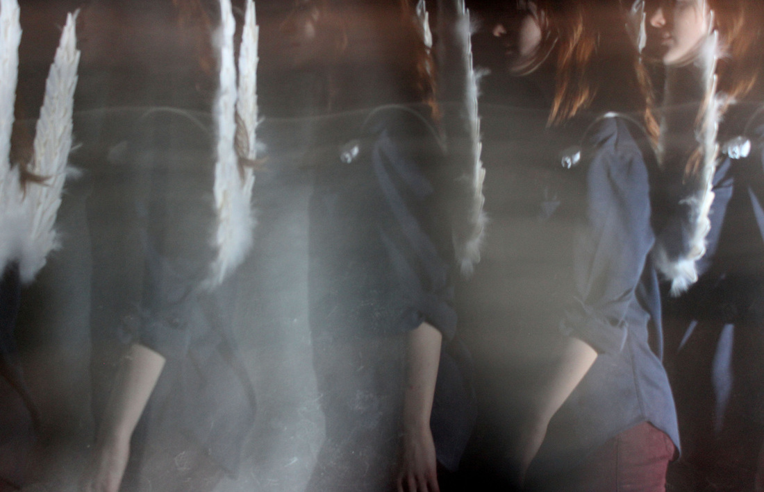
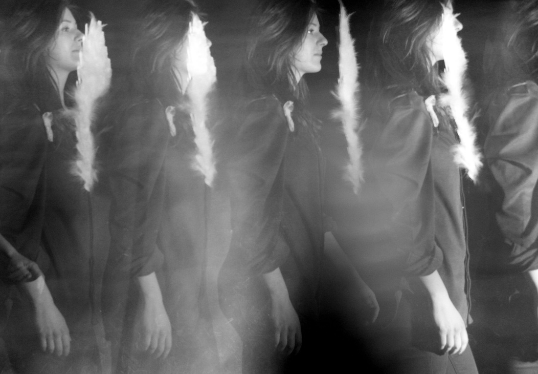
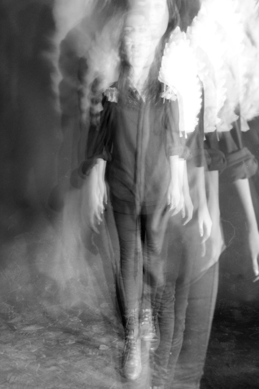
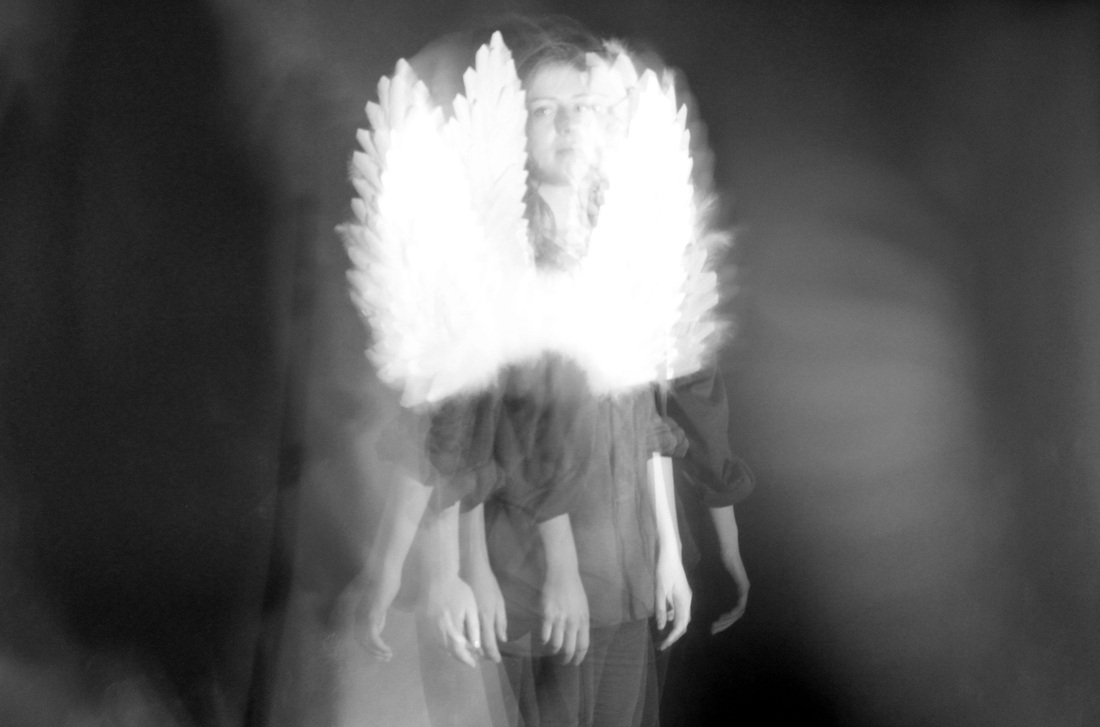
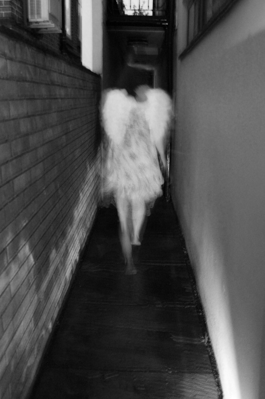
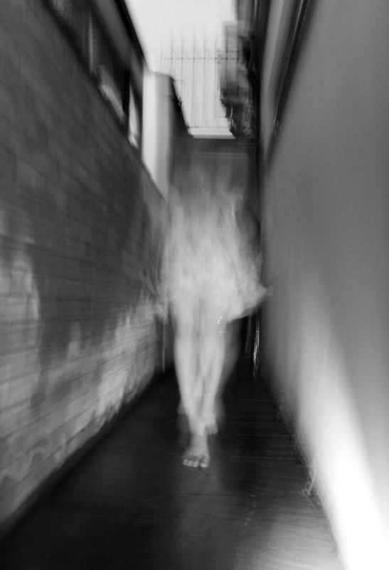
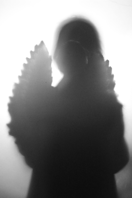
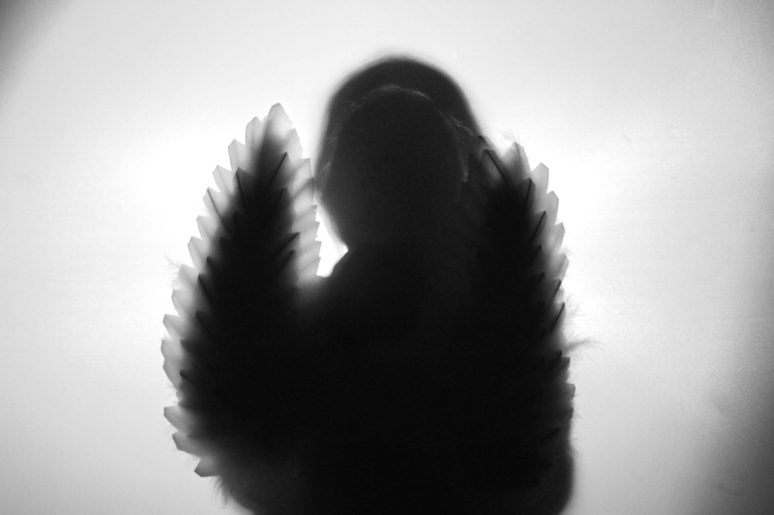
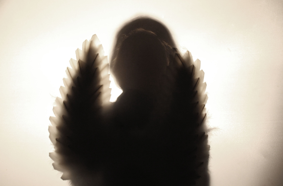
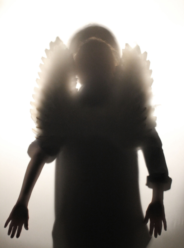
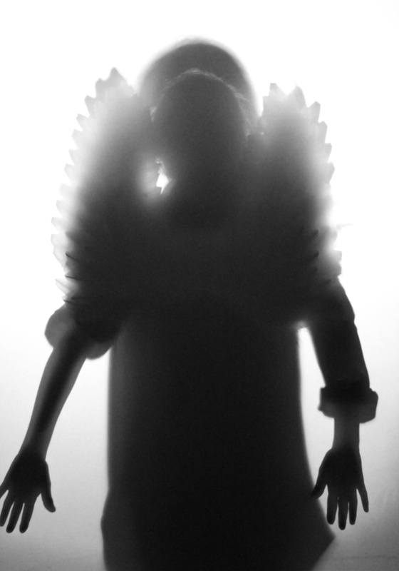
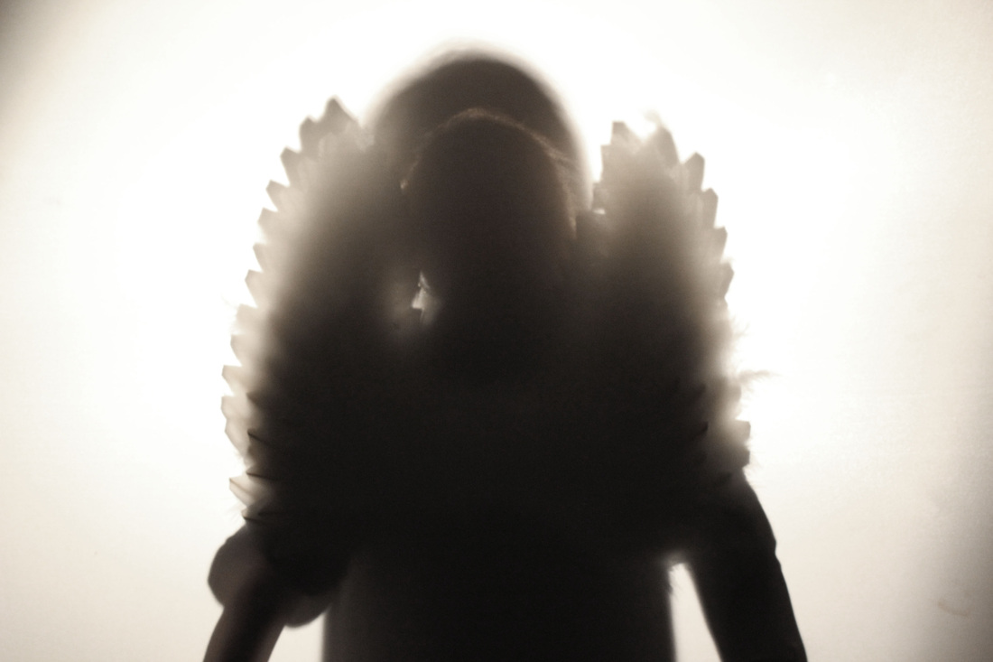
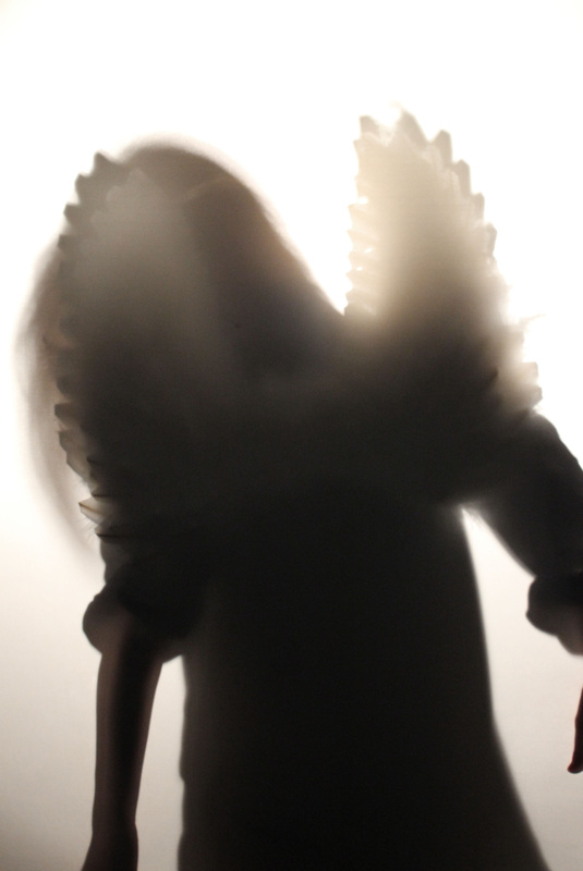
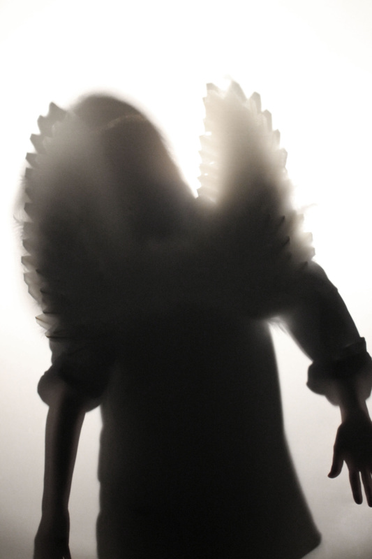
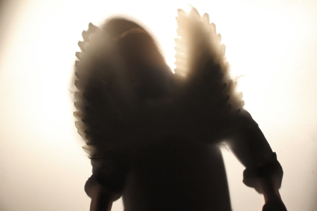
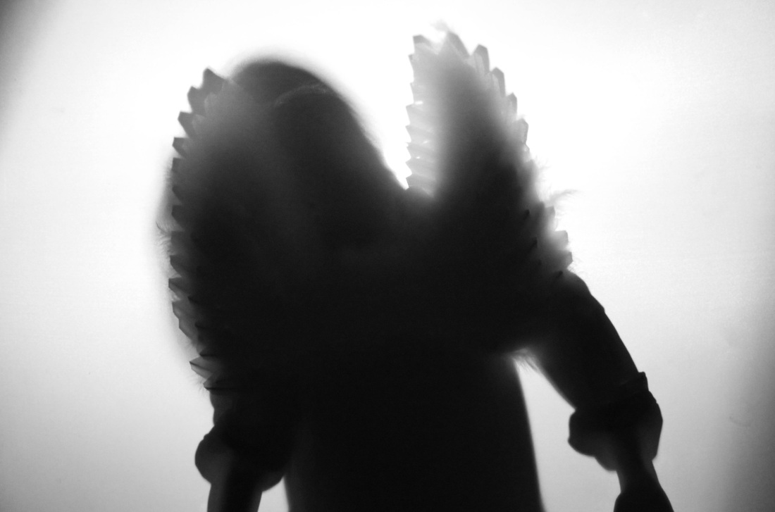
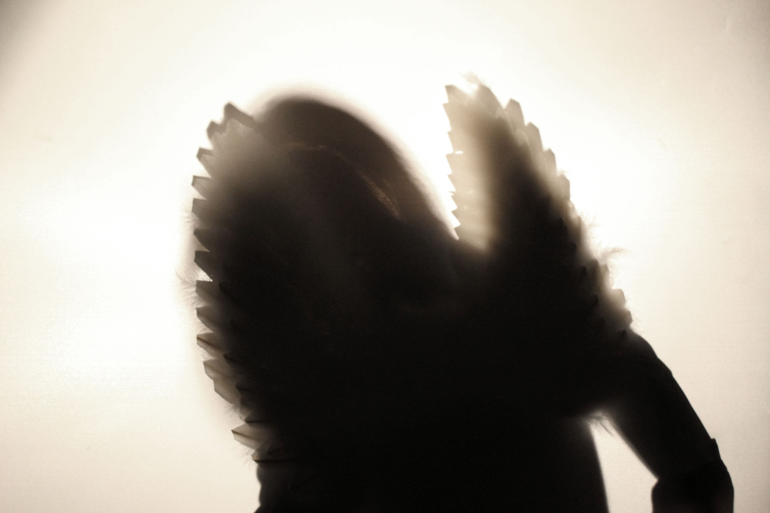
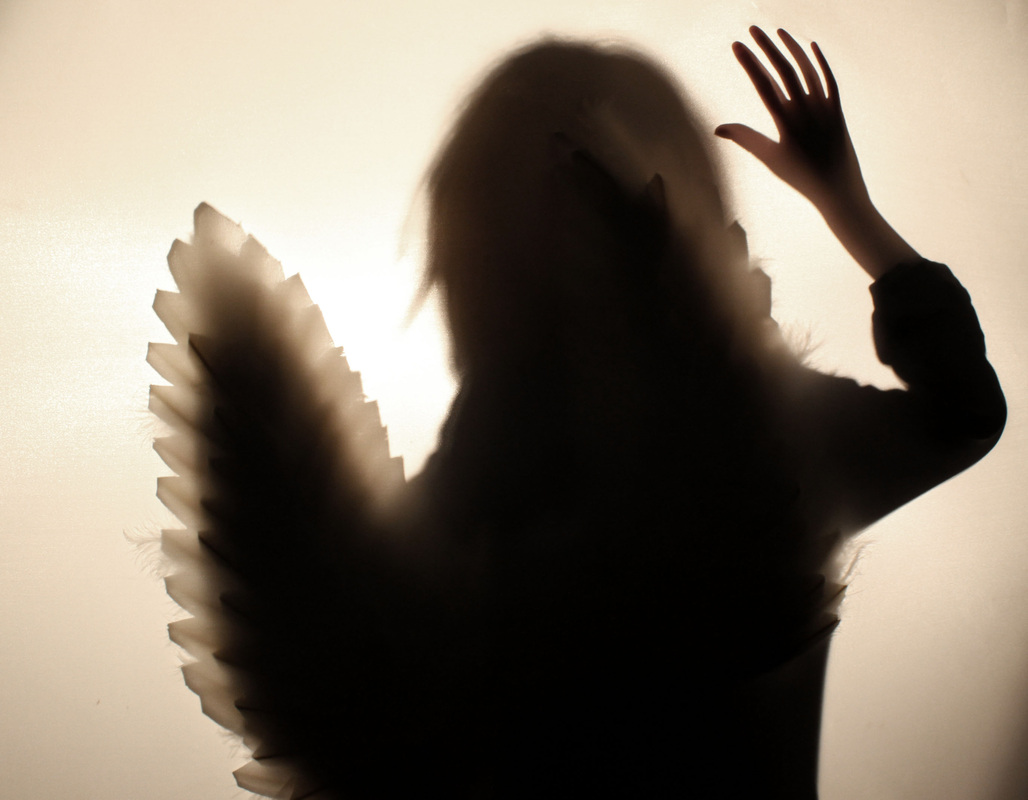
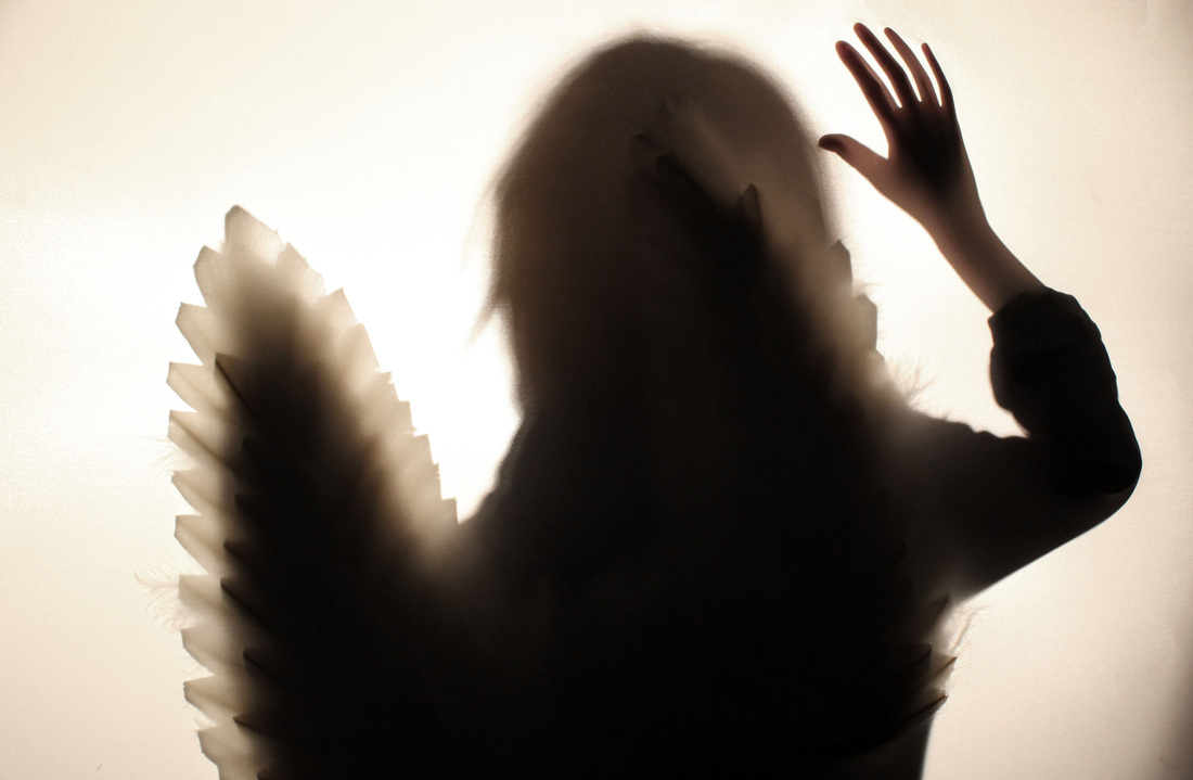
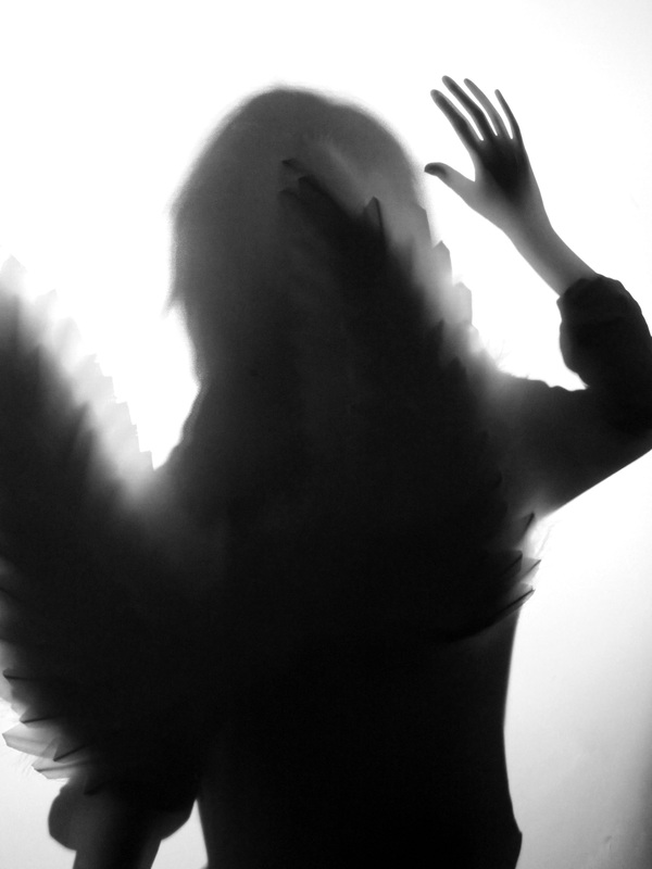
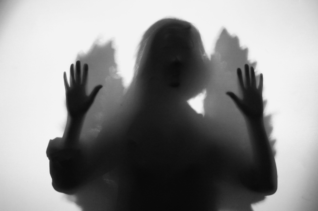
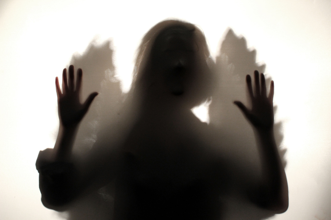
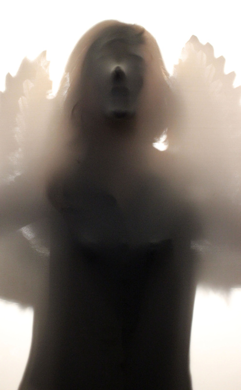
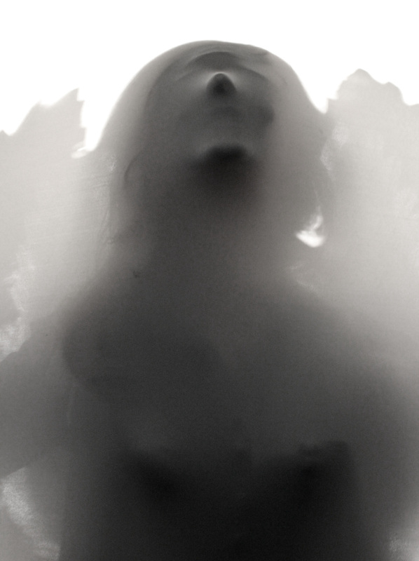
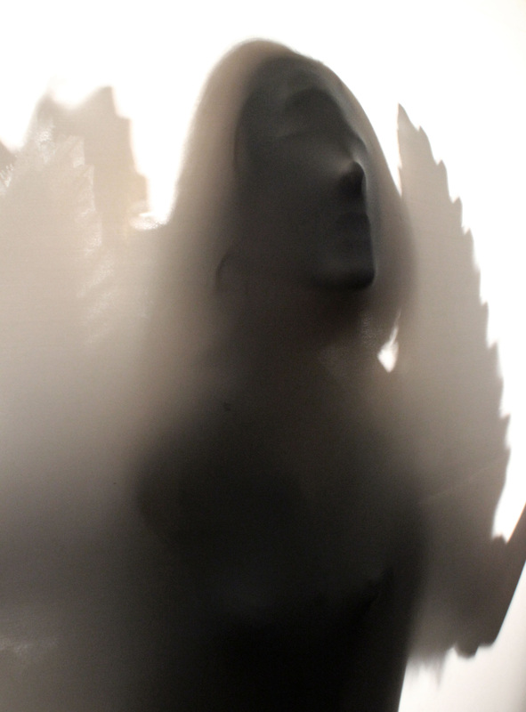
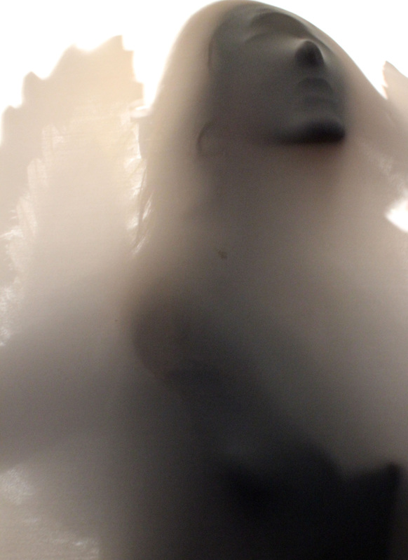
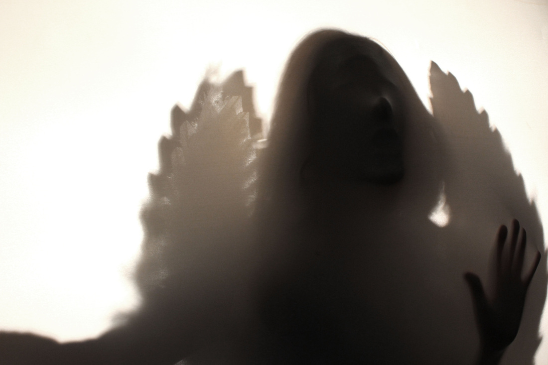
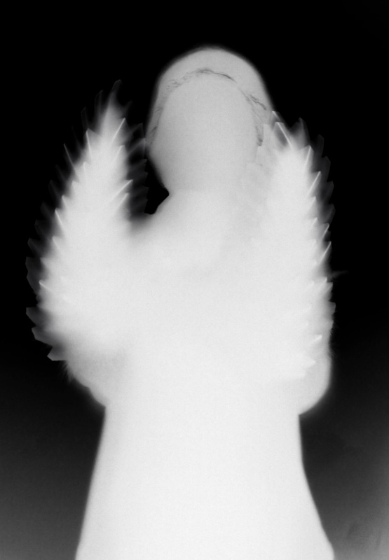
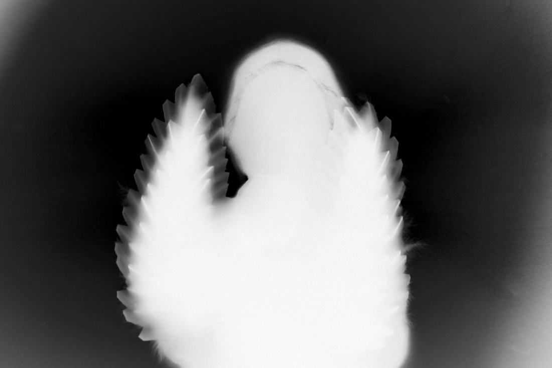
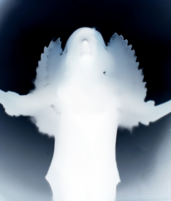
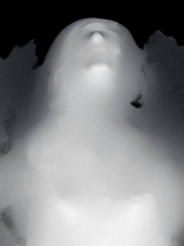
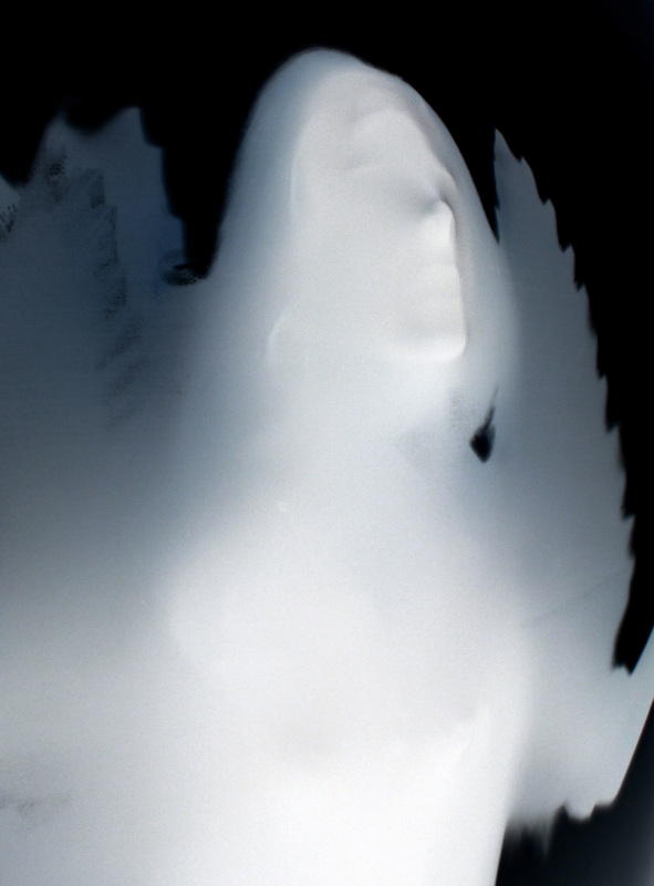
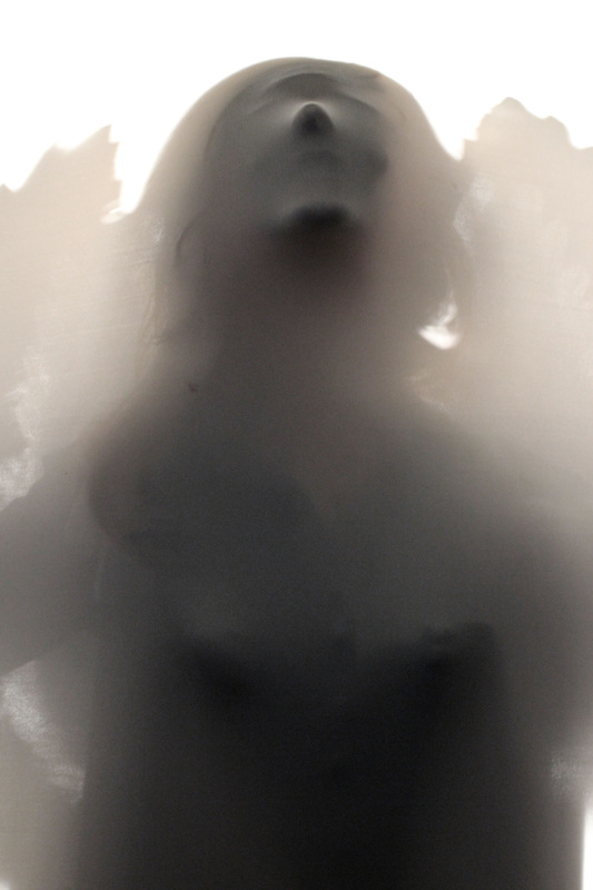
After watching Ed Sheeran's "Give me love" video, I was inspired to try and follow the same "fallen angel" concept within my Parallel world strand. I feel the concept links in well with the exam title, at the beginning, the girl is transforming into an angel, and then goes on to explore the world in this way. She is neither within one world, nor another, she is "In Between". Therefore I attempted to recreate the same idea with the use of angel wings as a prop. My images were set in the woods, to further enhance the feel of mystery that is created already by the wings. I chose casual clothing as with the Ed Sheran video, as I feel the highlights the idea of the angel being in our world. I feel the model looks rather peaceful in comparison to the highly detailed trees in the background too. I found the images looked the most effective in either black and white or with a low saturation as this effect enhances the mysterious/spooky element that is seen in Francesca Woodman's images. I also experimented using the the zoom blur technique I had previously learnt to enhance the angelic feel and the isolate the model within the image. I like how it adds to the parallel world theme and almost gives off the effect that the world in spinning around her. Whilst I feel that the location was successful, I am not overly impressed with how these images turned out. Firstly, I feel that the fact the images were taken at day time takes away from the mysterious feel as we can see far into the distance which just isn't spooky.I think next time I will take my images at night to ensure this mood is created. Secondly, I feel the models clothing was unsuccessful. The dark jeans stand out too far against the background, drawing all our focus onto them. Instead, I could use a flowty dress which ties in with the angel feel. I would also change the location as although I do like the etherial look created, unless they're taken at night they are just not effective. I'd shoot my next images different location to one similar to the one in the video, a slightly dark and almost dirty one like an alley way or dirty, empty room, just like in Woodman's images. I would also like to add movement using the strobe light, thus combining techniques of my parallel world strand and my movement strand. This will enhance the ghostly/ spooky feel of the images as it does in Woodman's images. |
Edited image selection.

Experiments in Photoshop
Invert.
Invert.
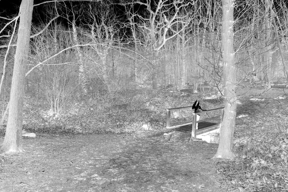
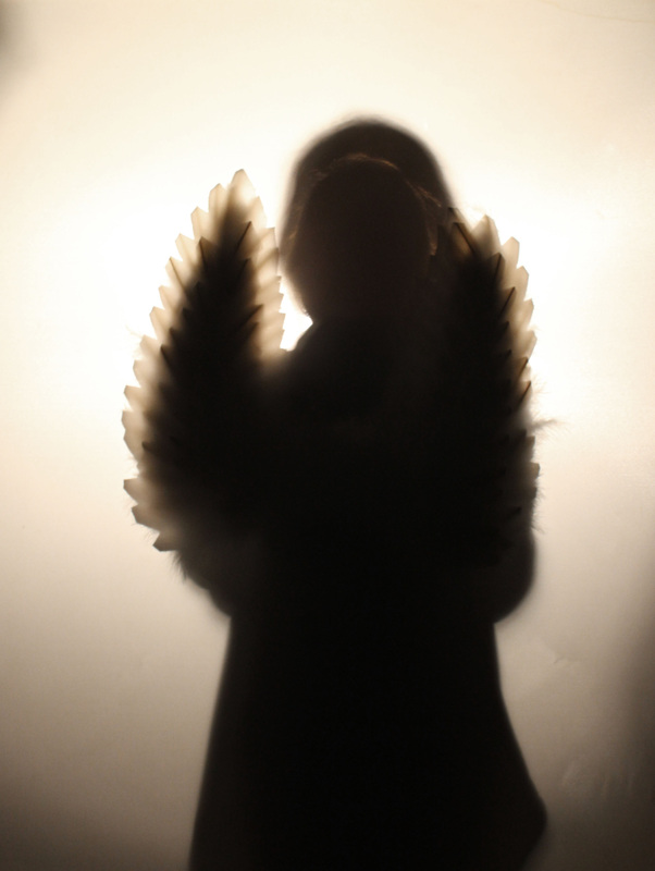
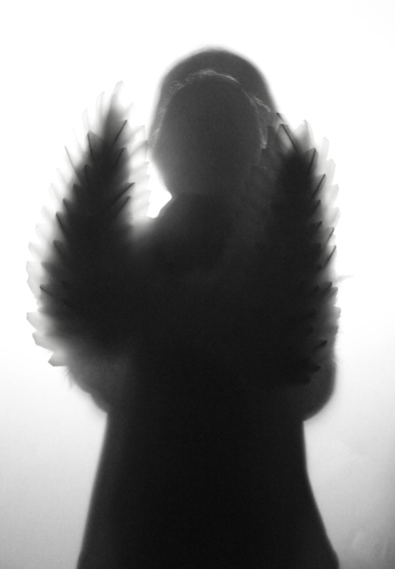
Whilst some elements of my angel in the woods experiment were successful, I feel that their was not a huge sense of mystery created as well as the mood not being exact due to the time of day and lighting. I decided to play around with ideas in Photoshop and attempted to enhance these feelings. I applied an Invert layer to the images, this gave them a much darker feel as well as creating a type of "paranormal activity" feel. I especially like the lighting trees contrasting against the dark sky. Even though I feel there is still a lot more I could do with this idea, and this is in no way a finished article, I am glad I experimented with the technique and wish to use it in future sets to enhance the surrealism that I want to achieve.
Parallel World combined with Movement.
(Strand two & Strand three)
Bragalia.
(Strand two & Strand three)
Bragalia.
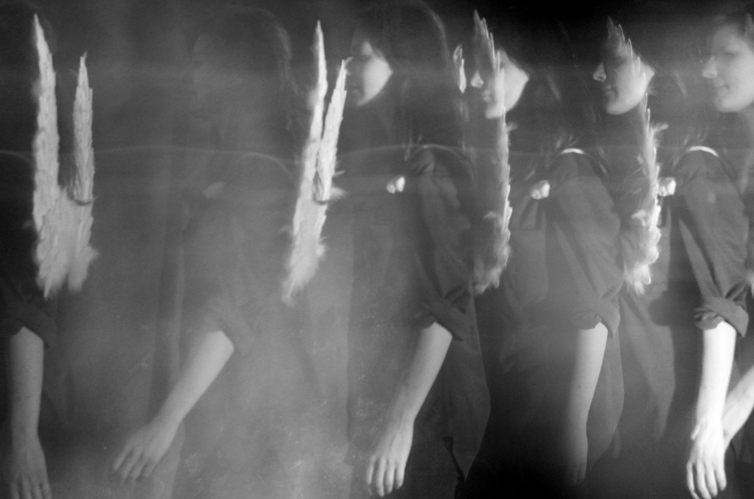
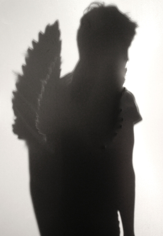
After experimenting with the angel wings, I wanted to combined both my movement strand and my parallel world strand as I feel there is potential in both themes.I found Bragalia's work and was really inspired by the spooky, almost out of body effect they convey. This is also the case with a lot of Francesca Woodman's images. Anton Giulio Bragalia is an Italian photographer known for his futurist style at the time and I was really inspired by how his images look ghostly and as if something is taking over the individual's body and actions. I'd like to enhance my parallel world images with this concept, long exposure, and experiment with ways in which it can enhance the angelic feel of the wings. I predict that the images will be successful in creating a light and peaceful feeling.
|
|
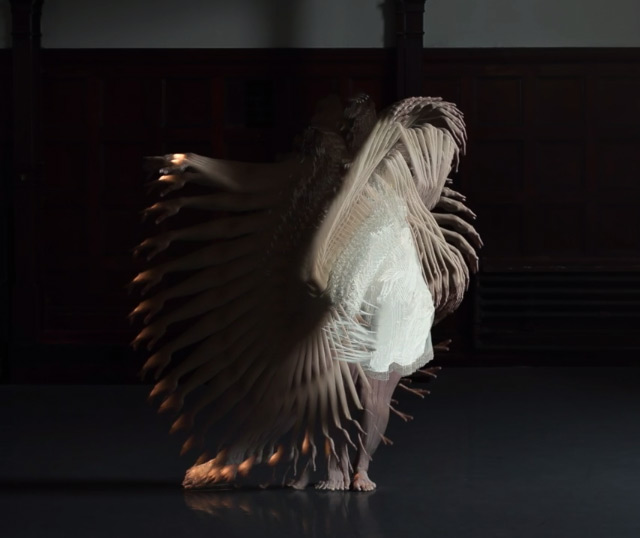
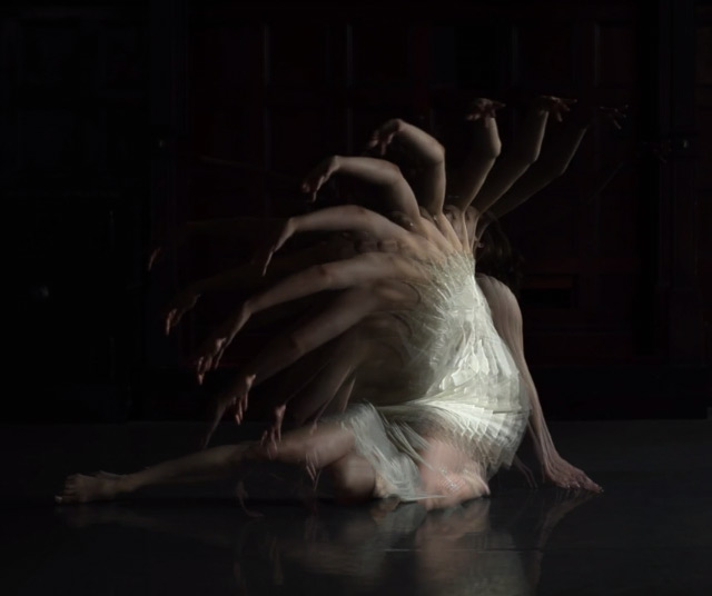
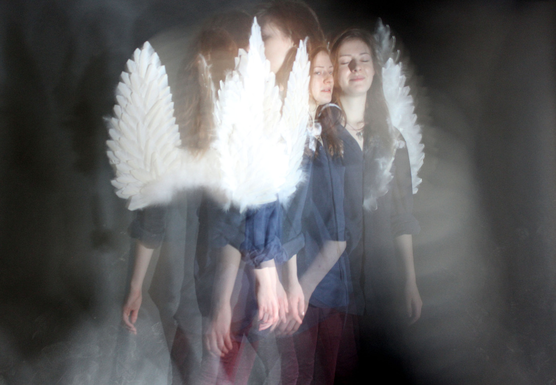
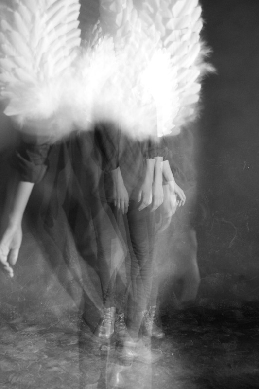
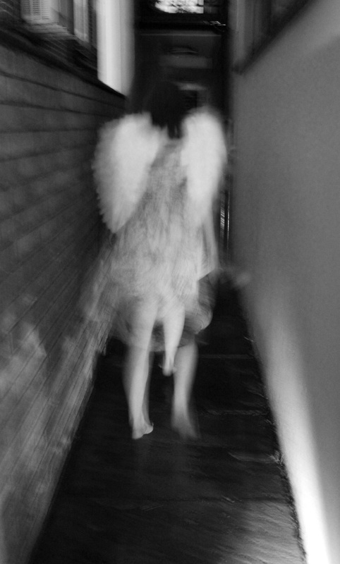
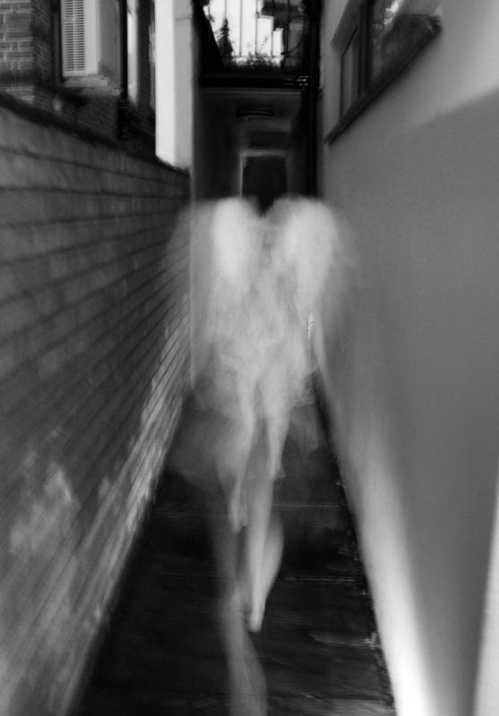
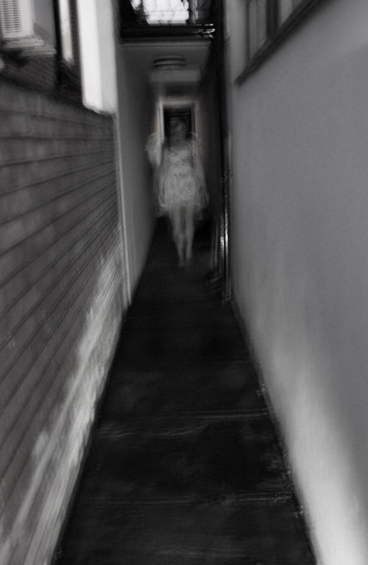
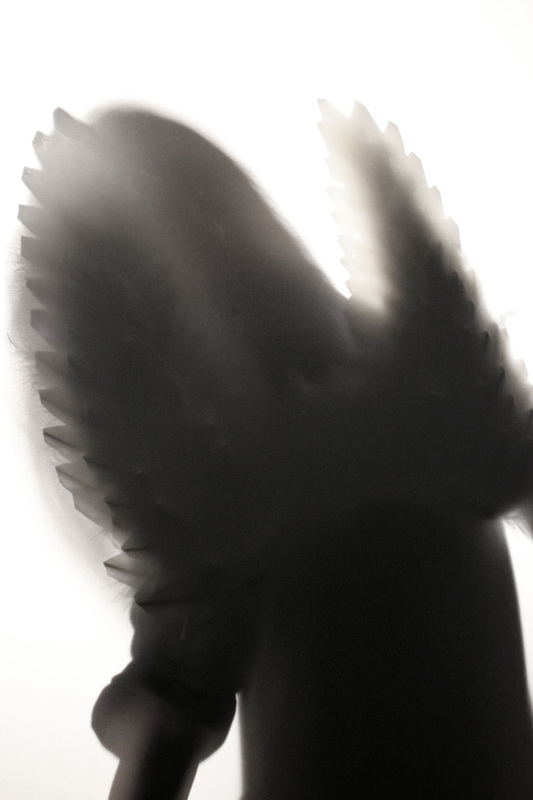
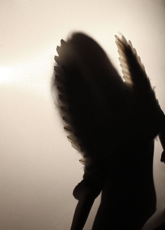
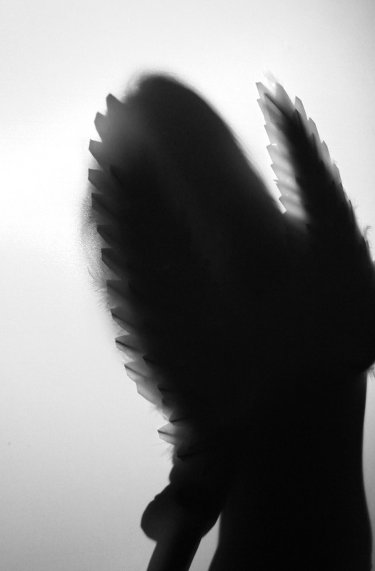
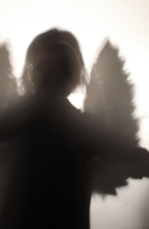
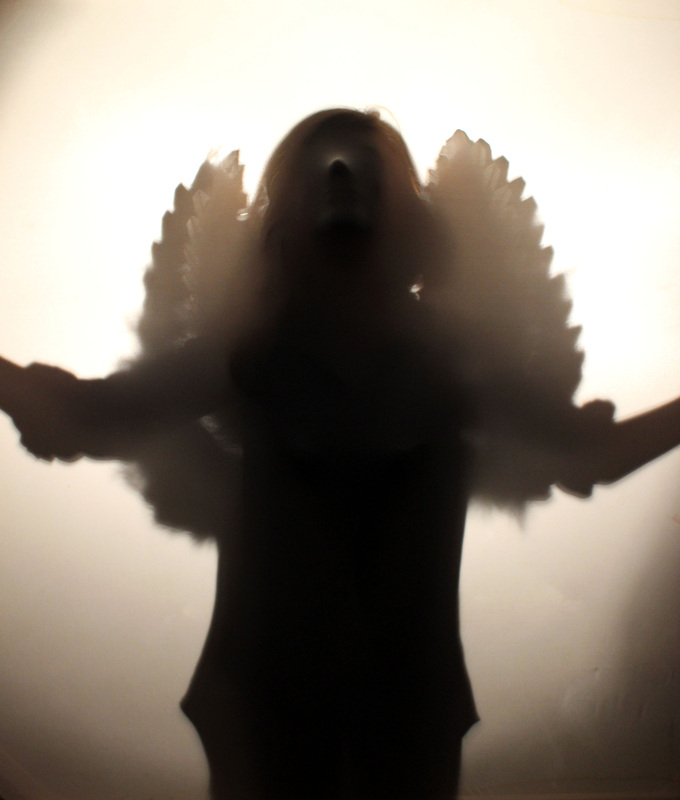
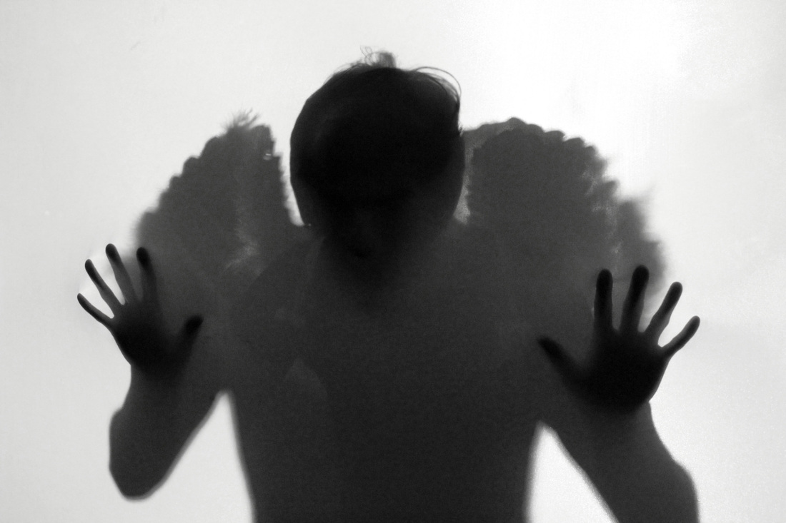
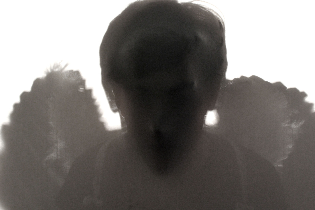
After my first experiment with the angel wings, I wanted to attempt to combine the use of props within the use of long exposure and strobe lighting. I thought the combination of the angel wings and the ghostly movement would prove effective due to the surreal effect given off through the almost transparent nature of the images. This proved very successful and I am very happy with how the wings look after several layers placed almost on top of each other. I am especially happy with the images that feature the model walking either from side to side of the shot, or away from the camera due to the idea of the angels journey being enforced. The majority of the images are in black and white due to the dark and mysterious feel the effect creates. I also feel it diverts attention away from her clothing and onto the wings which look effective next to the black background due to the comparison in colours. Whilst the subject and effect worked out as I hoped, I feel that the location and plain backdrop didn't. This was down to the wings being such a strong prop that just didn't look effective in a studio set up. For my next attempt, I will add a back drop such a a dark alleyway/street, empty room or perhaps revisit the woods but this time at night, as mystery wasn't created in my last attempt due to the lighting. I feel by adding changing to a much more surreal environment, I will be able to truly enhance the mood I want to create. I will also attempt to take the strobe technique into these environments, as I like how ghosting she looks and feel the technique has been successful so far. To make this effective outside, I'd have to focus on the lighting, making sure its dark enough to capture each individual movement from the strobe.
|

Further development.
Use of strobe with a natural backdrop.
Use of strobe with a natural backdrop.
|
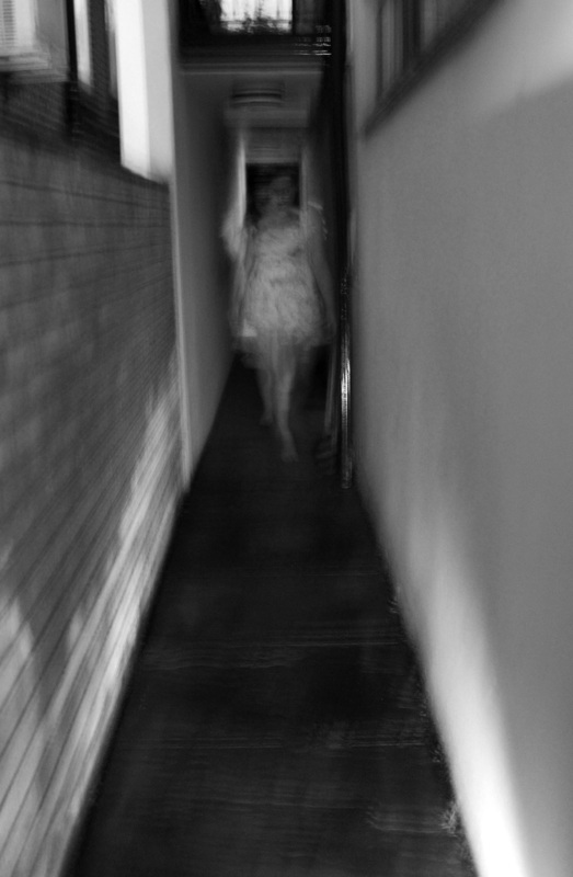
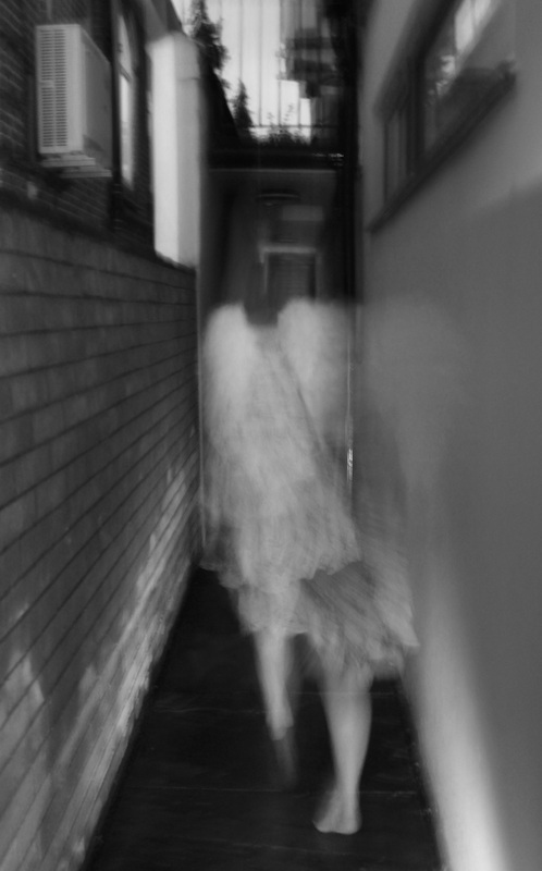
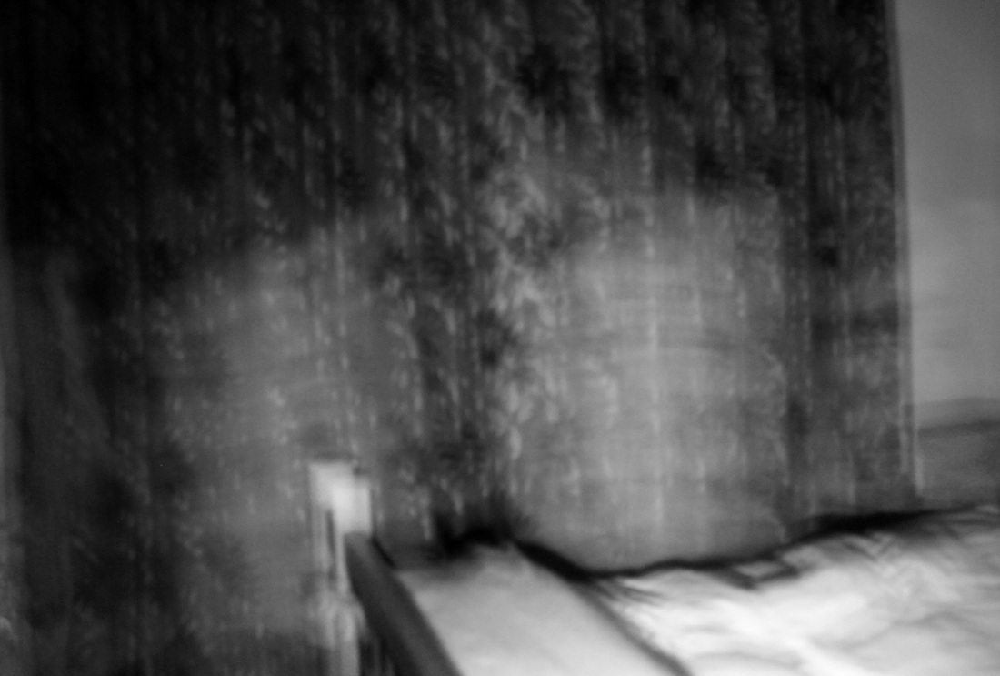
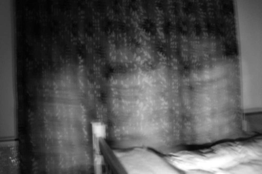
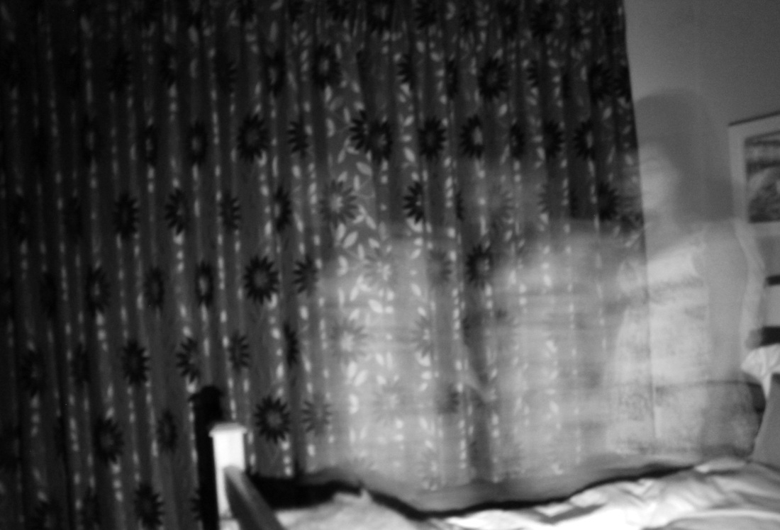
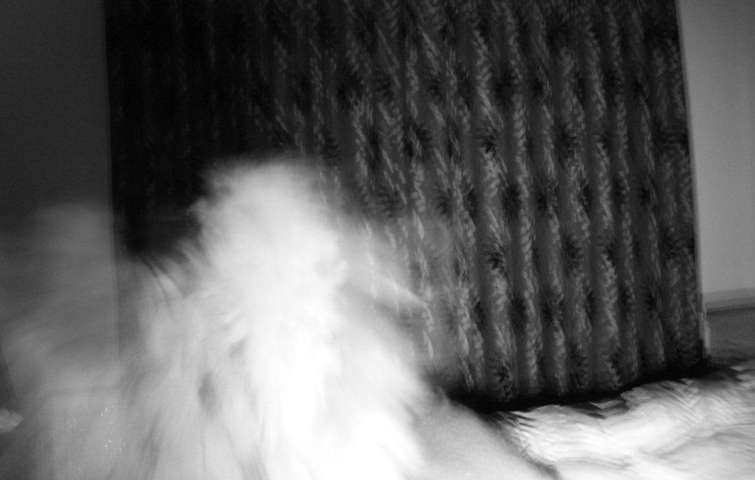
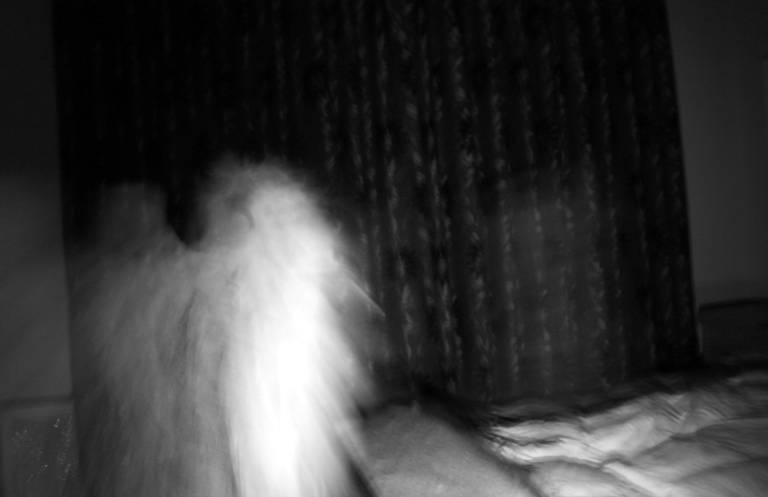
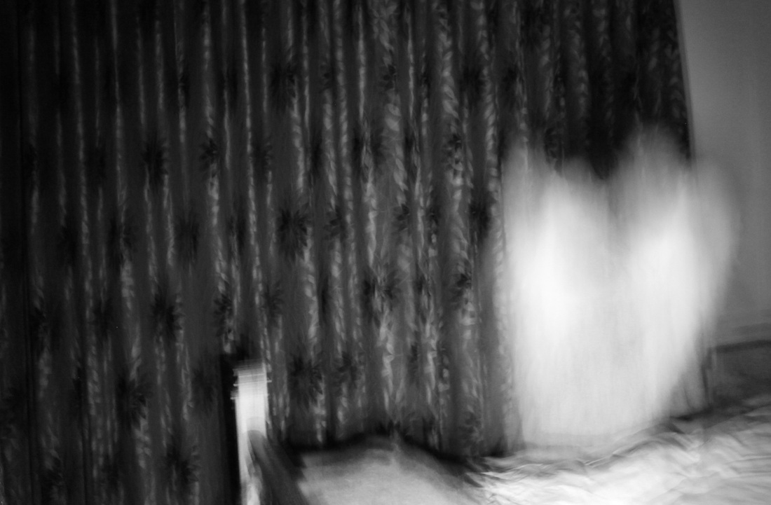
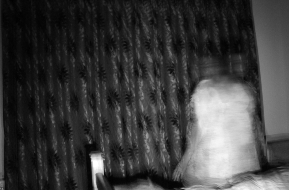
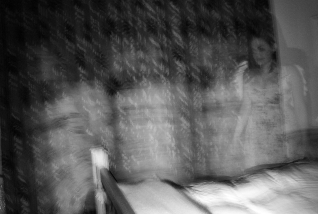
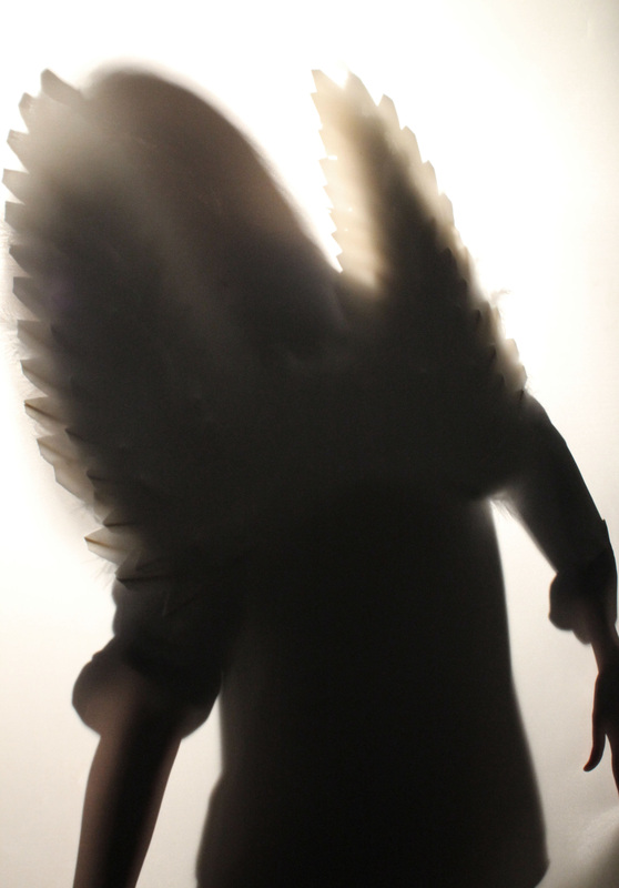
After experimenting with the angel wings and the strobe light/long exposure in the studio, I decided to take the concept outside and place the model in a natural environment to further heighten the mysterious mood created by the wings and ghostly look from the blur in movement. I experimented with an alley way and a bedroom, both with no lighting so the strobe would be at its most effective. I'm really pleased with how my images turned out, especially after manipulation in photoshop where I completely reduced the saturation to enhance the mystery feel. The set with the model in the alley way were effective as a large range of movement was created through the model walking backwoods and forwards. By changing the models outfit to a flowy dress in comparison to black jeans made a huge difference in the ghostly look of the angel. The most successful images of the alley way set were the one taken from a lower angle, and even though the wings were not always in shot, the look of the bare feet next to the dark, wet floor created a really nice etherial effect. I also took a set of image inside, with a bed and curtains in shot to enhance the effect of the ghost effect. Again, I am really pleased with how these images turned out and feel they are the most like Francesca Woodman's images than any of my others as in some, you can hardly make out the model's features, just the movement.
|
|
Parallel World (Part 2).
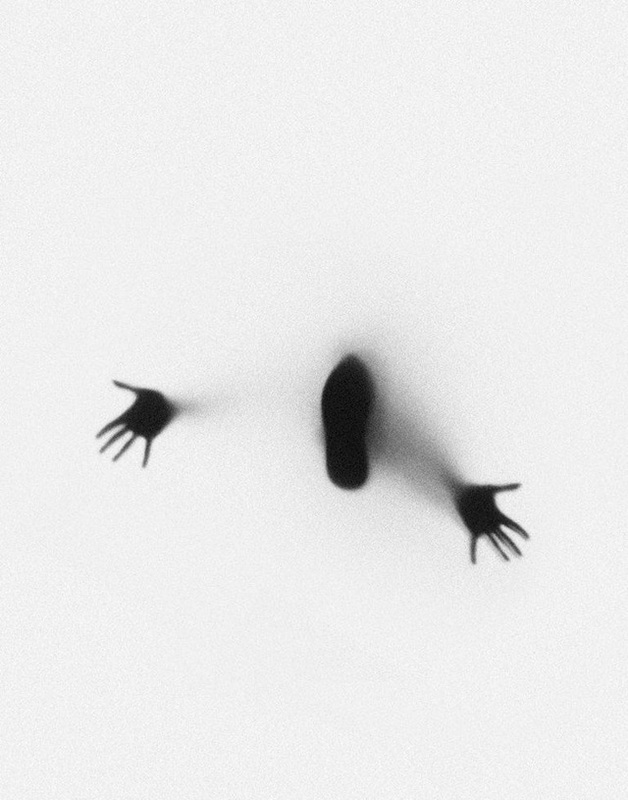
The inside trying to get out.
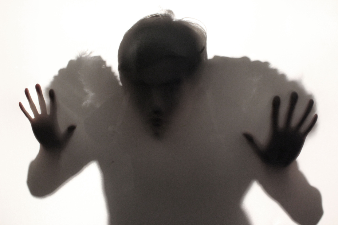
Julien Palast.
The inside trying to get out.
Julien Palast.
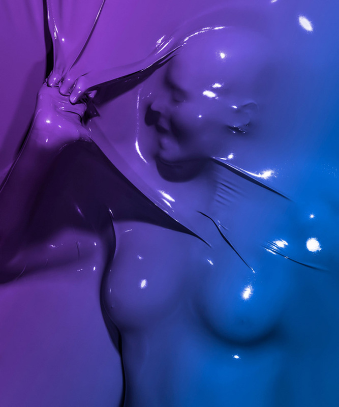
Julien Palast is a french photographer who's set "skin deep" relates perfectly to the exam brief due to the struggle created from the model pushing against the plastic sheet. This gives off the effect of somebody inside trying to get out. The rubber used looks almost liquid-like and it almost appears the model is drowning underneath the liquid.The way in which Palast creates shadow around the models body really emphasises the look of the model pushing against the plastic, or even attempting to push through. However I feel that this concept is contradicted by the bright colours used, as the images do not look quite so sinister as they wood if they were in black and white. However a spooky feel is still created through the model's facial expressions and the defined features showing through. I feel that as a set, these images look really effective next to each other due to the strong, contrasting colours. In some ways, I feel these images explore the idea of being entrapped, and unable to escape from a certain part of your life. As well as this, the way the figure is so detailed under the plastic that we get a chance to appreciate the human form more without our preconceived perceptions on skin colour and appearance. This is also achieved through the distortion of the face and figure. Overall, I feel that Palast's images are really effective in projecting the exam brief and I will now go on to experiment with the same concept used.
|
|
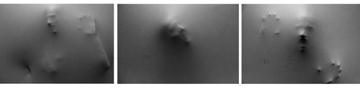
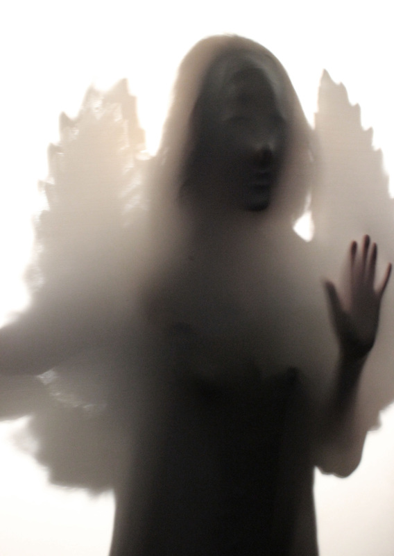
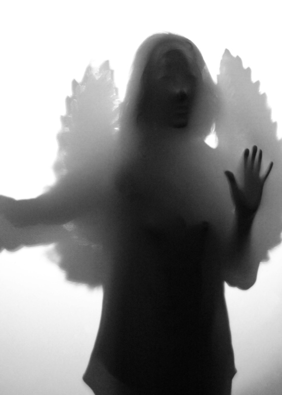
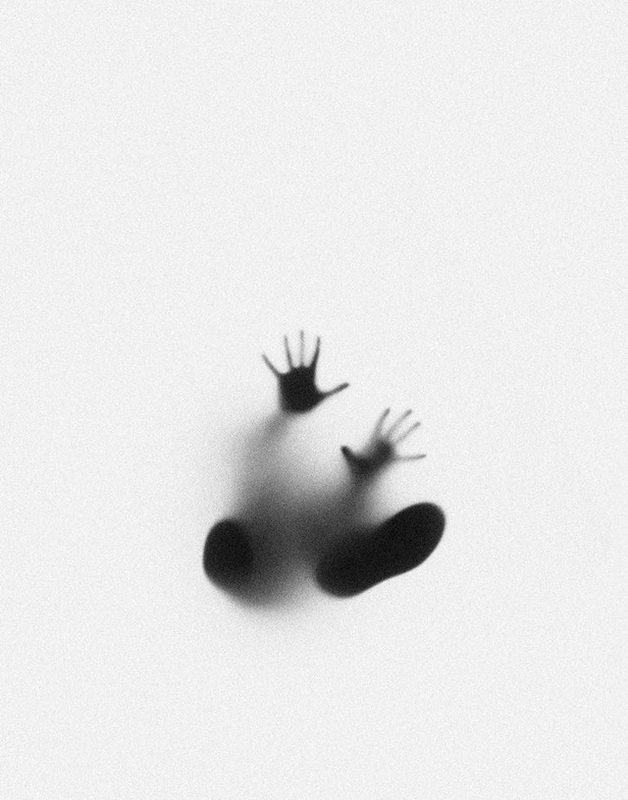
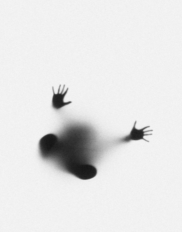
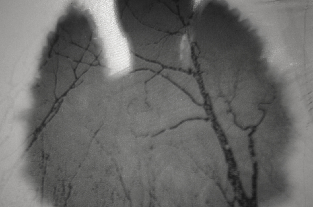
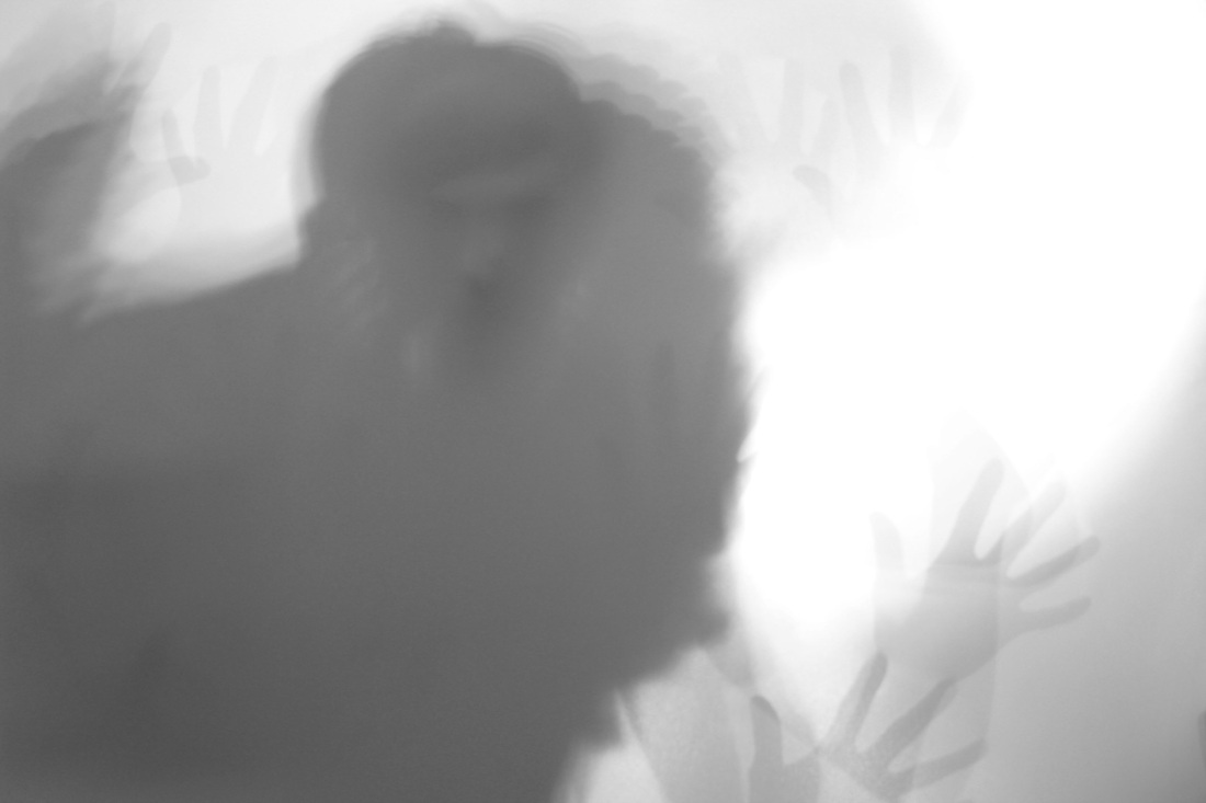
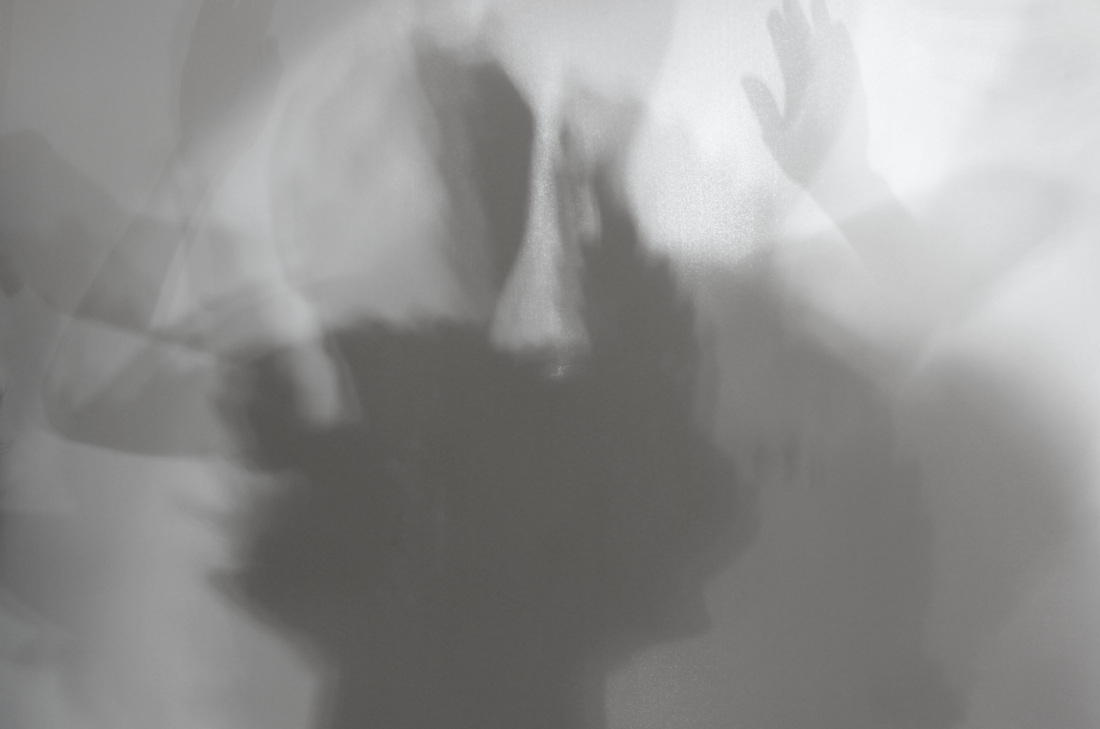
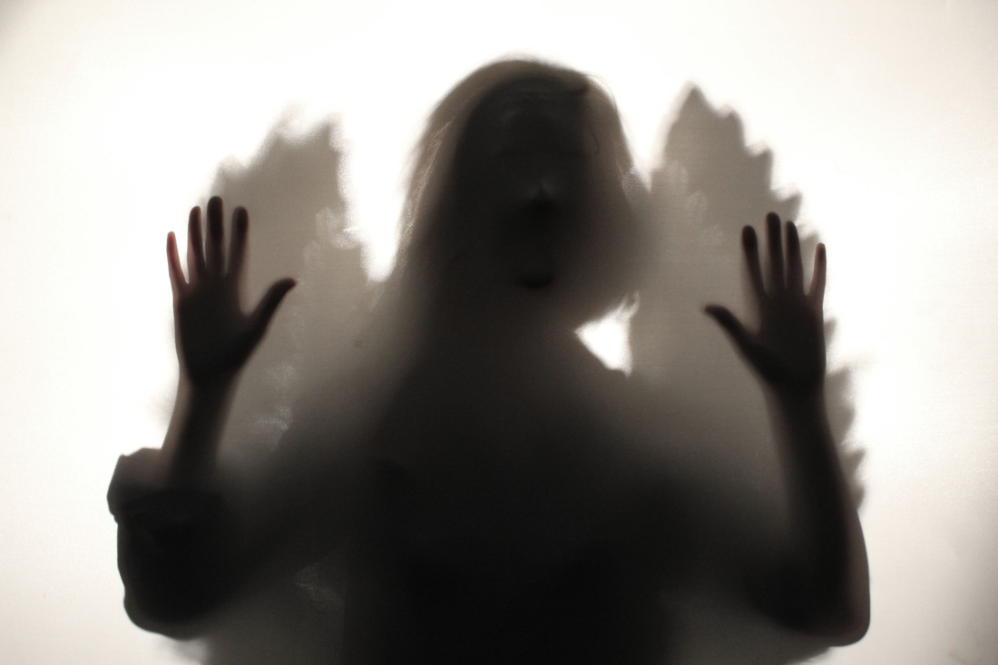
As a separate part of my "Parallel World" strand, I experimented with a tight piece of fabric over a frame and had my model made shapes and faces underneath it so the outline showed through the opposite side, similarly to Julein Palast's. I didn't have many expectations for this shoot as I was just experimenting with a new technique. However, I am really pleased with the outcome as they look rather dark and spooky. The concept also fits in nicely to the brief of "Inside, Outside, In between", as it appears the subject is struggling to get out. I also like the shadows in the images, as they really add to the 3D effect. If I was going to improve this set I would pay more attention to the lighting, as I hardly even used it in this first experiment. To further improve I could light the screen from behind and almost create a shadow of the face. I would also have more than one model in the shot to add to the mysterious feel, or layer several images over one, to enhance the movement element. This would also tie in nicely to my movement strand. Similarly, I could combine the set above with this set. So I would incorporate the angel wings within these images, having it appear as it the angel is struggling from the inside trying to get out, almost as if they are transcending boundaries.
|
Further response.
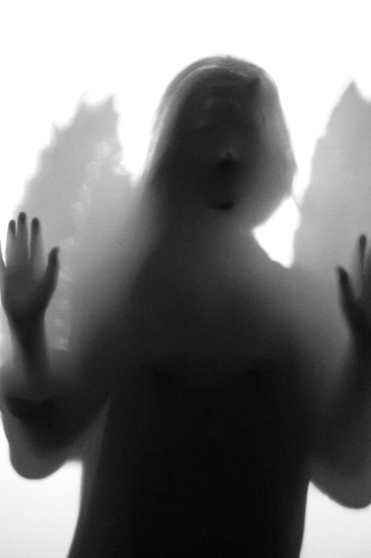
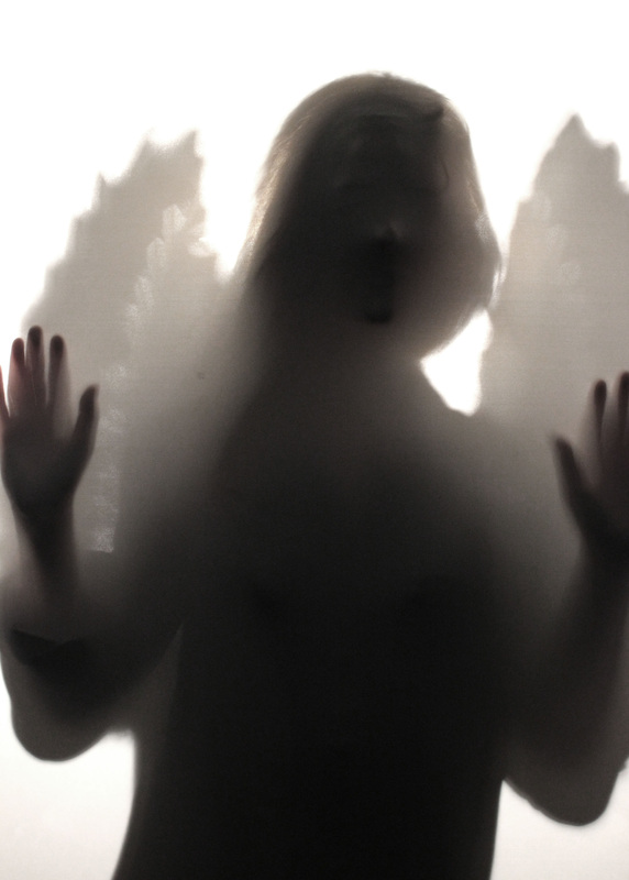
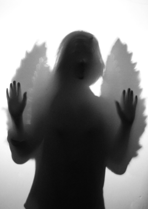
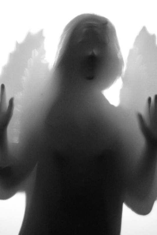
Parallel World.
Parallel World.

|
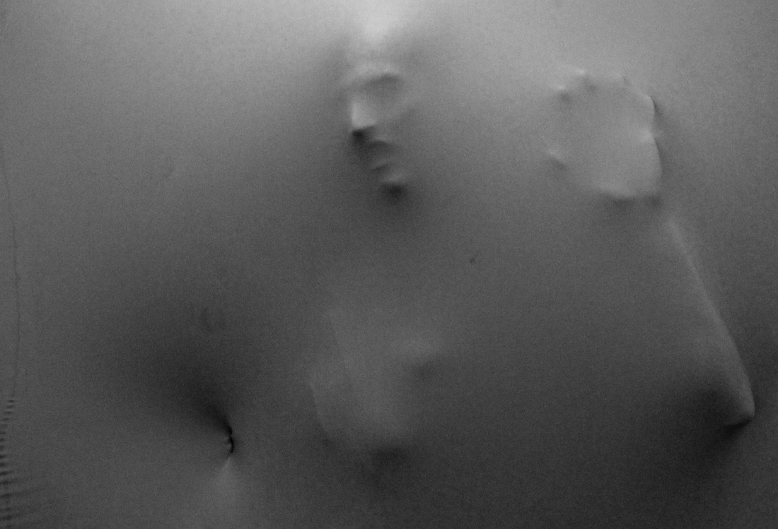
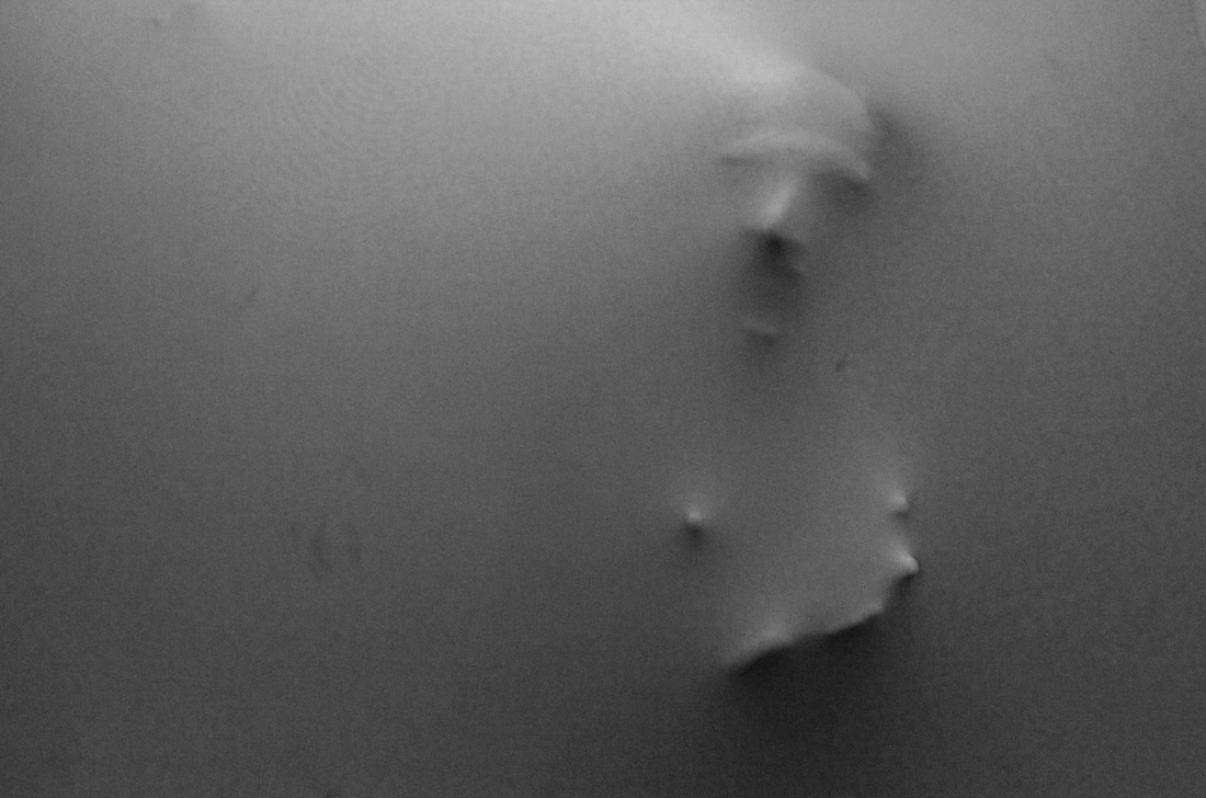
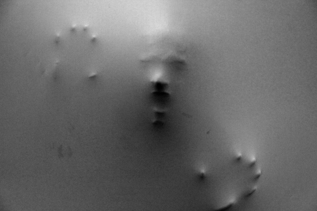
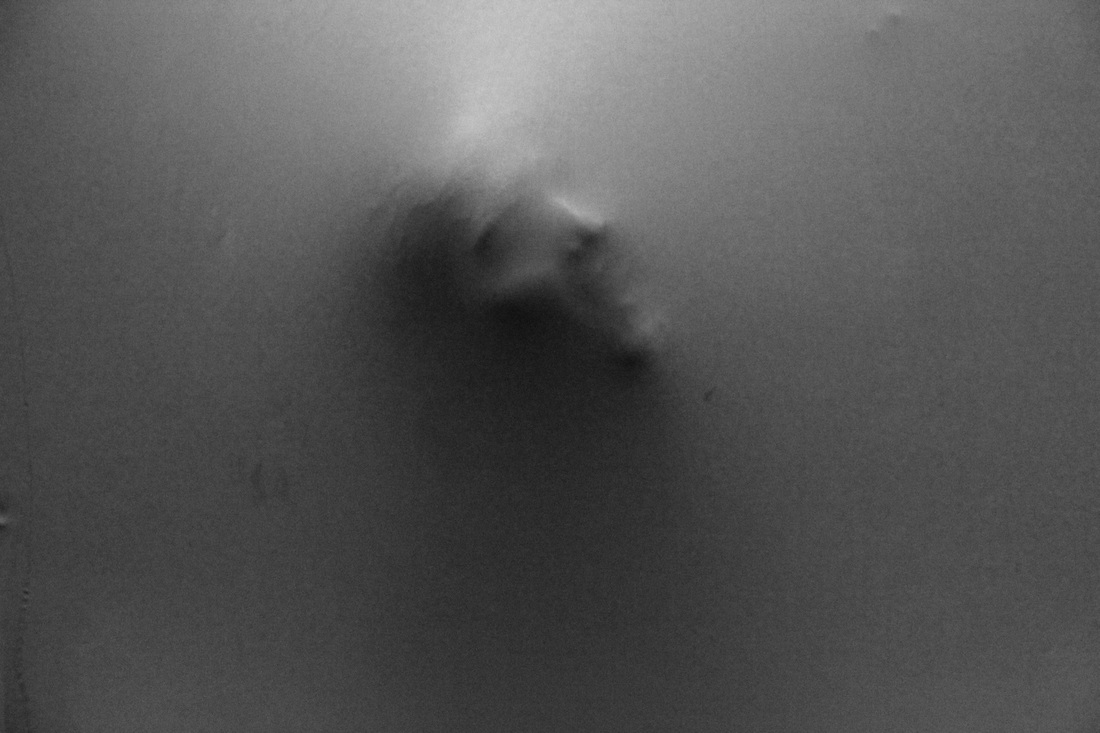
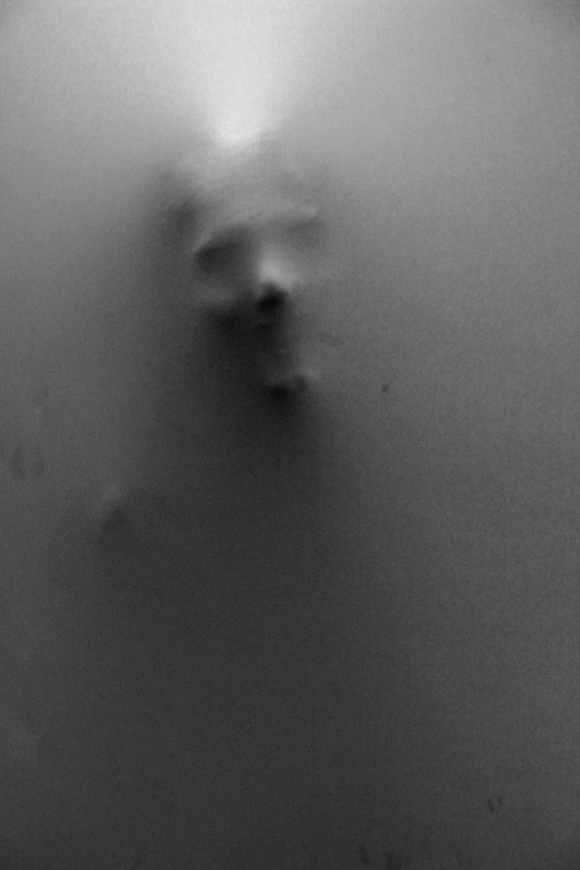
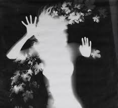
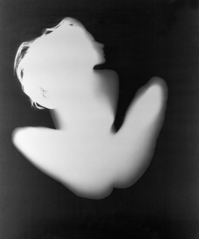
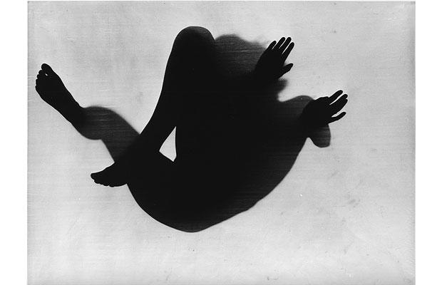
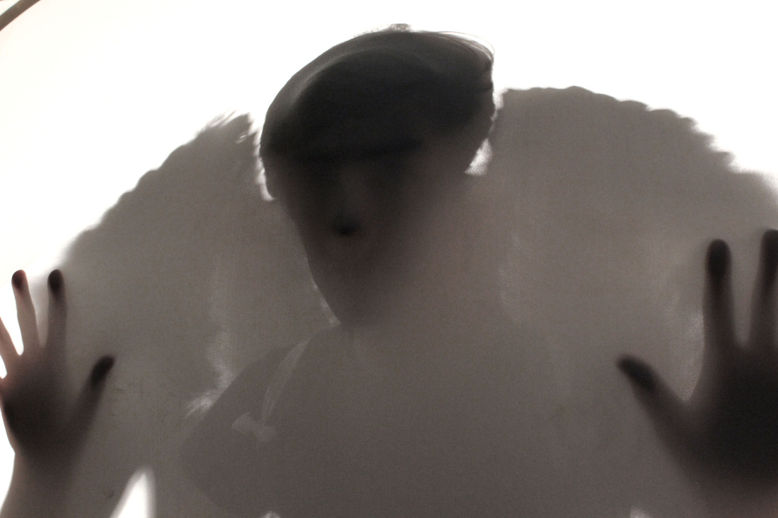
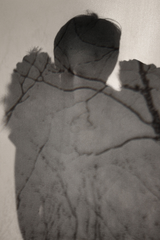
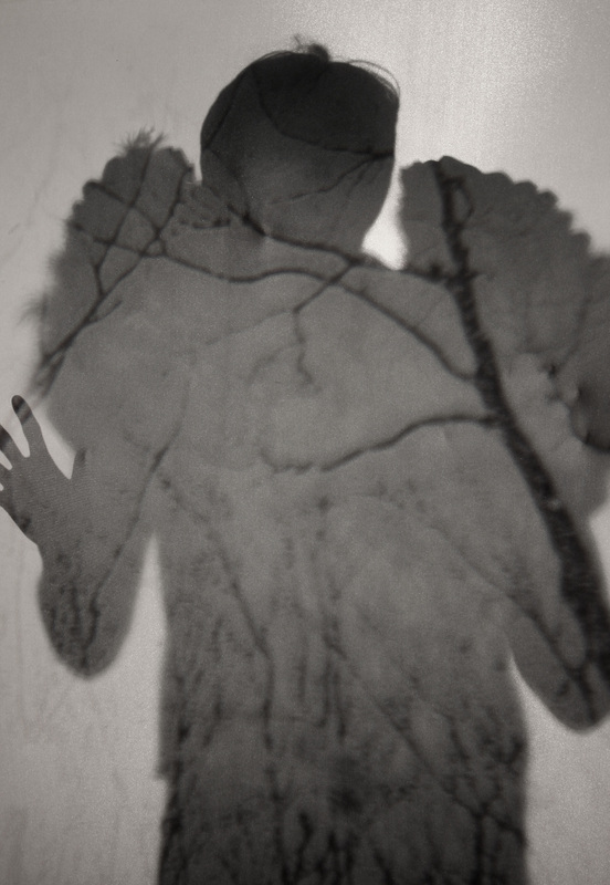
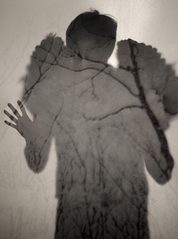
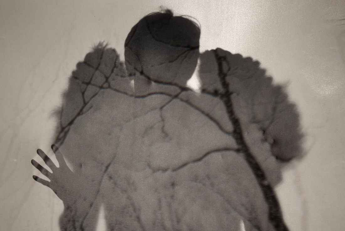
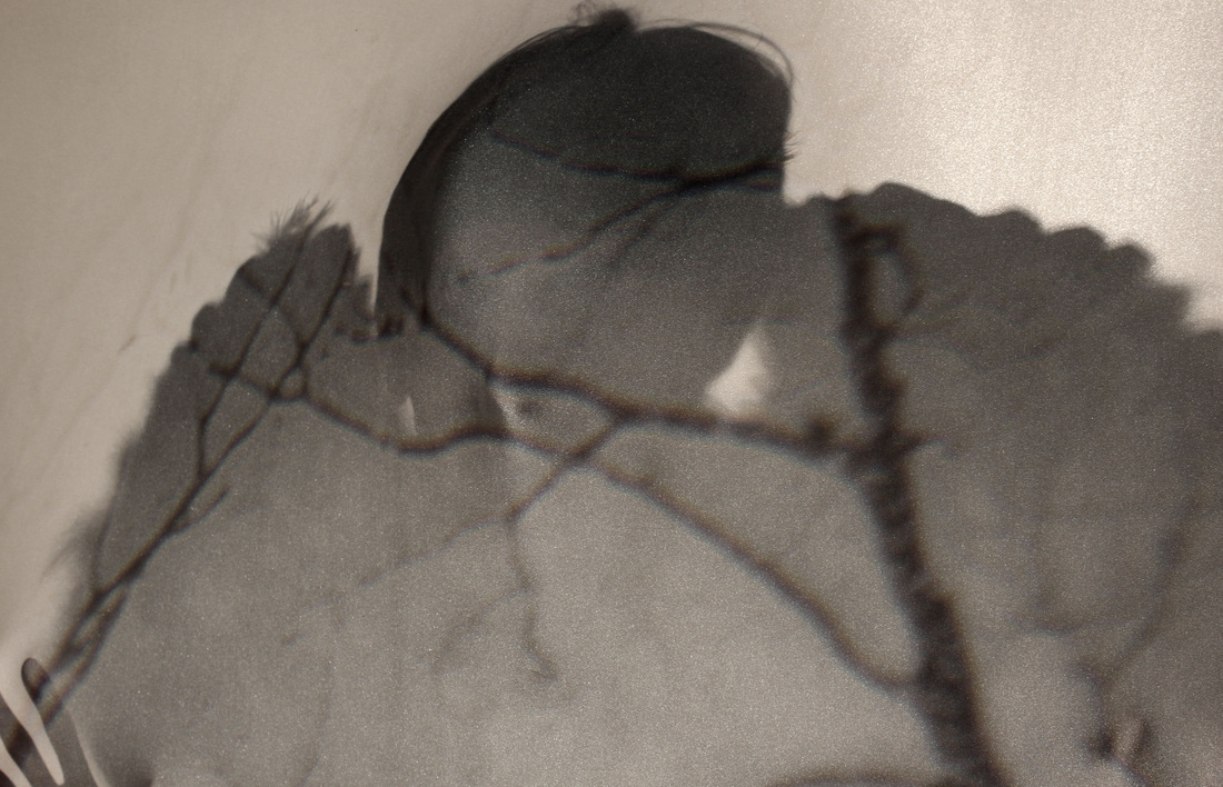
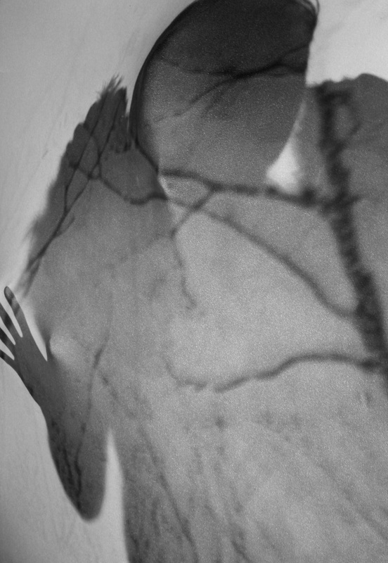
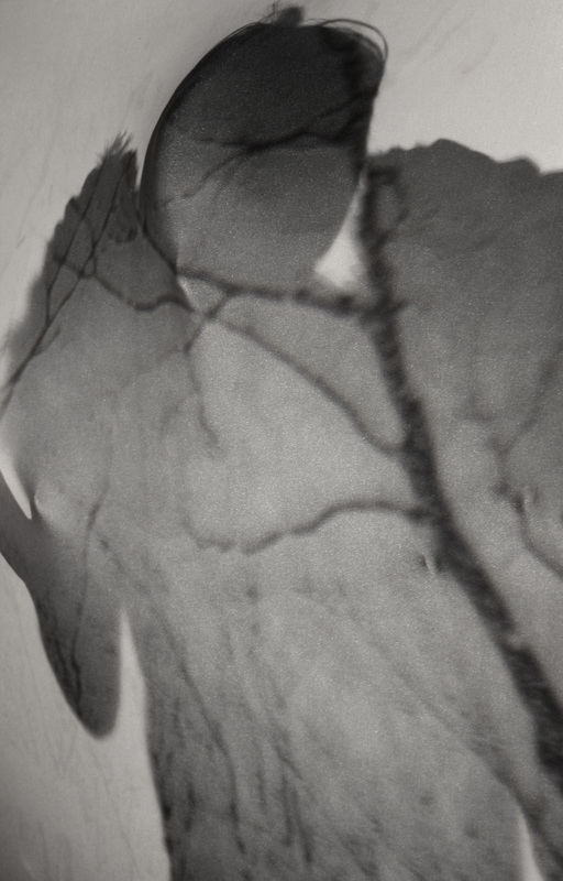
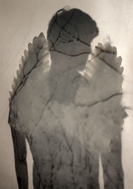
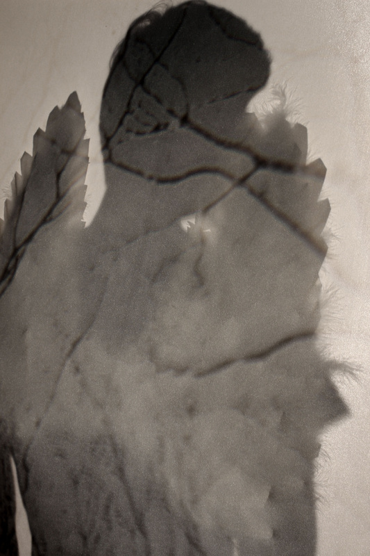
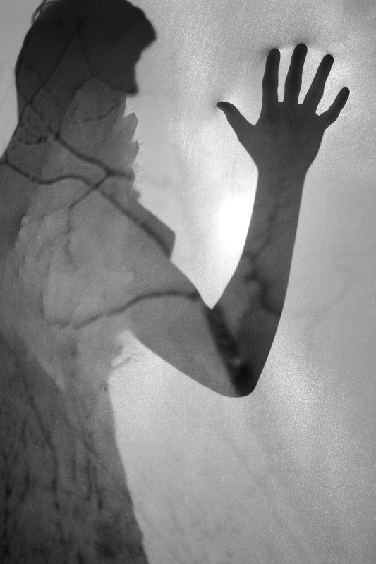
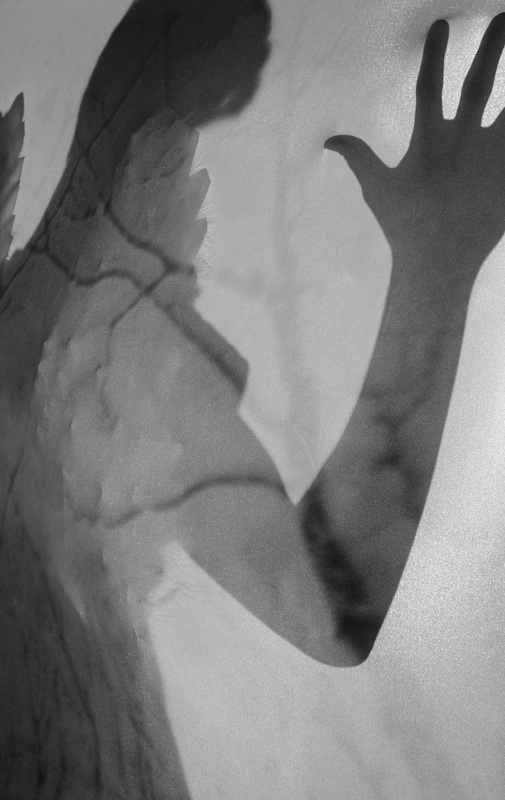
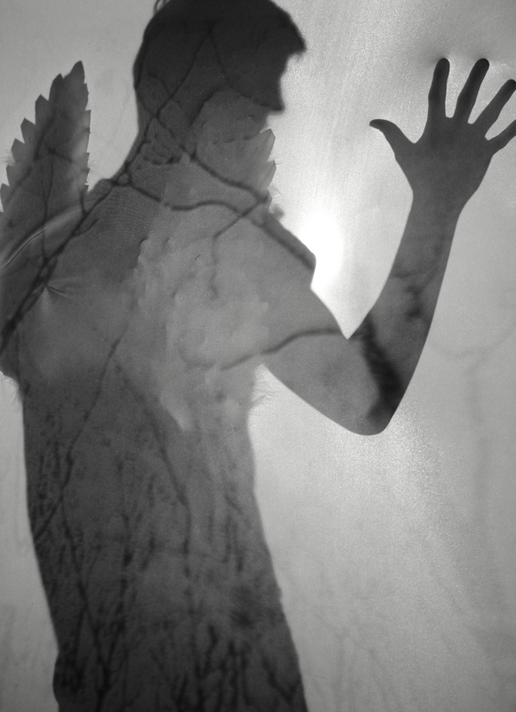
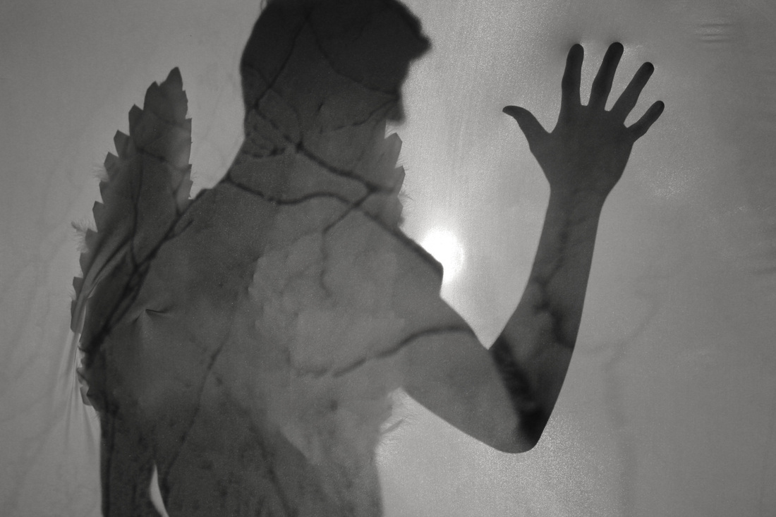
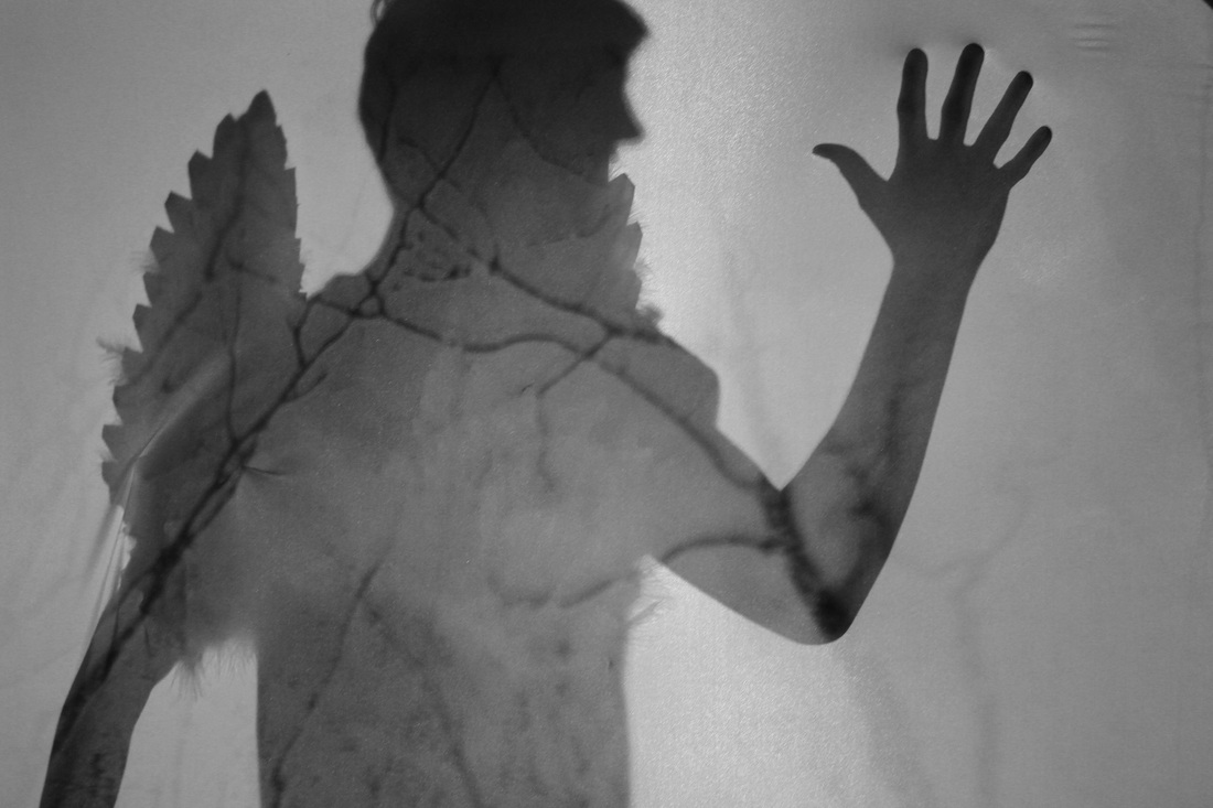
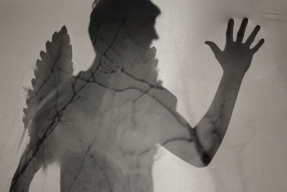
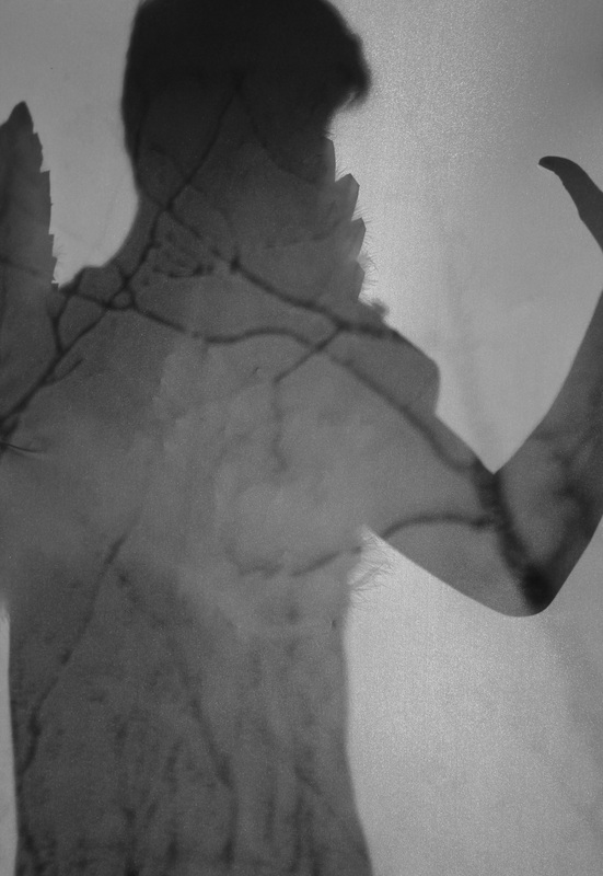
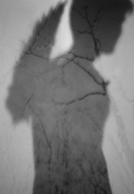
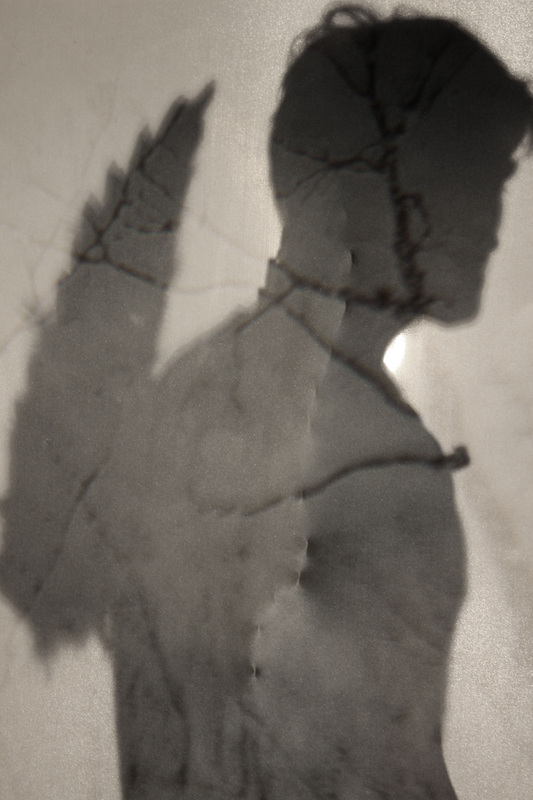
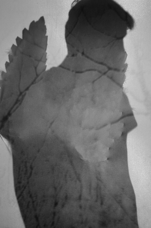
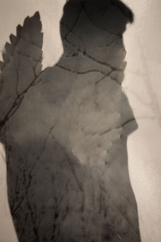
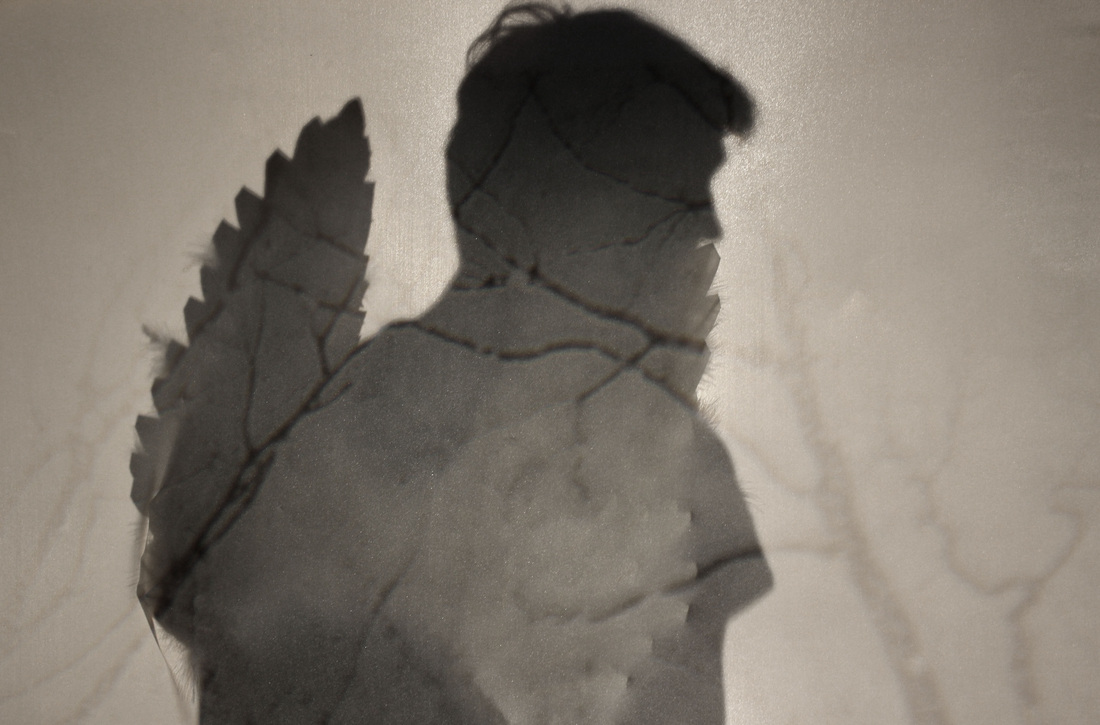
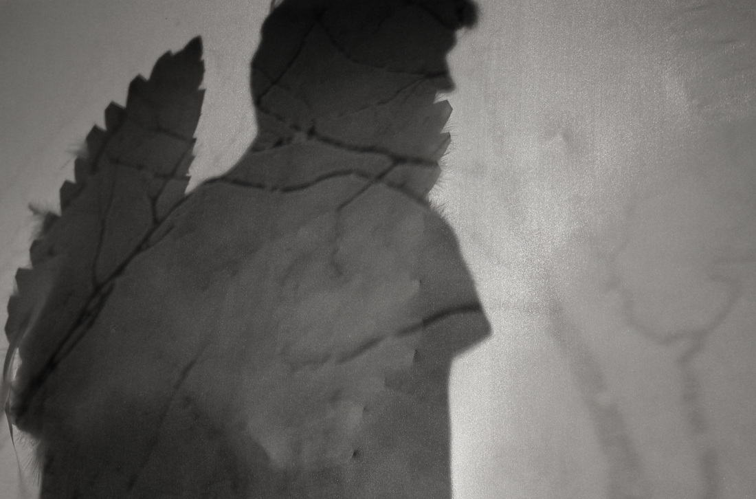
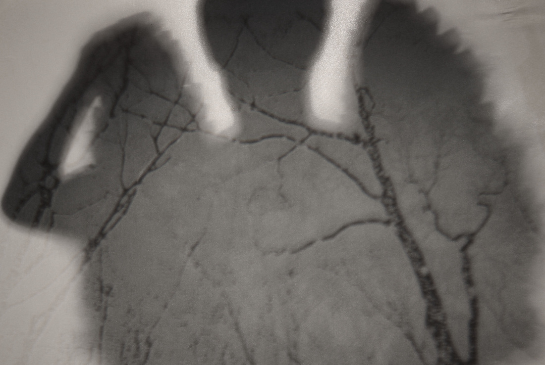
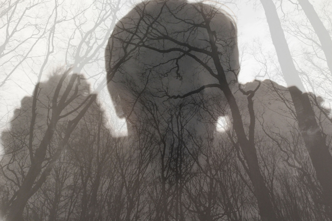
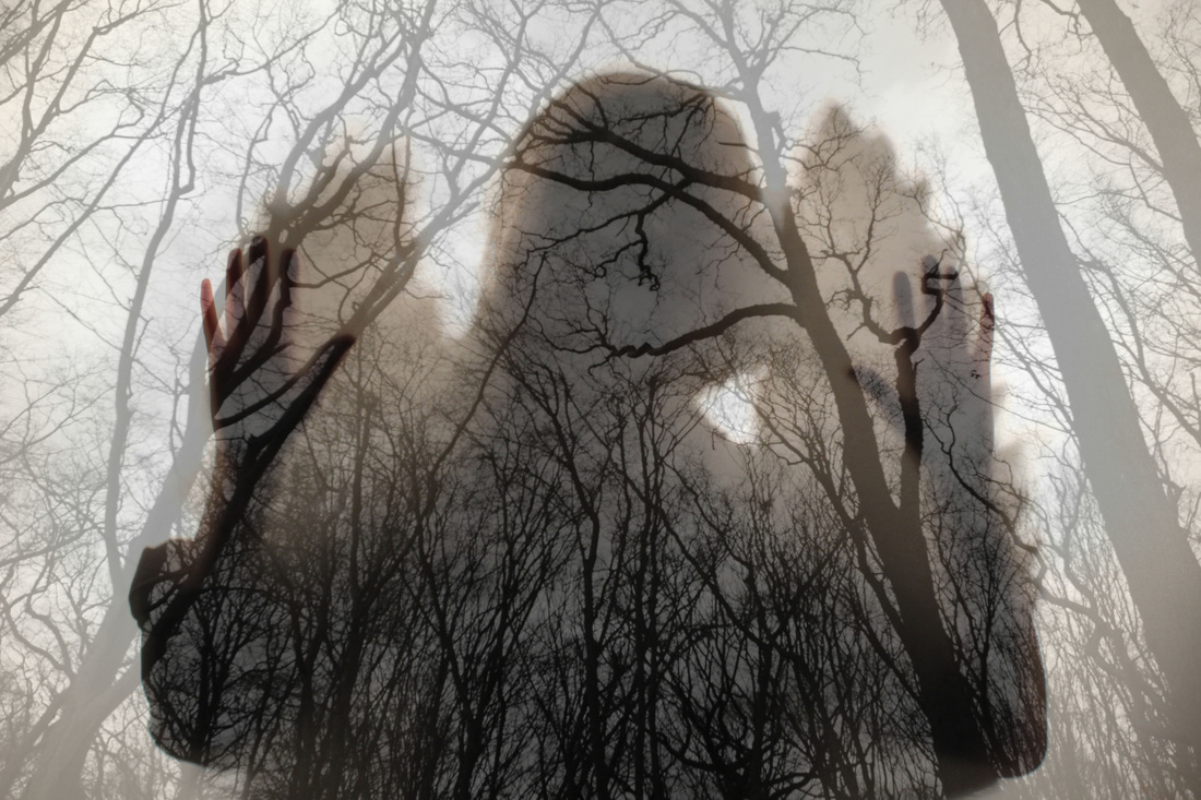
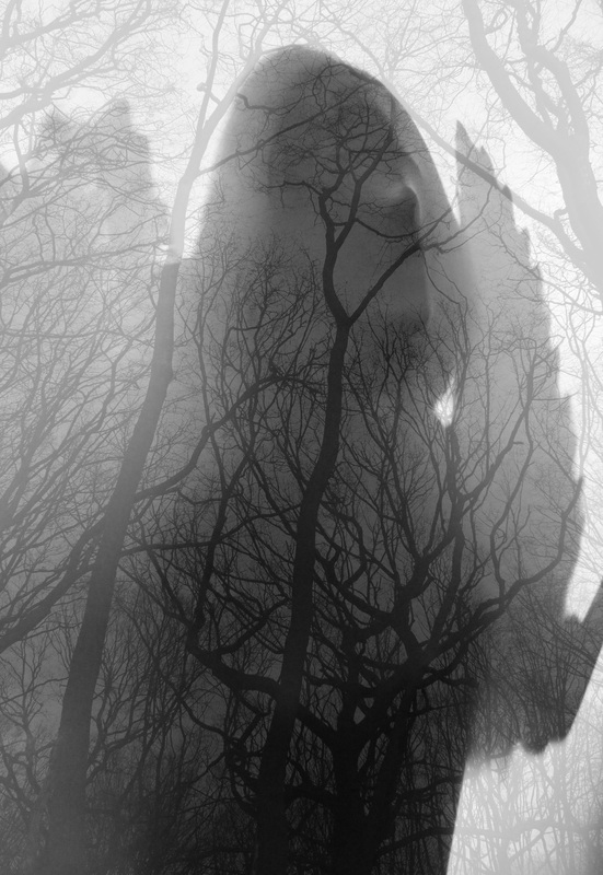
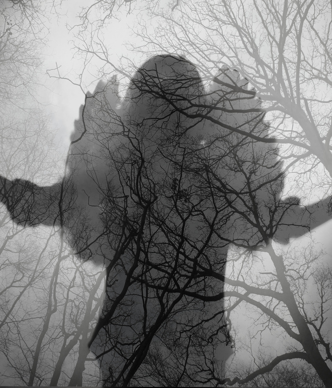
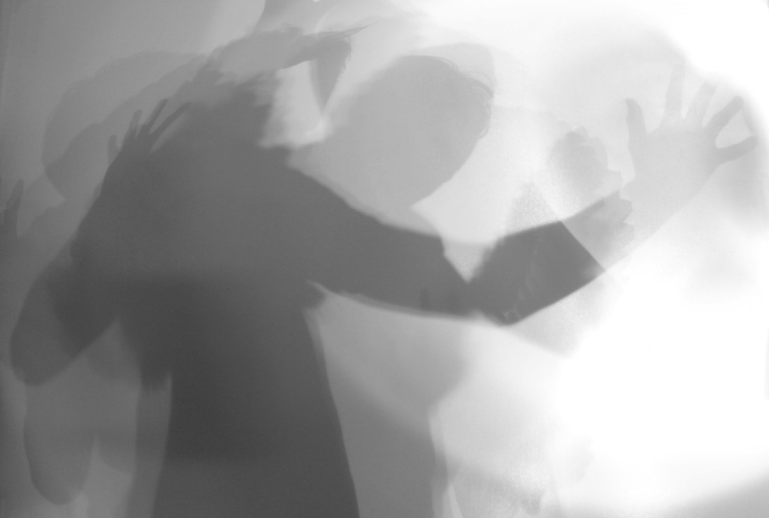
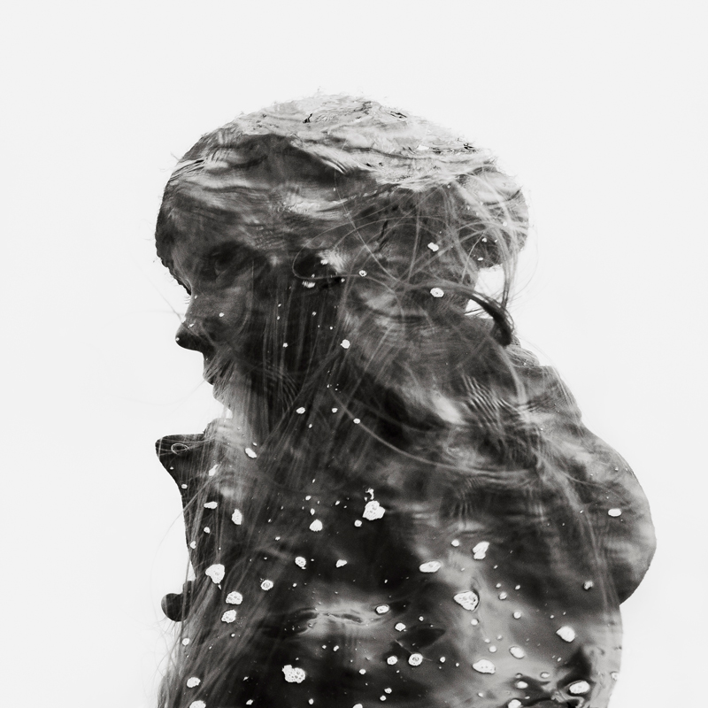
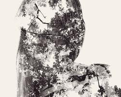
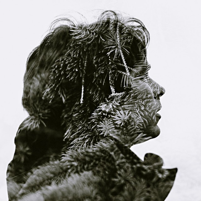
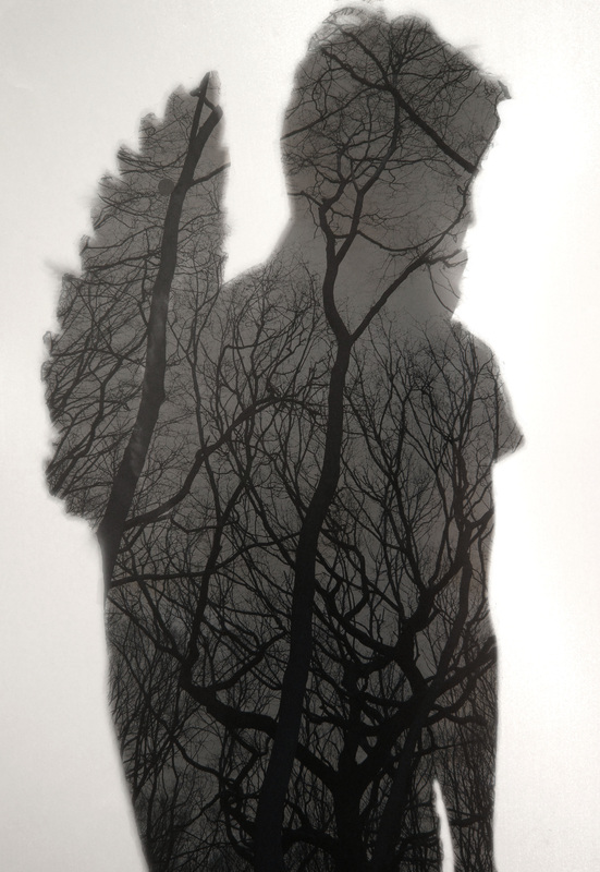
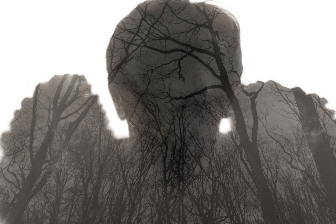
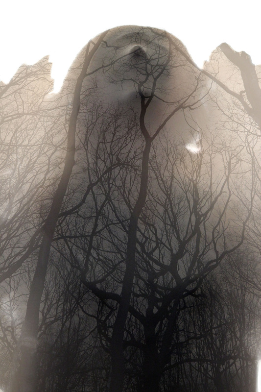
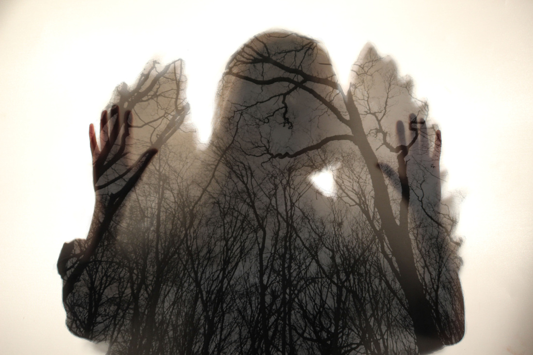
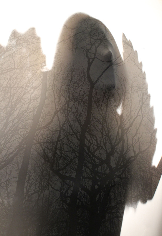
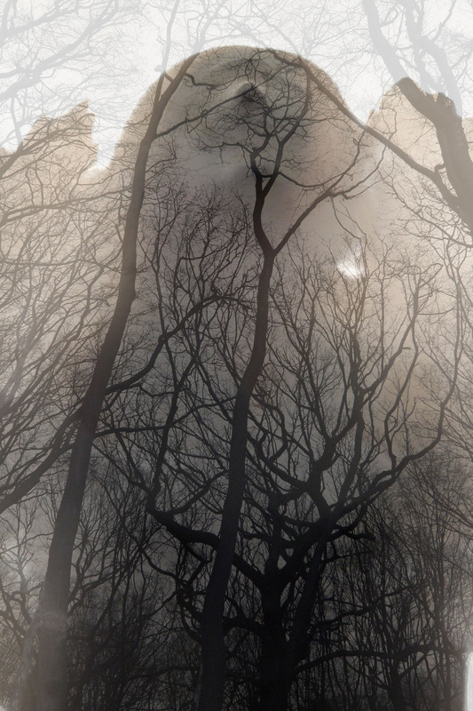
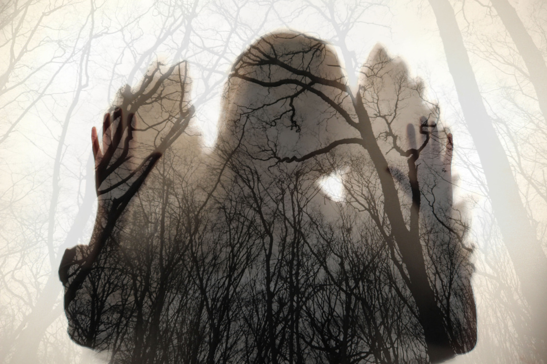
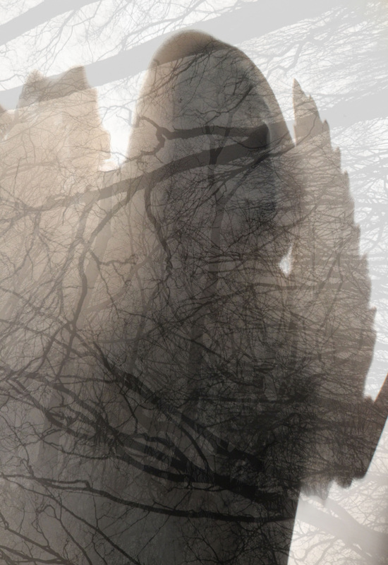
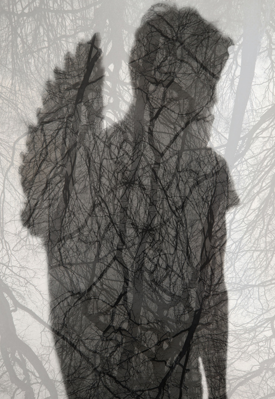
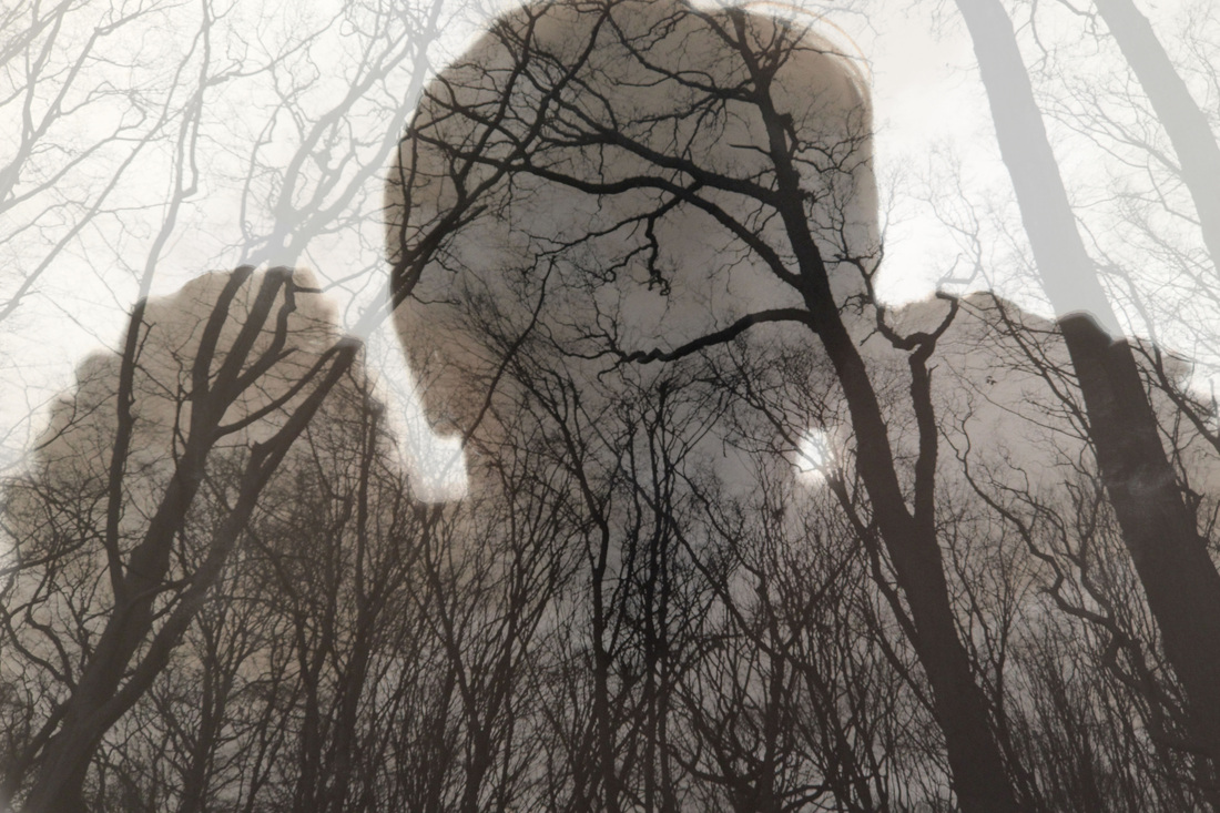
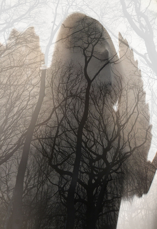
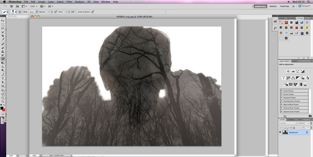
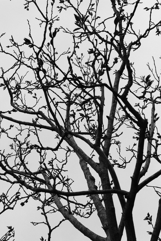
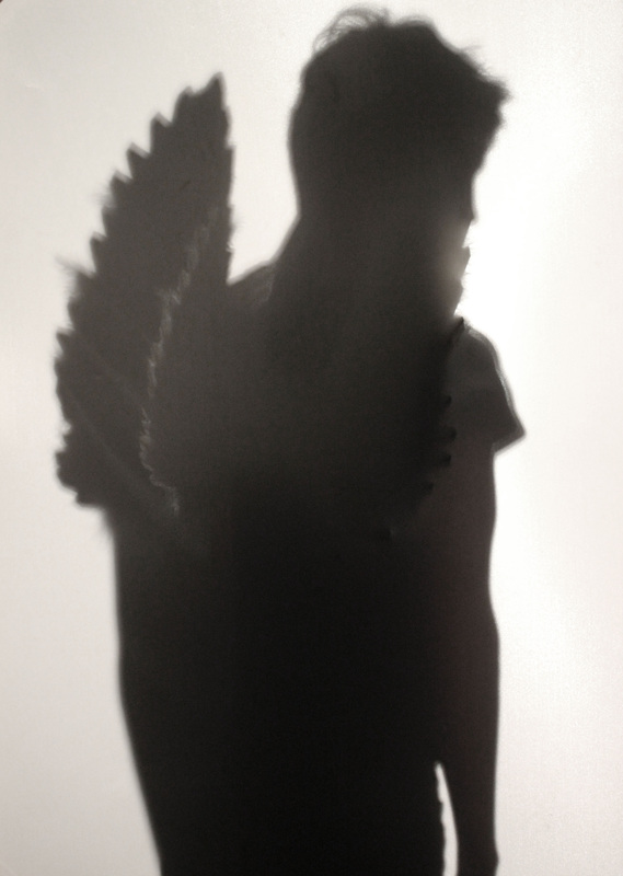
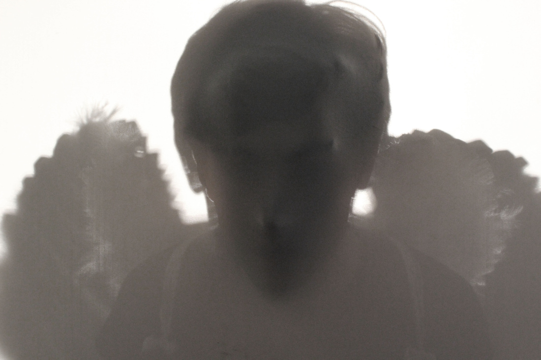
I wanted to further extend my distorted face set that suggested a sense of someone struggling to get out. I took the same concept of the fabric screen, yet this time I combined the supernatural (angel) aspect that I experimented with previously with the screen. This time I focused largely on the lighting and the shadows and texture created. By lighting the screen from behind as apposed to in front, the silhouette created had much more definition and shape to it. The lighting also adds to the angelic feel that comes with the angel wings. As we normally associated bright, white lighting with heaven, it feels as if the angel is attempting to transcend boundaries from heaven into the human world. I'm really happy with these images, especially the ones where the shadow is combined with texture from the models face pressing against the screen. In some ways, this heightens the surreal effect, and almost creates a feel of horror. These work best taken at an angle so the 3D effect can really hold its own. The negative white space draws all the attention to the silhouette whilst again creating the effect that she is emerging from heaven. Due to the lighting being so effective, very little manipulation was needed afterwards, accept for in some I wanted to experiment with the black and white effect to add to the sense of darkness. However, I feel as if the sepia coloured ones are more effective and create an almost ancient feel, similar to Francesca Woodman's. Whilst I am very pleased with the outcome of this shoot, there are still a few ideas I would like to touch on when I further improve them. As my favourites are the ones where her face shows through, I could further enhance this effect by laying a plain image of her face on top of the screen. This would further enhance the "In between" aspect of the brief, as the figure is neither in one world, not another, they are in between. I could also layer or reflect an image of texture or pattern on top of the screen, for example an image of the woods I previously experimented with, to add an ethereal mood to the already mysterious image. Alternatively, I could play with the figure itself. While I have just focused on shooting a typical angel as female, I could play around with gender, contrasting the masculine from to the some what feminine wings. I could then take it further by experimenting with age and height. I found several links between my work and the work of Marek Chaloupka and Floris Neussus. I feel the way Chaloupka only reveals certain parts of the body from below to be really effective in creating a mysterious, surreal feel. Furthermore, the contrast between black and white really heightens this effect, isolating the figure creating an element of loneliness to the images. The way Chaloupka has played with angle and prospective by taking the image from below further suggests a sense of surrealism, as we are just not used to seeing someone from this angle. As well as Marek Chaloupka's work, I also found Floris Neussus's work to be highly effective in creating a sense of surrealism through the use of the human form. While Neussus's images are created using completely different technique to how I have taken mine, through the use of the dark room, I am still inspired by the ethereal aspect created through the use of nature textures (leaves), as this is a similar concept to my images taken in the woods, and therefore inspired me to combine my silhouettes with this type of earthy pattern.
|
Marek Chaloupka. Floris Neussus.
Inverted silhouette images.
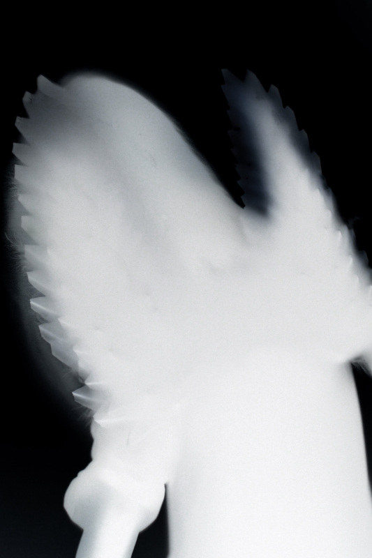
As a further development of my angel silhouette, I decided to experiment in Photoshop with possible ways to increase their spooky/mysterious feel. Just like with my previous angel/forest images, I applied an Invert layer. This technique also draws parallels with Floris Neussus' work.I really like the effect created by the invert and feel they look like x-rays of the angel. The technique is specially effective on the wings, as the feathers contain different textures and thickness of fabric. Whilst this is an successful experiment, I prefer the look of and mood created by the images without invert as there is a greater range of detail from the face and wings. There are also so shadows created by the invert which I think made my other images quite so successful. Similarly, I feel the colours and different depth of colour on the non-inverted images to be more effective in enhancing the mysterious mood of the angel images.
|
Further responses to strand three, "Parallel World".
Use of a male model.
Use of a male model.
Adding texture and pattern.
Manually and digitally.
Manually and digitally.
|
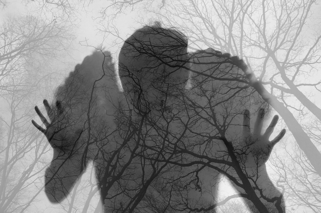
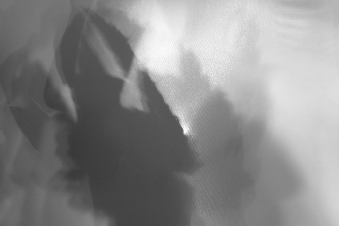
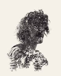
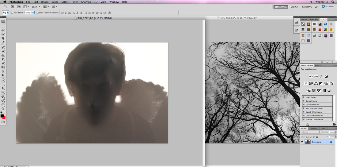
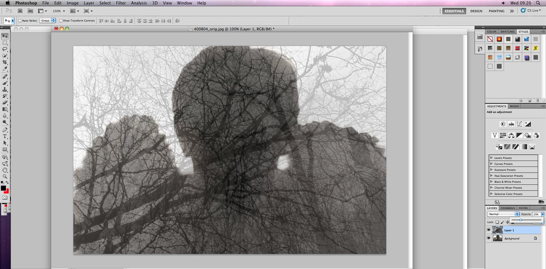
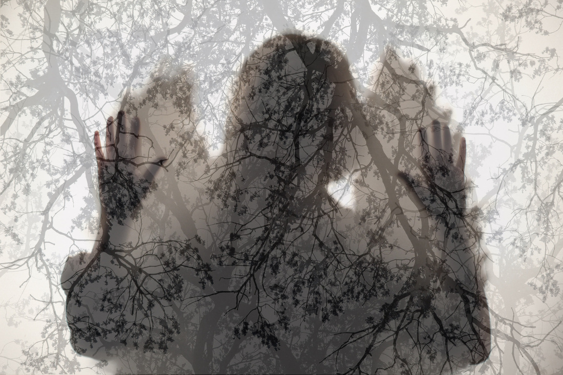
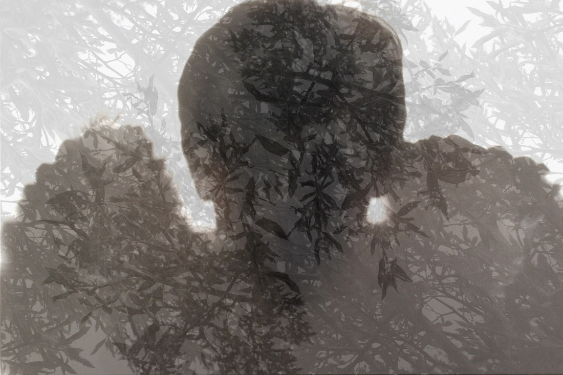
After experimenting with a different model behind the screen, I realized that I wanted to further develop this idea due to its effectiveness in creating a type of parallel world. I firstly projected an image of the woods onto the screen, while the model stood behind it. In some ways, this proved a success due to the pattern creates however I feel it almost gives off a marble pattern, which did look nice, it just wasn't the ethereal effect I was aiming for. As well as this, the tree pattern was hard to make out due to the power of the projection. On the other hand, I was still really keen on the concept and feel that so far its heading in the right direction. Once I realised this, I decided to take my original, non projected images and add the forest detail digitally through Photoshop. This gave the exact effect I was hoping to achieve and I feel these look much more effective than my previous attempt. I created a new layer in Photoshop in which I layered my forest image of the image of the angel, then I was able to play around with the transparency of the layer. I really like the way that the figure in the background is still visible, yet the detailing of the trees is still strong enough to make out what the pattern is, unlike the set prior. I also feel the mood created is much more mysterious and spooky compared to any set I have taken yet, and the ghostly look I achieved through the use of long exposure is achieved due to the transparency on the figure.
|
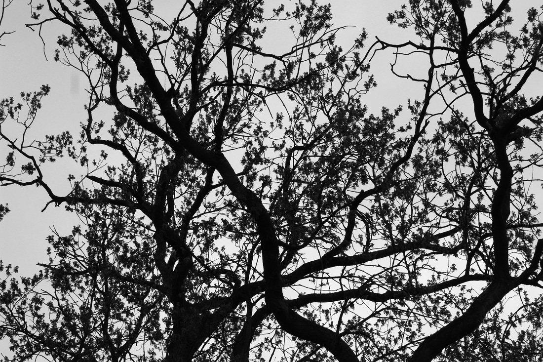
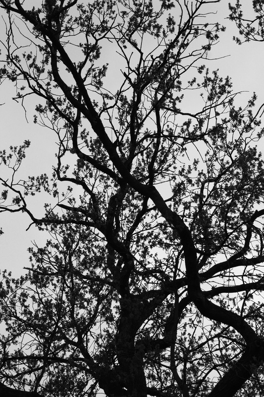
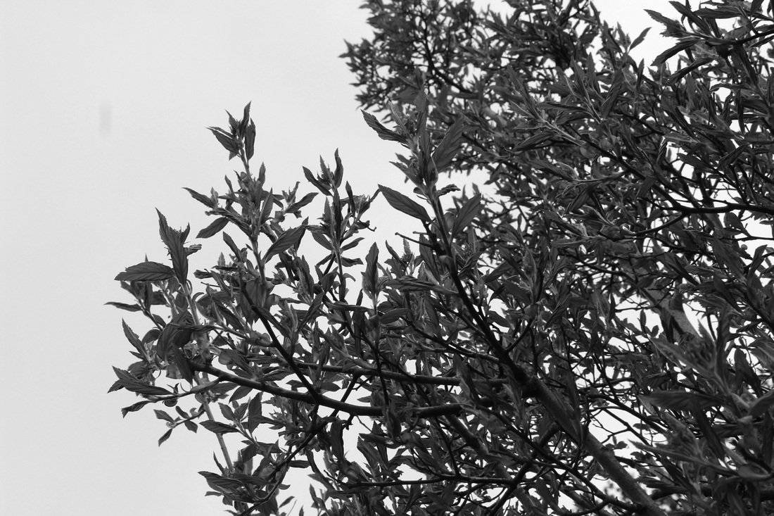
Forest images to layer.
|
Combining the strobe and screen.
Movement.
Movement.
As a further extension of the angel behind the screen set, I attempted to create an element of movement. I combined the use of the fabric screen with the use of the strobe light as well as keeping a long exposure. Whilst I had aimed for a larger range of movement to be created, there was only so much the model could do behind the screen due to space limitations. However, I feel that the idea of the angel moving in these images is apparent, and works quite effectively that its mostly from the shadow. I think the layered silhouettes over each other work well and almost make us question what is taking place behind the screen. This layered effect is successful and further follows on from my previous set, due to the slightly mysterious feel portrayed. I feel as if this technique would be a successful one to use for horror narrative photography, instead of the wings, weapon such as a knife, similar to the film Psycho.
|
Christoffer Relander.
Christoffer Relander's work relates to mine as his images work with double exposure and pattern. His technique of layering patterns of nature and the elements over a portrait, as I have done with mine. However, Relander then goes on to remove the excess pattern around the face so the pattern remains inside the model. The sharp lines created around the portrait enhances the contrast between the person and the background, as well as this the negative space around each image puts all the focus on the portrait, so the pattern becomes the person. Relander's work effectively creates a certain mood within each image, for example the nature element that includes trees and weather add a sense of peacefulness and stillness to the person. This effect could further be enhanced through incorporating specific patterns personal to the individuals such as memories or hobbies. However, I feel my angel images are most effective combined with the etherial pattern, but I would like to experiment with Relander's techniques of creating a space around the portrait. |
|
Development.
Relander's technique
Relander's technique
Further manipulation
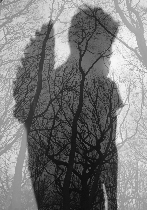
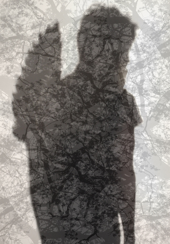
I wanted to further experiment with techniques that related to Relander's images. Using the already edited image above (negative space around the figure), I layered the same forest image over the picture to create a level of contrast between the strong, clear trees inside the portrait compared to the light, transparent tree in the background. I now had full control over the opacity of the trees for the space around the silhouette. While I can tell a difference between this technique and just layering one image of the forrest over the portrait, I feel others may not and is therefore unnecessary. Furthermore, I have to remove the pattern around the angel, which in doing to can create an almost messy, imperfect outline around the persons head which when you look at closely gives off an amateur effect.
Final outcome and presentation.
|
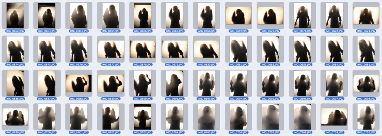
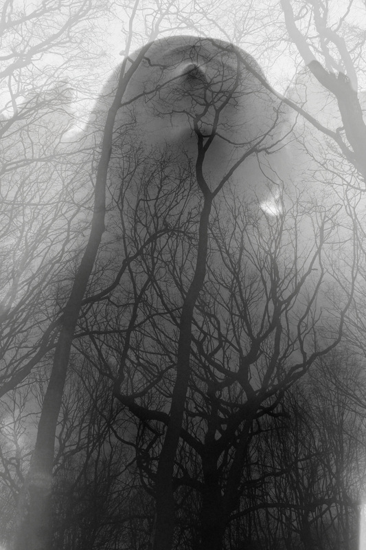
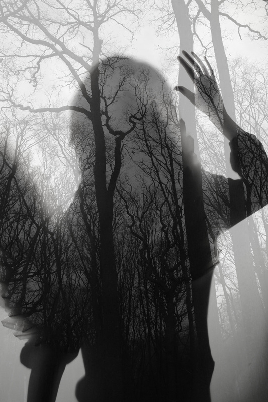
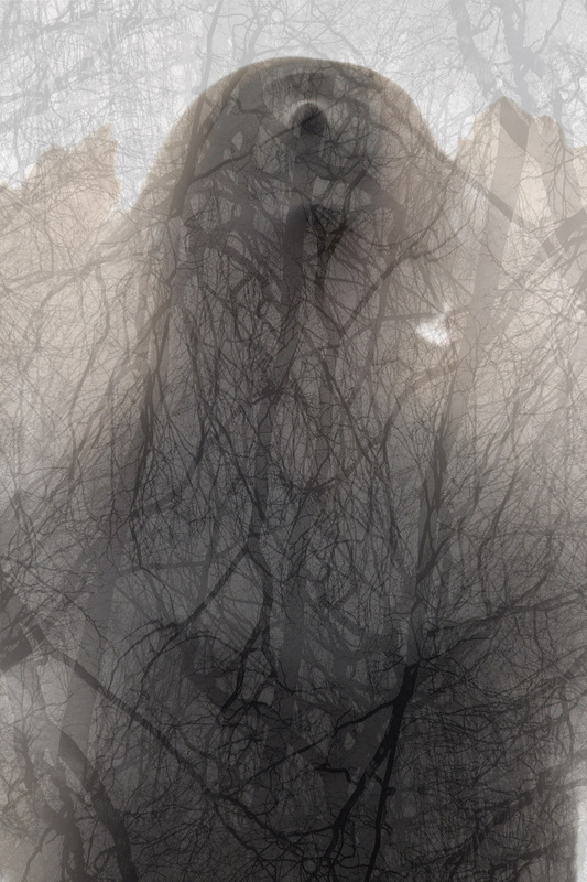
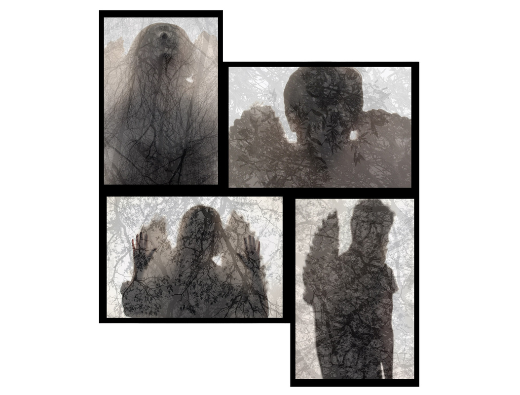
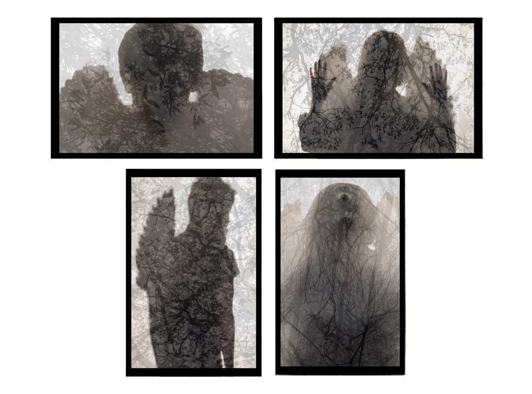
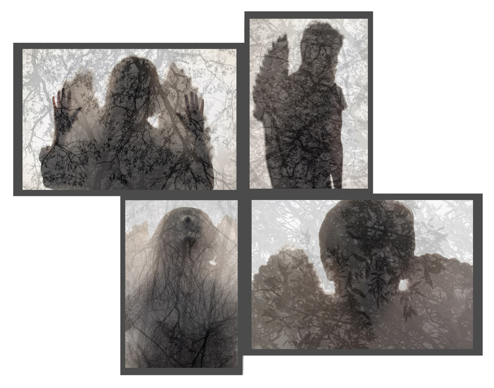
Out of all my images, I feel that the etherial pattern layered over the angel silhouette photos were to most successful in conveying the brief of "Inside, Outside and In between", as well staying close to my parallel world theme. I've chosen what I think to be my four most effective silhouettes (below), and the most effective layering technique (layering the pattern twice, with branches reaching from two different directions). Whilst I love how the silhouettes look on there own, ultimately the mood that is created by layering the tree pattern on top really enhances the overall look of the images. My images will be printed on A3 photo paper so the detail in the branches will stand out instead of fading away from using a small size print. I've also decided to take a few more tree patters to layer over my images, as a feel that four images with the same forest image will not look as effective compared to four separate images with four different patterns. As I've chosen two portrait and two landscape images, the presentation when it comes to the exhibition is slightly awkward as I can't line them up next to each other, or position them in a grid. Therefore I have done three digital prototypes (below) to determine how they will look on a wall and next to each other. I feel like the third option looks the best however when my final images are printed, I will then determine what colour frame to use, either black or dark grey. I will use a window mount technique.
|
|
Plain silhouettes.
Final outcome images.
Possible exhibition presentation.
|
|
|
Possible after print manipulation.
|
|
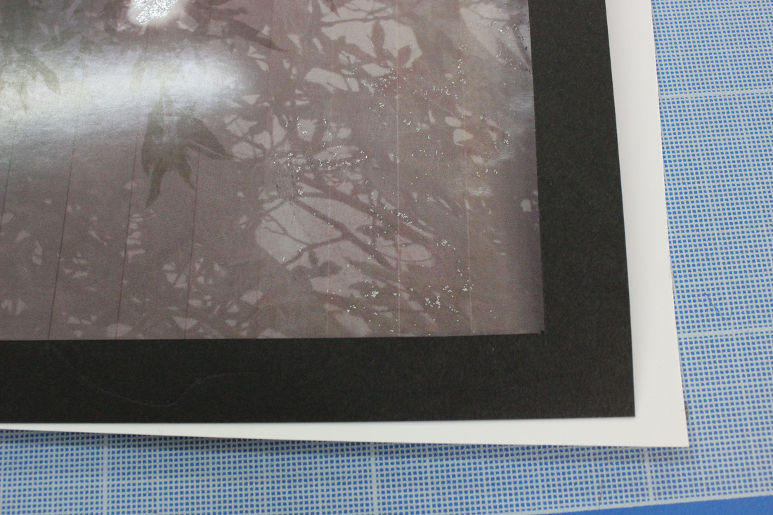
Before I produced my final outcome, I wanted to experiment with other presentation techniques such as manipulating the image after print. I wanted to do this as I felt that although my final presentation plan for my final outcome was effective, the framing is fairy simple. Therefore, using silver glitter glue/paint, I followed to lines and patterns of the tree/plan around the silhouette to enhance the pattern effect and create a higher contrast between the outside and inside of the silhouette. The concept was fairly simple as I was just outlining the tree branches. While I think this effect looked pretty and was effective in creating this contrast,I feel it almost distracts from my actual image which I spend a lot of time developing. The glitter also creates a christmassy vibe which combined with the angel, really takes away from the mysterious/ etherial feel I wanted to convey. Similarly, I feel that one my larger A3 photos for my final outcome, the glitter lines will not look as delicate as they do on the A4 tester sheets, as well as each print sitting next to each other, will become too overwhelming.
|
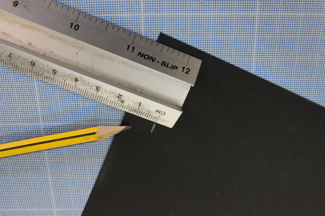
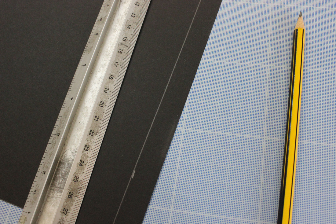
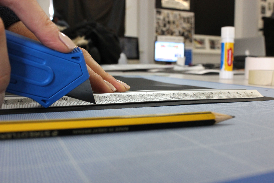
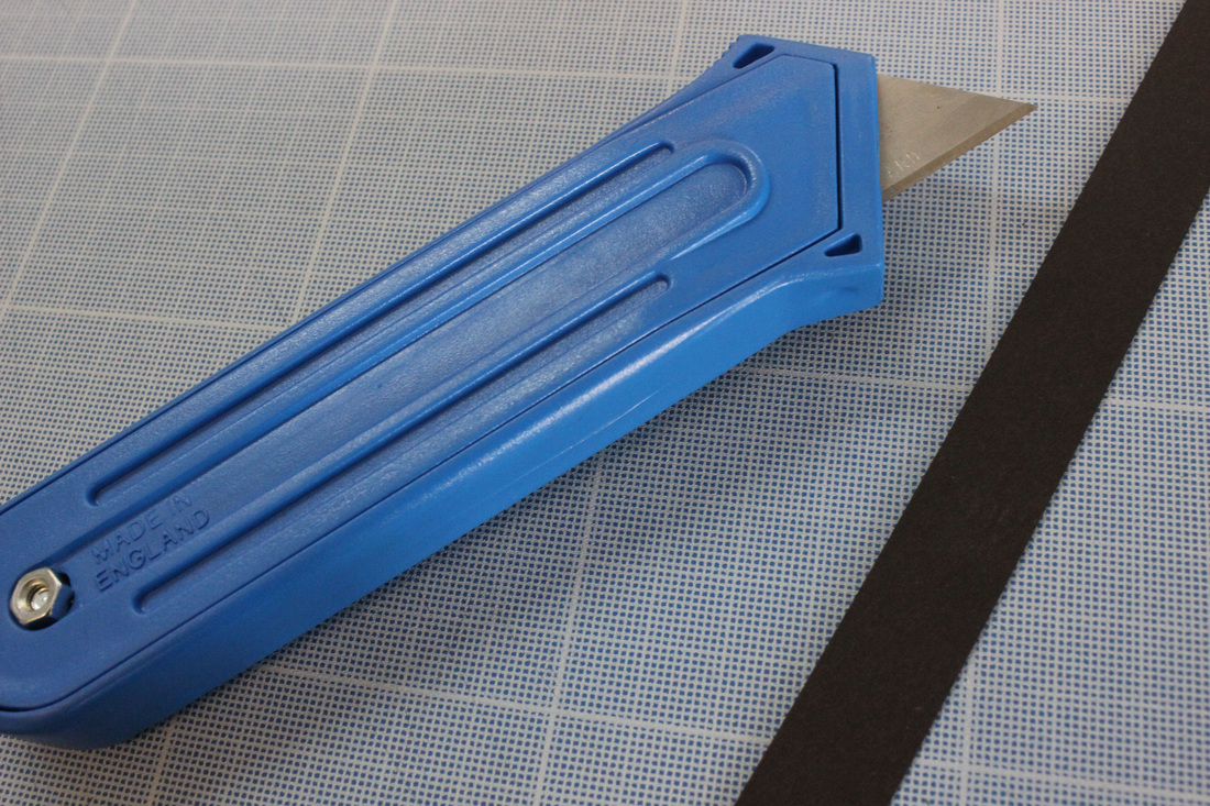
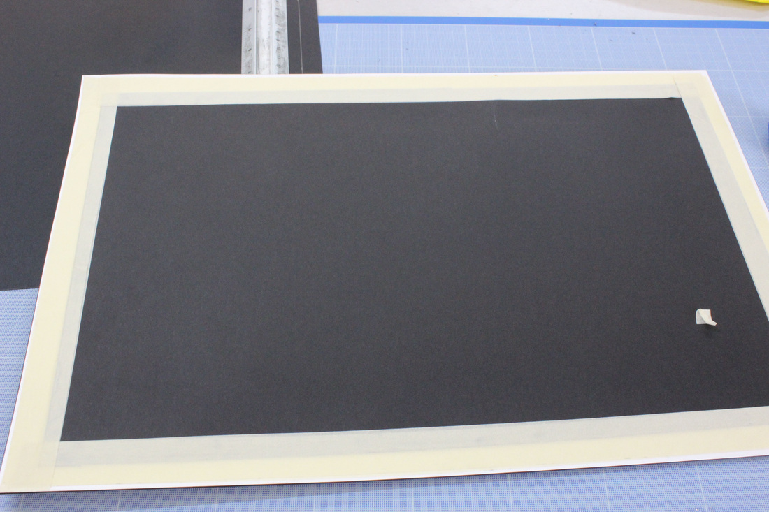
Final exam outcome.
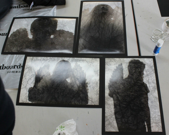
The image above is my final outcome for the "Inside, Outside and In Between" exam. I chose these images as I feel they look the most effective next to each other compared to any other combination as they hold a variety of poses, both up close and from a distance. This means the angel form can be recognised as well as including details of the wings and face. This is also my final positioning for my images, so I will imitate this layout for the exhibition. I decided to go with the black frames instead of the dark grey colour as I found it really brought out the silhouette in comparison to the dark grey which washed it out. To frame, I used a simple window mount technique by measuring out black card to the same size as my image, then measuring a half an inch boarder and used to scalpel to cut out the frame. Overall, I am very pleased with the outcome and love how the images look when positioned next to each other. I chose to take this part of my parallel world strand over the other part (movement with wings) as they convey the ideas of the exam brief further and I feel they look much more refined than my Francesca Woodman style images of the moving angel with the strobe and long exposure technique. Had I have had more time on this project I would have taken that aspect of the strand (strobe) further through changing the model, background and props.
Window mount step by step.