Exam.
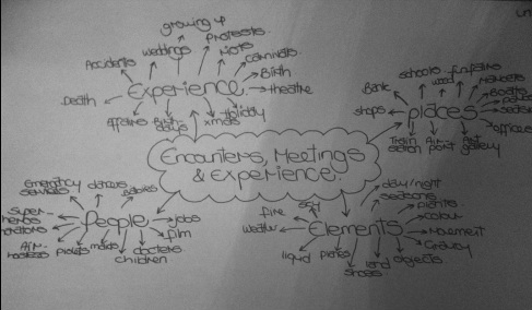
Encounters, Experiences and Meetings.
Final photograph selection. |
Final piece.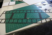
|
|
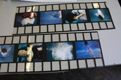
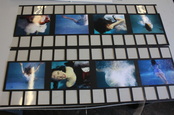
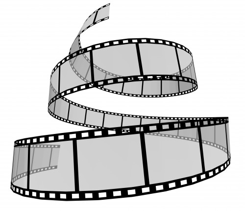
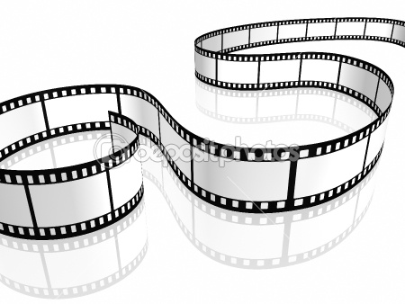
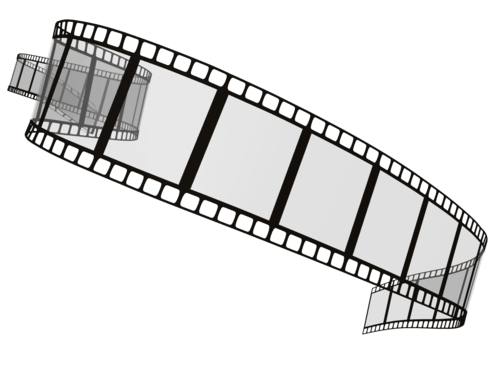
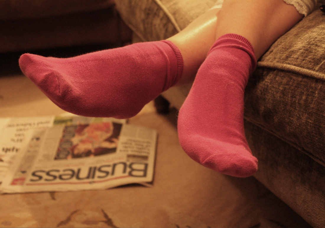
Presentation ideas. With the exam drawing closer, I'm beginning to consider final outcomes. My pictures below work well due to the constant theme. As they are stills, I could present them on a large film strip style mount like the pictures to the left, creating a story bored idea from the film below. I would use black card to window mount the actual pictures, A5 due to the quality. I could then create the effect of the film strip by adding little white squares along the top and bottom, and possibly numbers too. I could almost create a twisted shape like the example to the right to make the presentation slightly more interesting and relevant to the idea of the fairytale being twisted by the underwater idea. |
|
|
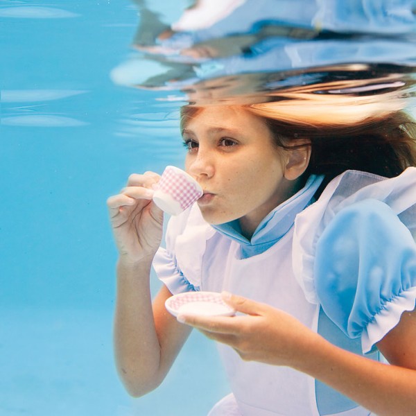
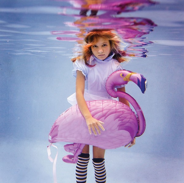
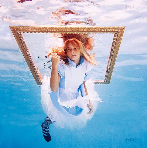
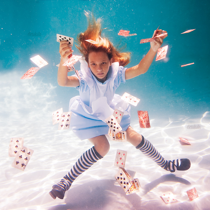
Alice in Wonderland set.
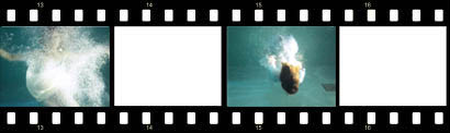
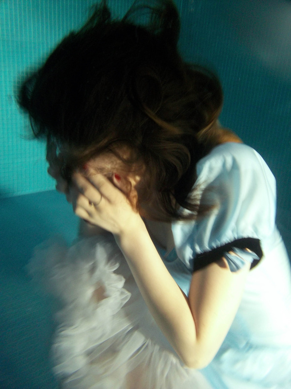
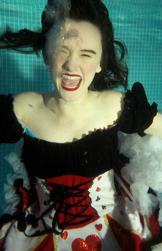
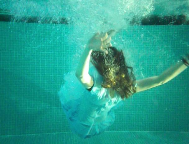
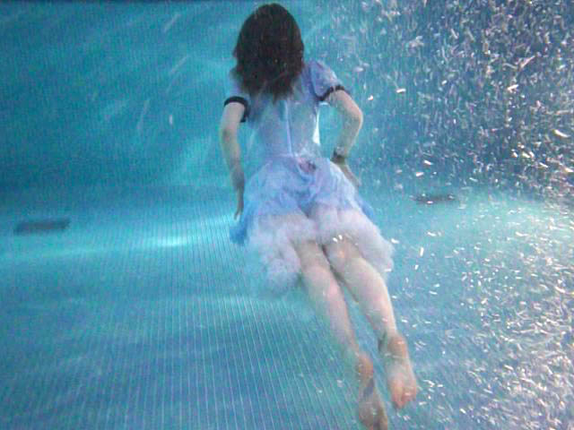
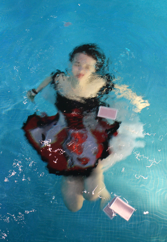
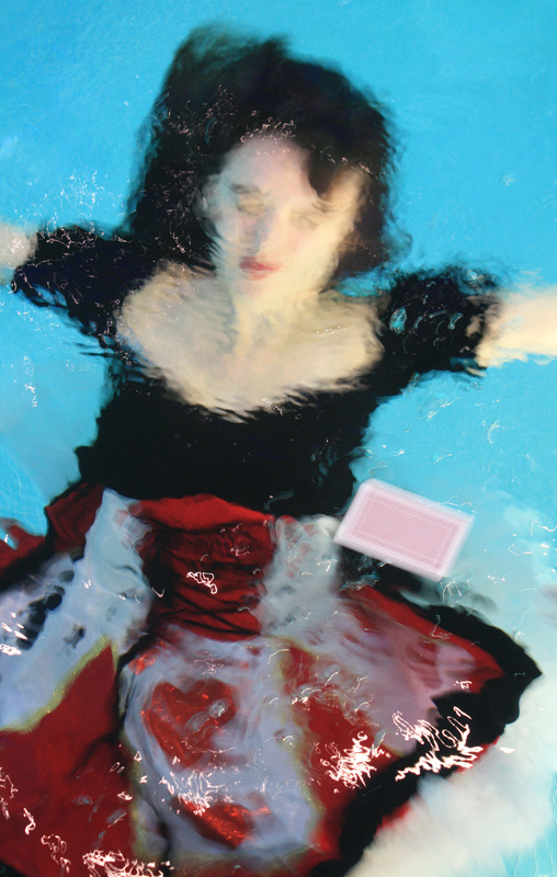
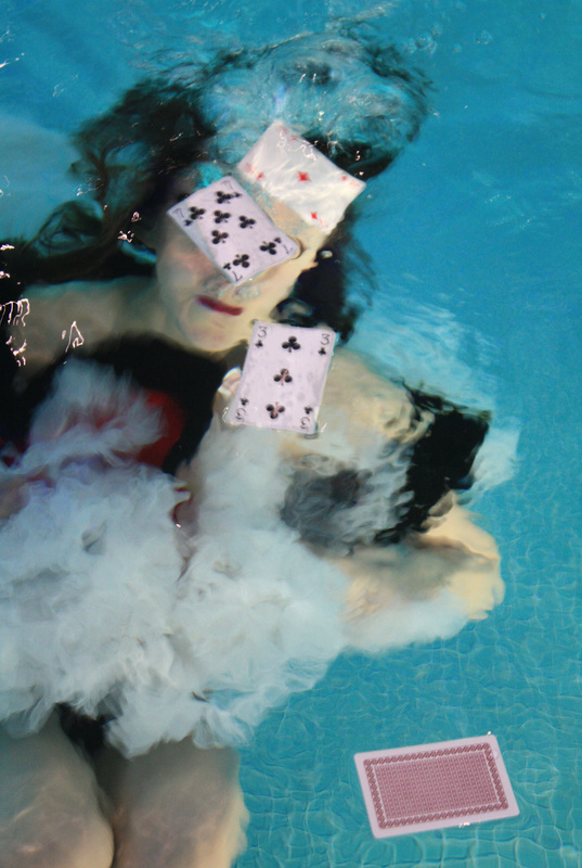
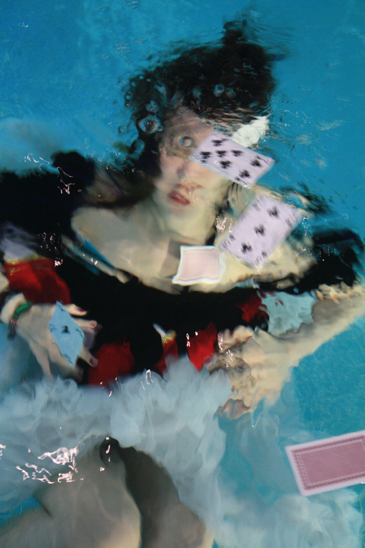
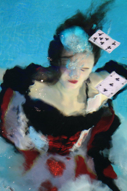
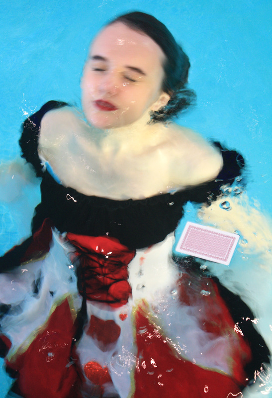
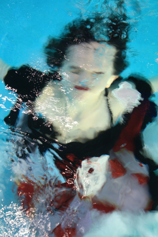
Strand two. With inspiration from Elena Kalis' underwater set, I attempted to incorporate costume into my underwater set. Like she did, I used Alice and wonderland fancy dress costumes. This added to the Bill Viola set making it slightly more interesting and magical. I took several still pictures with the underwater camera, however these didn't come out as well due to the quality of the camera and created a slight blur. The last four above were taken from video's I recorded as it was hard to capture the exact movement of the fall. I found it was hard to capture the subject still with minimum blur, the bubbles were an added bonus really highlighting the movement and add the same time added to the magical feel. The way the dress looks really good underwater, creating a lot of texture and movement to the pictures. I feel as if these have real potential as a set of final pictures. I also made a quick film of the clips I filmed all pieced together. For a first attempt I am pleased with the outcome yet feel the quality of the video isn't ideal for a final piece. To improve it, I would focus more attention on filming longer clips so less transitions were needed, I'd also use a tripod to keep the camera still, however to an extent this is tricky due to the water movement. |
Alice film. |
|
|
Further Development.
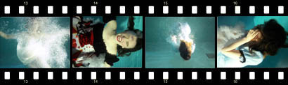
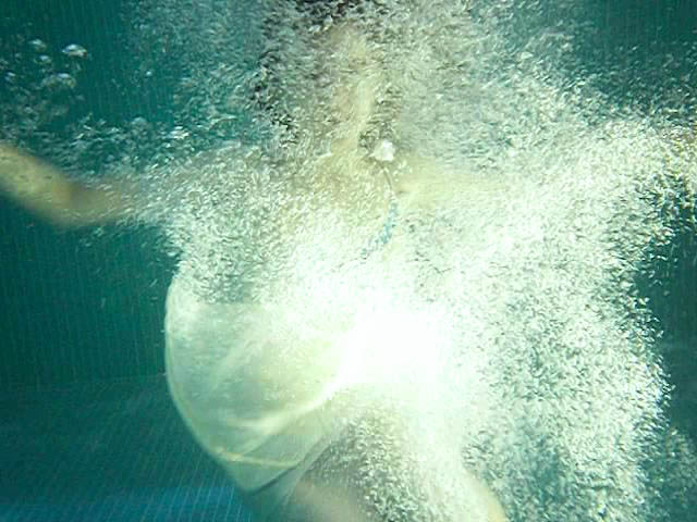
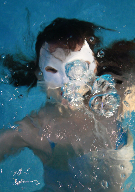
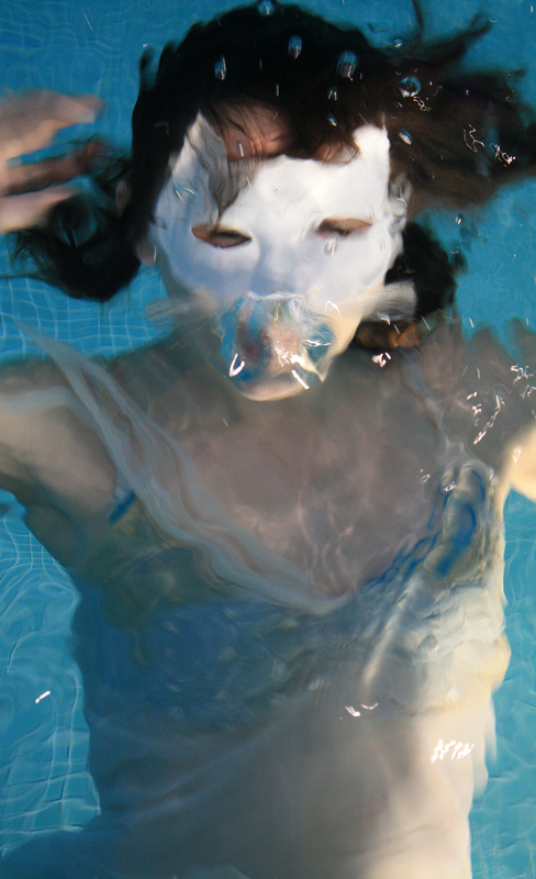
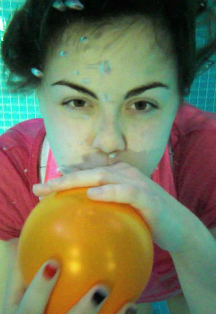
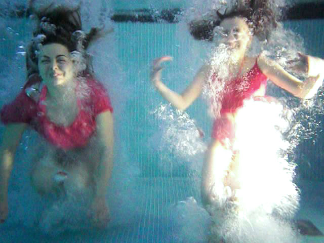
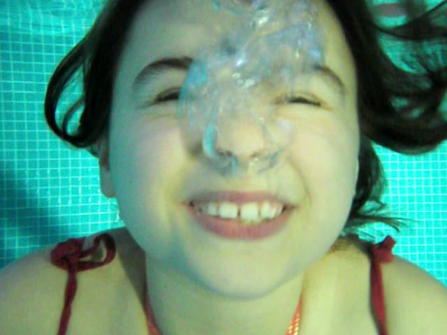
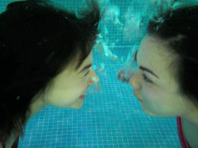
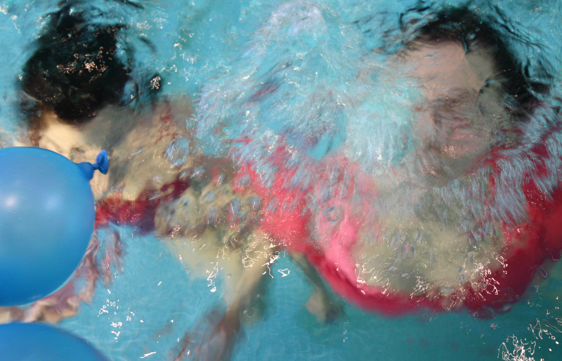
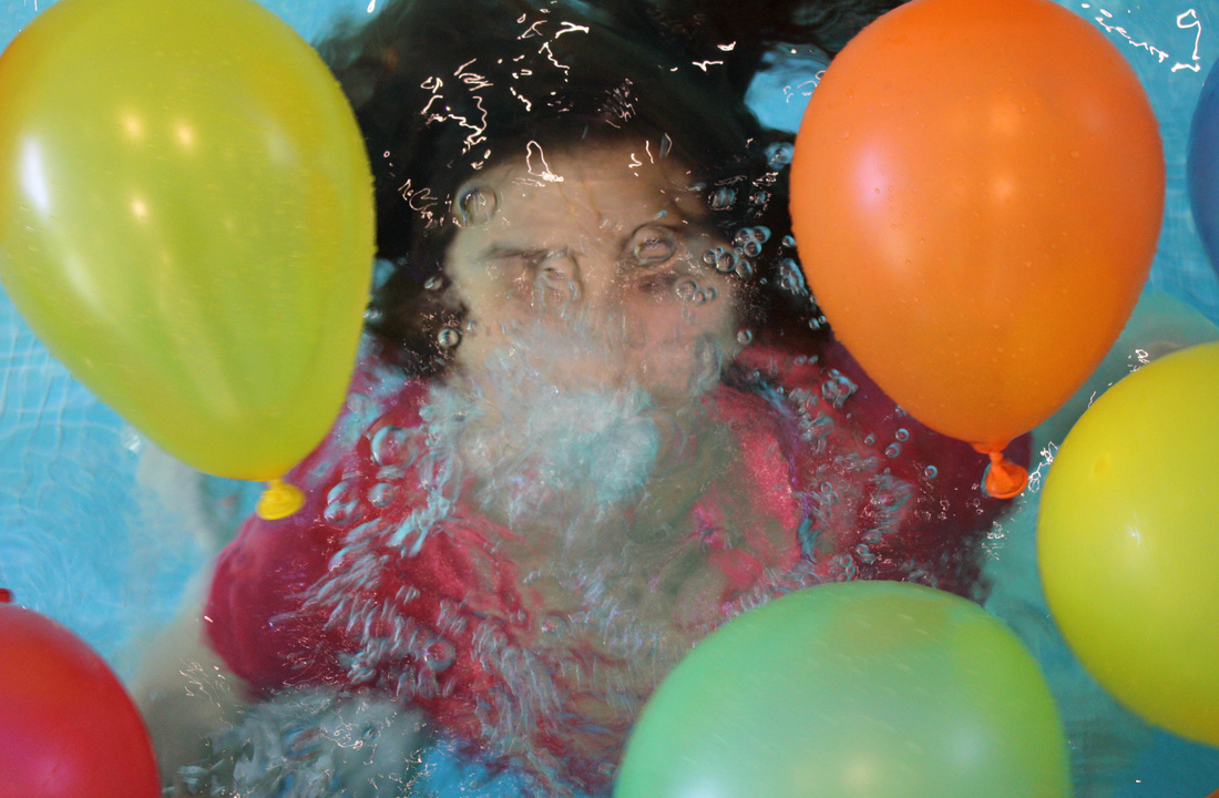
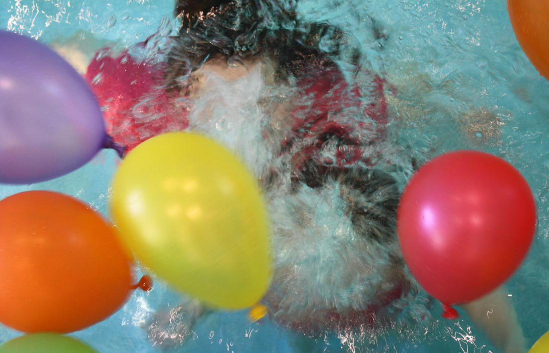
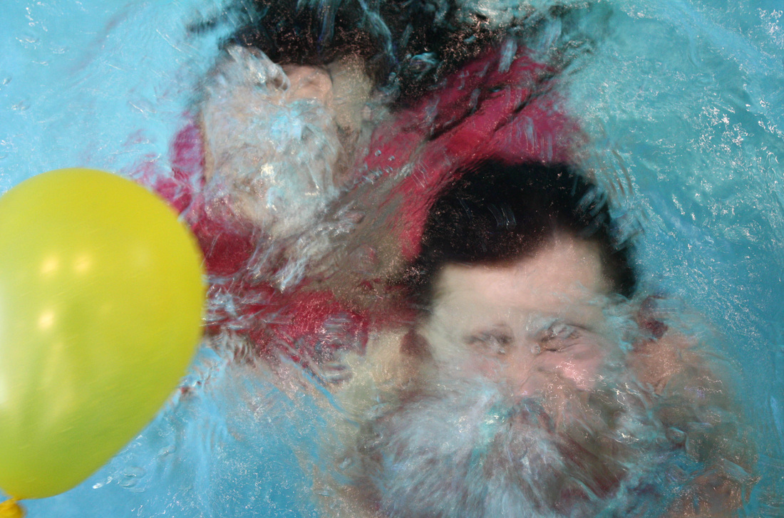
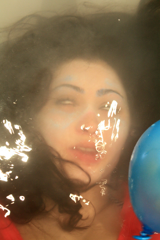
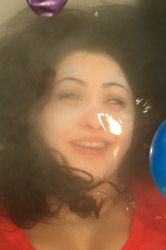
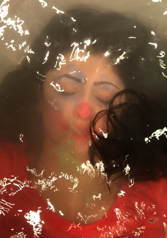
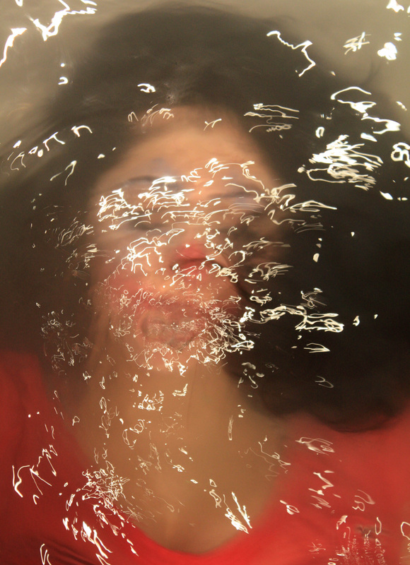
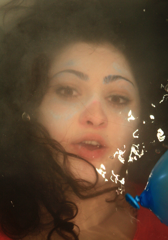
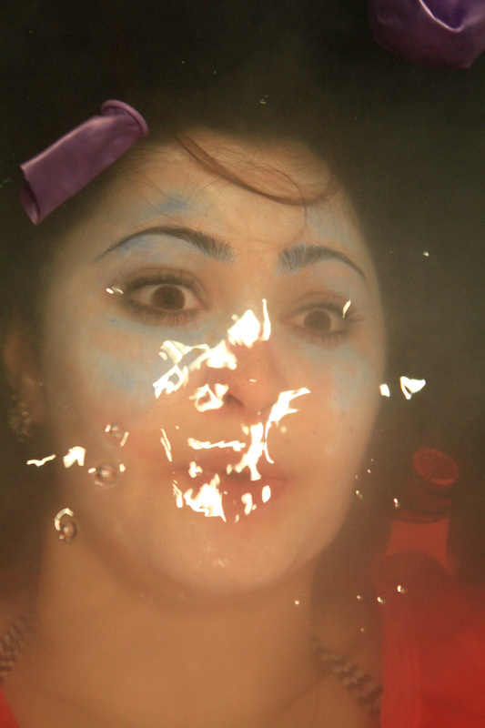
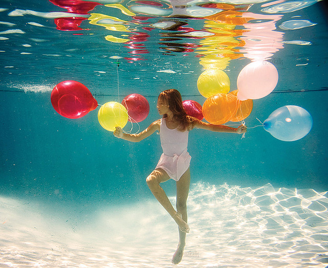
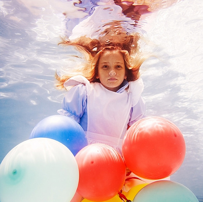
As a step on from my underwater Alice set, I focused on the same kind of idea but added a lot more colour to the ones above. I did this by adding balloons, interaction and the bright clothing. This time round I knew what to focus on for example, the movement when the subjects enter the water and texture (mostly from the bubbles). I feel the video I did this time worked out better due to being more aware of what makes it successful when filming and editing. The pictures work due to bright colours yet I feel unlike the Alice ones don't really follow a key theme so most don't work well on their own. I took the last four from above the water on a hight quality camera, I followed the same idea of the distorted face and asked the subjects to blow bubbles. The balloons in these ones add colour and also move textures, brighting up the typical idea.
As a step on from my underwater Alice set, I focused on the same kind of idea but added a lot more colour to the ones above. I did this by adding balloons, interaction and the bright clothing. This time round I knew what to focus on for example, the movement when the subjects enter the water and texture (mostly from the bubbles). I feel the video I did this time worked out better due to being more aware of what makes it successful when filming and editing. The pictures work due to bright colours yet I feel unlike the Alice ones don't really follow a key theme so most don't work well on their own. I took the last four from above the water on a hight quality camera, I followed the same idea of the distorted face and asked the subjects to blow bubbles. The balloons in these ones add colour and also move textures, brighting up the typical idea.
|
Distortion refined.
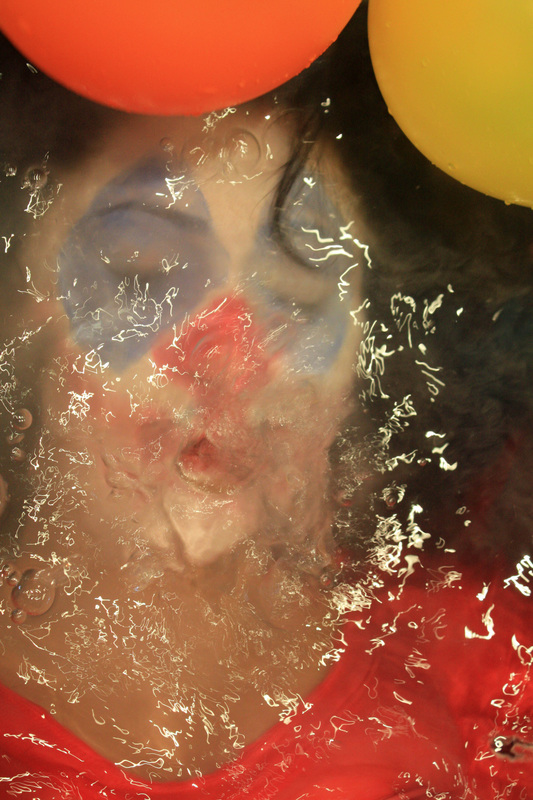
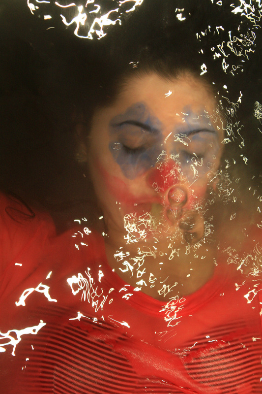
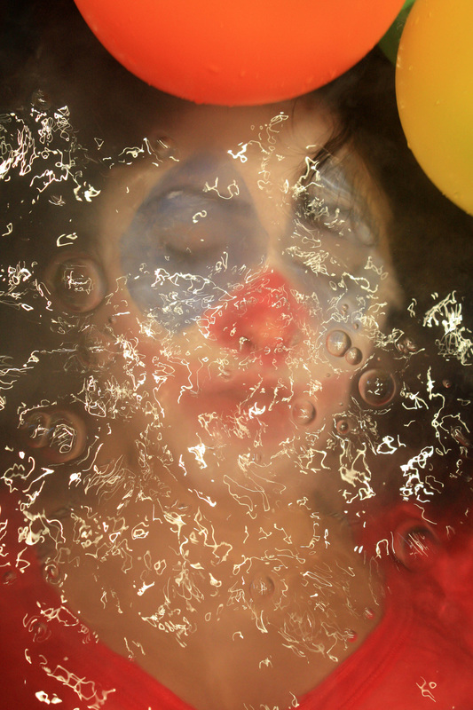
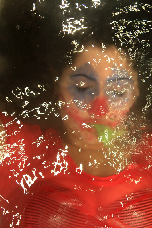
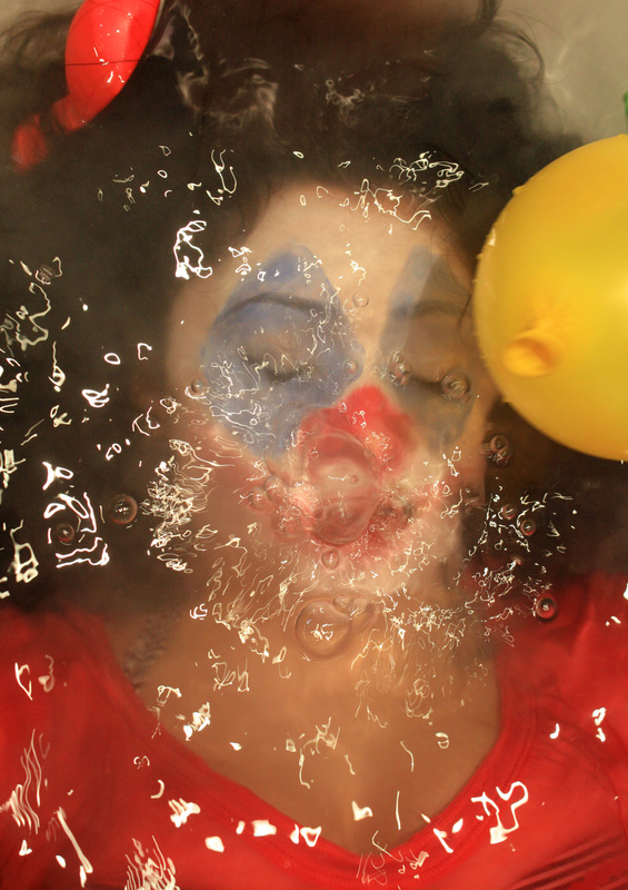
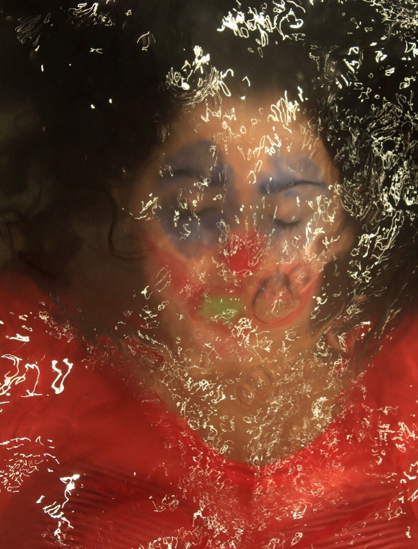
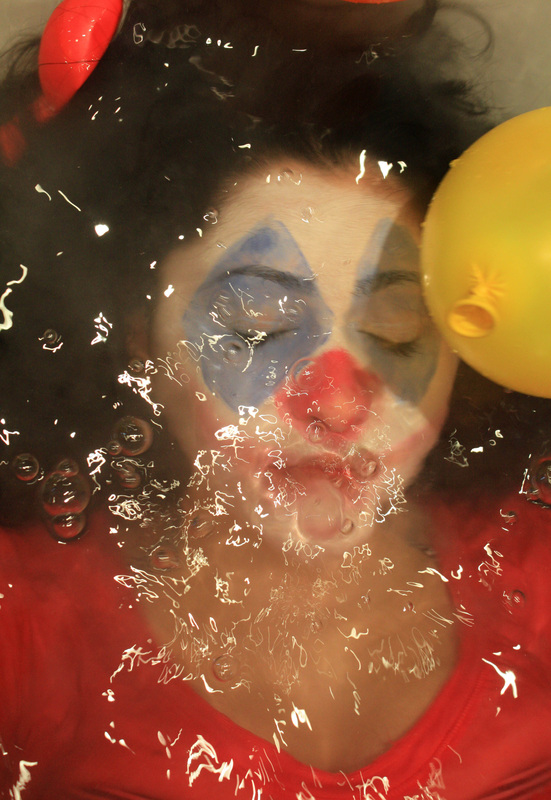
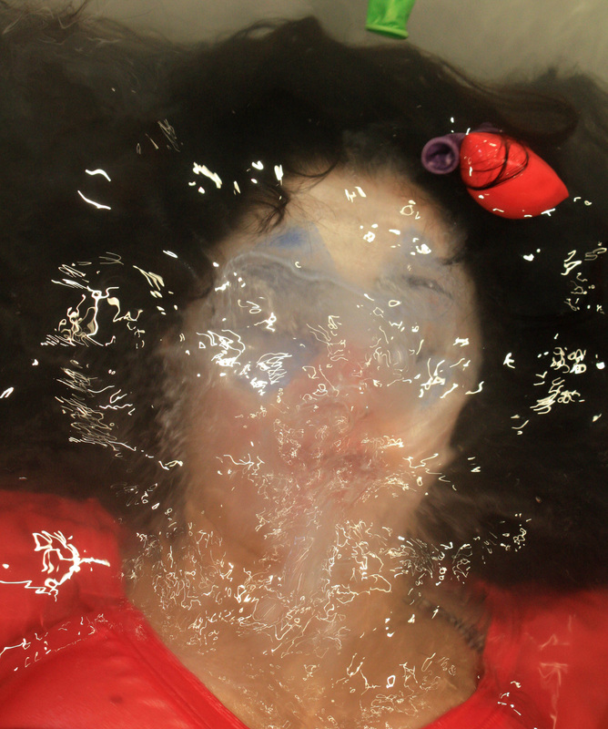
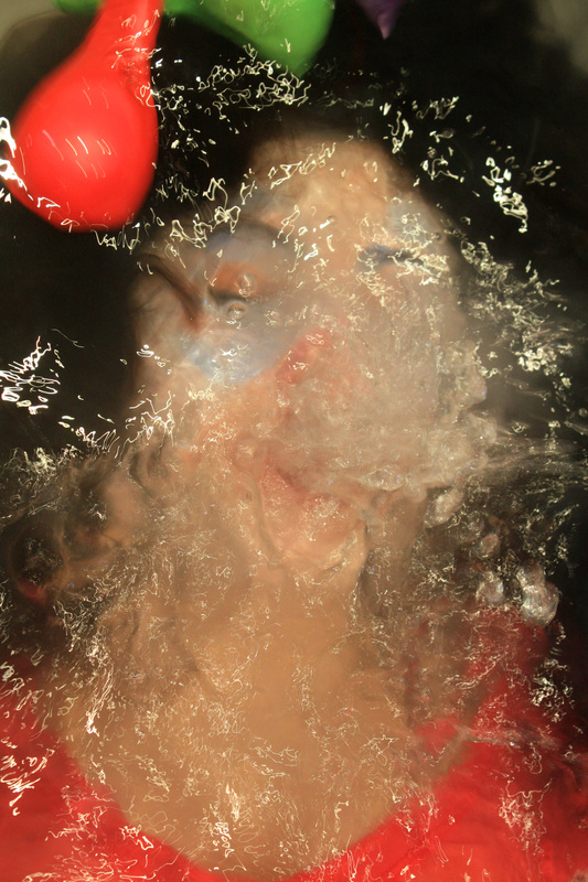
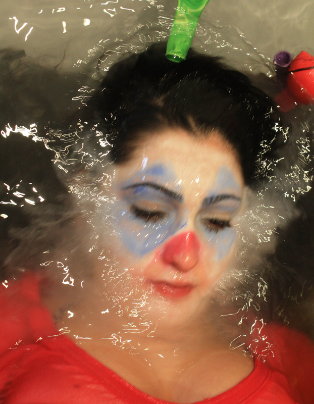
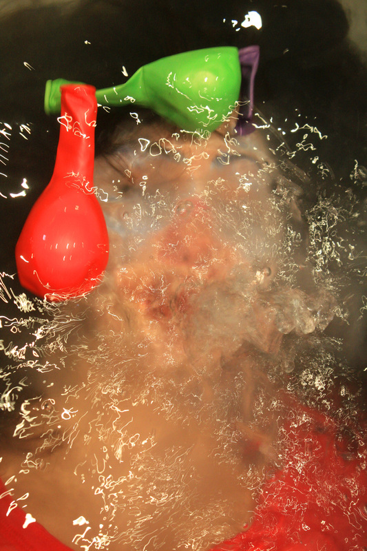
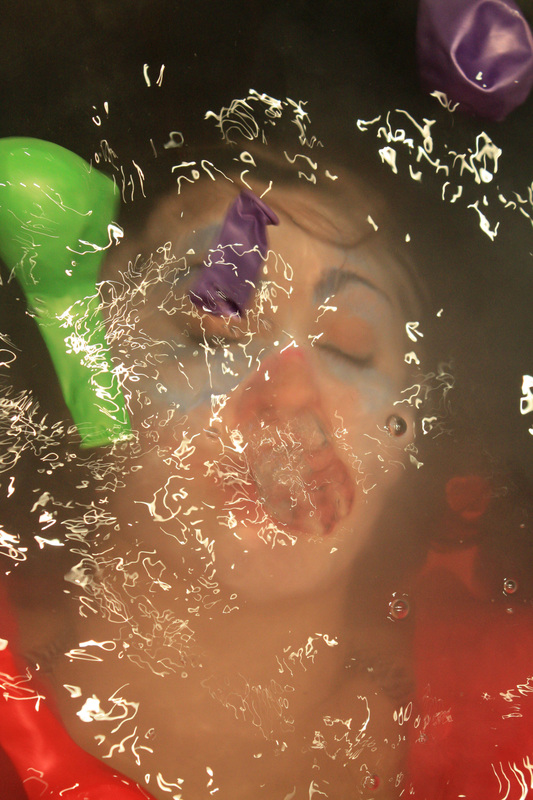
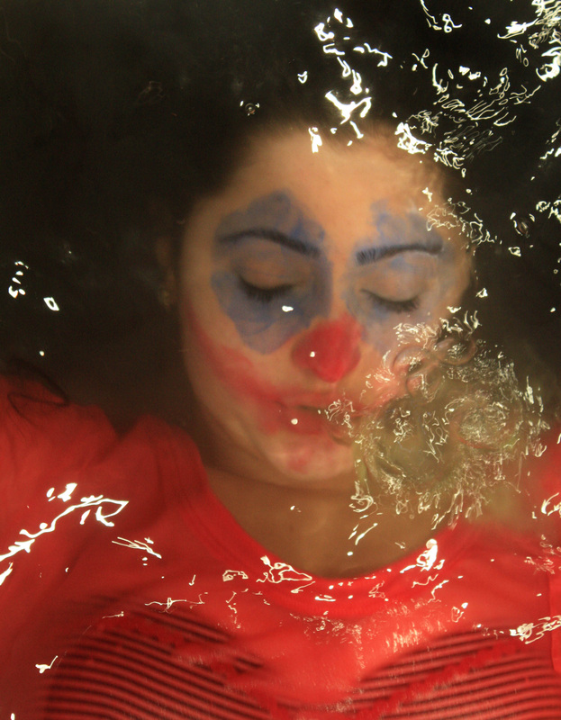
I further refined the distorted face photograph set by adding face paint and stuck to the balloon idea. I wanted to focus on the meeting of a happy, positive subject like a clown, with the negative, disturbing idea of death. This added to the idea of the distorted idea and at certain points worked well when the face paint was coming off into the water which added more texture. I asked my model to spit out neon paint that would further add to the disturbing feel as if it was blood, but as I focused on the happy clown idea. I am overall happy with the outcome of this set, yet feel I have better ideas and outcomes for a final piece. |
|
Strand Two Development.
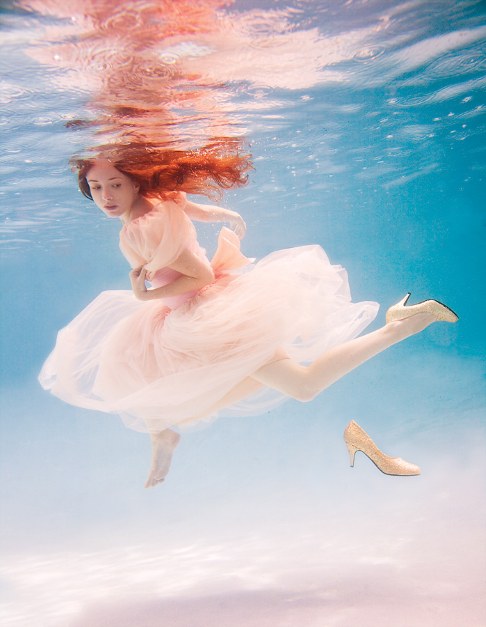
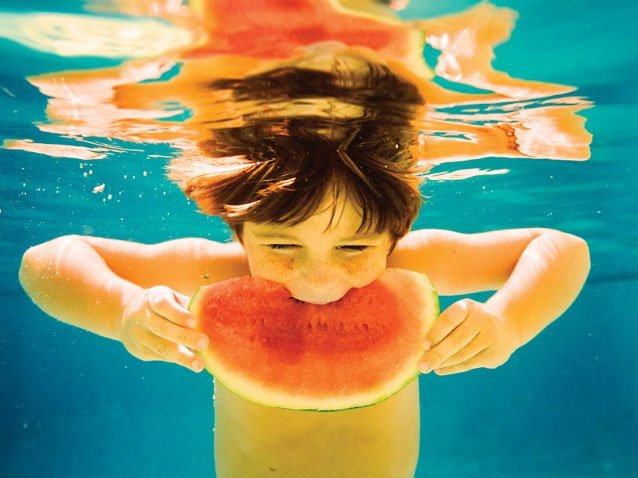
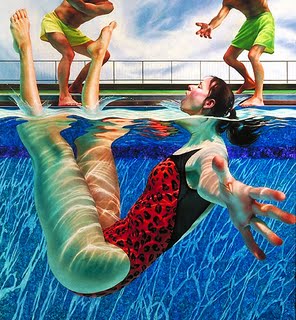
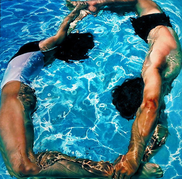
Elena Kalis, Underwater fairytales.
After several experiments regarding the idea of Bill Viola's work with water and film using different props, makeup and costume, I felt as if i'd reached the limit of possible ideas and outcomes. However, when researching underwater art, I came across Elena Kalis' portfolio. By the use of the water combined with props and costumes, Kalis takes a different turn on traditional well known fairy tales, creating a magical and enchanted mood. Elena Kalis uses such a large range of bright colours in her photos which adds to the childlike, happy feel of them. The red against the blue water background in some of her pictures, balloons, watermelon, creates a large contrast due to the two colours being on opposite ends of the spectrum. This should be a key focal area in my pictures, making sure the colours all work well with each other. Another possible idea regarding the pictures could be to create a type story with the pictures, where each picture acts out a whole significant part of tale, this could then later lead to the use of film and creating a video.
|
|
Ideas/themes and props. Teacup Flamingo Flowers Playing Cards Balloons Picture Frame Bubbles Fruit Umbrella Ballerina Fabric Shoes Mirror |
|
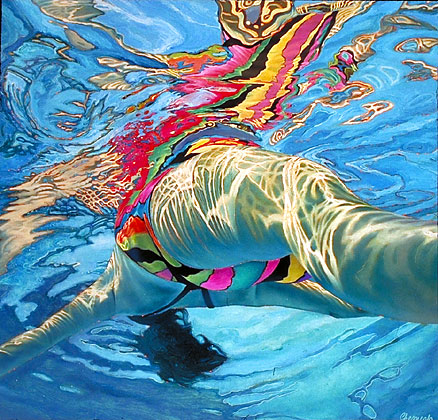
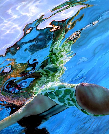
Links to bright colour and underwater textures. When looking at Elena Kalis' underwater pictures, I was firstly hit with the concept of just how bright the colours were, and the contrast they held with the bright blue of the water surroundings. Therefore colour will be a key part in my underwater photos, I found Lorraine Shemesh's art work a good link due to this reason. Even though her work is through paintings and drawings, the use of colour in her underwater pictures really inspired me, plus the idea of the cracked light lines reflected on the figures and the background of the pool (much like Kalis), really highlights the surroundings and underwater setting, making them even more photo-realistic paintings. |
|
|
|
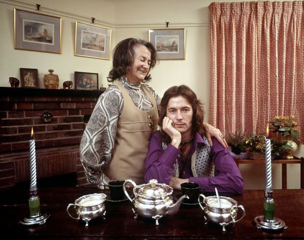
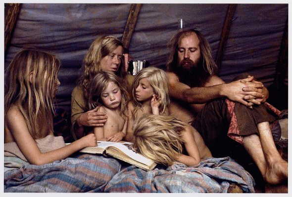
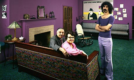
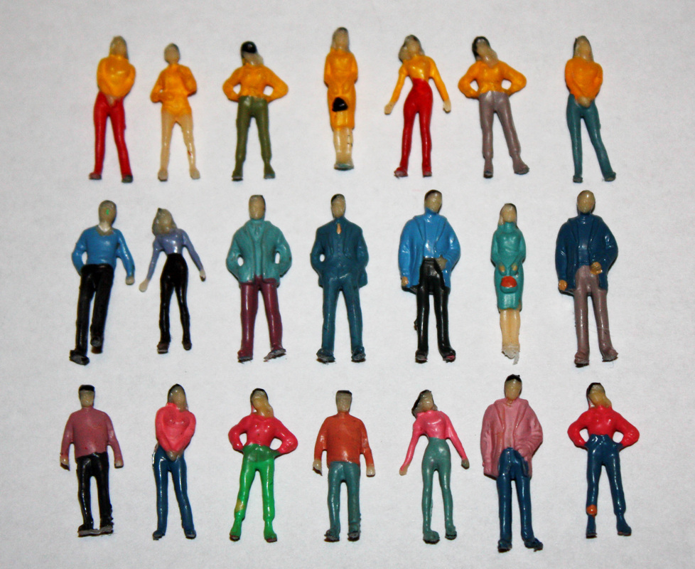
Strand one, Identity. James Mollison- Where Children sleep. For my final strand of the Encounters, Experiences and meetings exam project, I've decided to focus on the idea of identity. There are many ways identity links to the title, such as how certain experiences have chanced the way we are and how we come across, other peoples views and interpretations of us, the idea of stereotypes and how that changes how we are viewed and how our environment reflects who were are. The last idea is presented perfectly by a Australian photographer James Mollison, who traveled the world photographing a large range of children, each differing from each other by race, religion, background, upbringing, wealth and gender. He then took a picture of their bedroom, their safe zone and placed the two together. Each situation the children are in are unique to each child, showing their social situation as a way of addressing complex issues in the world today, through the eyes and property of the children. Mollison didn't just want to take pictures of the most poverty stricken children of the world, he also thought by capturing the over indulged and privileged ones he'd be presenting roughly the same idea such as Kaya, 4, from Tokyo, showing the extreme contrast with the children who don't have a bedroom, or even a bed, highlighting the unjust and unfair issues of the world. |
John Olson.
People and their environment.
James Mollison Response.
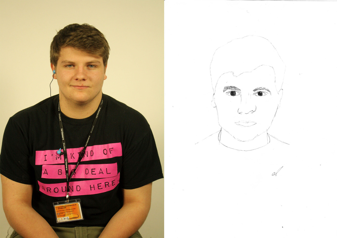
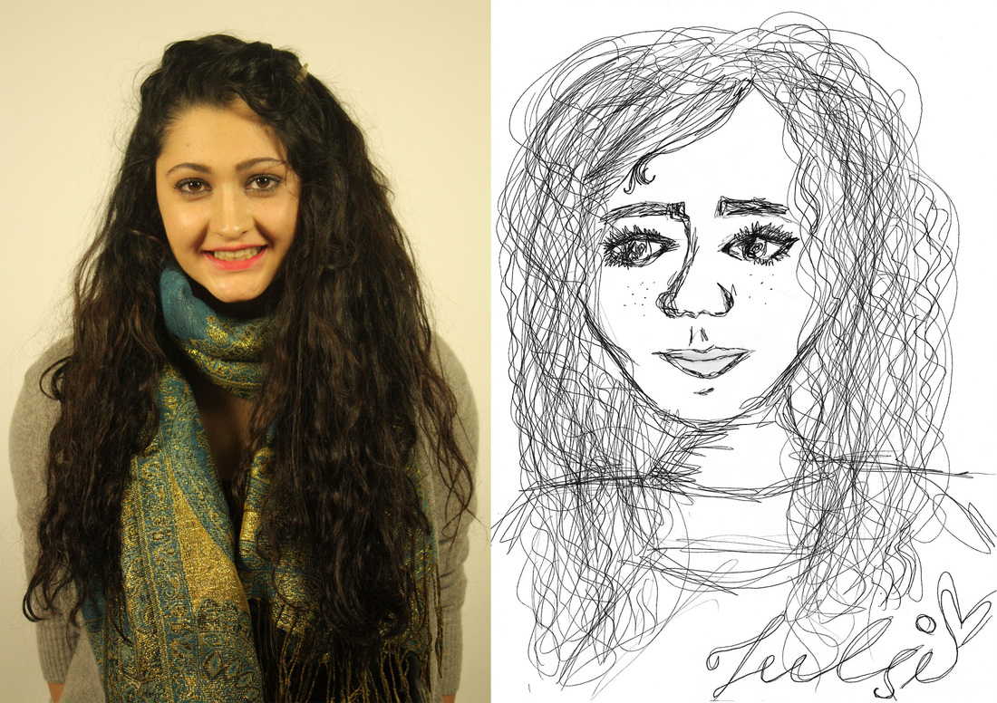
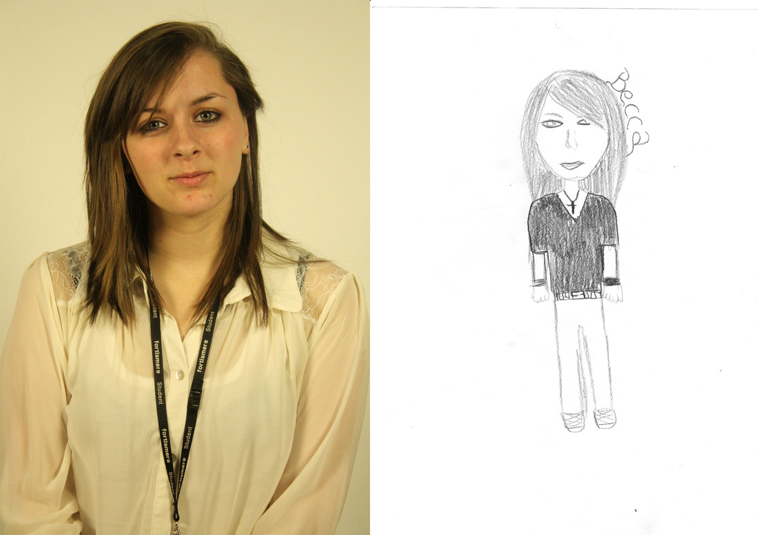
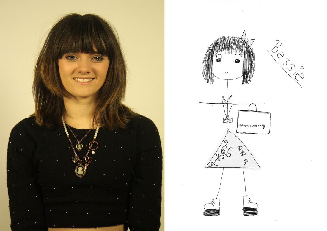
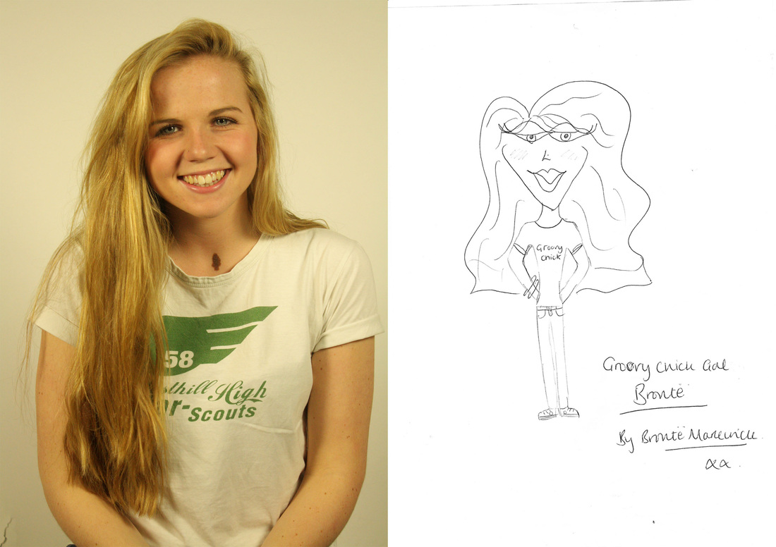
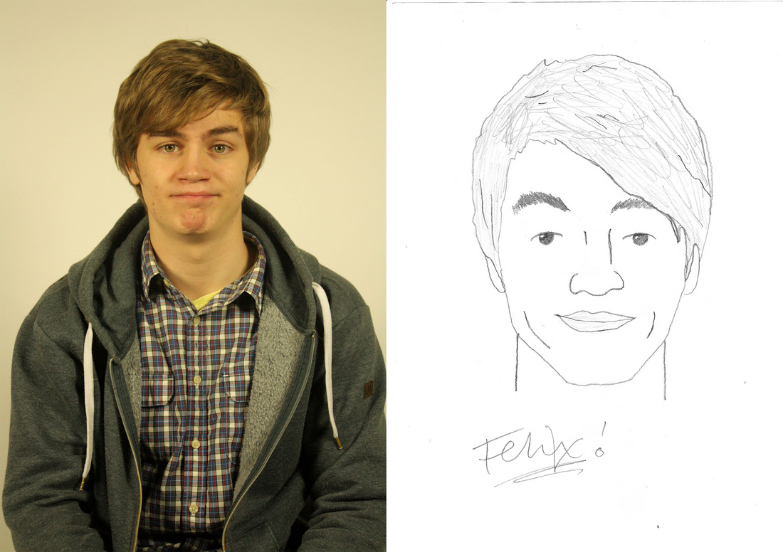
As a further development of James Mollison inspired bedroom photos, I attempted to put a different turn on the next set I would attempt. The simple portrait side of the whole picture, the left, presents the person the way the world sees us, due to the idea of the "camera never lying", the portraits are taken on a simple blank background with studio lighting so that no attention is drawn away from the main focal point of the person on their own. I then asked my models to draw themselves on plain paper which I would then later pair up with the picture, and sign it. I think the photos are all visually effective due to the two different medias side by side, but also due to the playfulness of each one. At first glance, we experience this idea of childhood pictures, and how distorted are view of ourselves are, and then as we get older and break away from the playful idea, how more realistic they are. I think we can tell a lot about the person due to there pictures, from their drawing style, on how they view themselves, but also how similar they are to the childhood cartoons we used to draw. The way we sign out names also shows some significance in this to, down to what our names say about us to our handwriting style. In terms of my objectives, these pictures were successful, however I am slightly displeased with the yellowy tone on the photos in contrast to the white, white paper beside it. I would also like to explore other ideas in this area, maybe looking further into the handwriting idea, or possibly group up and get others to draw one another.
Identity, Organisation.
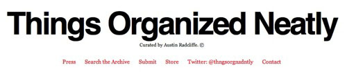
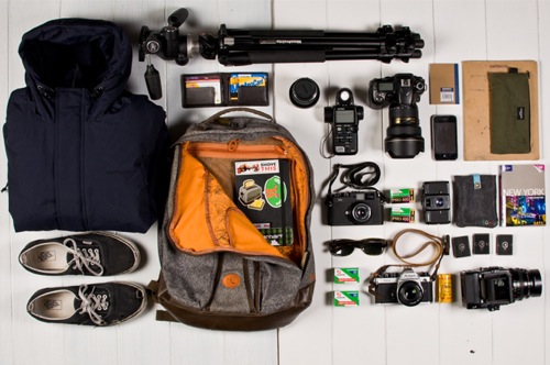
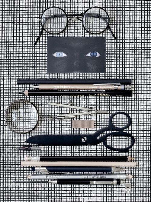
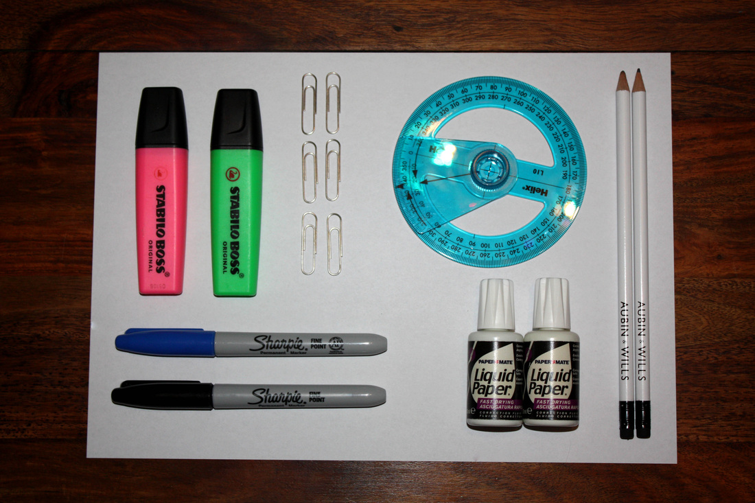
As a new take on my identity strand, I found a blog on organisation, which relates perfectly on from my previous responses of the way people view themselves, through drawing. This idea focuses on personal style, skill and neatness. To simplify this, I had the idea to focus directly on peoples own direct organisation. Austin Radcliffe is an Indiana designer who created the blog, www.thingsorganizedneatly.tumblr.com, shows this idea perfectly. The neatness and ways of presenting objects can tell so much about a person and their way of life, fitting into the theme of Identity. A possible next step in this could be contrasting these to peoples clutter and mess, or perhaps like before pairing a someone up with the way they tidy their desk, for example, or what they carry with them in their bags. Some of the pictures below could be preparation for certain experiences. It also relates to the theme the way the objects are aligned next to each other, or how they meet on the blank surface.
Response.
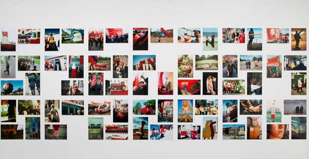
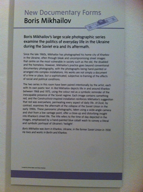
Gallery Visit, Boris Mikhailov.
As part of the Encounters, Meetings and Experiences exam project, I went to the Tate Modern to get some ideas on other themes for the project. One of my favourite pieces of photography from the gallery was Boris Mikhailov's "Red". This piece not only opened up new ideas for a possible "Experiences" strand, it also gave me inspiration for possible presentation for a final piece. For example, Mikhailov sticks to a current theme of the colour red throughout the pictures. Some of the photos he photographed red originally, and others he actually painted red on to the pictures. Each picture is part of a series about the everyday life and politics in Ukraine around 1968 and 1975, the colour red acts as a constant reminder of the of the soviet era.
|
|
Strand Two.
Contact, Combinations and Movement.
As a second strand for the project, I feel to extend my previous portraiture coursework idea of movement. I looked at a few basic videos on Youtube to gather some ideas and possiblitlties for new branch on that one. The slow motion videos link to the title by the key moment that two objects come into contact and there is a reaction due to this, for example in the right video below, the moment the water balloon meets the mans face creates a large ripple effect and exaggerates the moment of contact., relating back to the title. I first started with a basic direct response to the flu awareness advertisement below, filming my model sneezing then on imovie, slowed the video down. The video highlights the movement of the sneeze and seperates it into three main sections, the point where they meet is the ideal focal point/topic. However, as this response was a very basic experiment taken quickly with a studio setup, I feel there is lots to improve on. I firstly feel that the majority of the video is out of focus, a key issue when filming. For my next attempt I should spend more time on making sure the shot is perfectly in focus and of the highest quality. I also feel the sneeze I filmed wasn't as dramatic as the one on the flu video. This is because a motion such as sneezing is quite hard to create in this particular environment. I could also exaggerate the sneeze by having the model hold water in their mouth before hand, allowing it to spray on the sneeze, trying to avoid it looking to staged. Although I'm very interested in following the slow motion/movement idea up further, I feel the ideas in the bottom left video could possibly become slightly boring or repetitive after a while. Therefore I need to research photographers who have incorporated this idea into their work some how.
|
|
|
Possible Ideas:
Water balloon, Sneezing, Lighter, Jumping, Paint, Popcorn, Blender, Fizzy Drinks, Frying, Pillow Fight, Bubble Blowing, Punch, Bullet. |
Response.
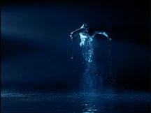
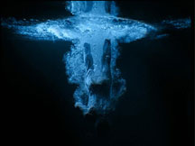
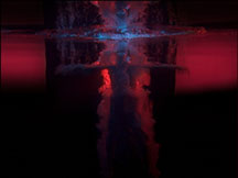
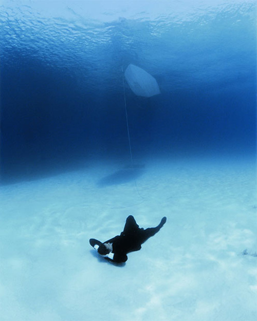
Bill Viola.
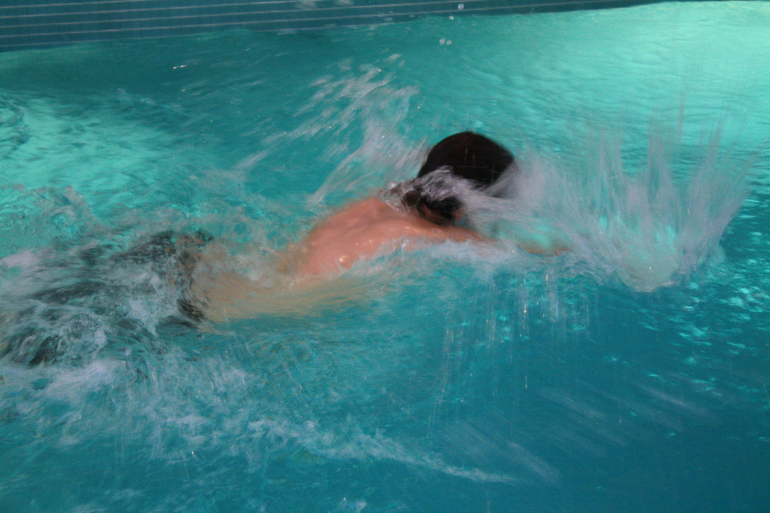
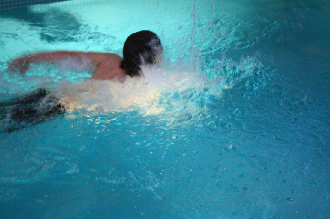
As an extra piece of research into movement/speed, I looked at Bill Viola, who for forty years has been creating videos which relate to the Encounters, Experiences & meetings title due to his focus on universal experiences such as birth and death. A lot of these works featured in largely distinguished exhibitions and collections over the world. The video to the right, "creation angel", is one of Viola's most well known videos from a set of videos and stills called "Five Angels For The Millennium", produce in 2001. Originally, Bill Viola set out to take several different photos of a man plunging into water for different ongoing projects, a few years later while going through the old footage, he discovered the five shots that worked just as well as stills as they did as short video clips. The main objective for the pieces was to capture the man sinking, however when Viola looked at the footage closer and gathered other people opinions, he played around with sleep and order of the tape. When he reversed the videos, he found a new angle on the footage, by the figures rushing out of the water, capturing the main theme of death to birth.
|
|
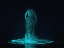
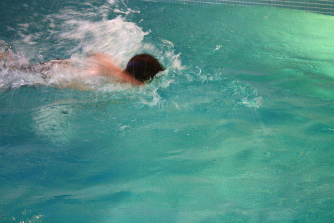
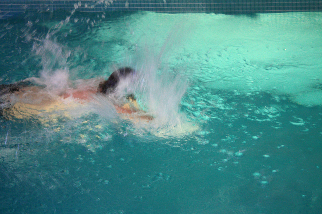
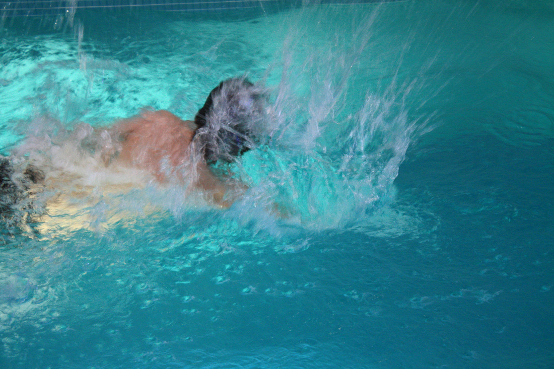
Bill Viola Direct Response.
|
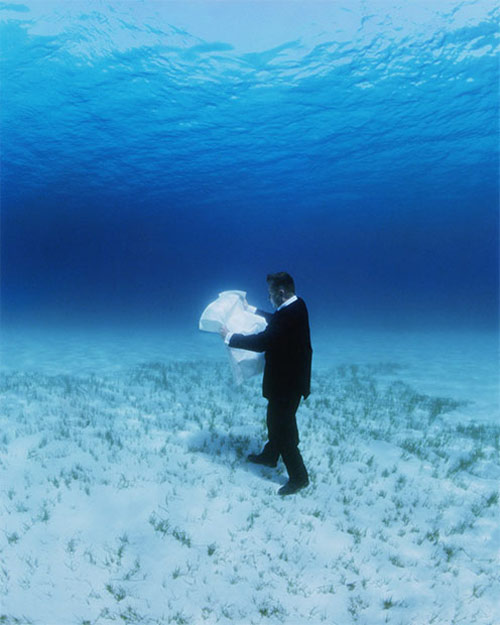
To the left are my videos in reponse to Bill Viola's angel film. I am very happy with the outcome, the texture and movement created after the slow motion edit is very effective and the splash created reversed adds a twist to the original photos, perhaps a sense of surrealism. The only thing I'd change with these is focusing on how the water changed colour after the jump due to the lighting, yet I feel this may prove difficult to change.
|
|
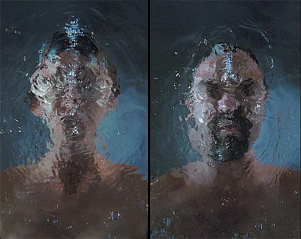
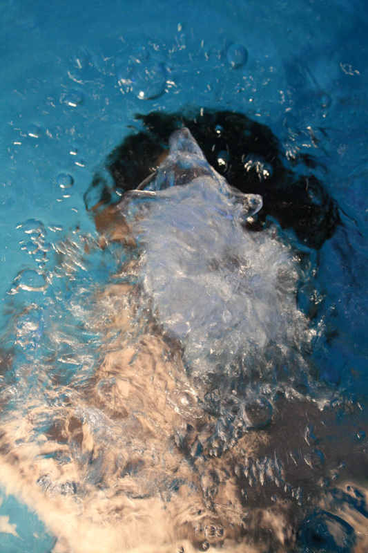
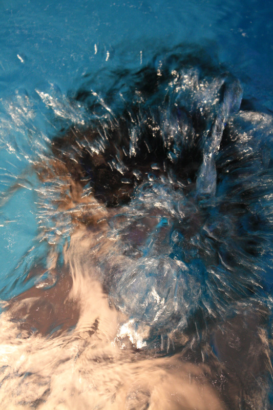
Further experiments for Bill Viola distorted faces. |
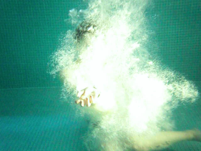
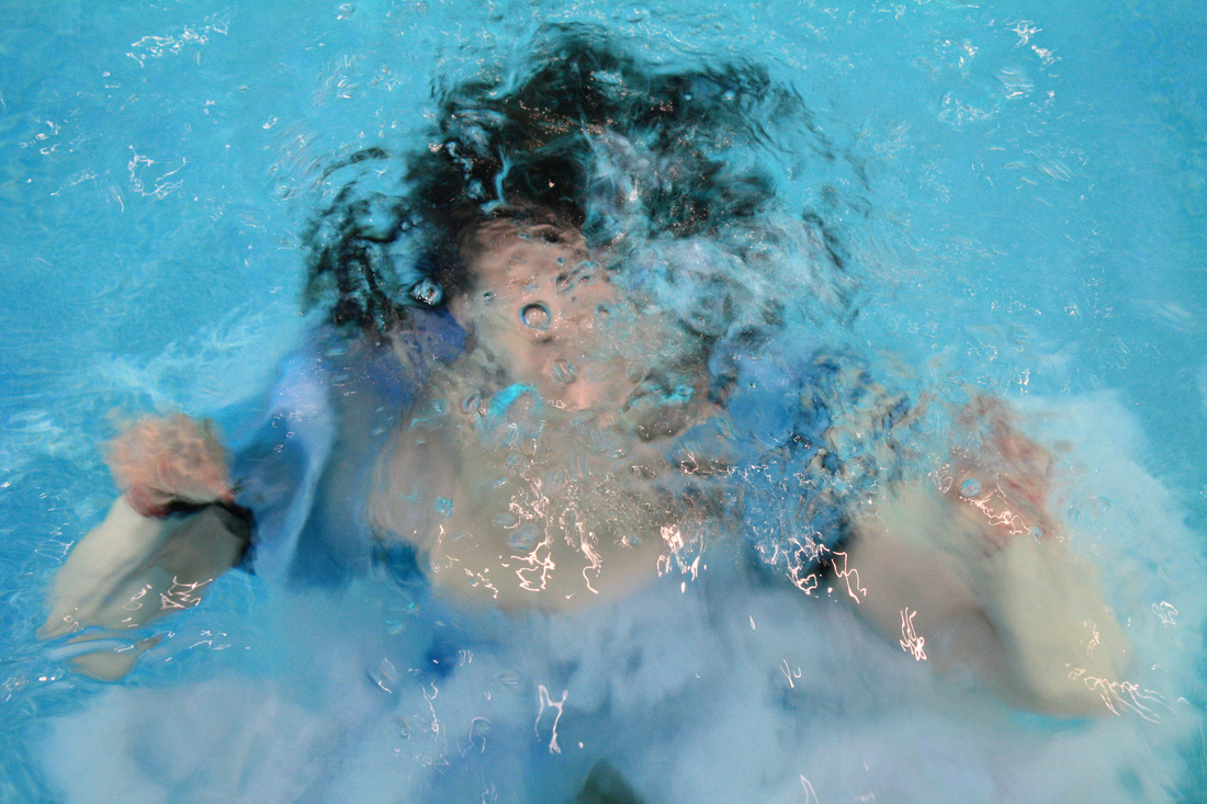
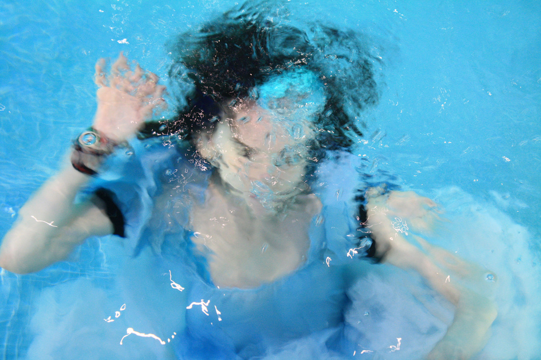
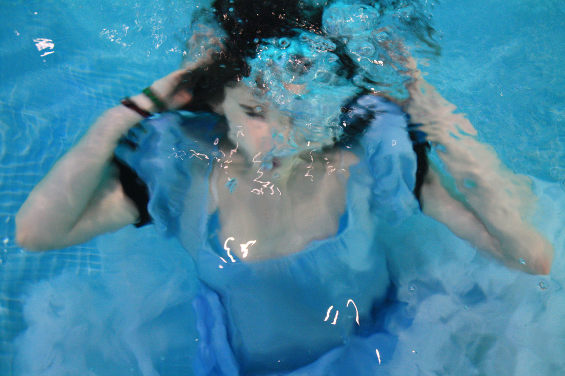
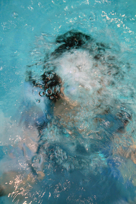
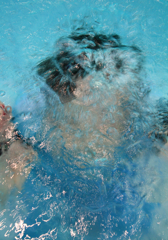
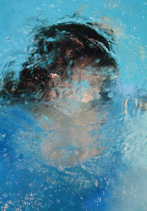
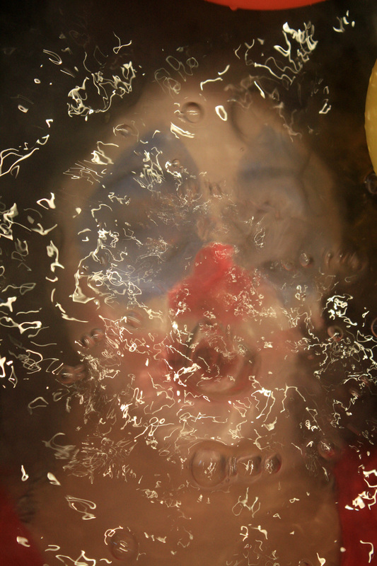
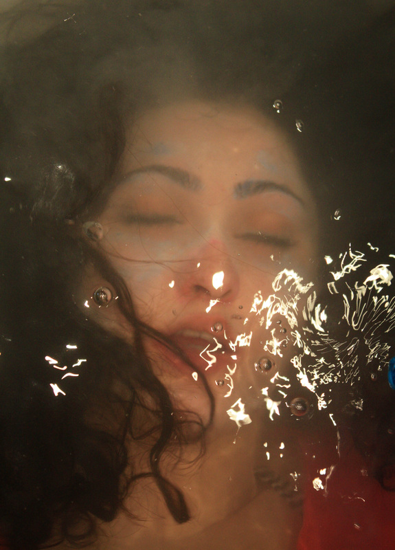
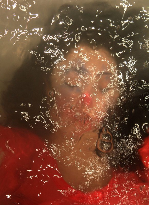
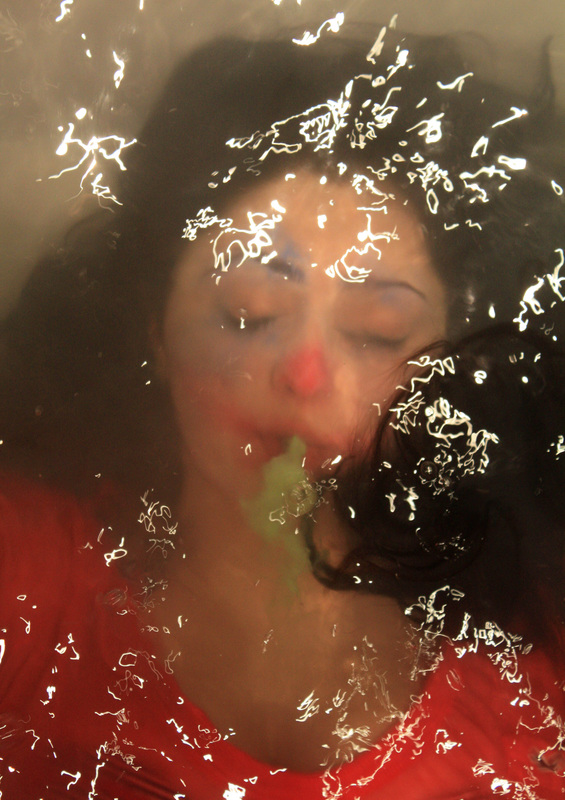
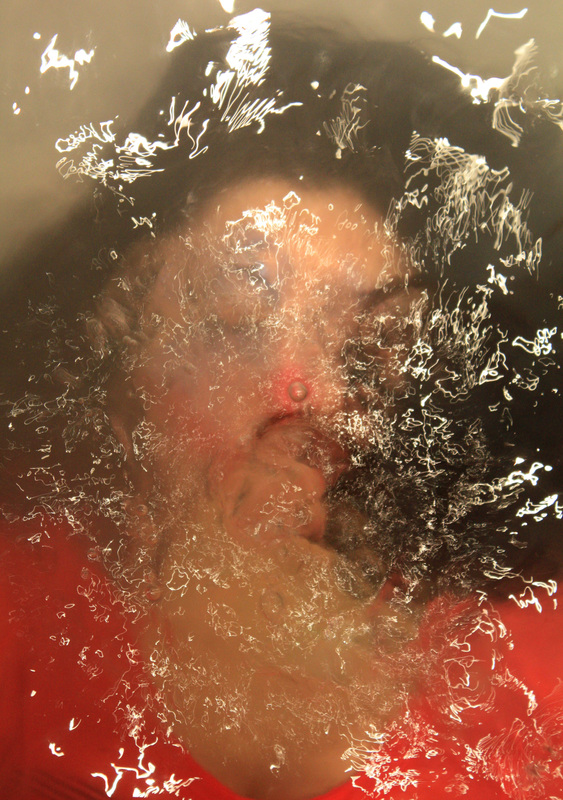
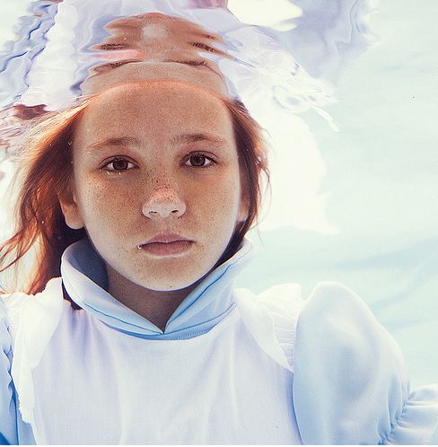
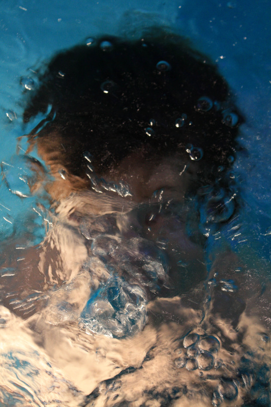
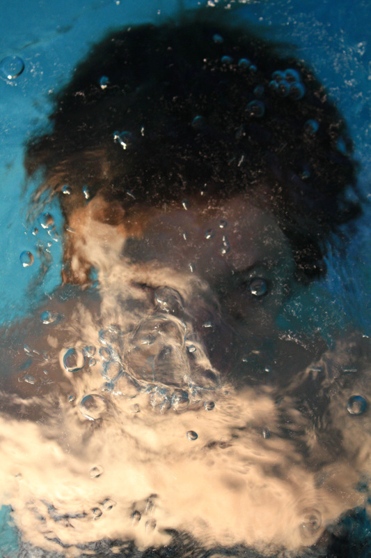
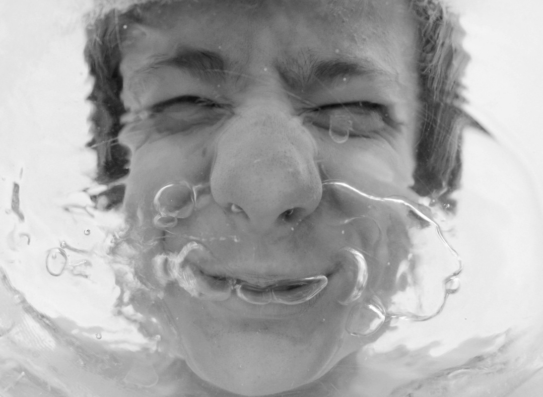
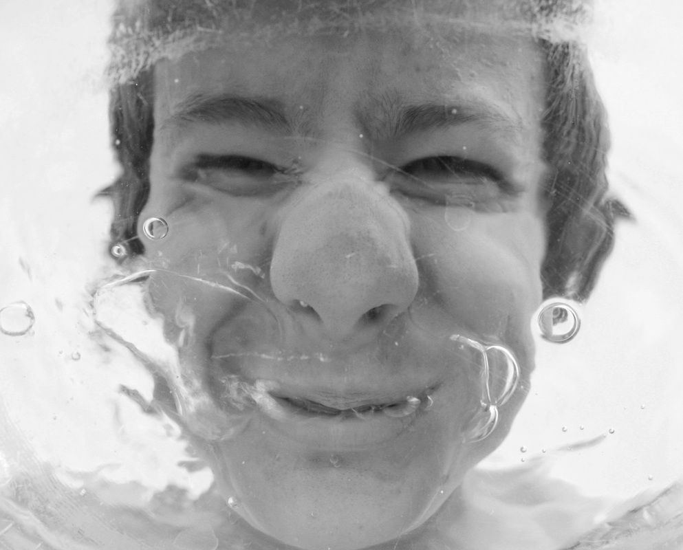
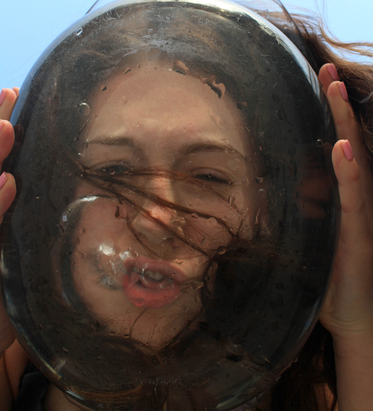
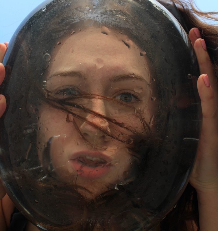
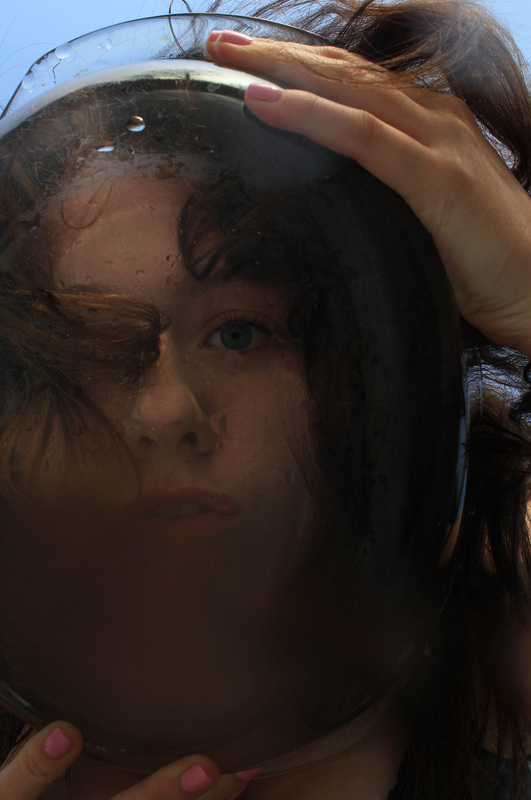
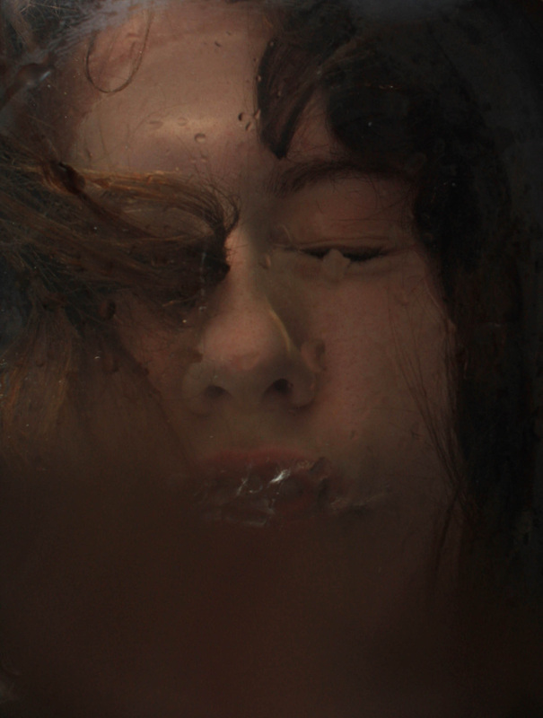
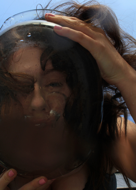
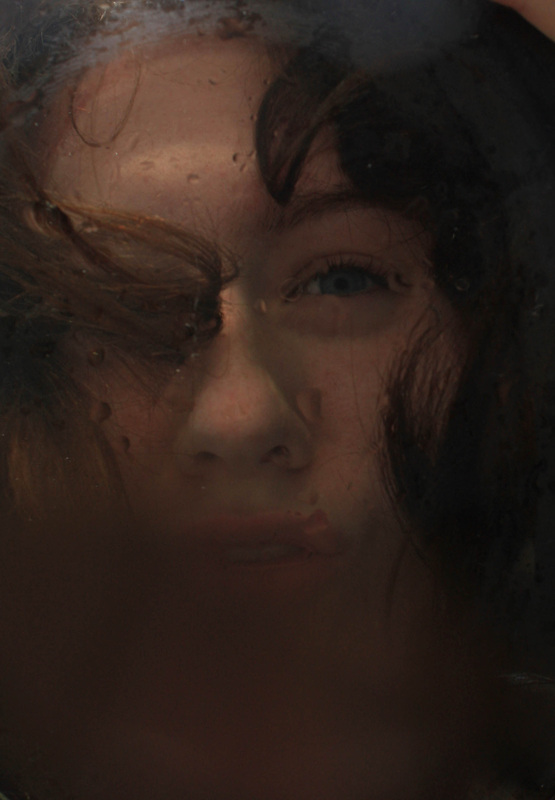
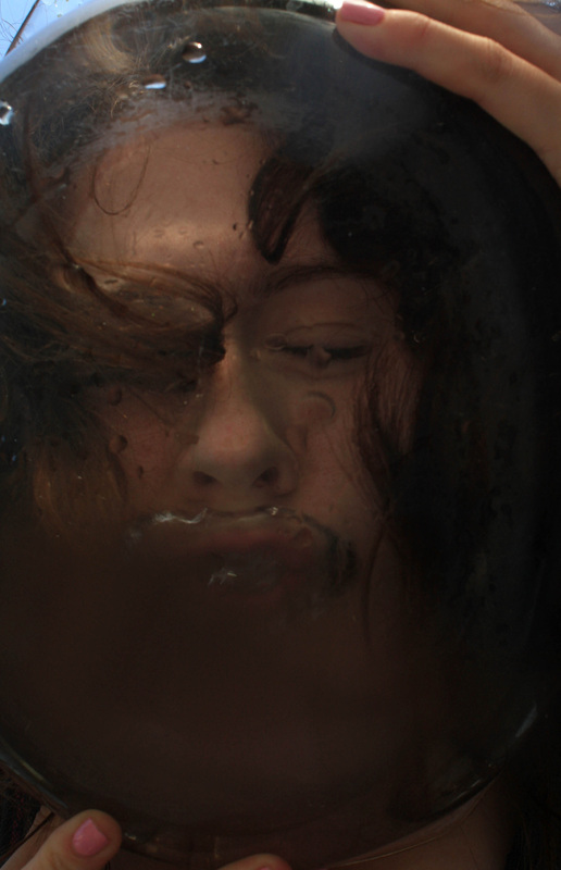
As a step on from Bill Viola's distorted face/water pictures, I decided to take the photos from a different angle as to just from above, these ones are taken from below. I stuck mine, and my models face into a bowl of water, and blew bubble to add some texture and distortion to the pictures. In some of the self portraits above, the bowl is in shot which gives off a nice effect almost a sense of surrealism. When first looking these pictures, especially the bottom left, they remind me almost as if someone has placed their head in a fish tank. To refine these further I could add props, such as goldfish (however there are limits to that), plants and flowers. I would also have the model create more movement in the water which will take the photos up a level and make them all the more interesting, as I feel these ones above have a limited amount of movement. |
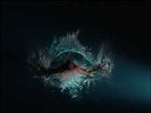
Further experiments for Bill Viola jump.
|
1. Underwater angle. 2. Objects, Balloons. 3. Clothing. |
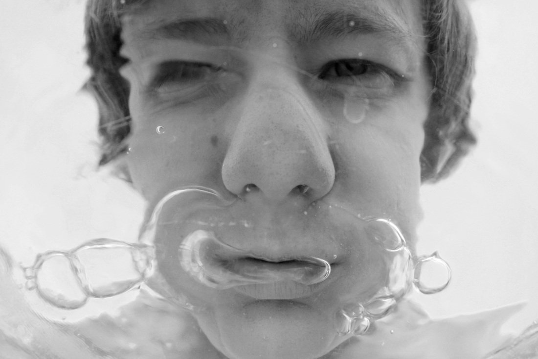
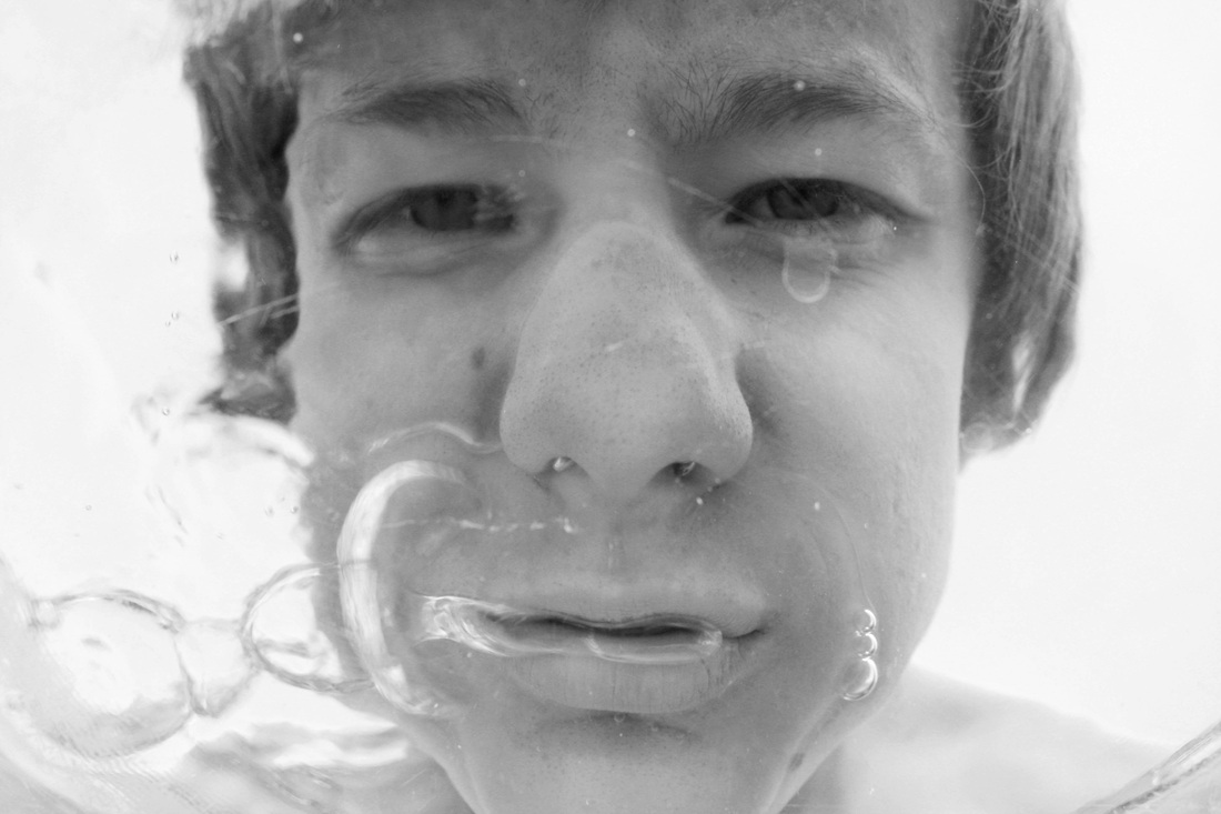
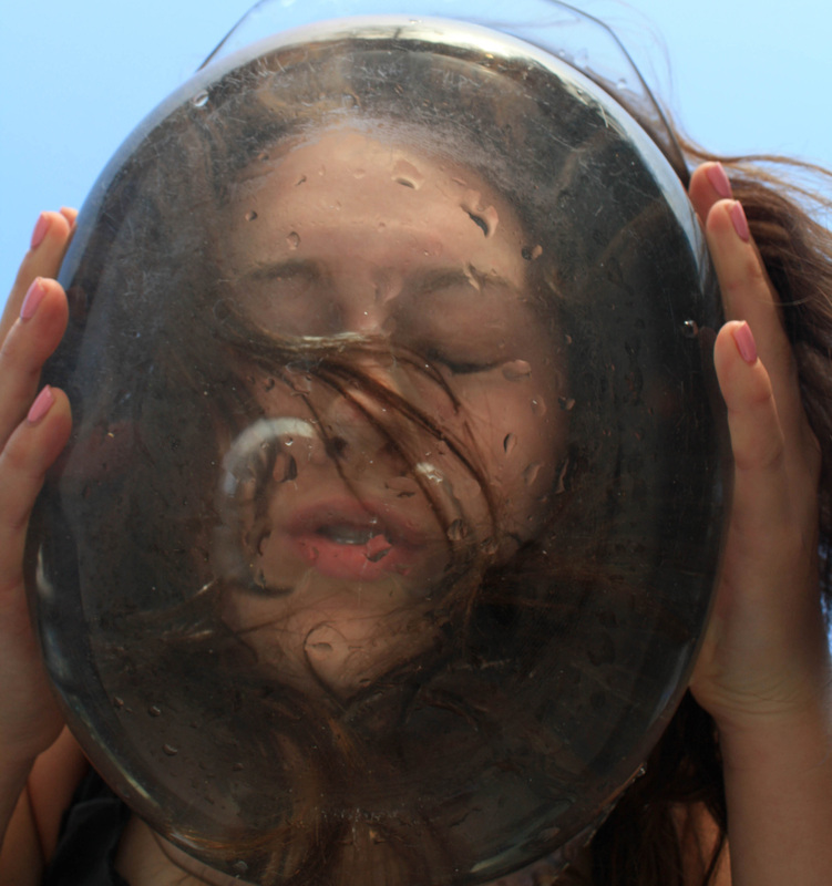
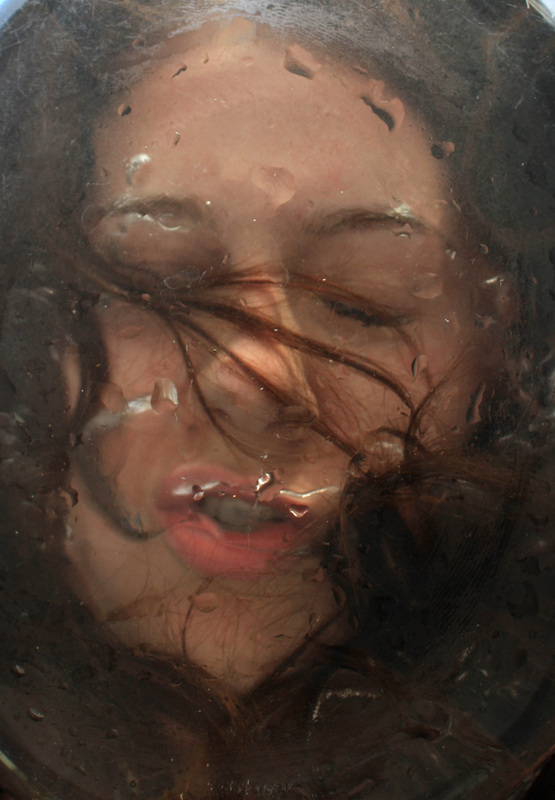
Phillip Ramette.
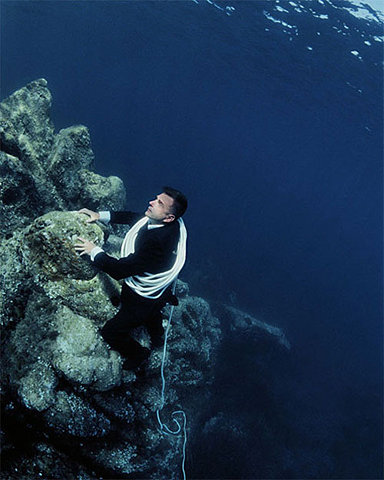
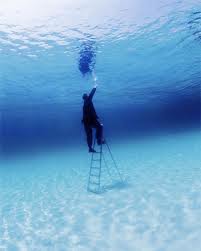
Phillip Ramette is a French photographer, born in 1961. His pictures and ideas fit in well with further development from Bill Viola's set. Ramette tries to create illusions of humans breaking rules of gravity and movement. Throughout his pictures, He wants to create journeys and stories of individuals. I find Phillip Ramette's use of costume and props very interesting. His use of surroundings in the first picture adds to the sense of surrealism already their through the underwater effect and the clothing. The colour hue in all the pictures works well too, in my clip above taken from below I have only managed to achieve a slight green/yellow effect. I feel it would look a lot more successful and overall more attractive if it was the blue colour like in Ramette's pictures. By discovering this set, I feel I can step away from the idea of the slowed down movement and possibly focus more on the underwater subject and objects, possibly creating a story or journey like Phillip Ramette's.
|
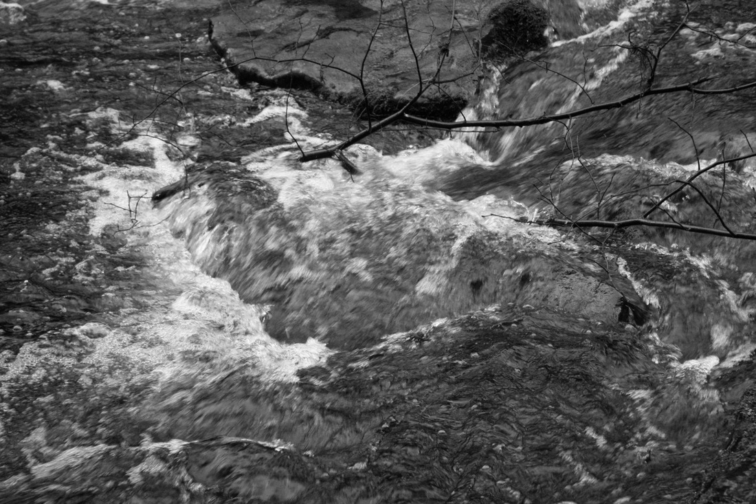
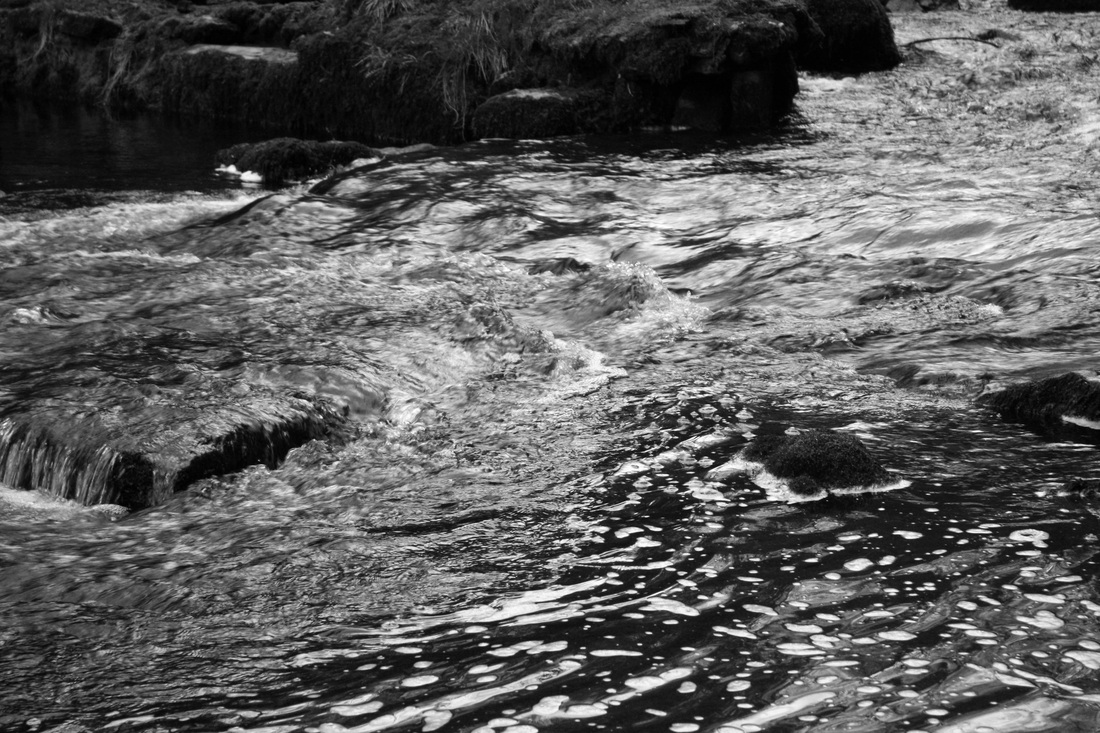
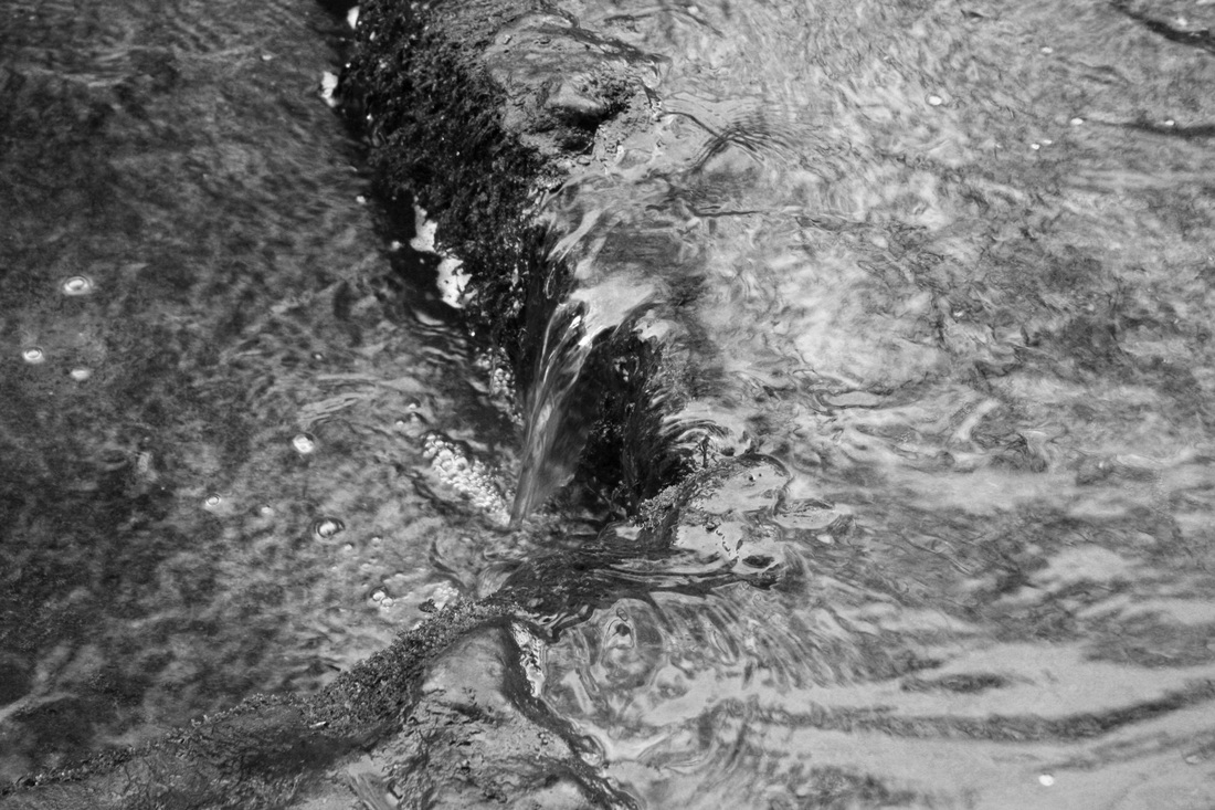
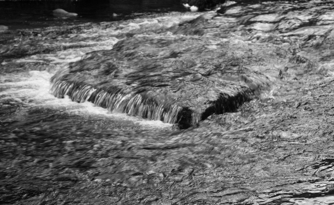
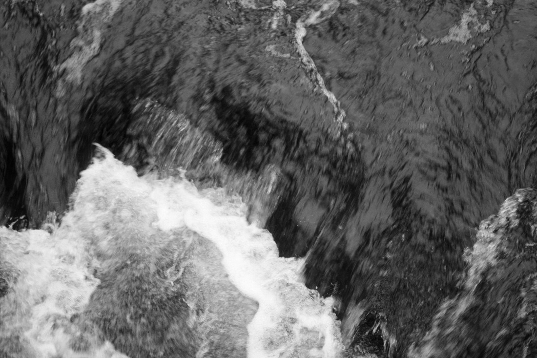
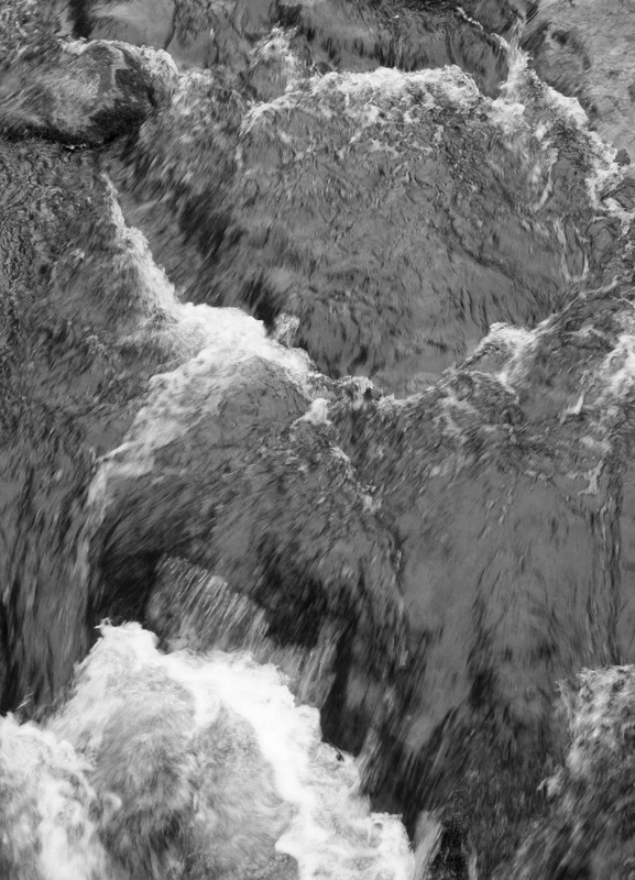
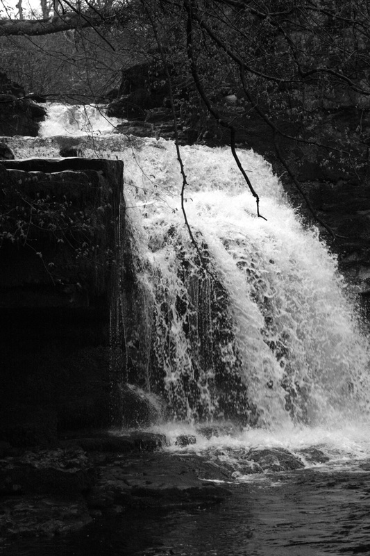
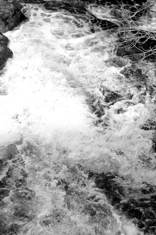
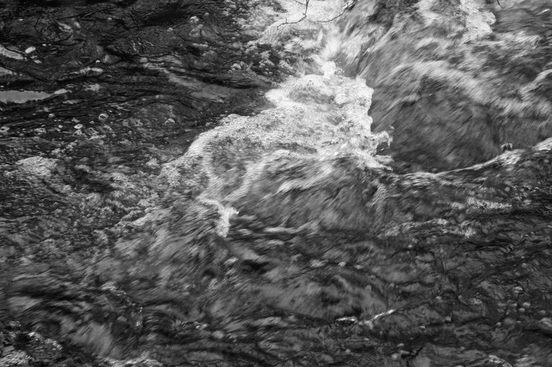
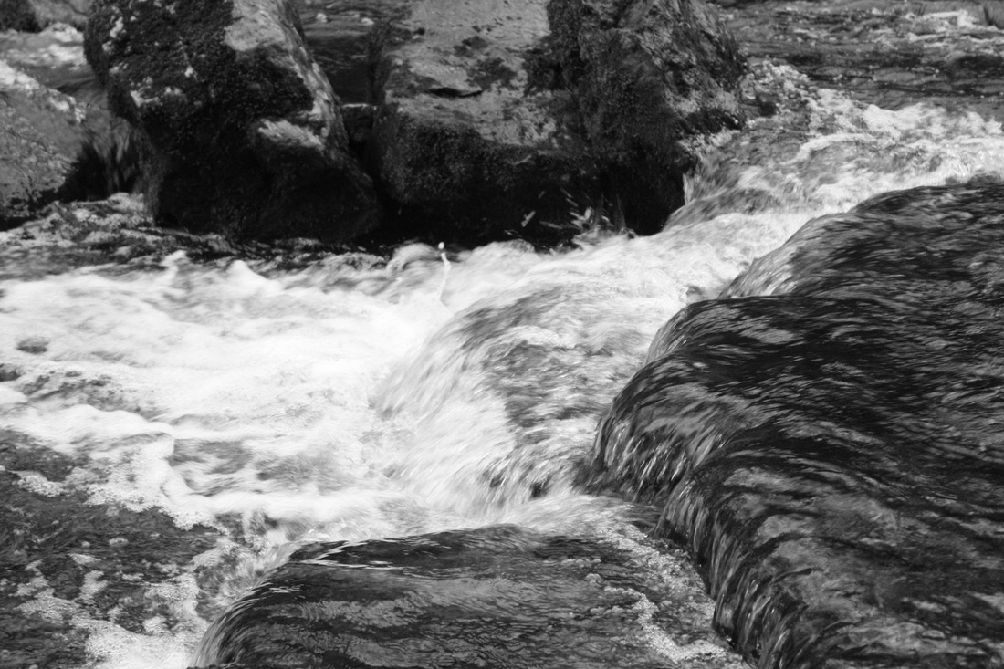
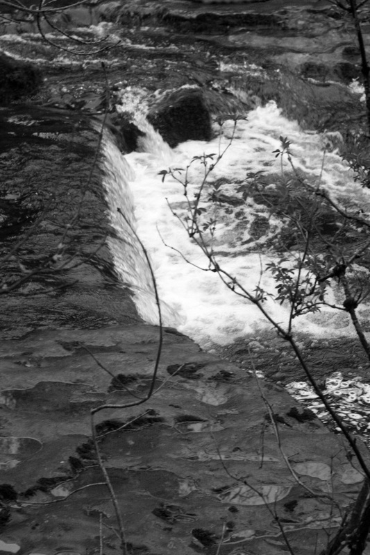
As part of my movement and water strand, I decided to experiment with a different aspect of the theme. I captured a set of photos of running water all around a waterfall. In some I used a fast shutter speed to keep blur to the minimum and to capture the ever aspect of the movement. Some however do have slight blur, I quite like this look as it highlights the water all flowing into one. When editing, I lowered the saturation and kept them in black and white, as the original colours were quite dark and muddy looking anyway, this way the focus is on the water and makes the pictures look a lot more peaceful and elegant.
|
|

Strand Three.
Contact with floor, different levels and angles.
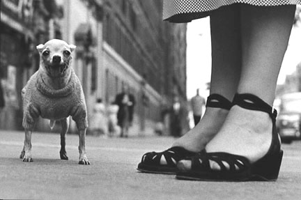
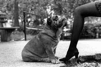
Elliot Erwitt."Balance of light is the problem, not the amount. Balance between shadows and highlights determines where the emphasis goes in the picture...make sure the major light in a picture falls at right angles to the camera." |
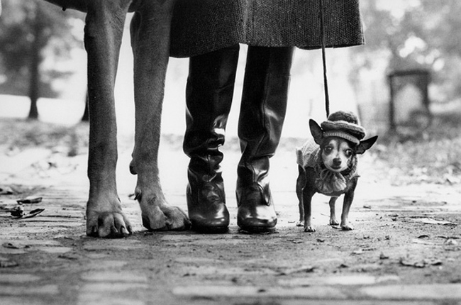
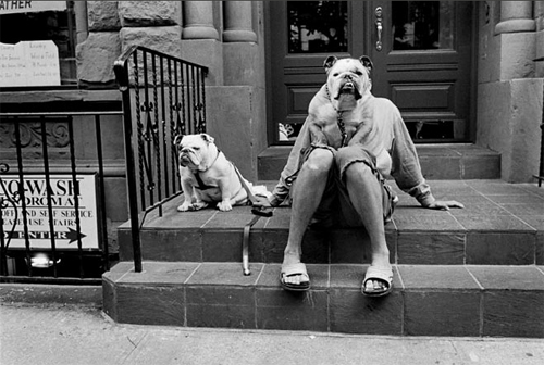
Elliot Erwitt is a French photographer born in 1930 to Russian parents. In the fifties Erwitt moved to America and began his career as a photographer there, capturing ironic and absurd situations. The photograph to the right was taken in New York, 1974. "Dogs Legs" is the ideal picture in viewing figures using different perspectives and angles. Elliot Erwitt relates to the title by exploring the links between animal contact and human contact, the relationship between animals (in this case the dogs) natural environment. "Dogs Legs" has a hint of humour to it, for example the sizes of each dog and the human hat on the dog. The picture mostly explores the idea of the relationship between owner and dog, which is very clearly presented through Erwitt's photographs, and how the dogs could quite possible be the most important being in their lives. This is shown through the positioning of the legs, how the human is in between her dogs, and the loyalty the dogs have towards her, always close by her side, and her being the centre of their lives, making the photos somewhat warm and comforting, which is a contrast between the mood and the black and white colours. This colour choice adds to the raw, dirty feel of the city. The picture does not feel staged, Erwitt seemed to take the picture in scenes as he would find them, adding to the humour.
|

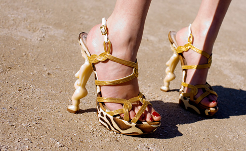
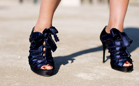
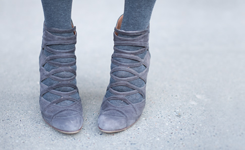
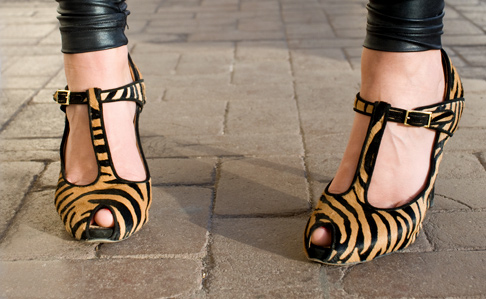
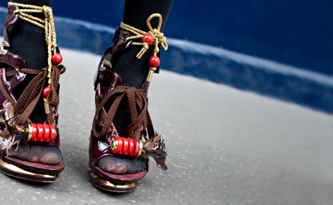
Wayne Tippets, Street Style.
Fashion Week 2009.
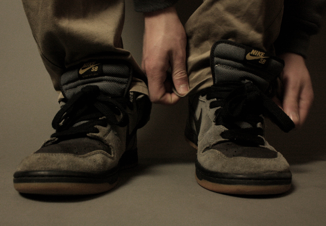
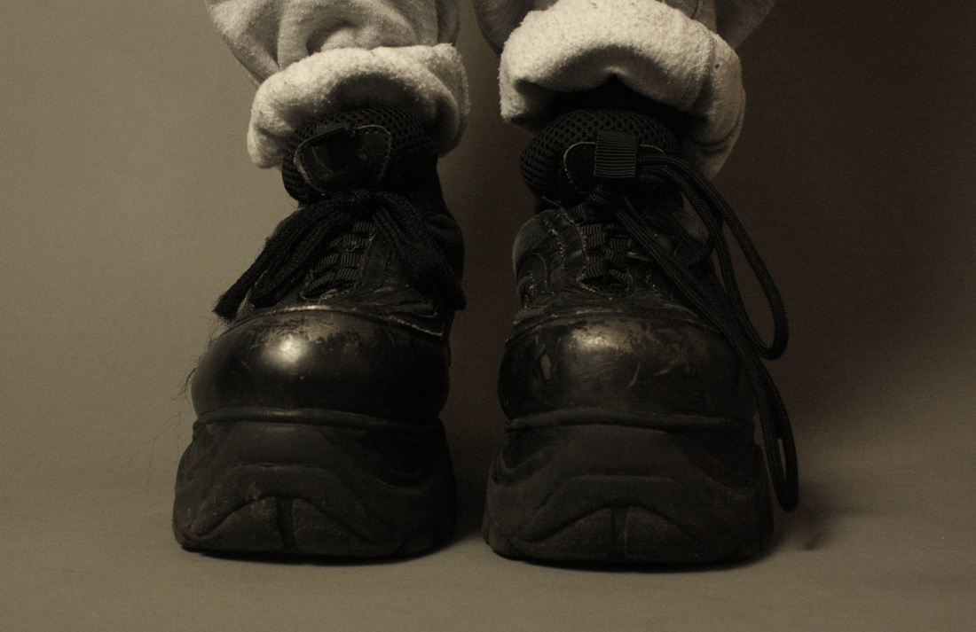
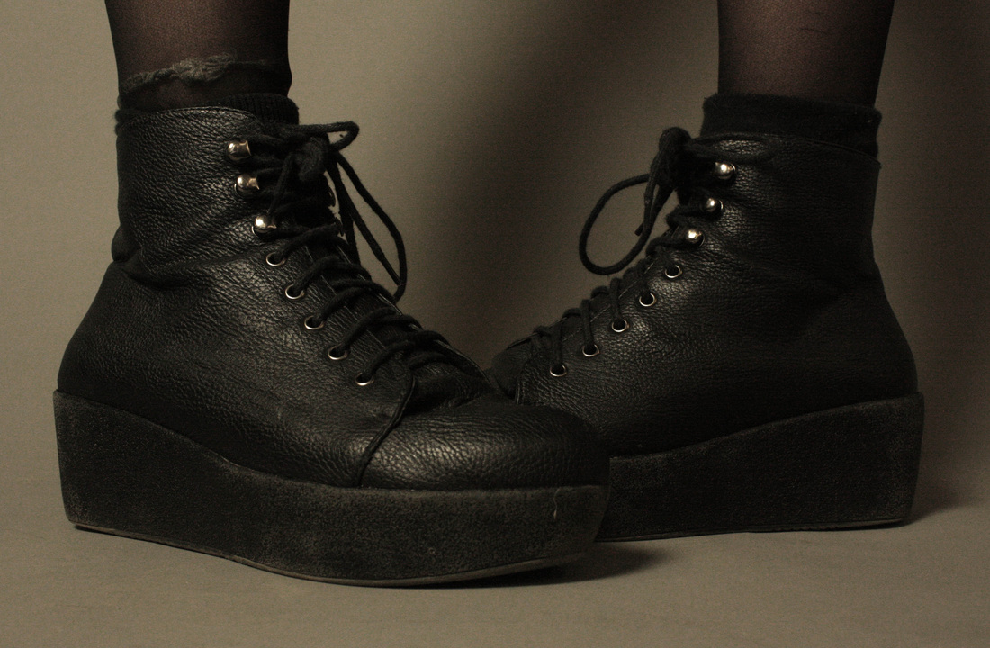
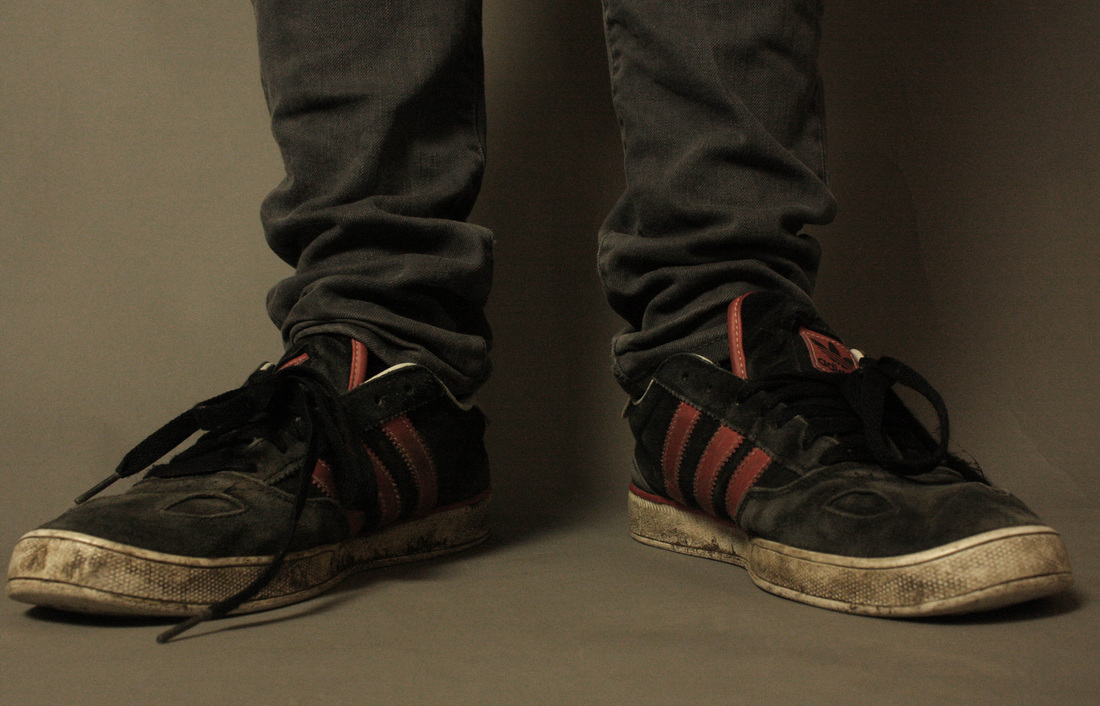
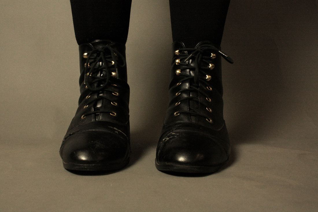
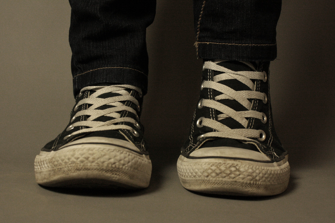
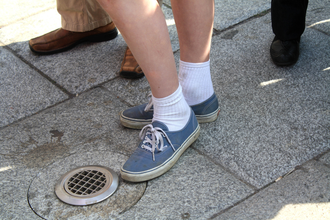
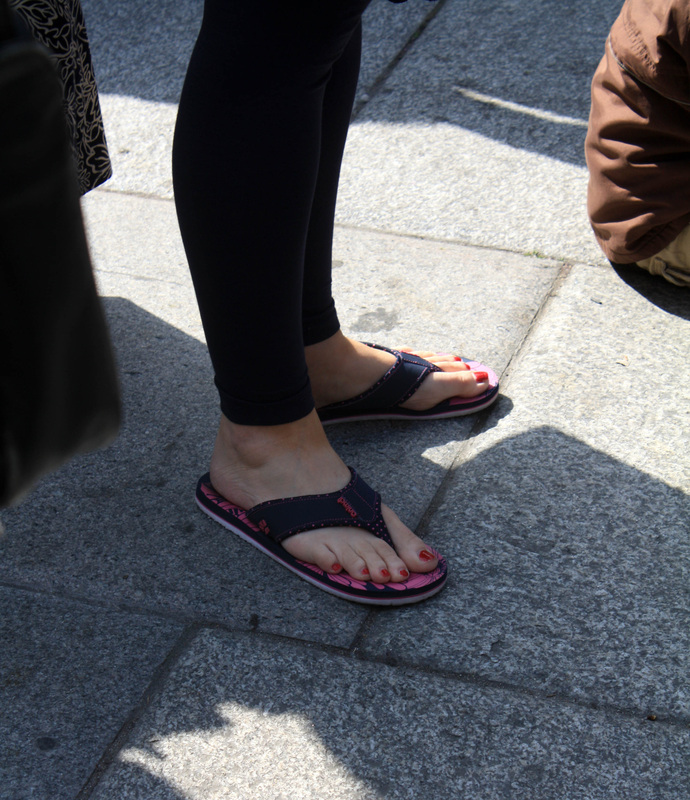
Basic Contact Experiment.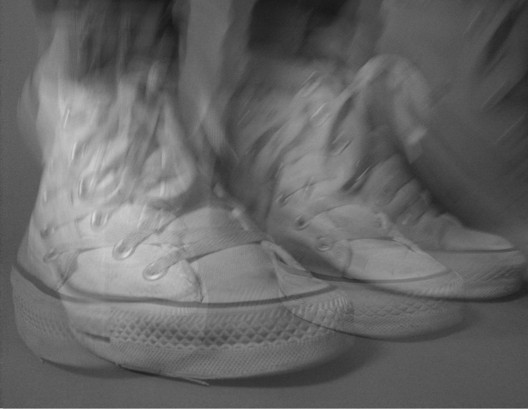
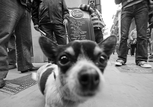
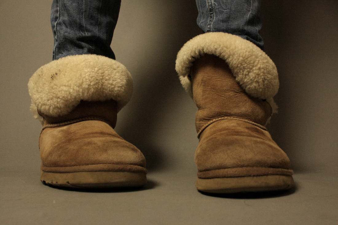
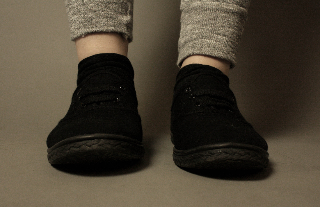
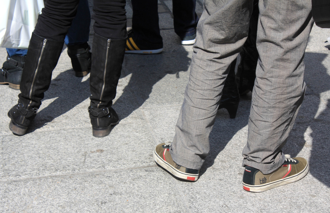
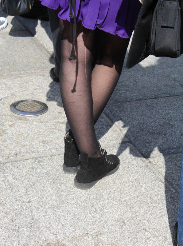
As a third strand/idea, my interest is focused on the less obvious idea of contact and meetings through an idea that we don't think about a lot/take for granted. This idea came from Elliot Erwitt's set of pictures from a lower angle, of the contact certain people have with the floor. From this idea, I can explore different ways people have contact with the floor; this includes shoes, the way people stand, the relation we have with animals, ect. So far I have taken a few shots at floor level of people shoes in the studio. This by no means would be I final idea, just an experiment from floor level, and testing the way people stand from that level. I feel all of these picture work well together in a grid like formation, highlighting the different way people stand and their taste and almost how people's sure reflect personality, yet without a face, its left to the imagination. The picture on the top left is several pictures layered on top of each other, each layer is slightly opaque (i.e 50%). This creates the effect of the person moving, thus highlights different peoples movements, and also creates an effect of long exposure. To improve this, I will take this idea to different backgrounds and environments, possibly matching with the types of shoes there wearing. This may end up linking to Wayne Tippets street style (above) pictures, in a fashion photography way, linking to personality, status and even culture.
|
|
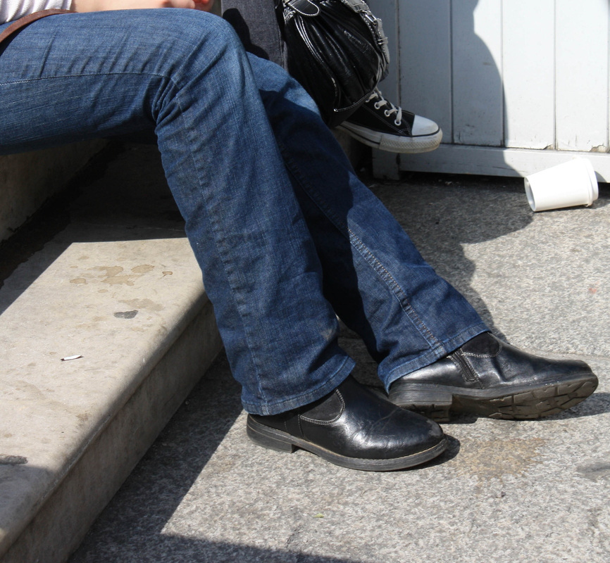
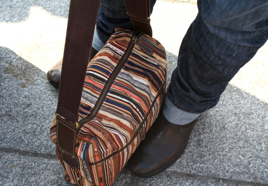
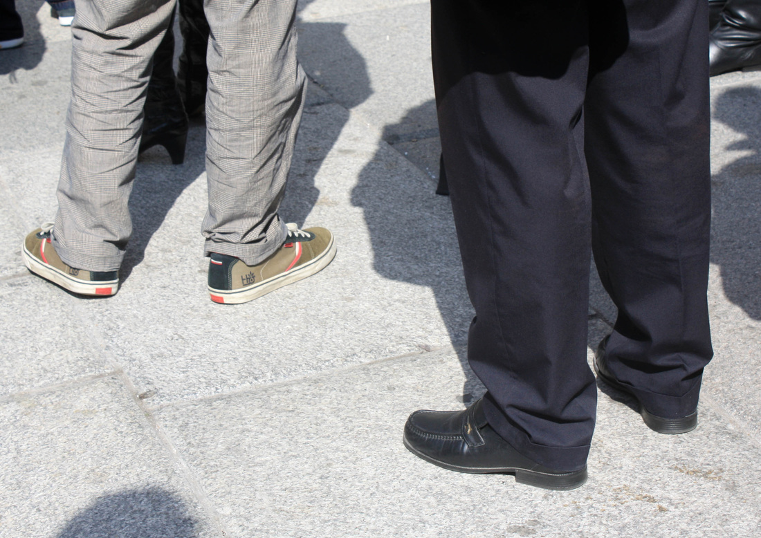
Further Response, The Queue.
|
|
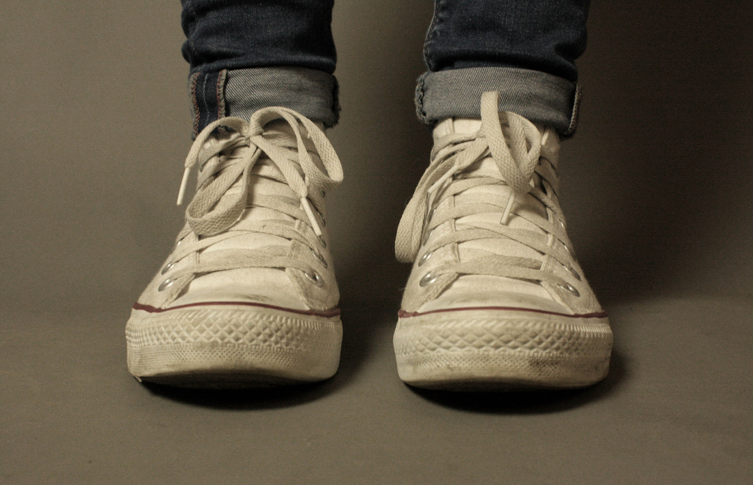
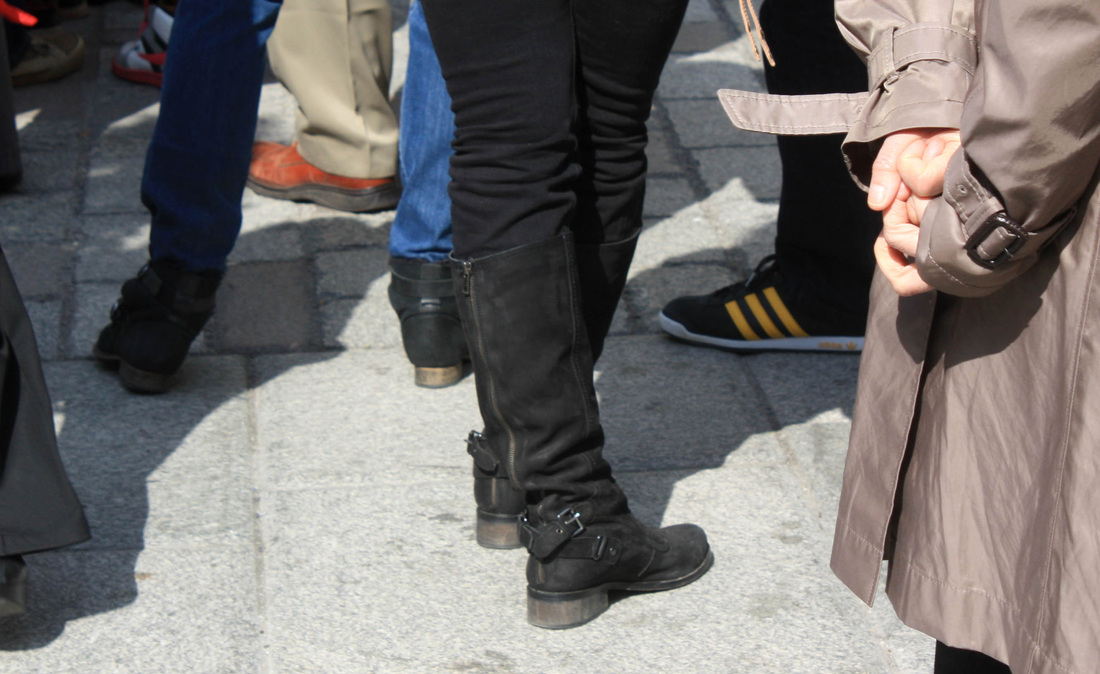
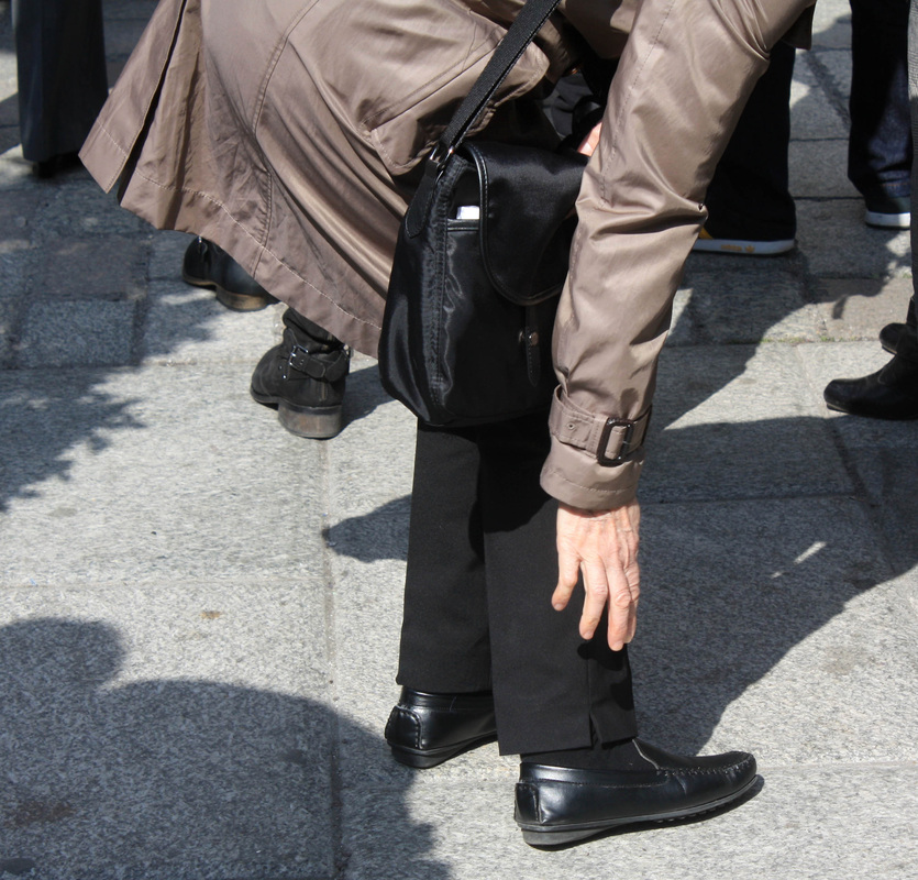
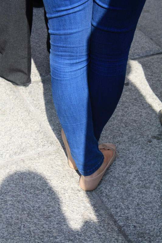
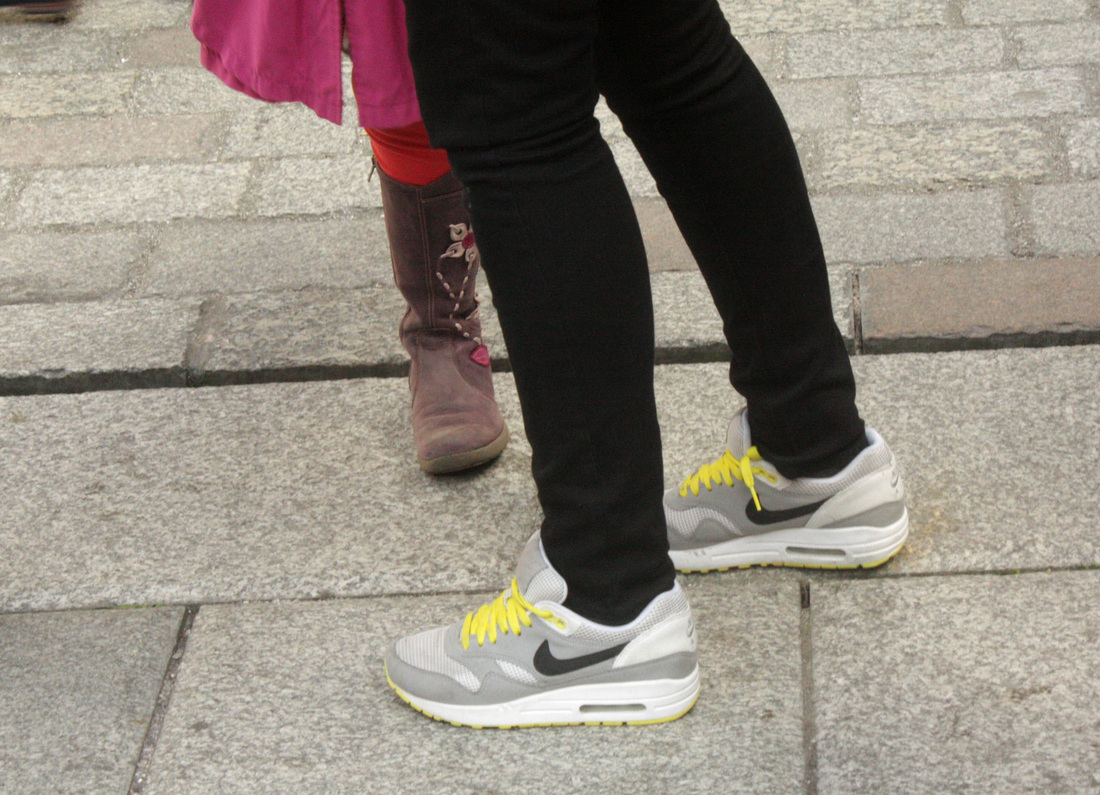
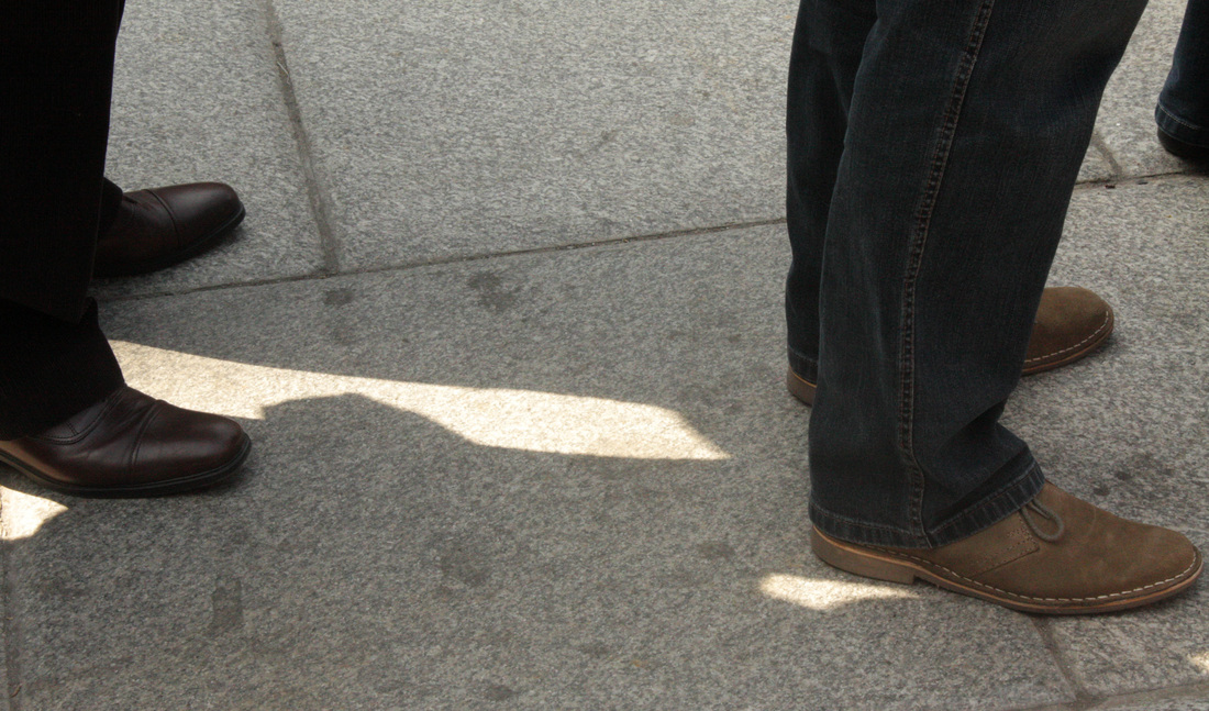
I improved my contact idea further by adding a background and objects, I did this but taking a series of street shots. While waiting in a queue for a while I noticed the different way people stand, along with their different shoes and found it quite interesting. I think these work well as a set due to these differences, and the raw, real life background compared to the previous studio set, works well in adding a story. I then focused more on objects in the two pictures to the left, this still focused more on aspects of the persons personality and interests. Even though I do like the set of pictures above, I feel as if their is only so much I can do with them, and they only make real sense in a group. I feel I'd struggle to take it any further from here.
|
Half Term Experiments.
Places, Runway.
|
|
|
|
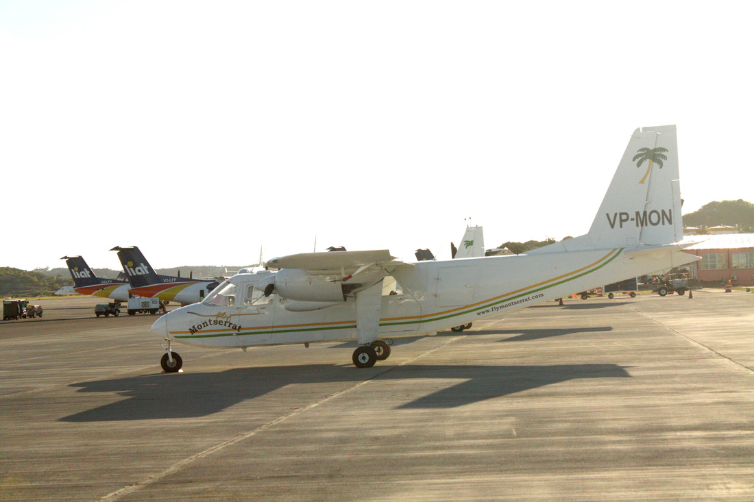
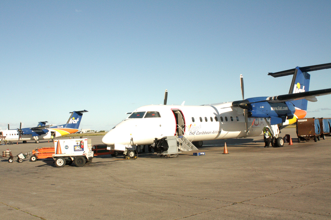
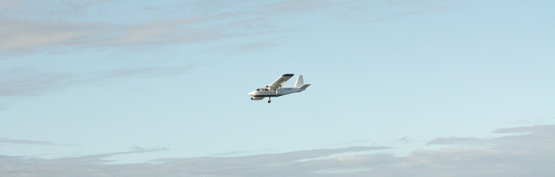
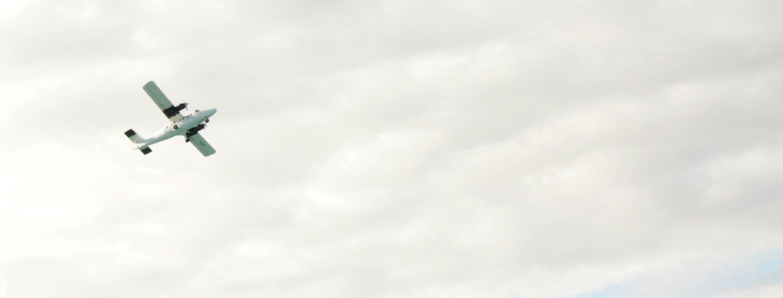
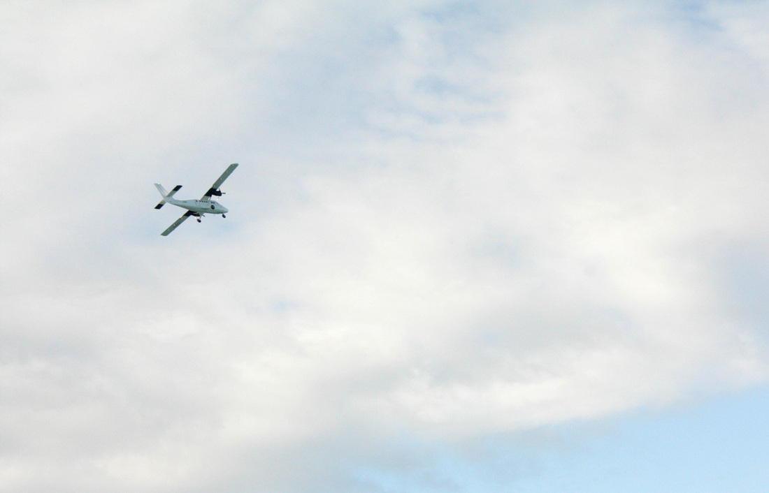
I took some photos at an airport runway, As one strand of my mind map, As one strand of my mind map, places. This strand also linked to all of the other strands on the mindmap. For example, people on holiday/travelling and experiences due to the being on the plane and the holiday itself. The photos of plane in the sky were taken at a high shutter speed to reduce blur, yet at the same time the aperture was large. I feel these pictures work out well due the amount of negative space around them. However, I feel this idea as a whole project/stand would not be ideal due to several factors, the limitations of constantly being at airports and the amount I can take/do with the idea, therefore I can't see this going any further. |
|
Research into relevant photographers.
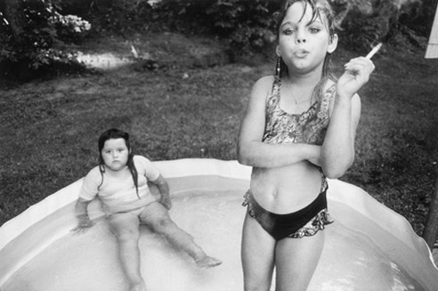
Mary Ellen Mark.
Amanda and her Cousin.
Mary Ellen Mark's controversial photograph is of a two young girls from North Carolina, Amanda and her Cousin, Amy. Taken in a paddling pool, in their back yard, picture presents the many different themes that at first may not be apparent, but when looked at closer there are obvious links to Encounters, Experiences and Meetings. The girl with the cigarette almost is looking through us, as if she has already made that transformation into adulthood by adapting to poses and learning the ropes of the adult world. The paddling pool background featuring her young cousin really adds to the unusual atmosphere of the picture by contrasting young to old and almost growing up to fast. The fact that Amanda is wearing lots of makeup with little clothing adds to this, compared to her cousin who is plain and simple, a sidekick type figure. By using black and white, adds to the raw, uncut and unglamorous feel of the picture. The picture isn't staged, Mary Ellen Mark met Amanda and her family on a trip to North Carolina in 1990 and stumbled across the unusual habits and behaviour of the infant.